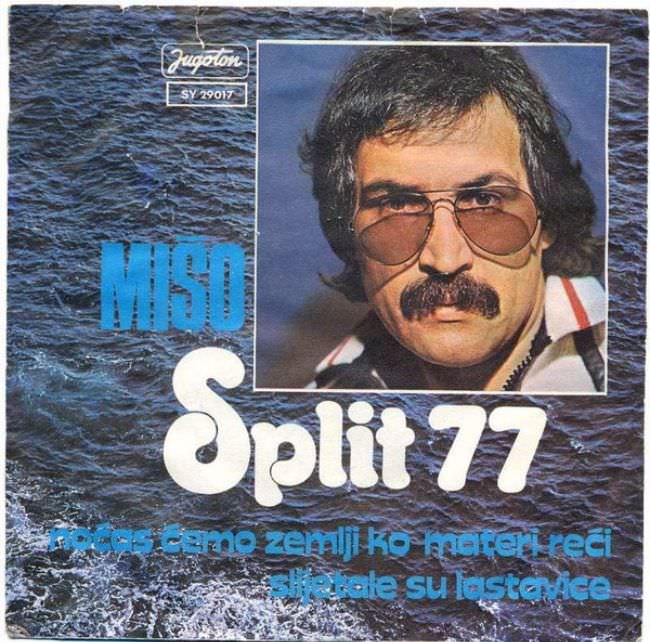
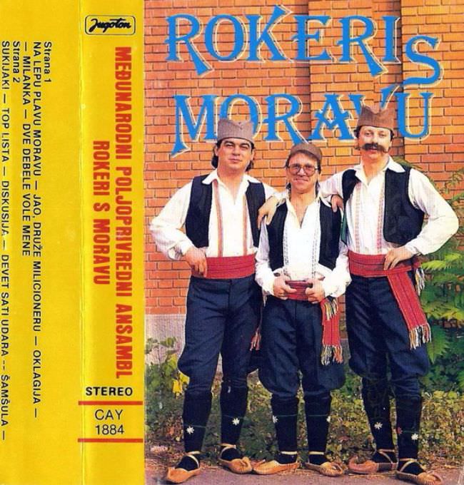
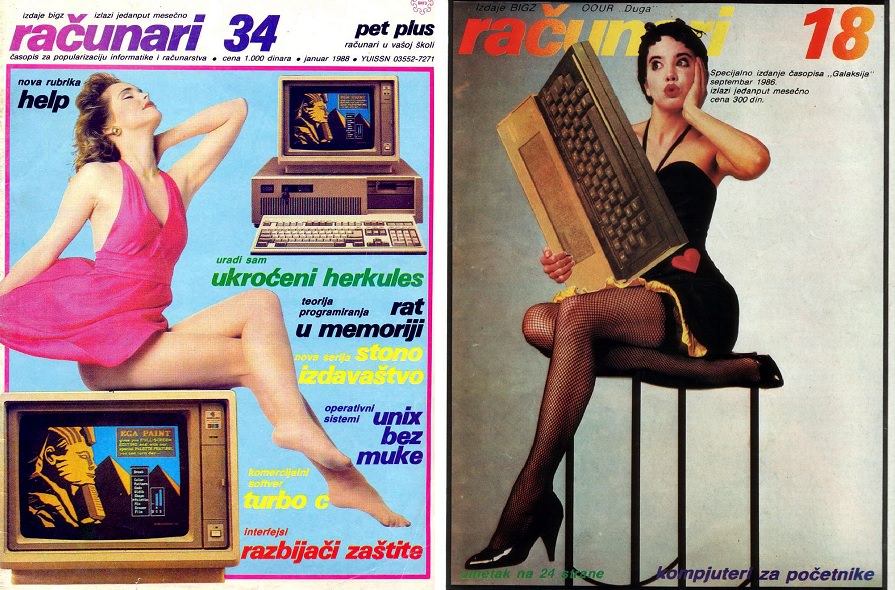
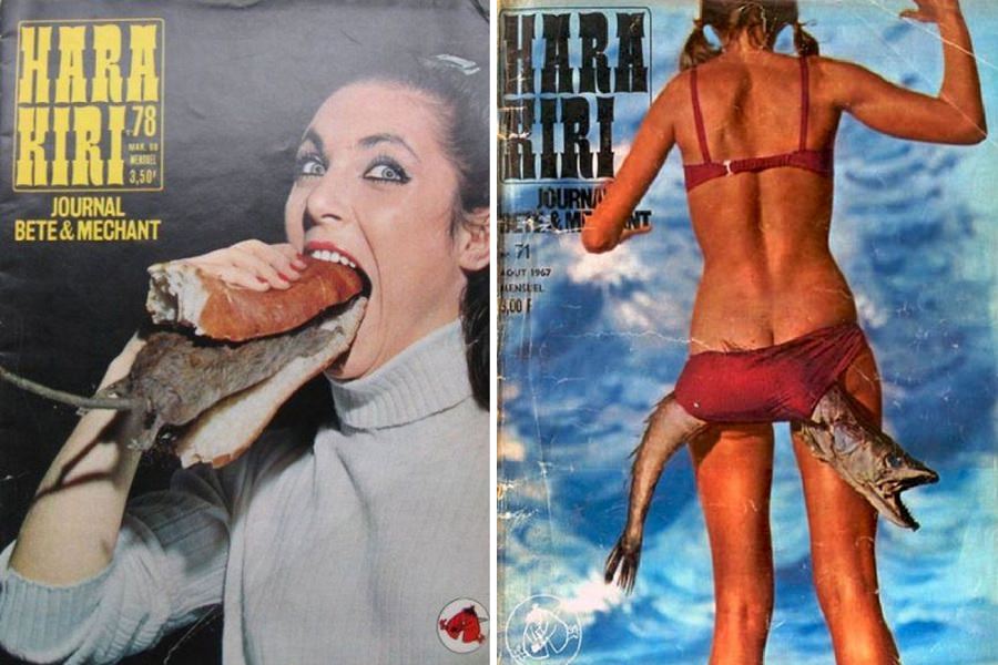
Yugoslavia had a surprisingly active music industry during the 1970s and 1980s. Bands and solo artists released records across genres, from folk and pop to rock. The music found real audiences. The album covers, however, were a different story entirely.

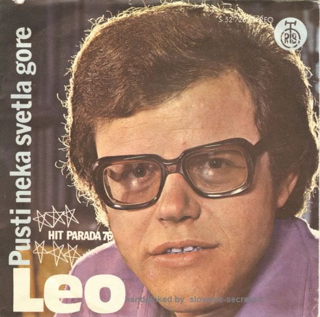
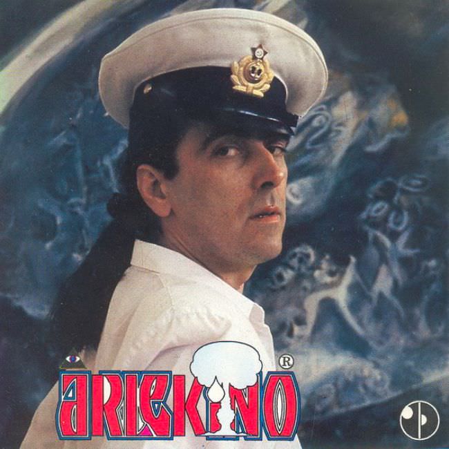
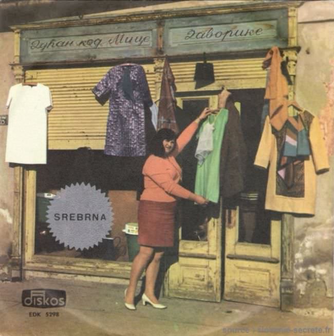
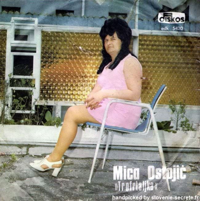
Many of these covers featured odd illustrations, clashing colors, and photography that looked awkward even by the standards of the time. Budget constraints played a role, but so did a creative culture that operated largely cut off from Western design trends. The results were often striking for all the wrong reasons.
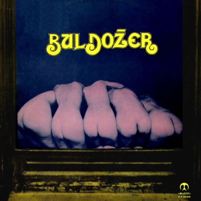
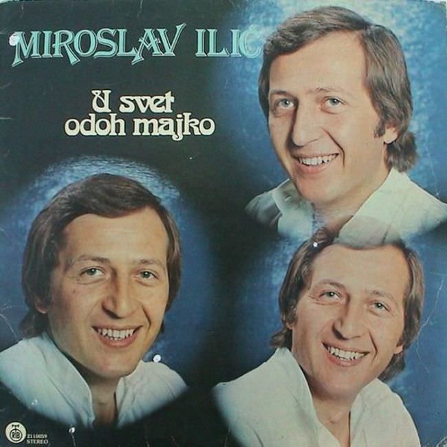
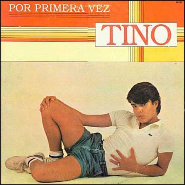
Some covers relied on hand-drawn artwork that ranged from charmingly amateur to genuinely confusing. Others used studio photographs with lighting choices and poses that made the artists look uncomfortable or unintentionally comic.

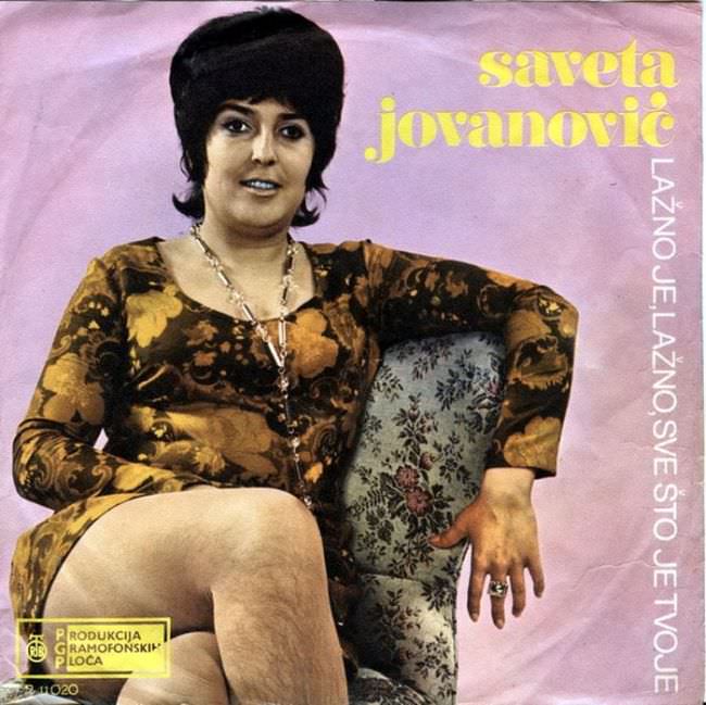
Typography was another weak point. Font choices were often mismatched with the mood of the music, and text was sometimes placed in ways that felt random rather than designed.
State-run record labels like Jugoton, RTB, and Diskoton dominated production. These labels prioritized getting records out rather than investing heavily in visual presentation. Graphic designers worked within tight limits, and it showed.
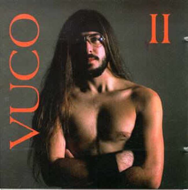

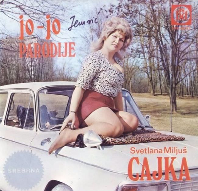
Today, collectors actively seek out these records. The covers that once seemed embarrassing now carry genuine historical value. They document real aesthetic choices made by real people working inside a specific political and economic system.
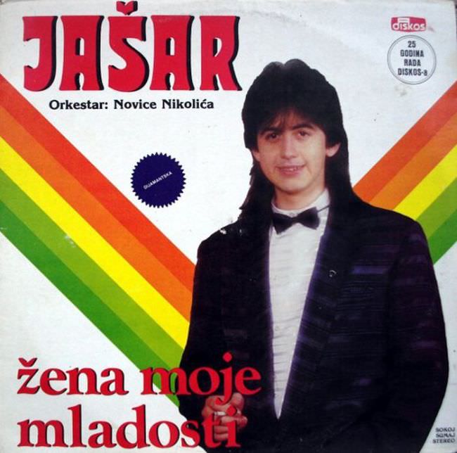
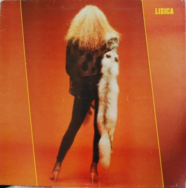
Each cover is a small artifact from a country that no longer exists. The strange poses, the garish backgrounds, the mismatched fonts — all of it adds up to a very specific visual record of Yugoslavia’s pop culture.

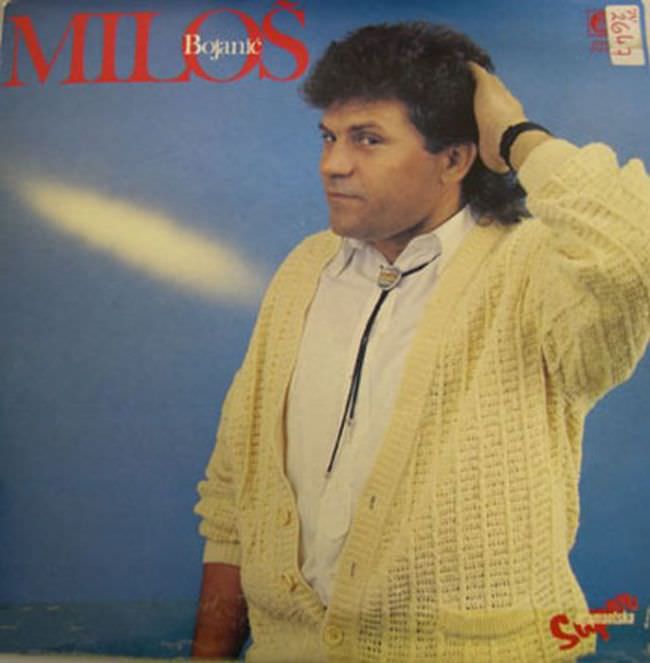
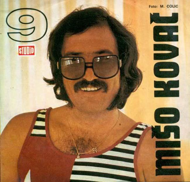
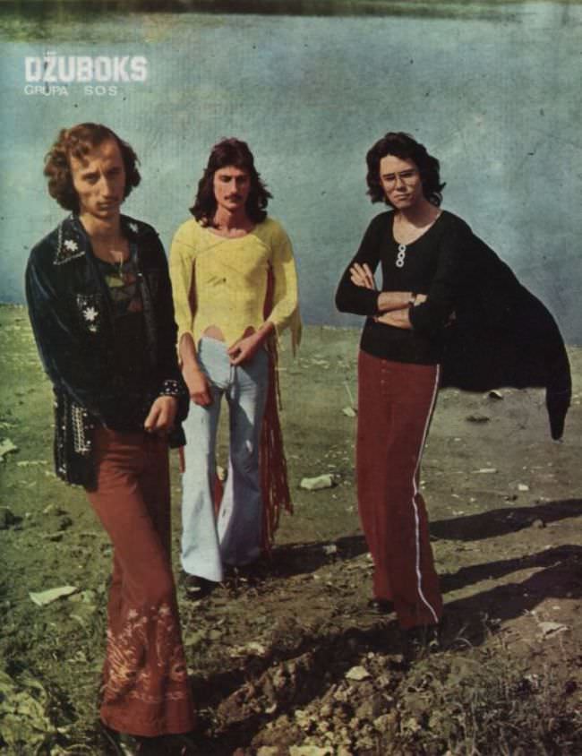
Some covers leaned into psychedelic imagery, borrowing from Western trends but filtered through a distinctly Eastern European lens. The results often felt off-kilter — like a copy of a copy that had lost something in translation.
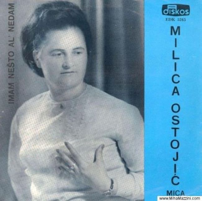
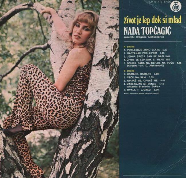
Others went the opposite direction, opting for plain, almost sterile designs. A single photograph of the performer against a flat background, with a name printed in block letters. Simple, but rarely effective.

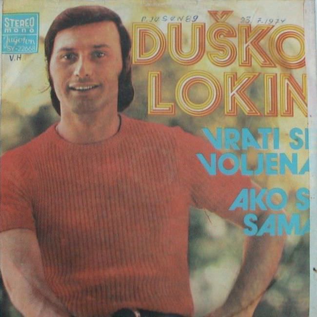

The folk and traditional music releases had their own visual language — rural scenes, embroidered costumes, and painted landscapes. These covers aged better than most, though they still carry an unmistakable datedness.

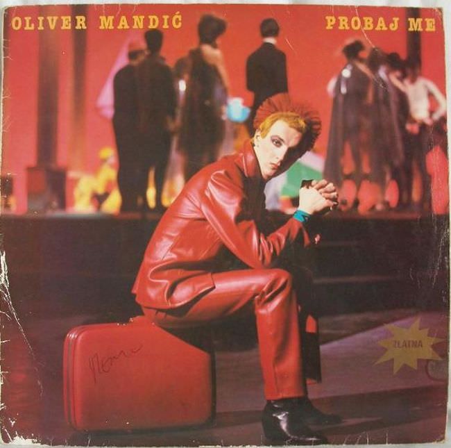
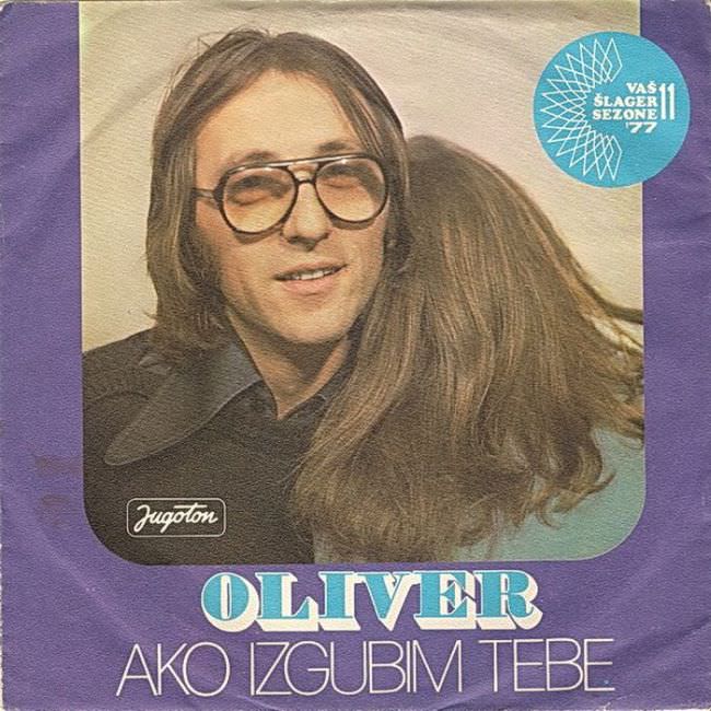
Rock and pop covers from the late 1970s onward tried harder to look modern. Some pulled it off. Many did not. The gap between ambition and execution is wide enough on several of these covers to make them genuinely memorable.
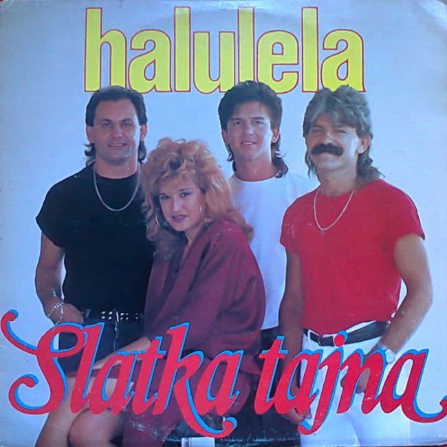

What makes these covers fascinating now is their honesty. There was no glossy marketing machine behind them. They reflect exactly what the designers had to work with — and what they thought looked good at the time.
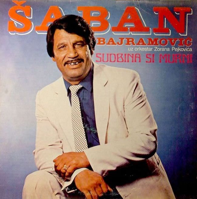

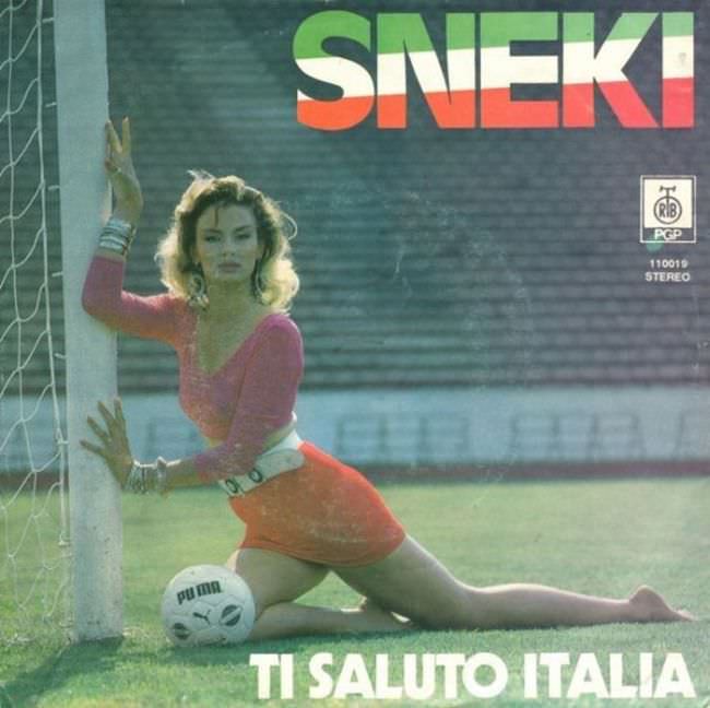
Scroll through enough of them and patterns emerge. Certain color combinations appear again and again. Specific poses recur. The same studio backdrops show up across multiple artists and labels.
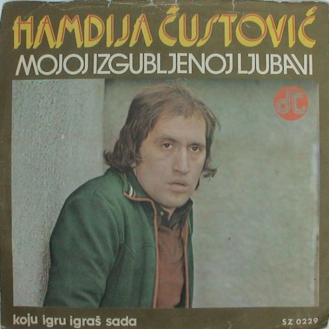

These records are physical evidence of a culture in motion — a country producing art and music under conditions that shaped every creative decision, from the songs themselves down to the font on the back cover.