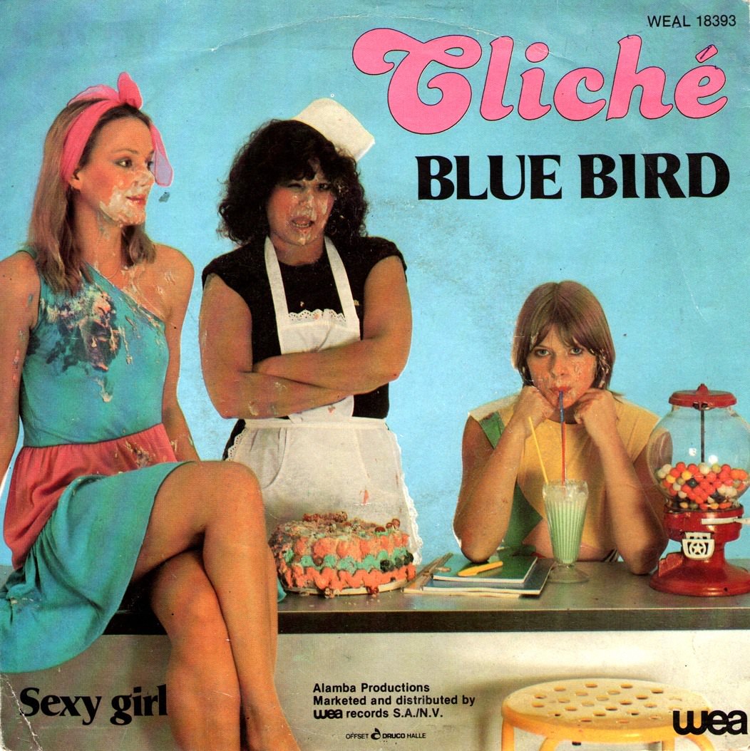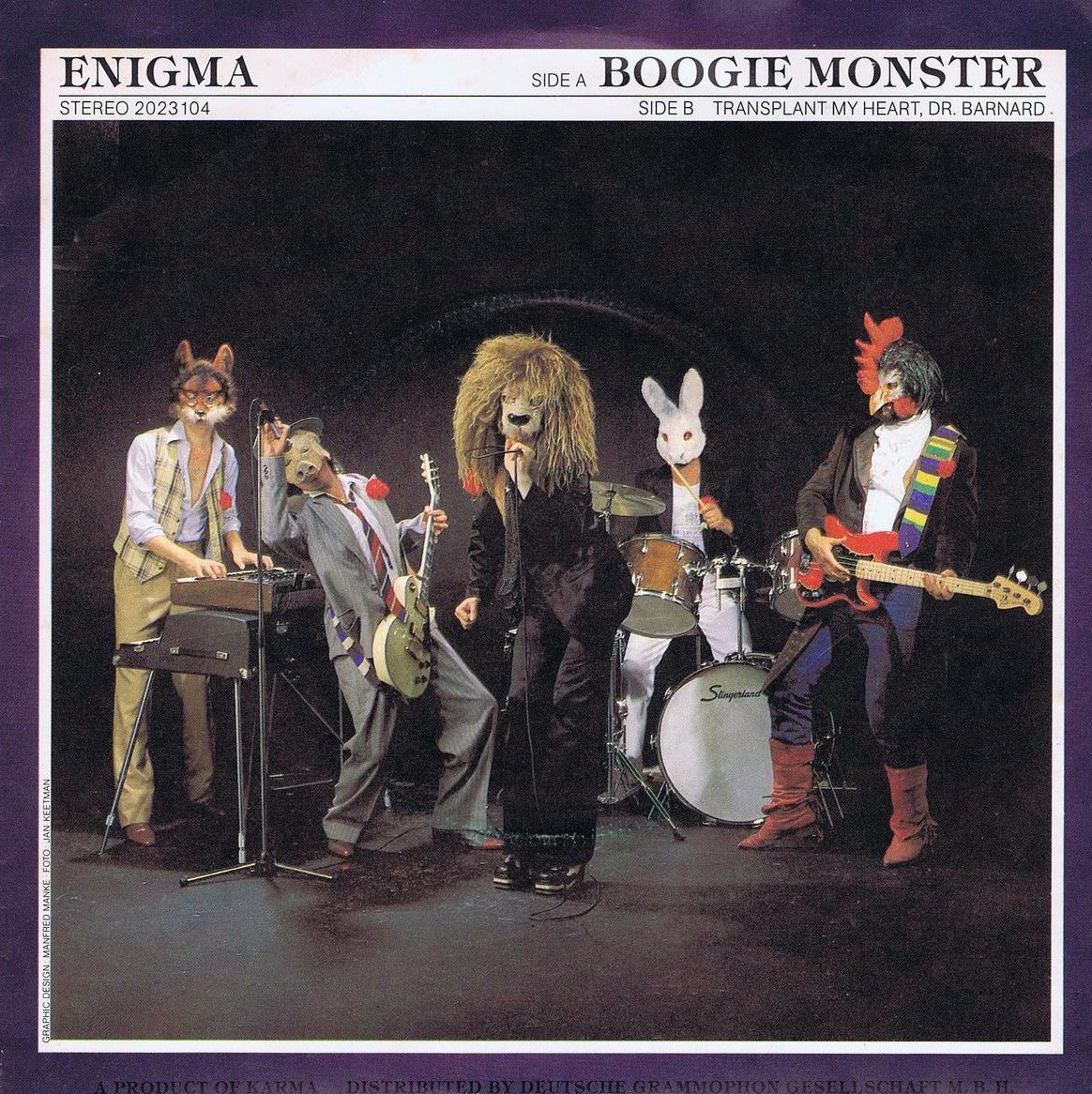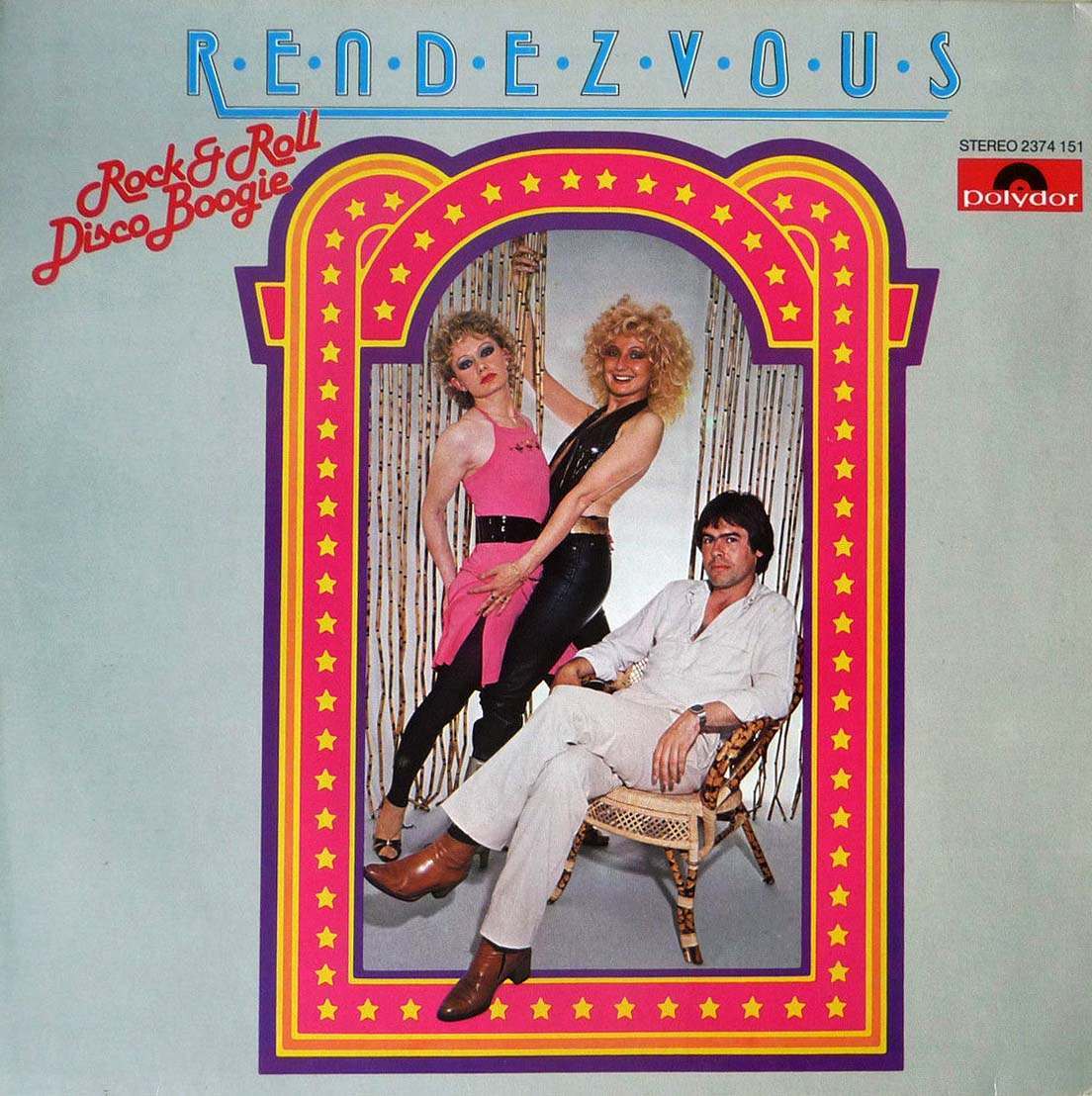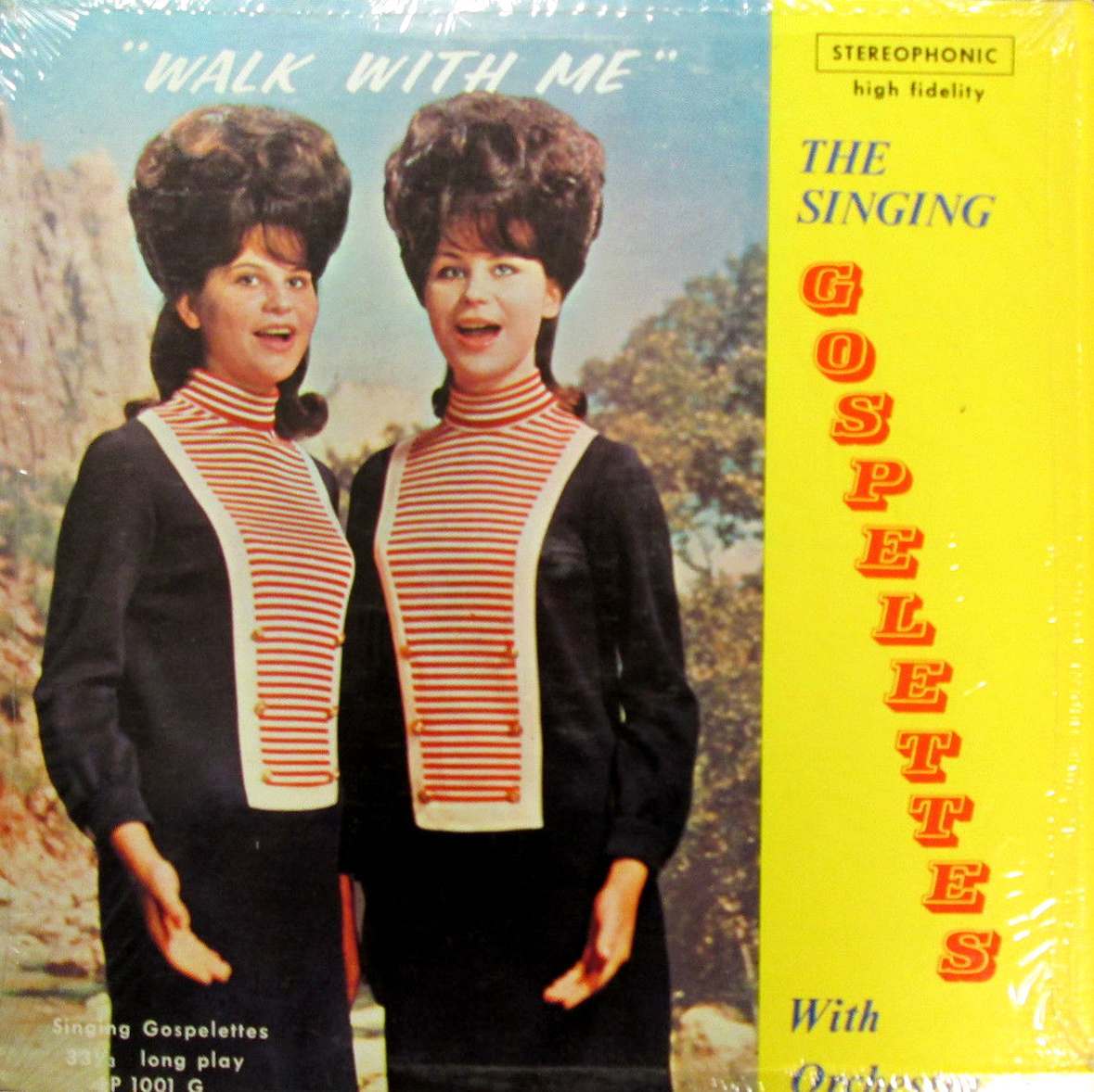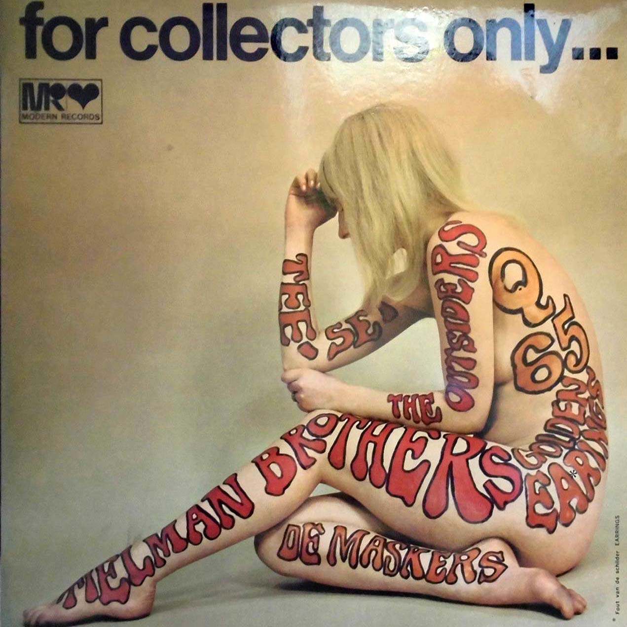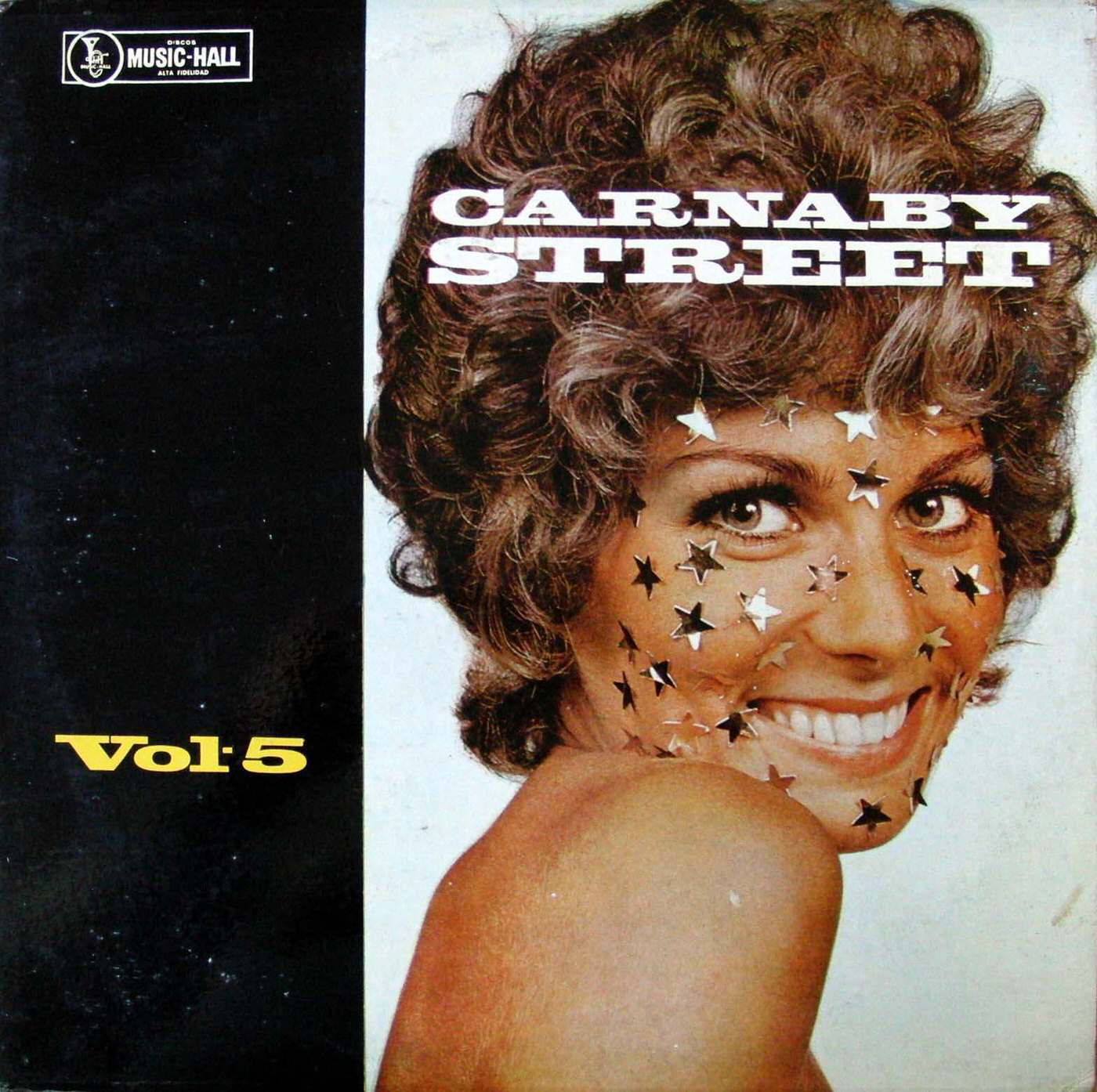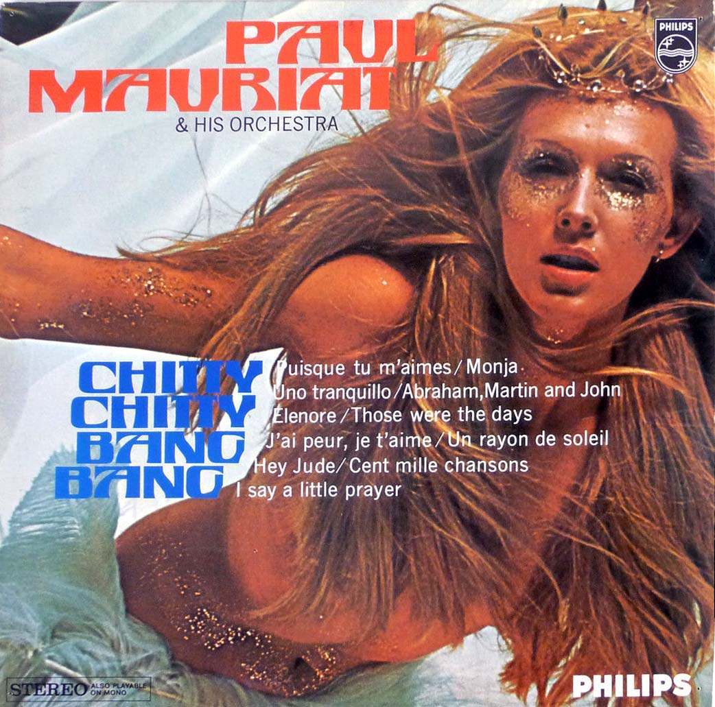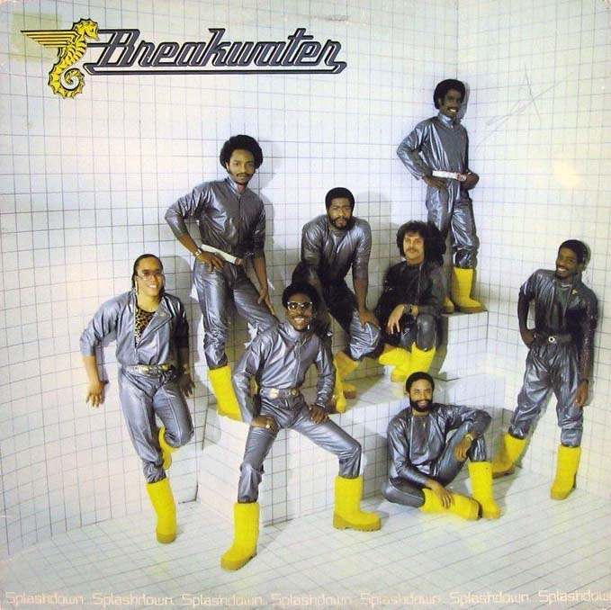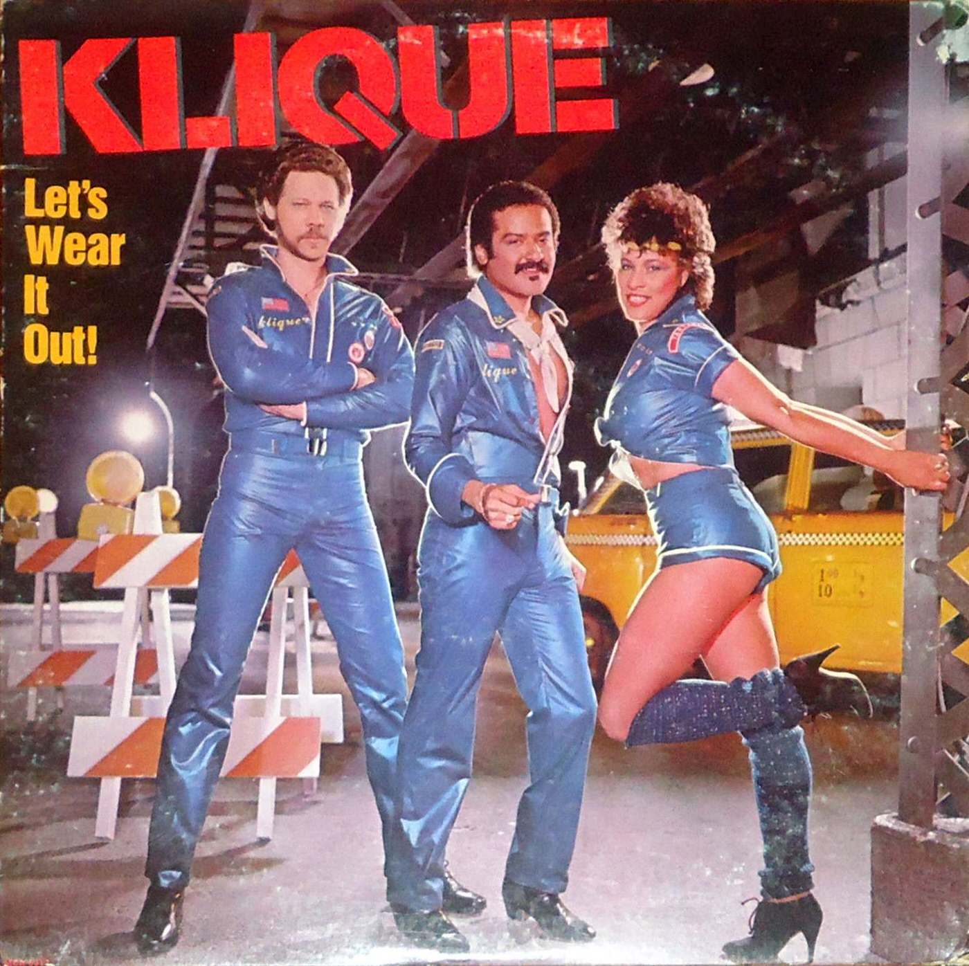

The 1960s and 1970s were filled with creativity and change, not just in music but also in art and design. As music became a huge part of popular culture, the artwork on album covers became increasingly important. The cover was the first thing people saw, offering a visual hint about the music inside and helping the album stand out in record stores.
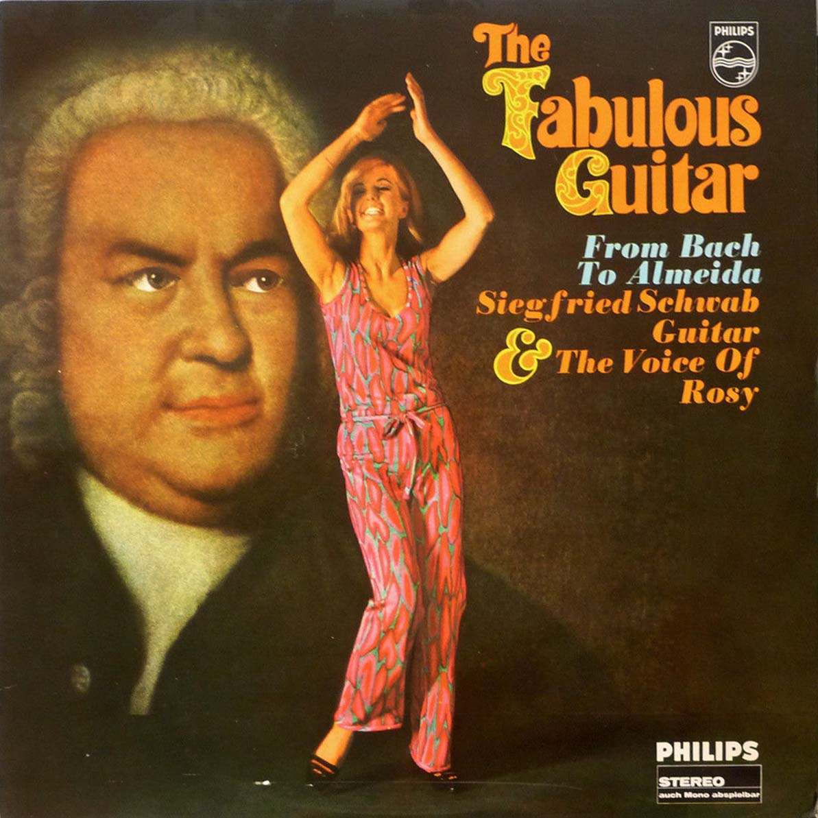
While many album covers from this era became famous and instantly recognizable, others took a more unconventional approach. Some covers featured designs that were unusual, puzzling, or simply very different from what people expected. These covers stood out from the mainstream and sparked conversation among music fans.
What made some of these album covers seem unusual often came down to the design choices made. Sometimes, the concepts behind the artwork were strange or hard to interpret, leaving viewers wondering what the image had to do with the music or the band. The imagery used could be surreal, abstract, or just unexpected.
Read more
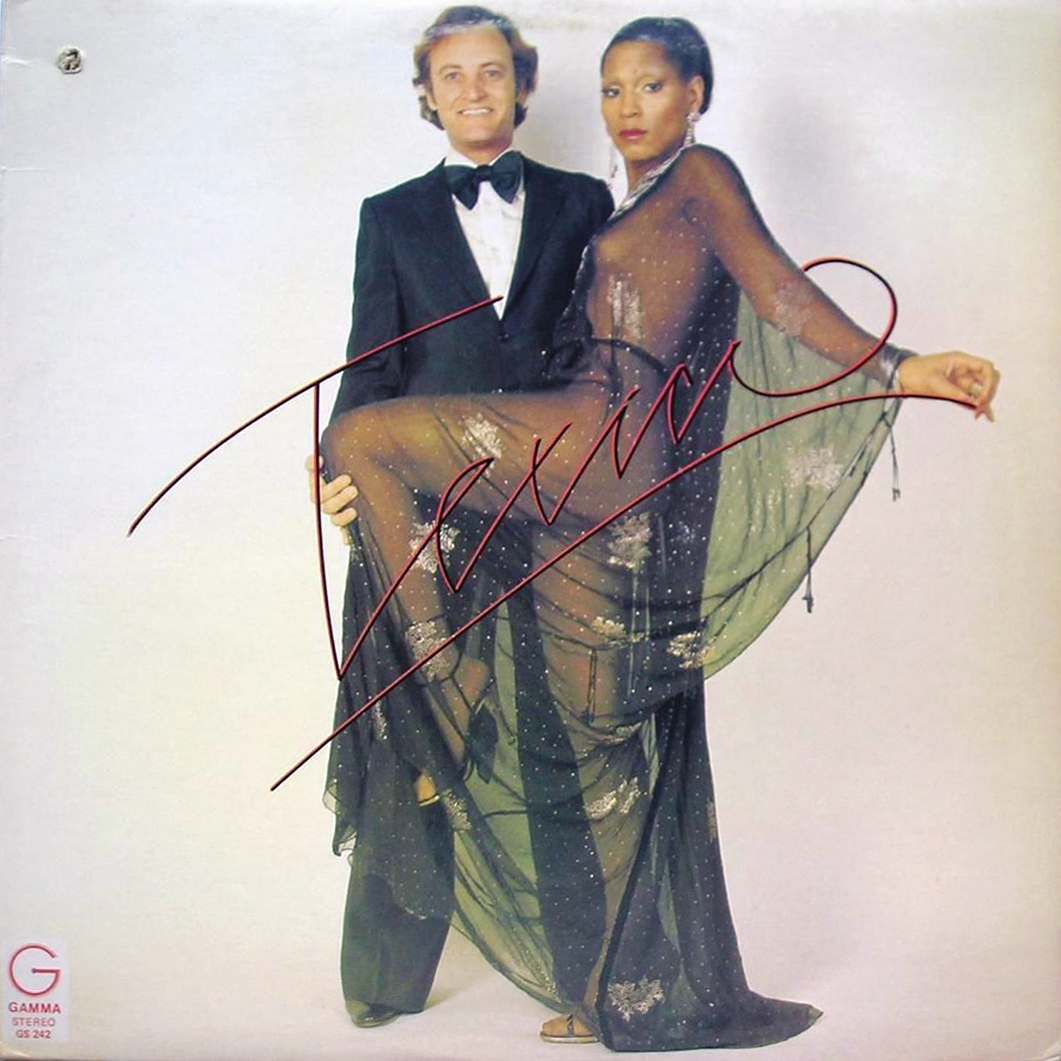
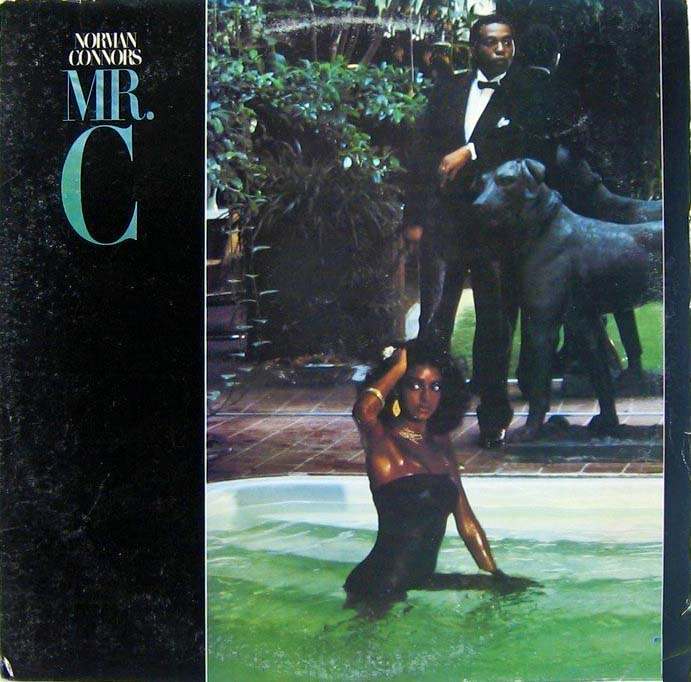
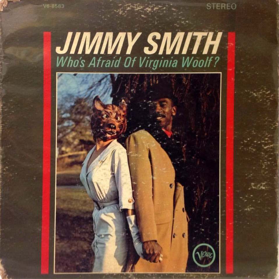
The artists themselves might appear on the cover in strange or awkward poses, or in settings that seemed out of place. Costume choices, props used in photos, or the overall styling of the band on the cover could contribute to an unconventional look that differed from typical band portraits of the time.
Unexpected use of colors, graphics, or photography techniques also played a role. Album covers from the 60s and 70s experimented with visual styles, and sometimes these experiments resulted in covers that looked jarring or confusing. Poorly executed artwork or photography could also unintentionally lead to a cover that seemed weird.