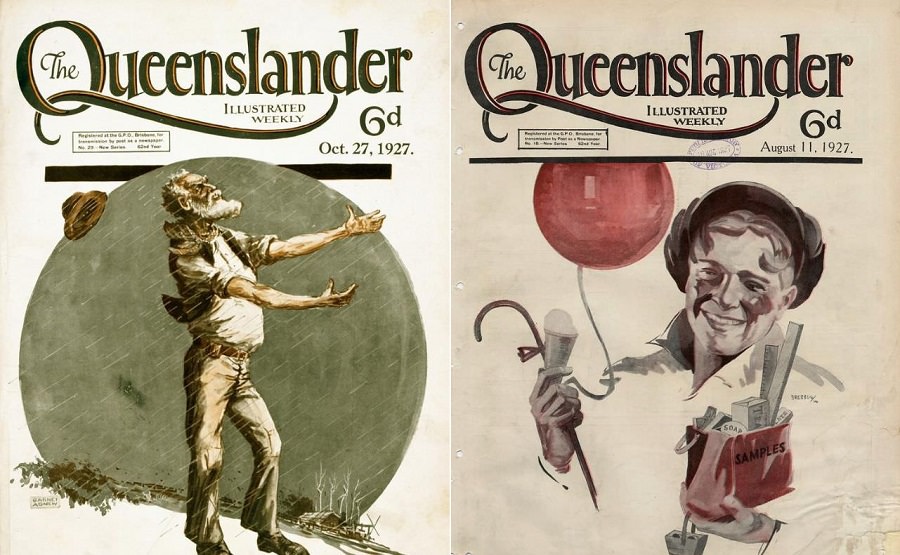
An album cover has one job: make you want to listen. It’s the first thing you see, and it’s supposed to pull you in. But flip through enough records from the 1960s, 70s, and 80s, and you’ll find a whole different category — covers so gloriously misguided that they’ve taken on a second life as comedy gold.
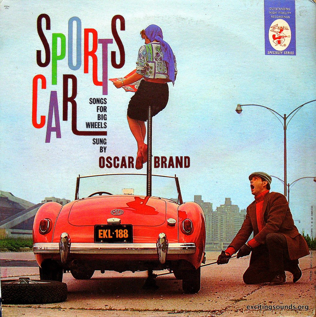
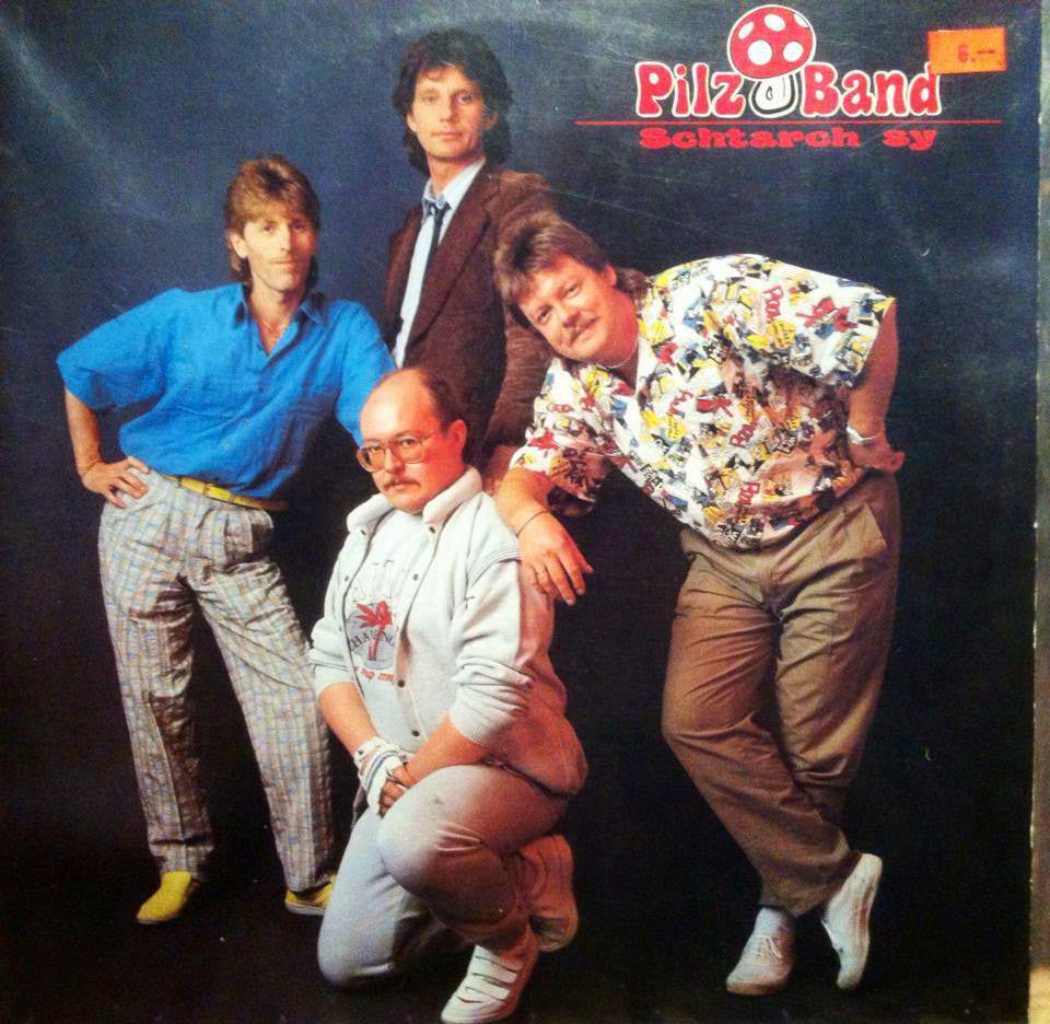
The fashions of those decades were bold, to put it kindly. Flared pants, polyester suits, and color combinations that no designer would dare repeat today all found their way onto album artwork. What felt cutting-edge at the time reads as almost surreal now.
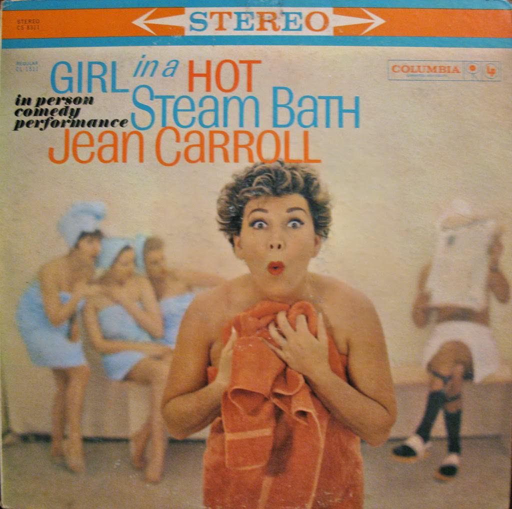
Then there’s the hair. Volume was clearly the goal. The bigger, the better. Many covers feature hairstyles that appear to defy gravity, heavily styled into shapes that must have required serious effort — and serious amounts of hairspray.
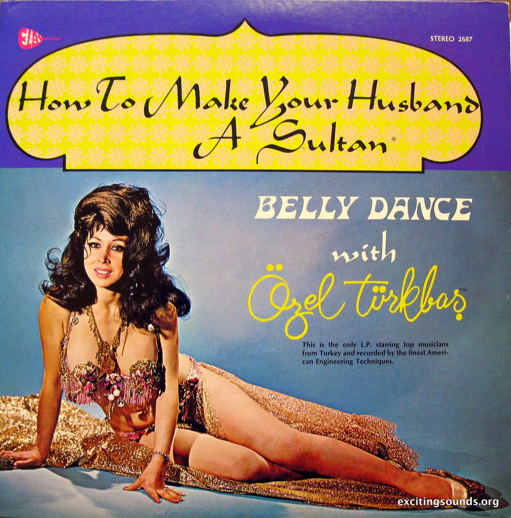
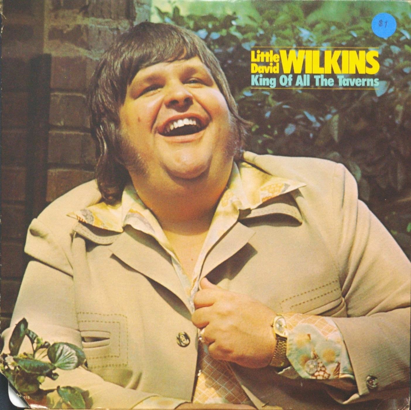
A recurring theme across these covers is the attempt at sex appeal. Shirtless men strike dramatic poses that land somewhere between brooding and baffling. Women appear in outfits that look pulled from a costume rack rather than a wardrobe. The intent is obvious. The execution, less so.

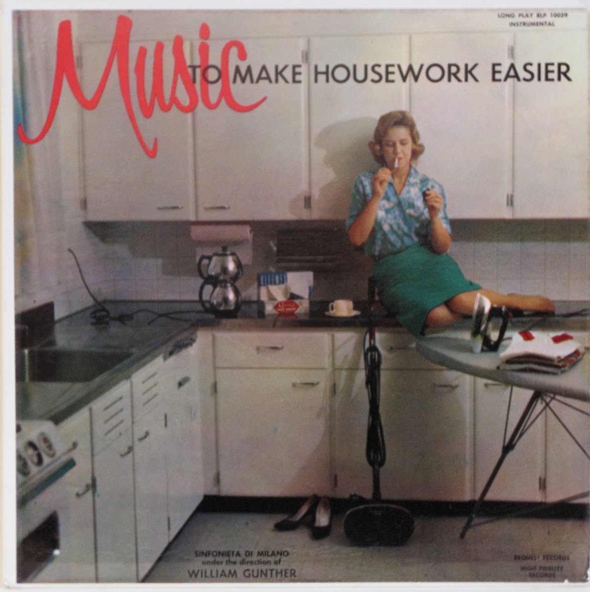
Family acts produced some of the most unintentionally funny covers of all. Matching outfits, coordinated colors, and wide frozen smiles were standard. These covers weren’t just selling music — they were selling an image of wholesome togetherness, and the pressure to project that shows in every stiff pose.
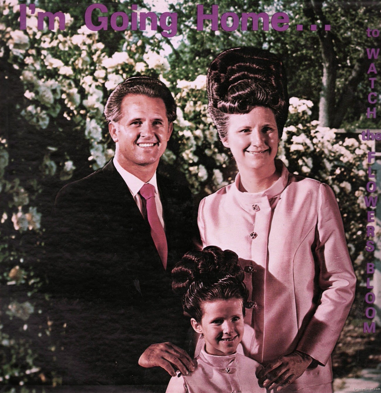
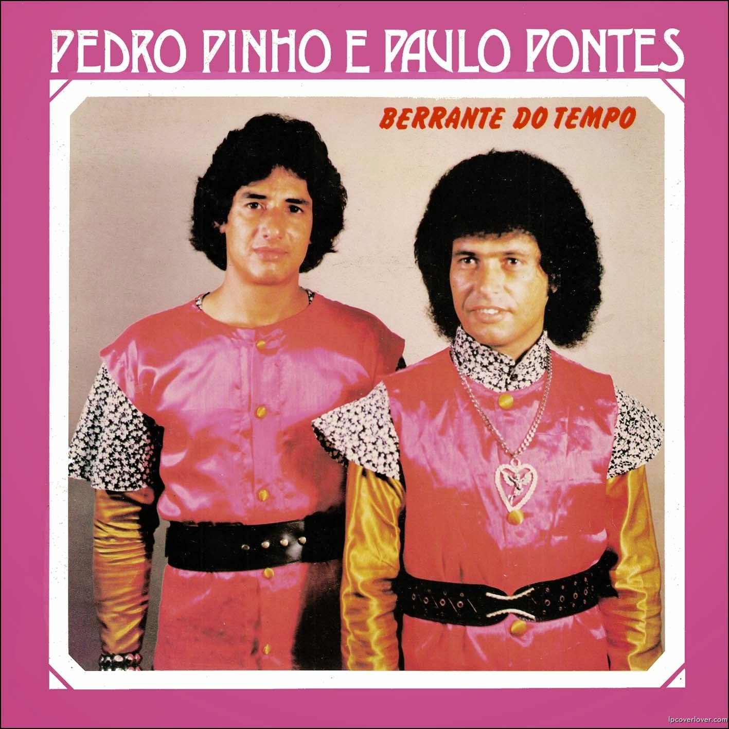
Some covers leaned hard into gimmicks. Props, unusual settings, and theatrical concepts were meant to signal creativity. A beach scene with no beach. A kitchen where no cooking makes sense. The stranger the setup, the more certain the artist seemed that it was working.
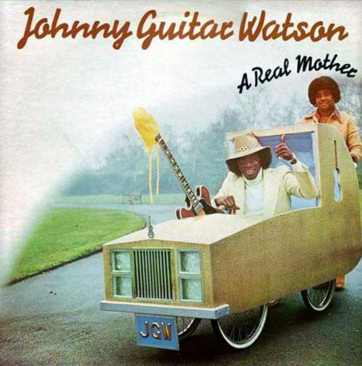
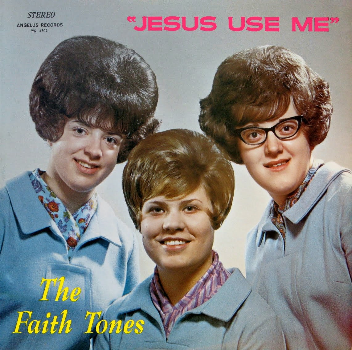
Budget was a real factor too. Not every act had money for a professional photographer or a graphic designer. Some covers were clearly assembled with whatever was on hand — a blank wall, basic lighting, and a lot of confidence.
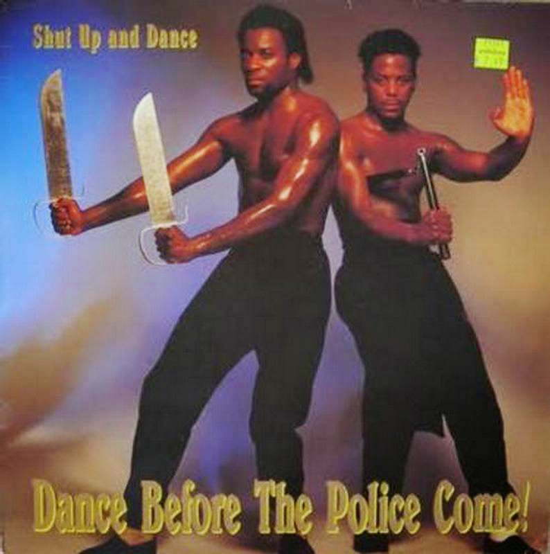
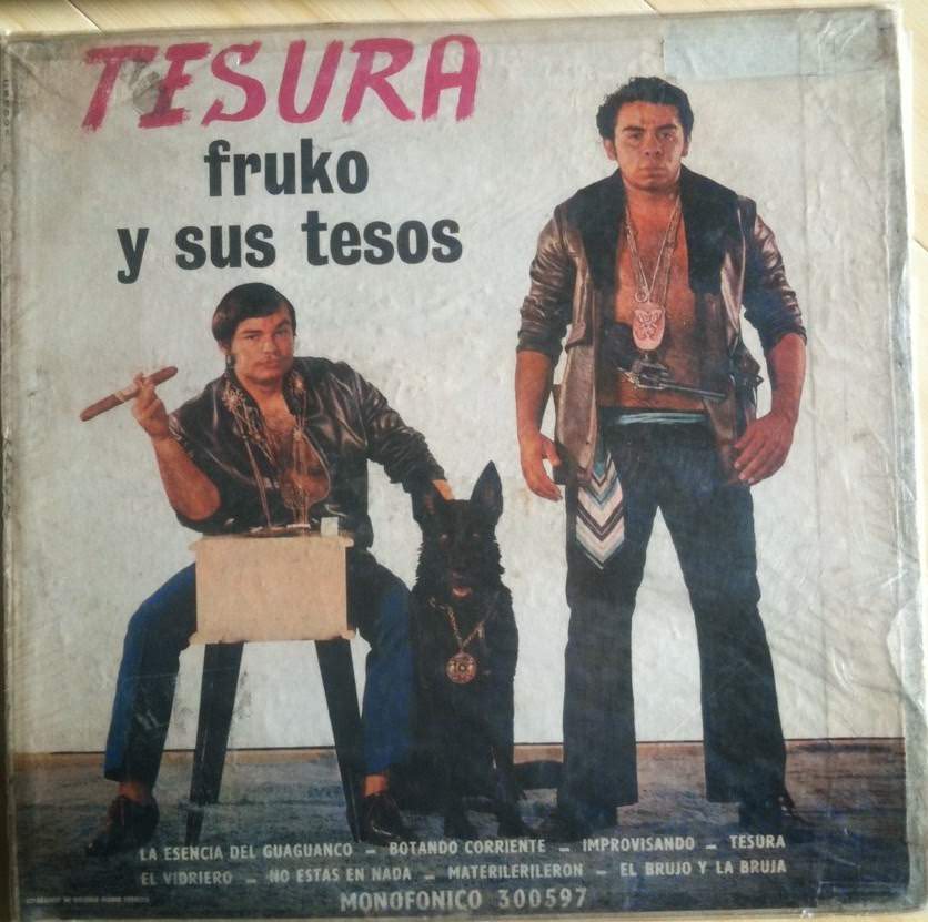
Typography choices added another layer of chaos. Fonts that barely fit the cover, text in colors that clash with the background, and titles arranged in ways that are genuinely hard to read all appear with surprising regularity.
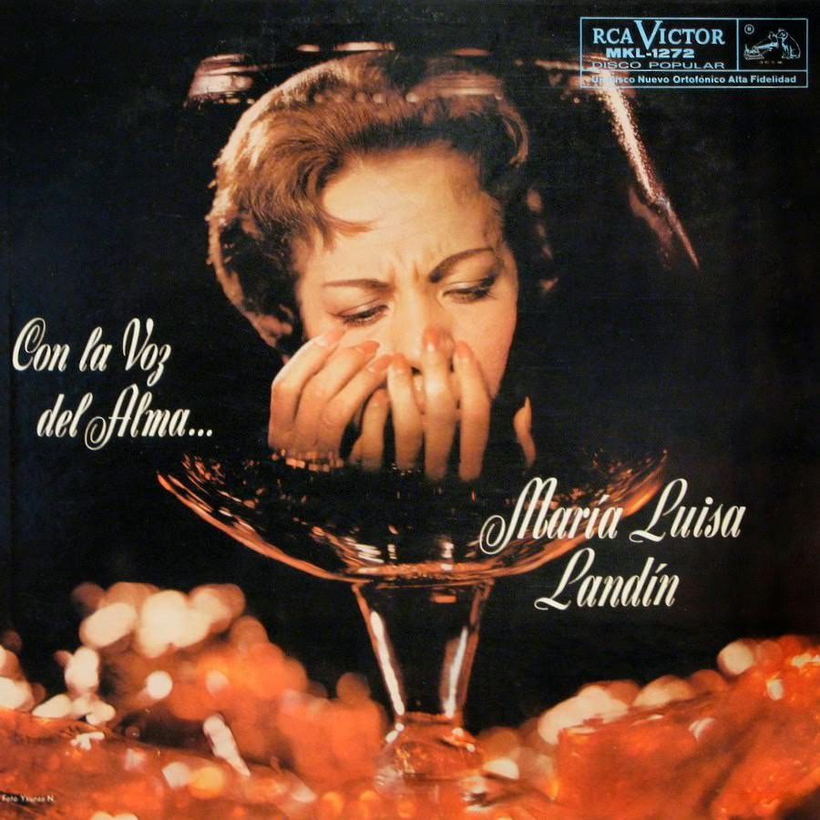
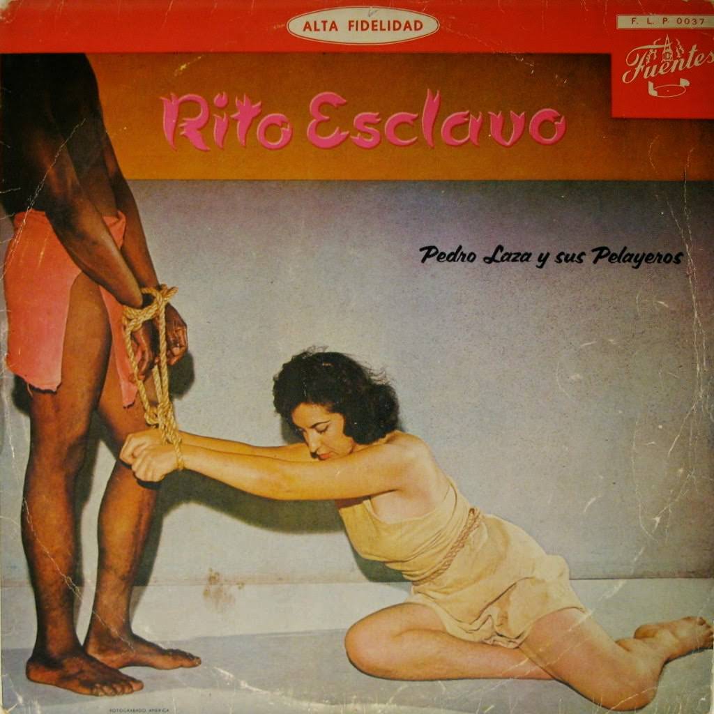
The comedy in these covers isn’t mean-spirited. These were real musicians, many with real talent, doing their best with the trends and tools available to them. That’s part of what makes them so watchable — the sincerity behind every questionable decision.
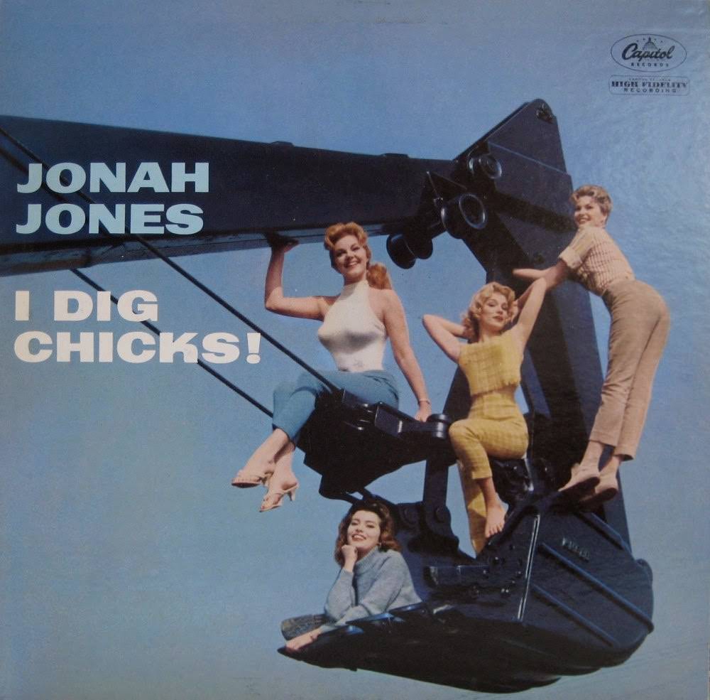
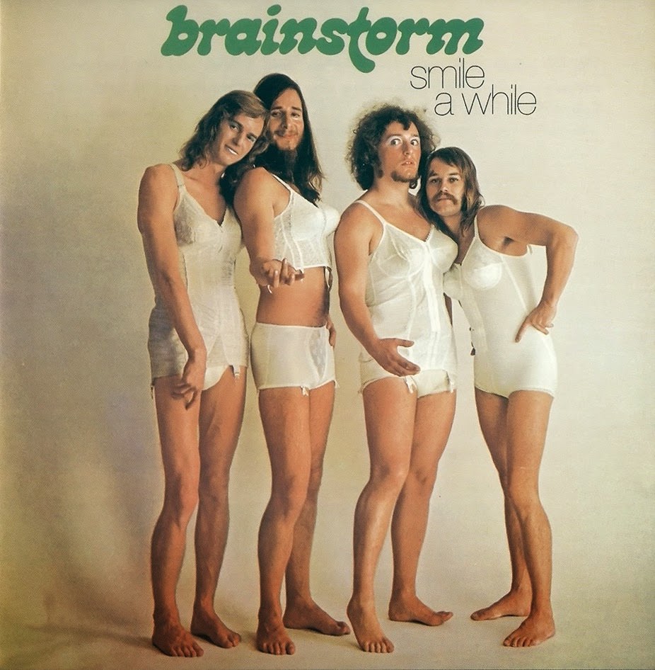
Gospel and Christian music albums from this era brought their own flavor of unintentional humor. Earnest expressions, dramatic lighting meant to evoke the divine, and robes that didn’t quite fit added up to covers that are hard to look away from.
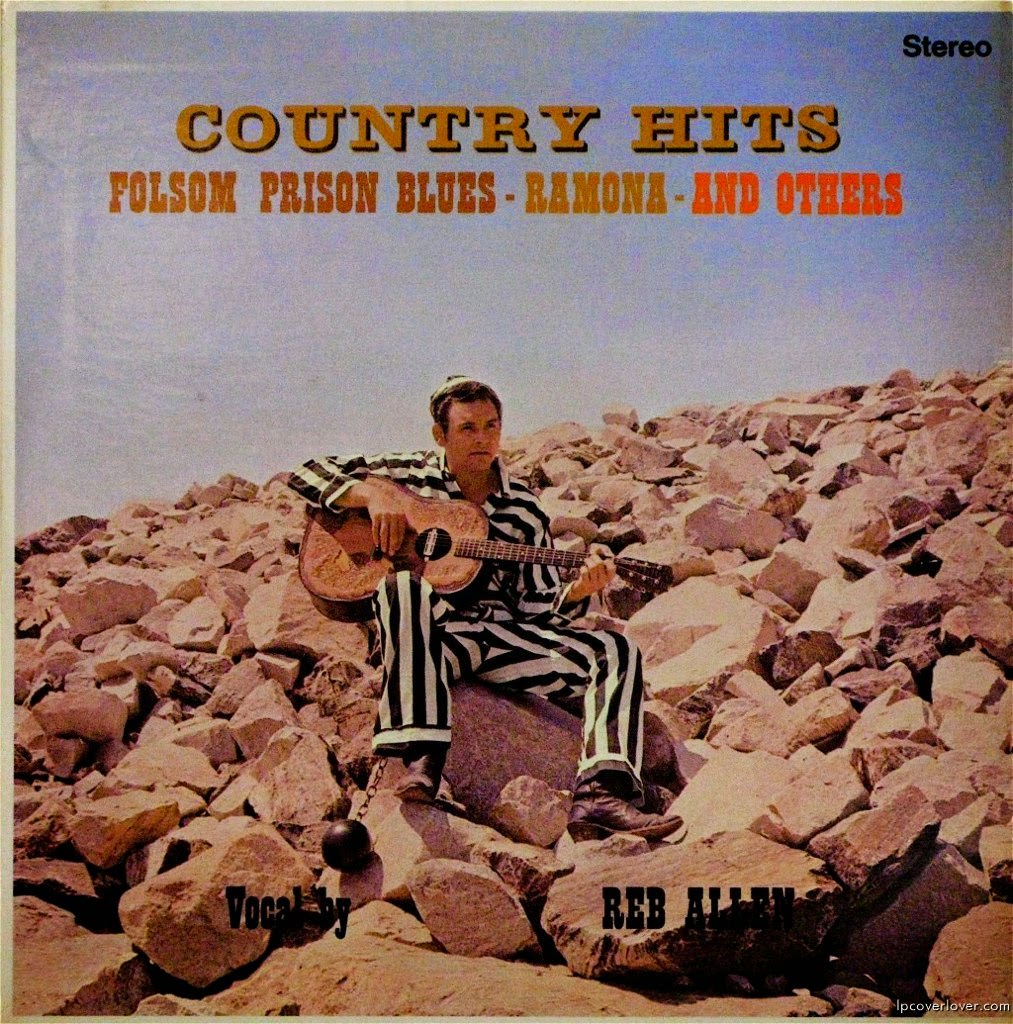
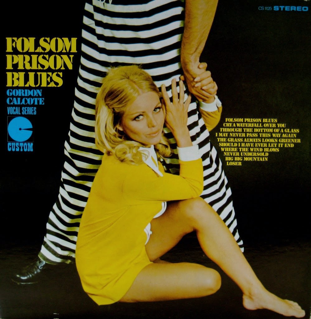
Country and western artists added their own chapter to this story. Rhinestone suits, wide-brimmed hats, and backgrounds featuring painted desert landscapes show up on covers that are practically their own art form at this point.
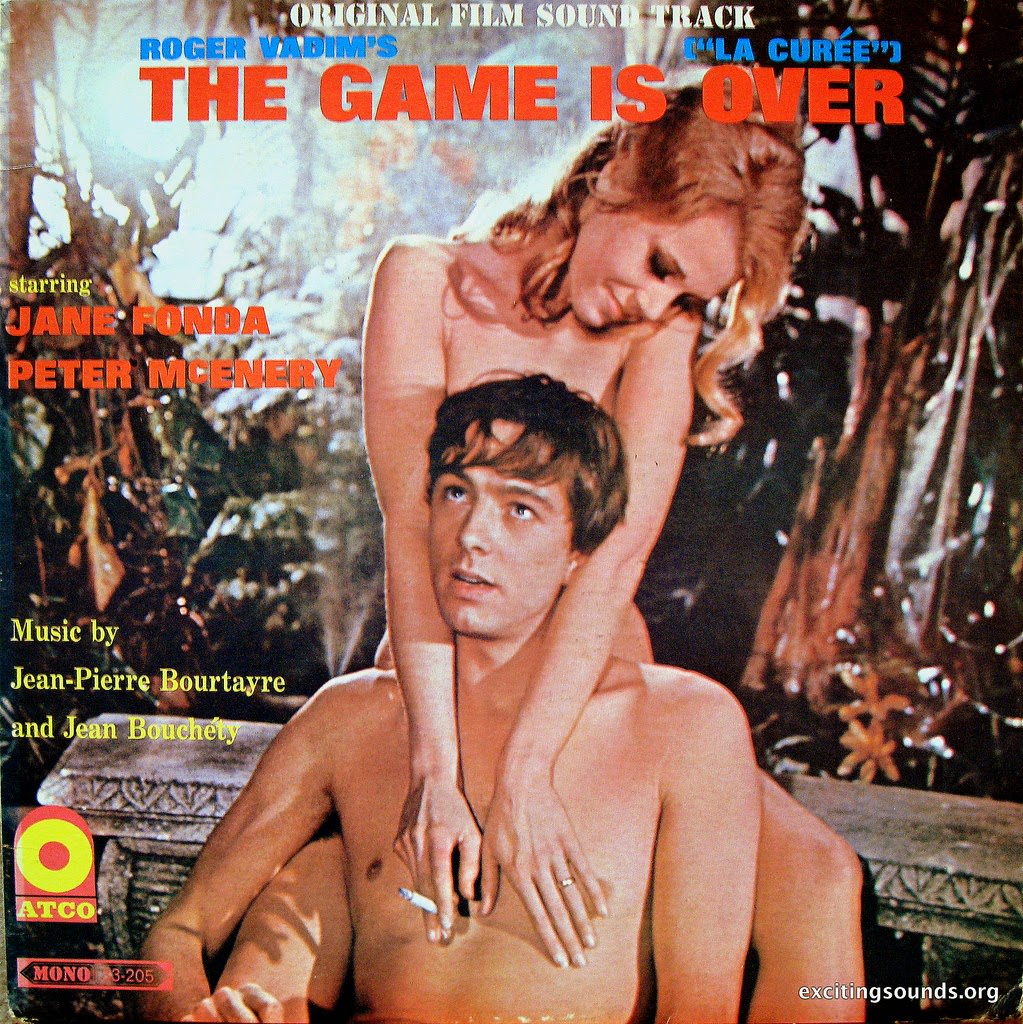
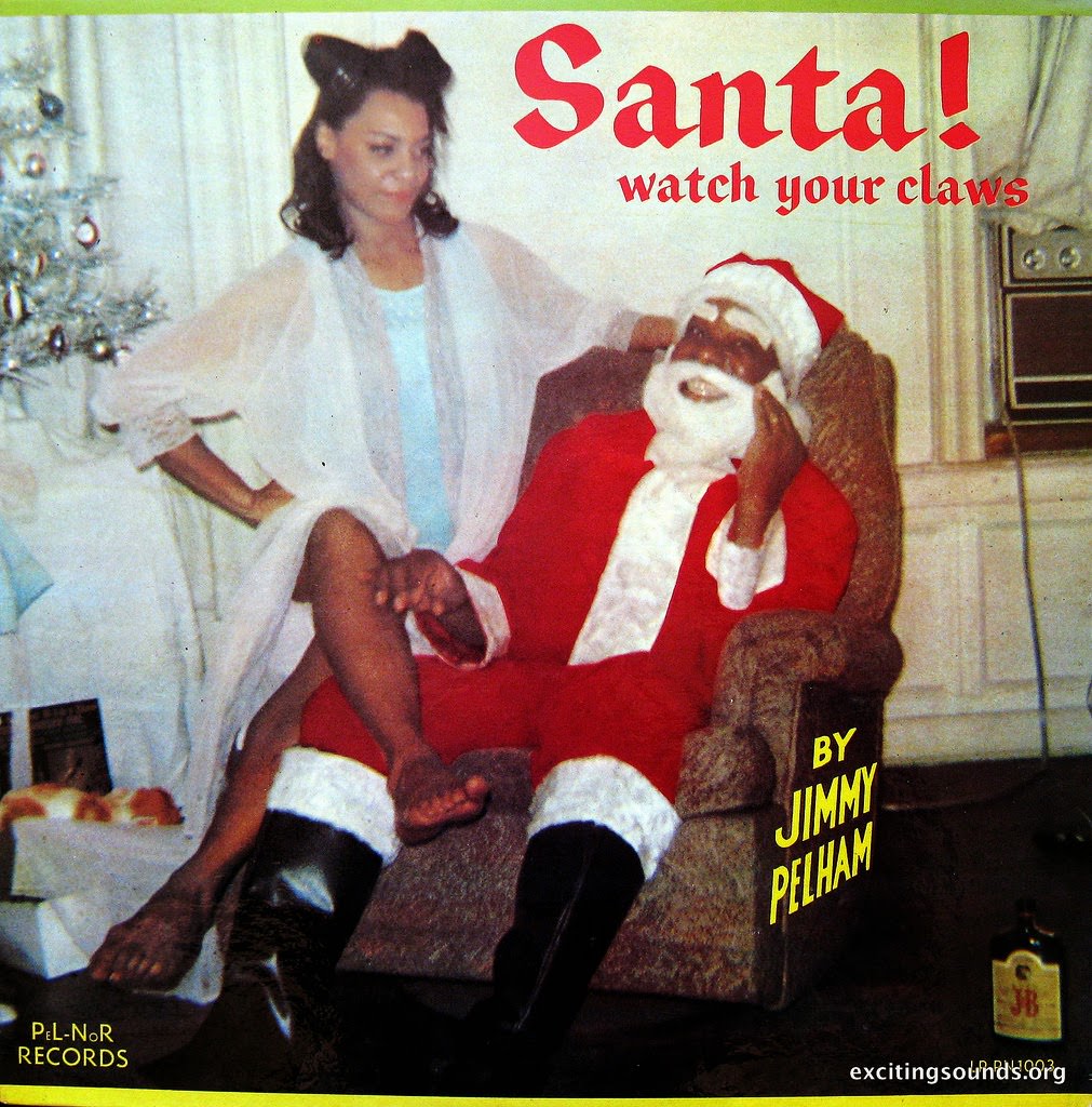
Easy listening and lounge records were especially committed to projecting a mood — usually sophistication. The result is often a very specific kind of awkward elegance, where the ambition is high and the outcome is pure vintage charm.
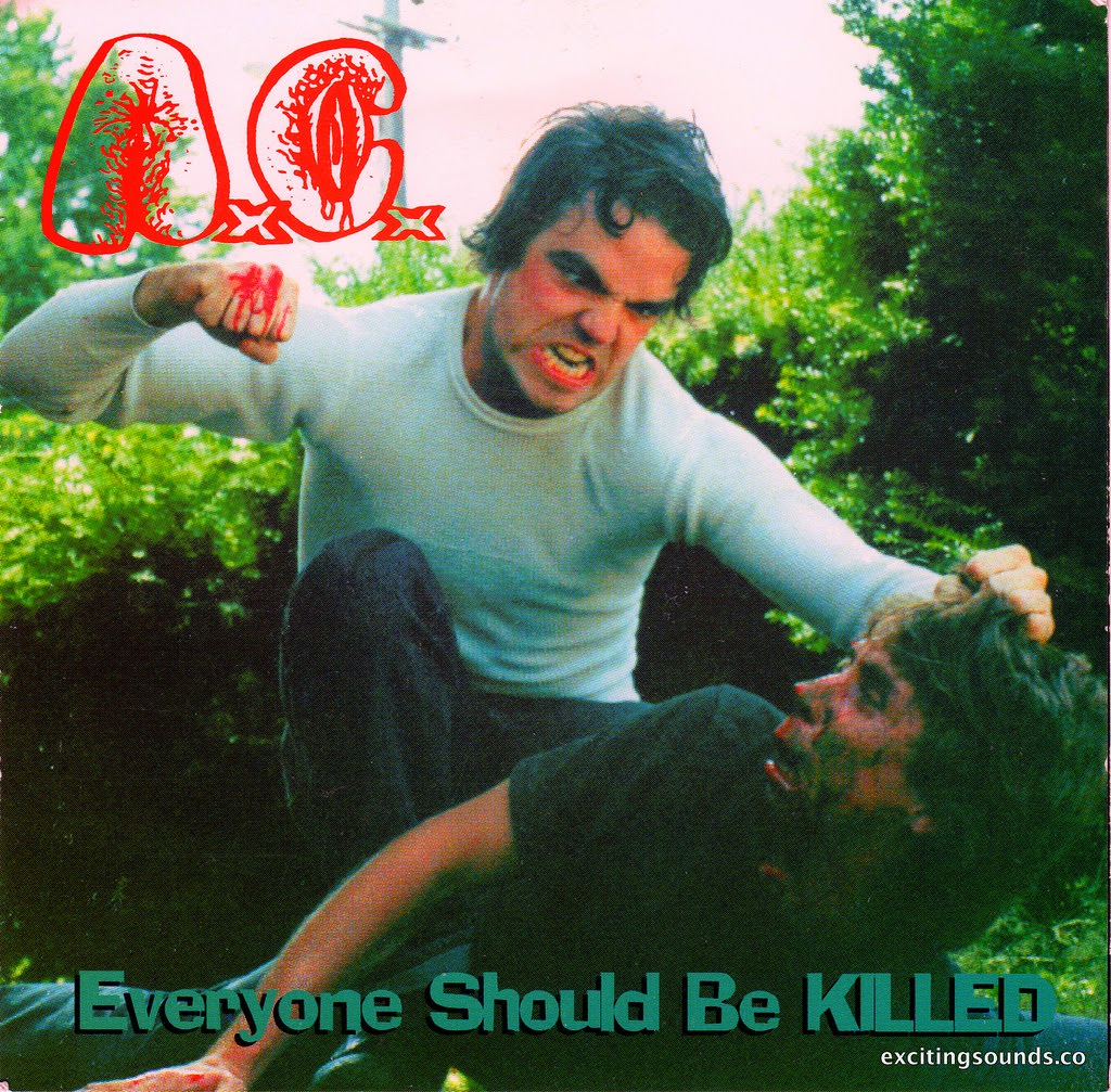
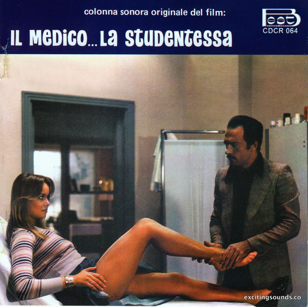
Children’s records deserve their own mention. Mascots, cartoon characters, and live performers dressed in costumes stare out from covers that range from cheerful to genuinely unsettling. Either way, they’re memorable.

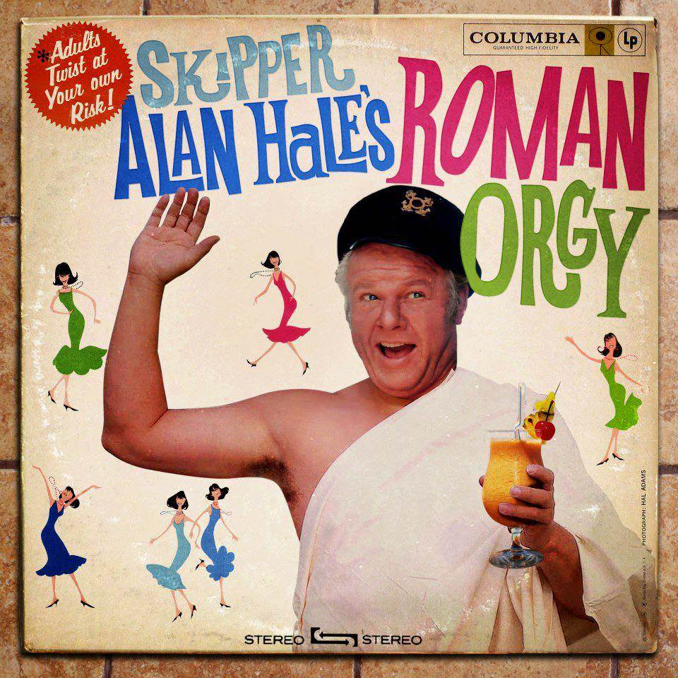
Every one of these covers represents a moment in time when someone looked at the final product and said, “Yes. This is the one.” That’s the real beauty of them. They’re a direct window into exactly what people thought looked good — and that honesty, decades later, is what makes them so endlessly entertaining.