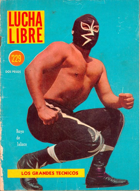
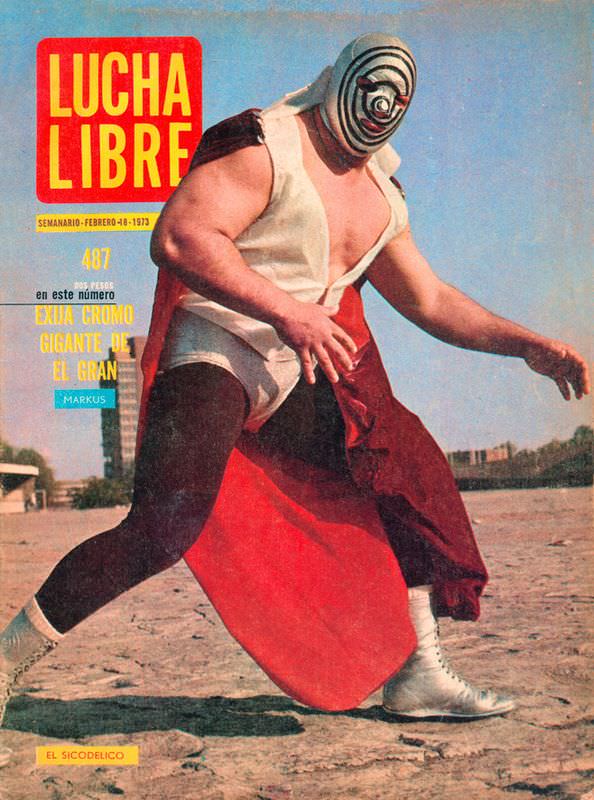
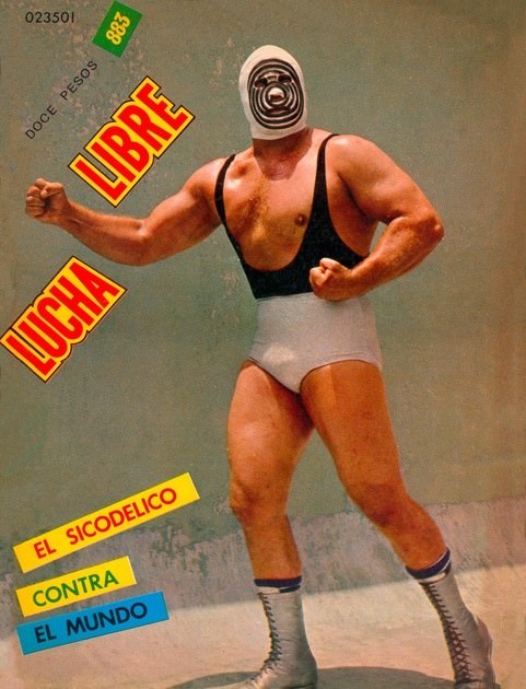
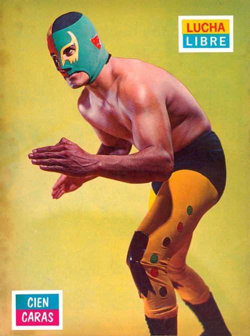
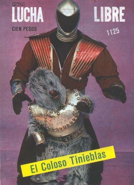
In the 1970s, Lucha Libre magazine covers were some of the most intense images on any newsstand. Bright reds, electric blues, and sharp yellows collided on every issue. These weren’t calm sports publications. They were visual declarations of war.
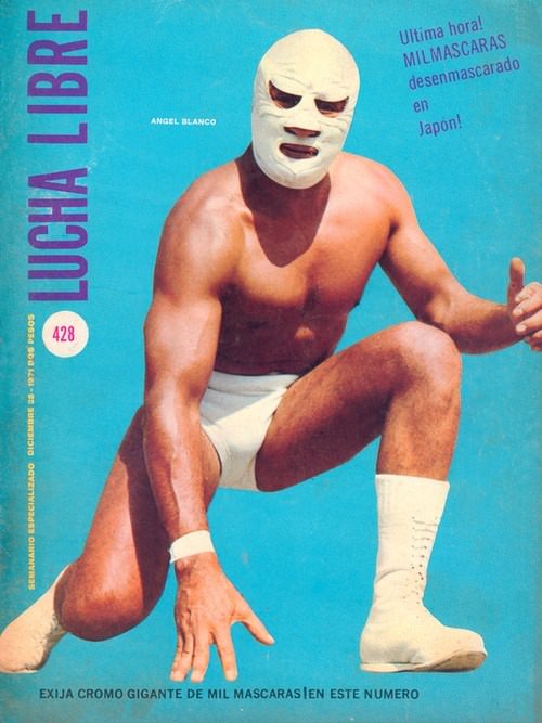
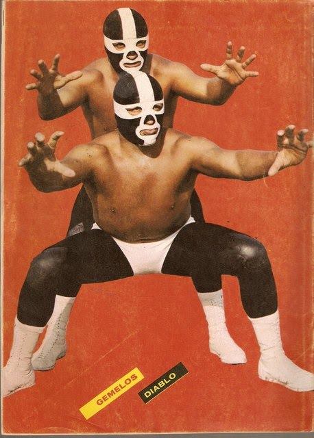
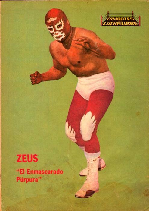
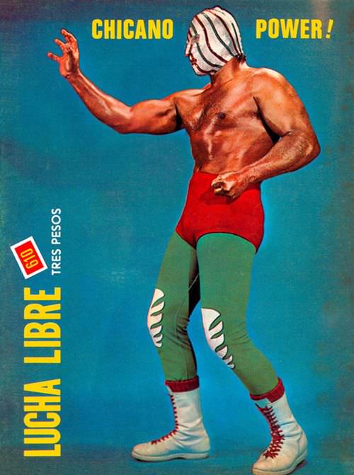
Luchadores posed with clenched fists and tense muscles, staring directly at the reader. Some covers caught wrestlers mid-leap. Others froze a crushing hold at its most brutal moment. The action felt immediate and real.
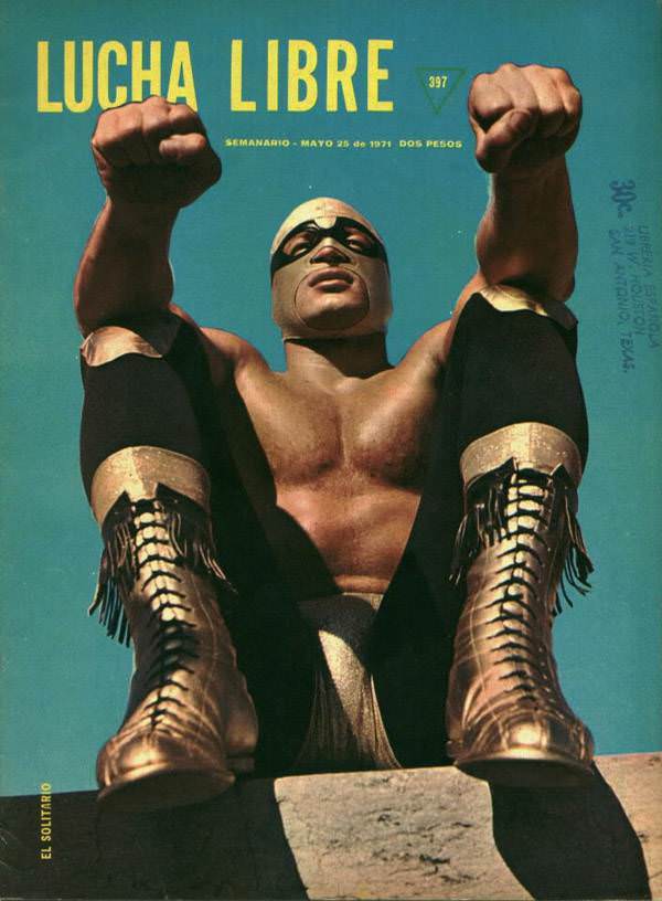
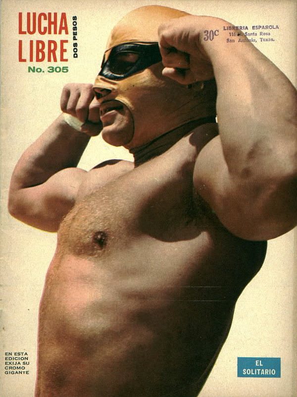
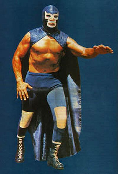
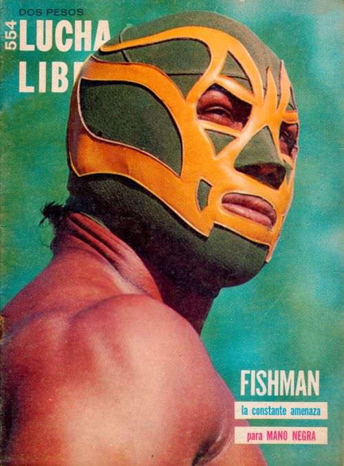
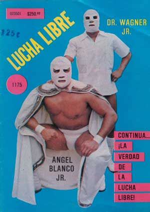
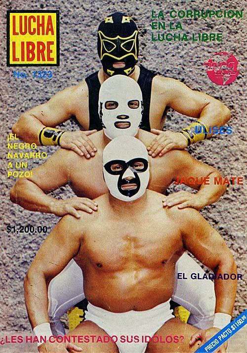
The masks were central to everything. Each design told its own story — sleek silver finishes, demon faces, animal prints. Editors knew this, regularly placing a single masked face in extreme close-up so readers could study every stitch and symbol.
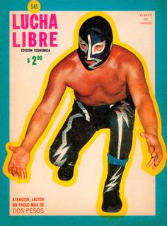
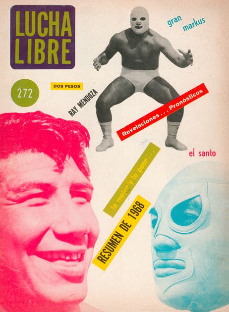
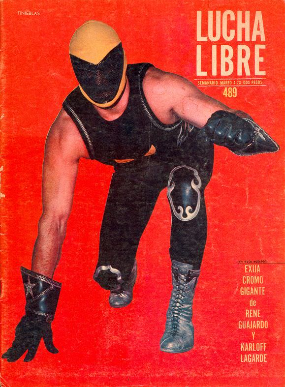
Rivalries played out month to month across these covers. A wrestler shown holding a championship belt in one issue appeared face-down on the mat in the next, beaten by a hated opponent. The covers functioned as a serialized story told in still images.
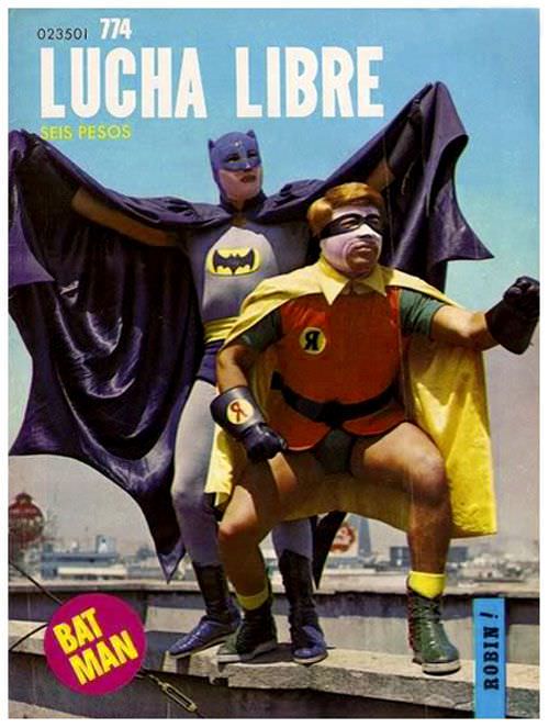
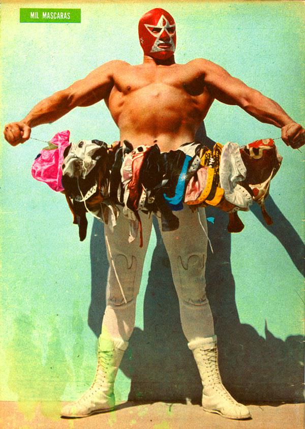
Tag teams got their share of cover space too. They were usually shown in tight formation, mid-attack, projecting a unified threat. The visual language was deliberate — strength in numbers, chaos as a weapon.
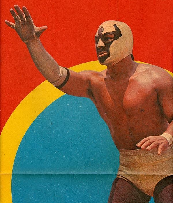
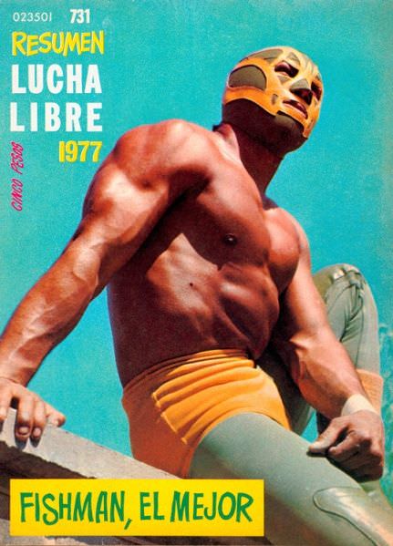
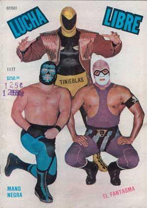
Violence was not hidden or softened. Blood ran down foreheads. Chairs connected with backs. Broken furniture littered the ring. The 1970s covers showed Lucha Libre as it was — rough, physical, and completely unfiltered.
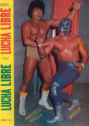
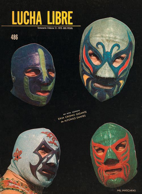
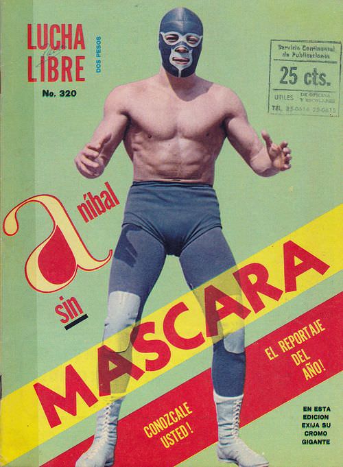
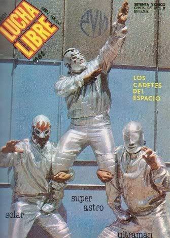
Close-up shots of torn, bloodied masks appeared regularly. A damaged mask carried enormous meaning in Lucha Libre — it signaled humiliation, defeat, or a rivalry pushed past its limit. Covers used this imagery deliberately to drive readers inside for the full story.
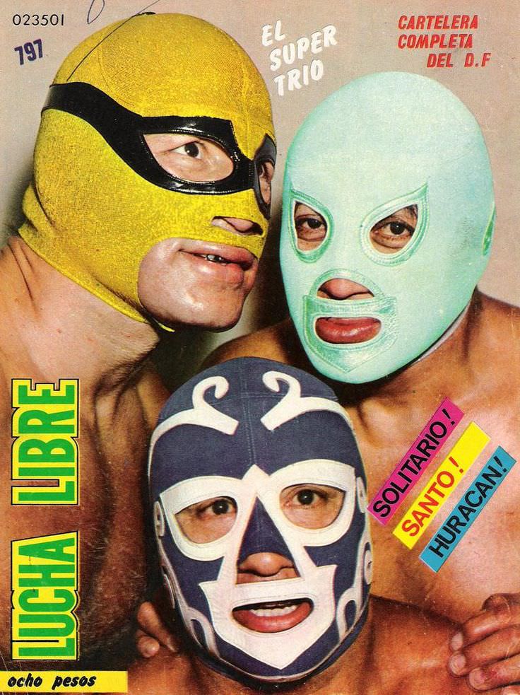
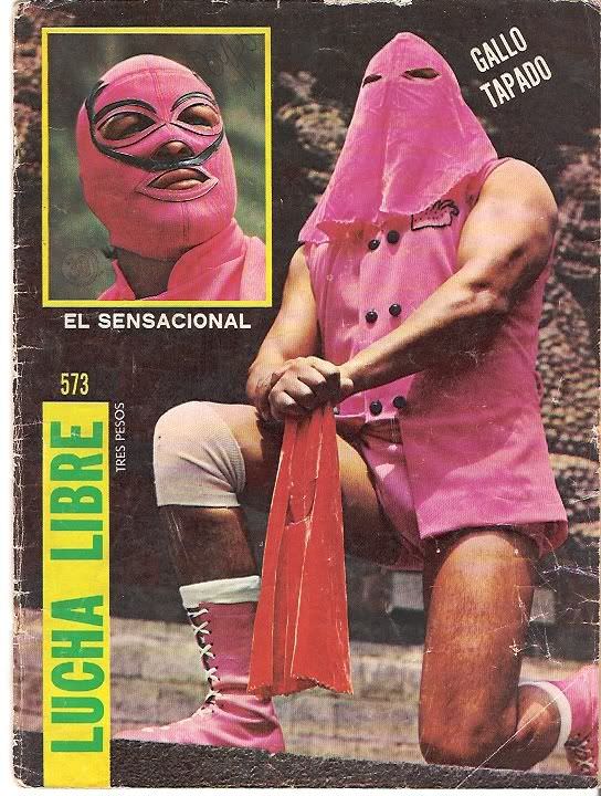
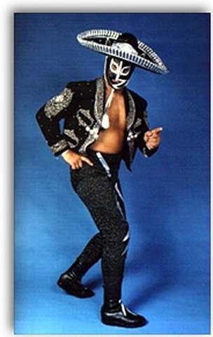
Heroes and villains were clearly defined through visual cues. Heroic figures, known as técnicos, stood tall with belts and open stances. The rudos — the villains — sneered, clutched opponents by the throat, or loomed in the background like threats yet to arrive.
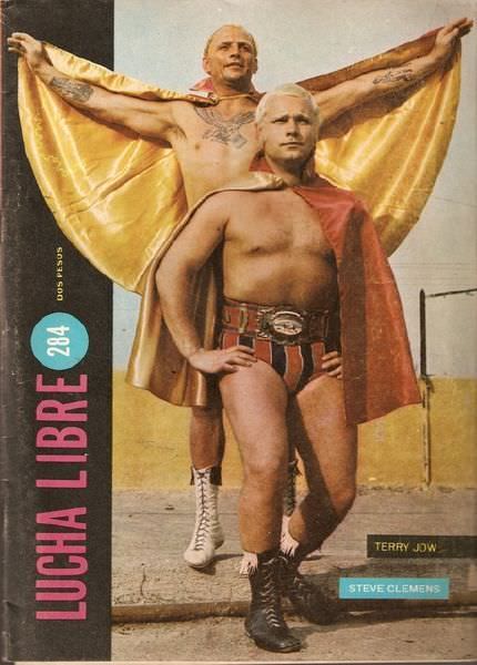
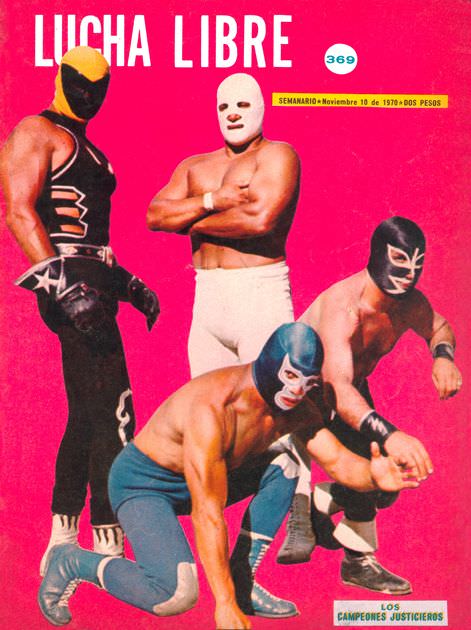
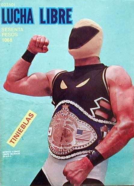
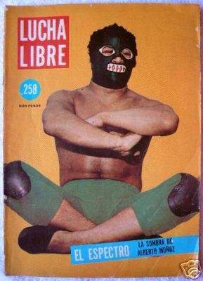
Typography on these covers was as aggressive as the images. Bold block lettering, often outlined in contrasting colors, announced match results or upcoming bouts. The text didn’t inform quietly — it shouted.
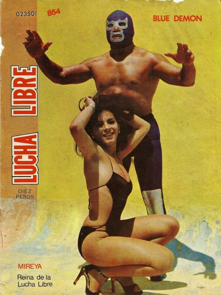
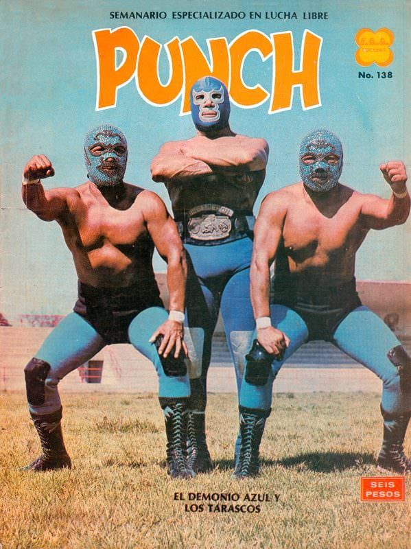
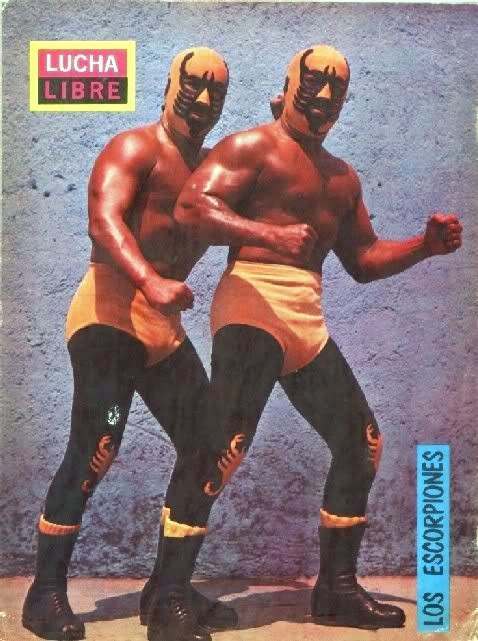
Photographers working these events had to position themselves at ringside, often inches from the action. The resulting shots had an urgency that studio photography couldn’t replicate. Sweat, motion blur, and impact — all preserved on the cover.
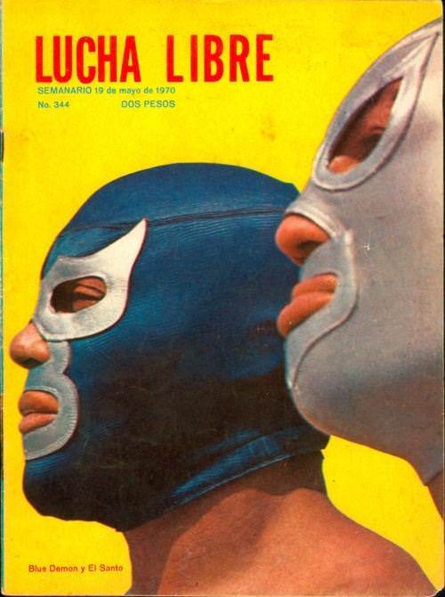
Aerial moves received special attention. A body launched from the top rope, suspended above the ring, communicated everything the sport stood for — speed, risk, and spectacle. These frozen moments turned wrestlers into something closer to comic book figures than athletes.
Championship belts featured prominently throughout the decade. A belt on a cover confirmed status. Whoever held it was the story of the month. When a title changed hands, the cover reflected it immediately — new face, same gold, entirely new tension.