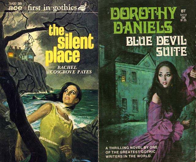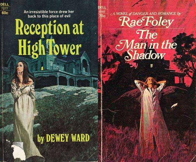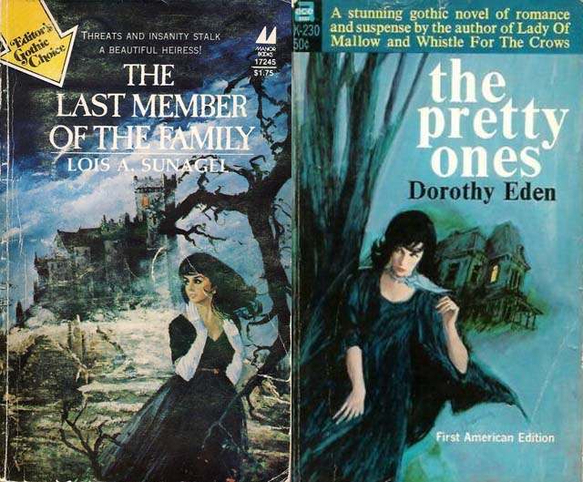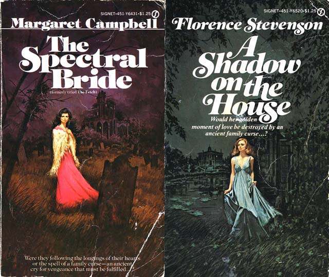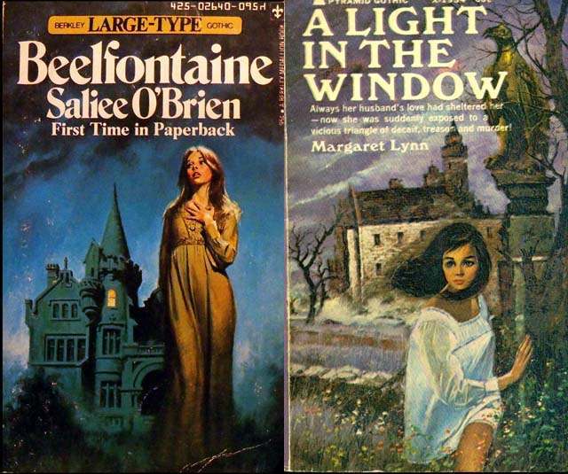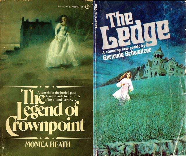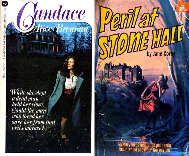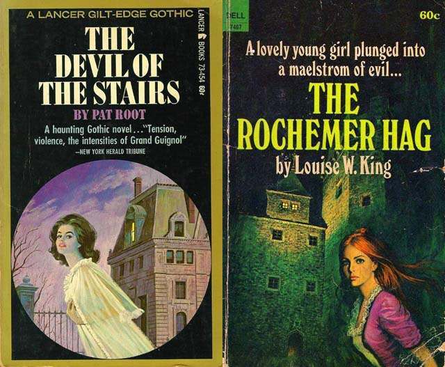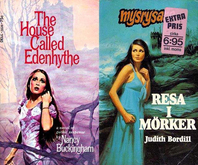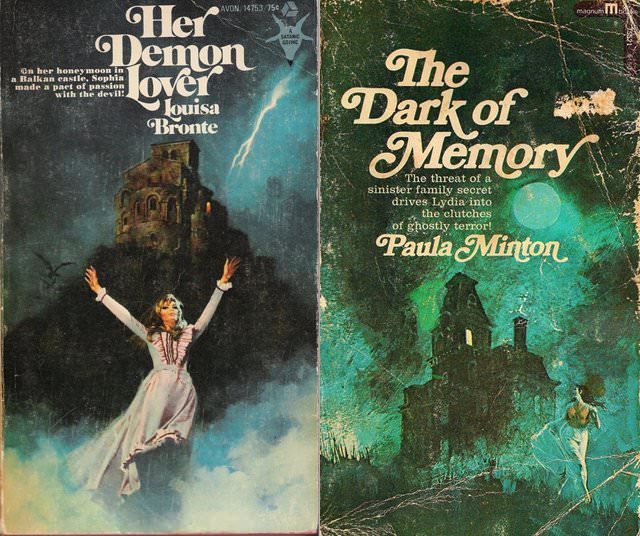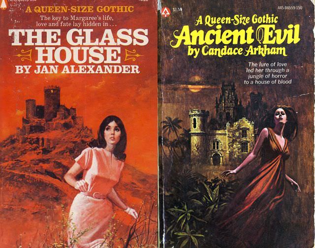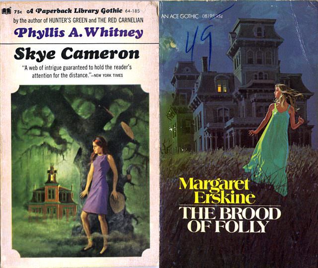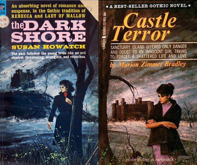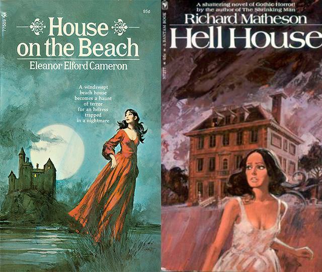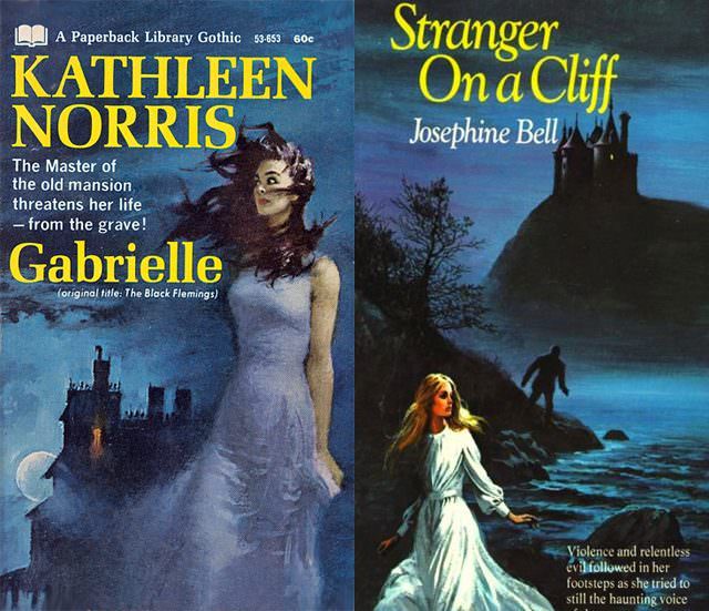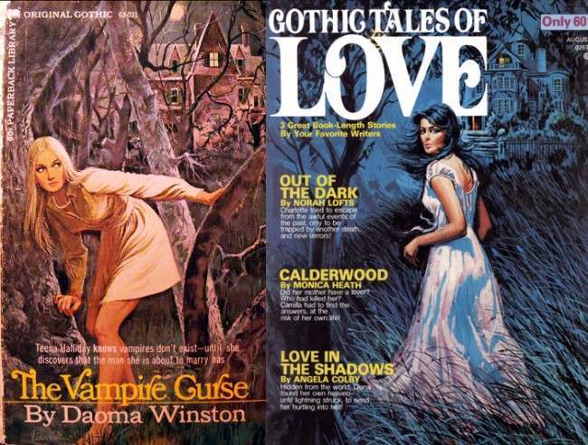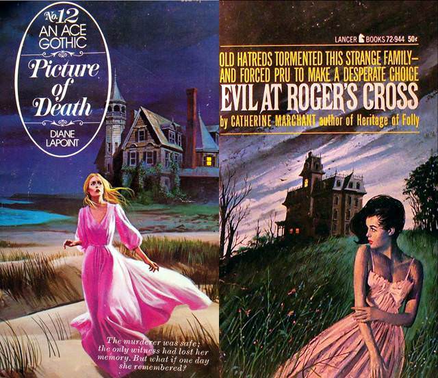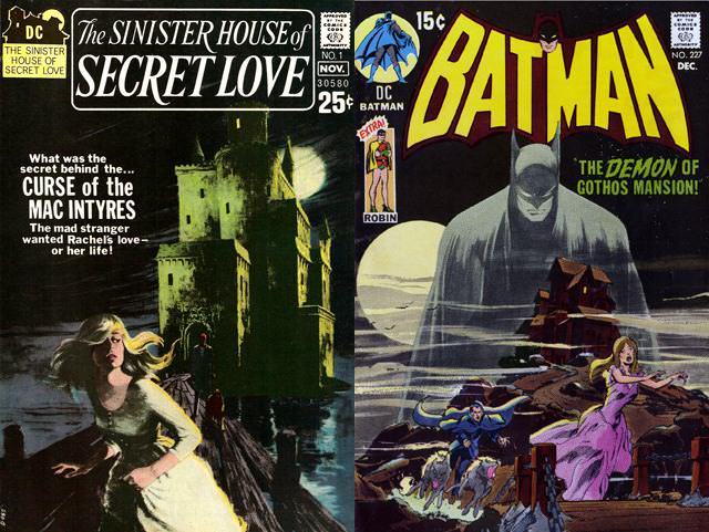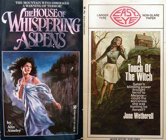

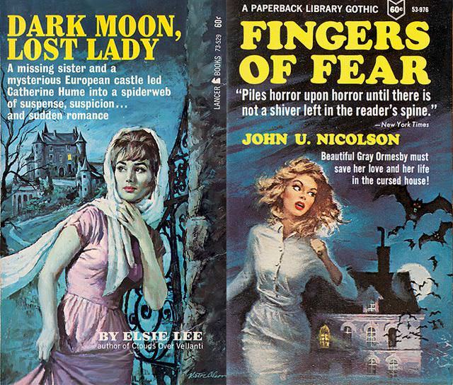
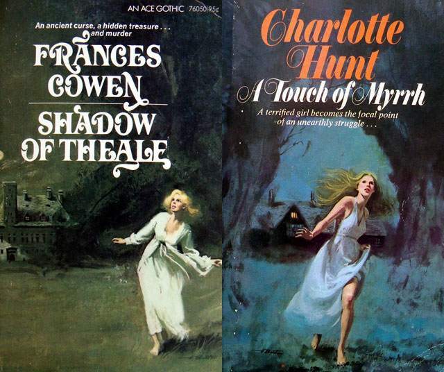
Pick up any Gothic romance paperback from the mid-twentieth century and there is a good chance the cover shows the same scene: a woman running away from a dark, looming house. This image became so common in the genre that readers could spot it from across a bookstore shelf. It was not accidental. Publishers, authors, and artists built this formula deliberately, and it worked on readers in ways that went far deeper than simple decoration.
The roots of this imagery stretch back centuries. Ann Radcliffe’s 1794 novel “The Mysteries of Udolpho” is the clearest early anchor. In that book, a young woman is trapped inside a vast, threatening castle and spends much of the story trying to escape it. Radcliffe made the building itself feel like a character — watching, trapping, and threatening. That idea spread to countless novels that followed. Matthew Lewis’s “The Monk” added dark tombs and haunted hallways to the mix. Together, these works set the visual and emotional vocabulary that cover artists later translated into a single frozen image.
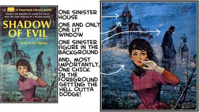
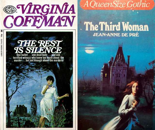
The formula that emerged on paperback covers has several locked-in elements. The house always sits in the background, dark and large. One window glows with light — just one. No porch lights, no car headlights, nothing else to break the darkness. That single lit window does a lot of work. It suggests someone is inside, watching. It hints that the house holds secrets the woman has already discovered and is now fleeing.
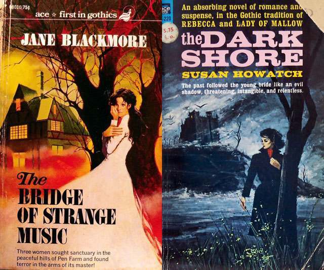
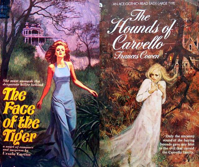
Many covers also include a shadowy male figure. He stands in a doorway or peers from a window, but the viewer never gets a clear look at his face. His presence raises the central question the genre always asks: is he a threat or a protector? Gothic romance sits in that exact tension — danger and desire occupying the same space. The ambiguous male figure makes that tension visible in a single glance.
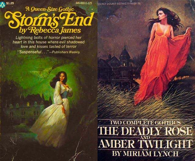
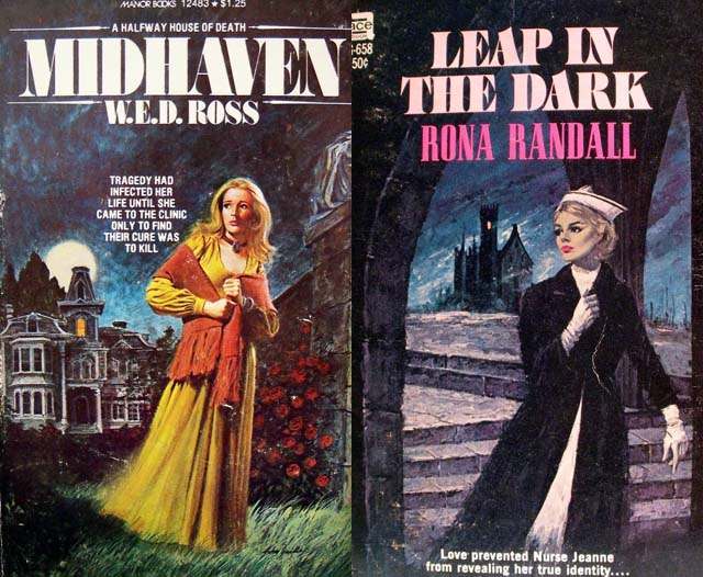
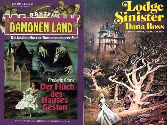
The woman in the foreground anchors everything. She is usually mid-run, her dress or hair catching the wind behind her. Sometimes she pauses, looking back over her shoulder. That backward glance is important — she is leaving but has not fully broken free. The house still holds power over her. Readers who picked up these books were drawn into that moment of suspended escape, wanting to know whether she would make it out.
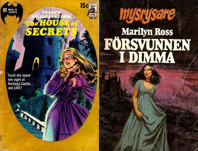
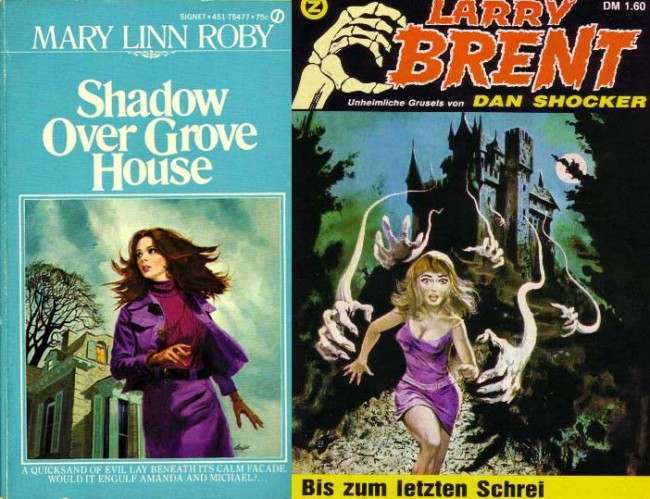
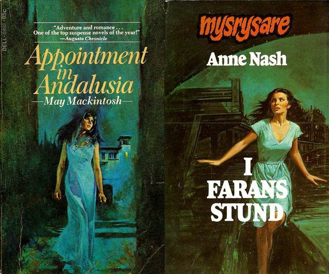
Publishers leaned on this template so heavily that it became a reliable sales signal. A reader who enjoyed one Gothic romance could scan a rack of paperbacks and immediately identify others in the same vein. The cover was a promise — this book delivers suspense, a threatening setting, a woman in danger, and a mystery wrapped inside a house. Titles like “The Rest Is Silence” hit every element of the formula directly. Others, like “The Third Woman,” dropped the lurking male figure but kept the fleeing woman and the dark house intact.
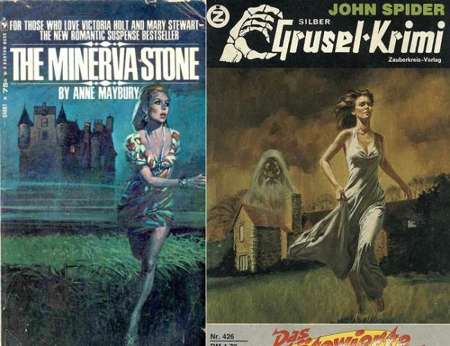
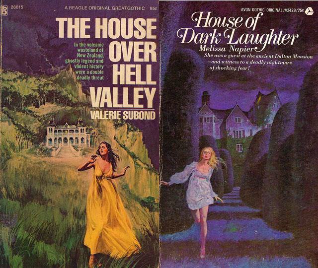
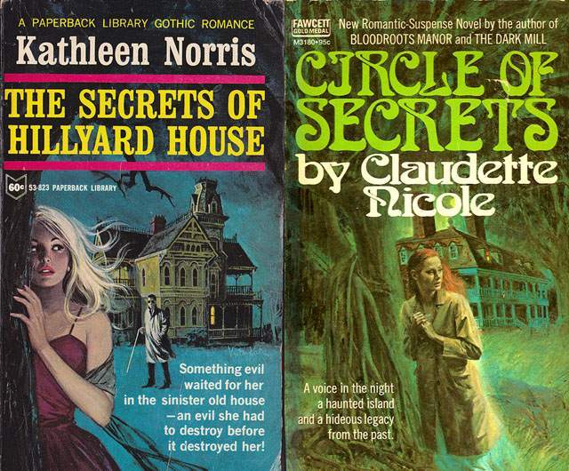
The psychological pull of the image comes from what it leaves unresolved. The woman has not escaped yet. The threat inside the house has not been named. That lit window keeps the danger alive. Readers are placed in the exact moment before the story resolves — which is, of course, the moment they most want to read through.
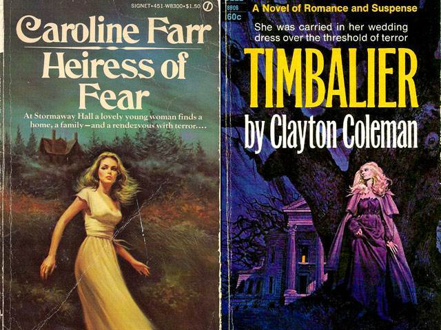
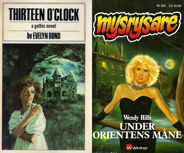
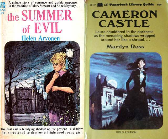
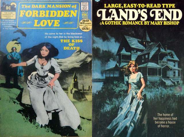
The house itself carries specific weight in Gothic fiction. Unlike an open landscape, a house is enclosed. It has rooms, corridors, basements, and attics — all spaces where secrets can be hidden. A darkened mansion signals history, old money, and buried wrongs. For readers in the mid-twentieth century, the Gothic house also represented domestic life turned sinister, a familiar space made dangerous. That contrast between the expected safety of a home and the real threat lurking inside it is what gives these covers their staying power.
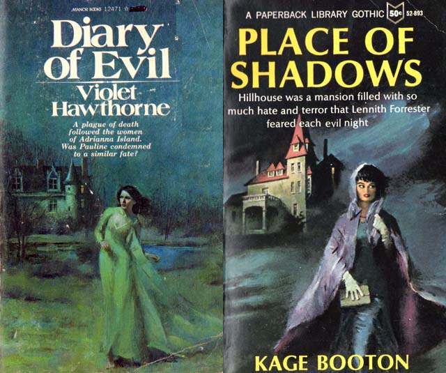
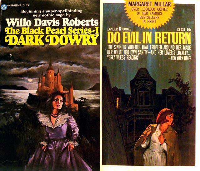
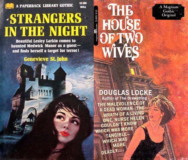
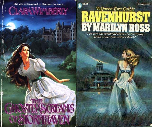
Cover artists working within this genre were not simply repeating a tired cliché — they were refining a visual shorthand that communicated an entire emotional experience in one image. Each new title adjusted small details: the color of the woman’s dress, the style of the house, the position of the figure in the window. But the core elements held firm because they worked. The formula was a contract with the reader, and the reader kept accepting it.