Long before birthday cards came with sound chips and metallic foil, they carried something quieter — a careful illustration, a short verse, and a genuine wish. In the 1950s, sending a birthday card was a small but meaningful ritual, and the cards themselves reflected the era’s taste for simplicity and warmth.
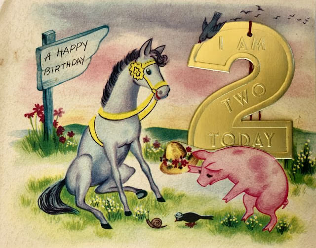
The visual style of ’50s birthday cards leaned heavily on pastel colors — soft pinks, mint greens, and baby blues. Delicate line illustrations replaced bold graphics. Flowers were everywhere: roses, daisies, and violets appeared on cards for all ages, from toddlers turning one to grandmothers marking another decade.
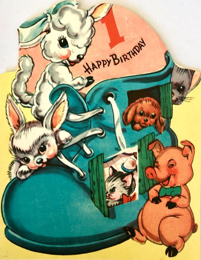
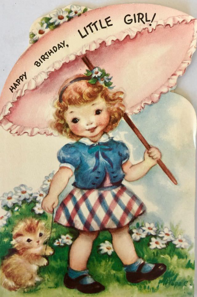
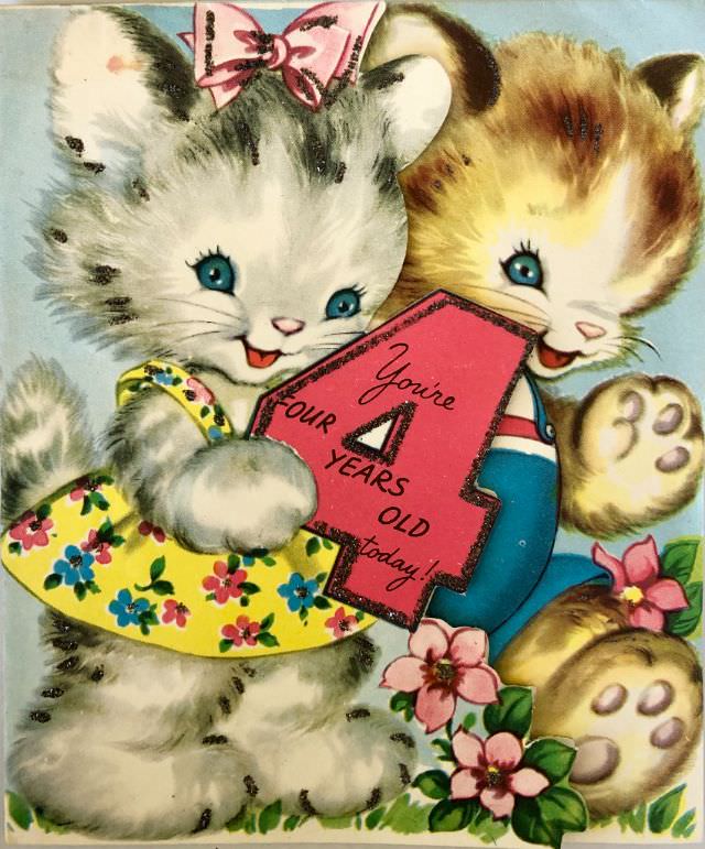
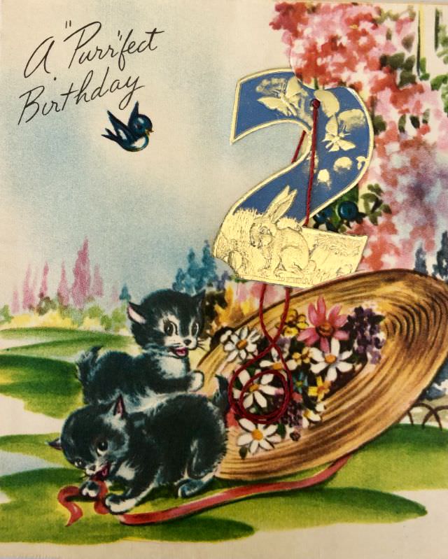
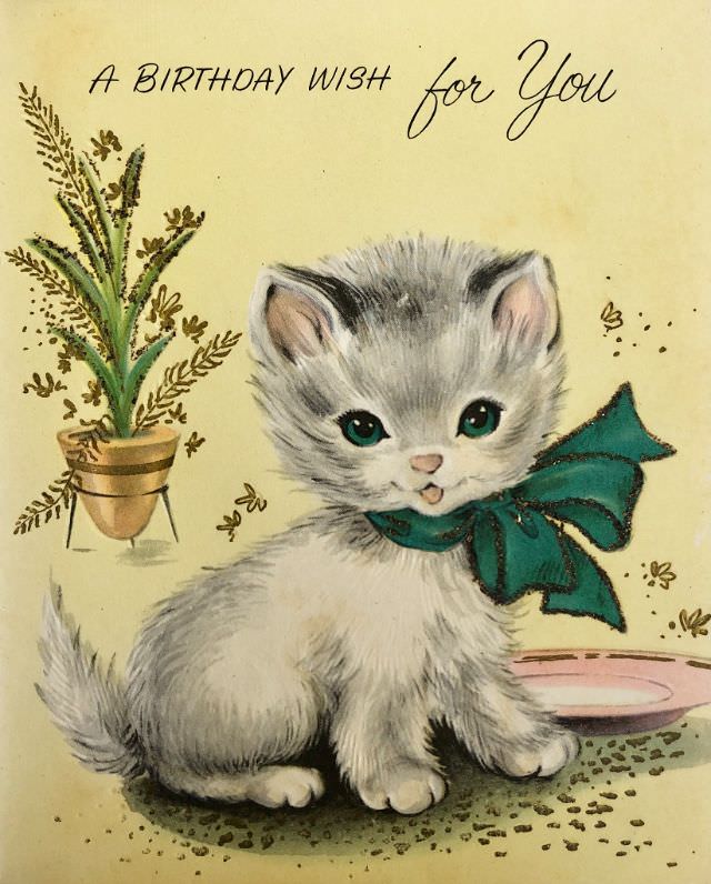
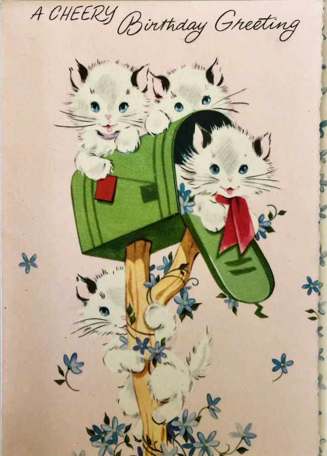
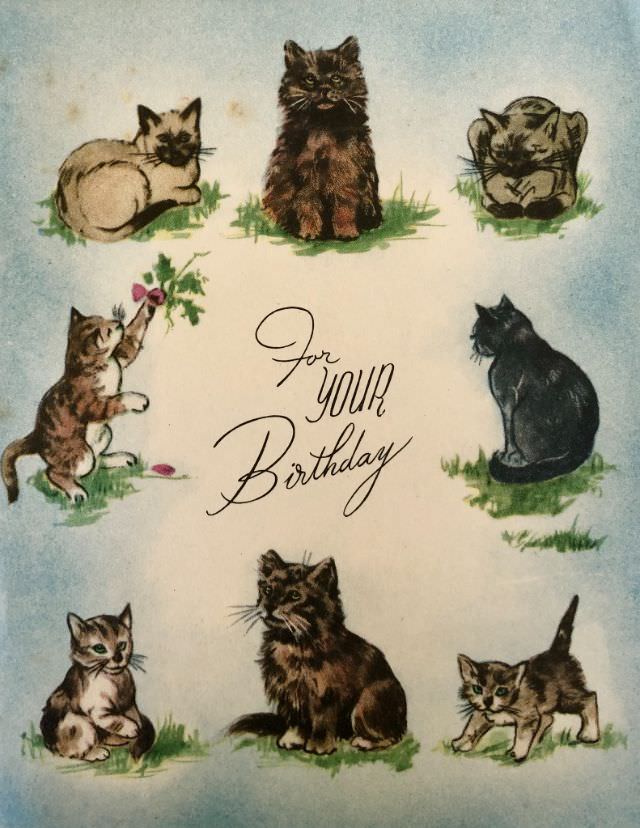
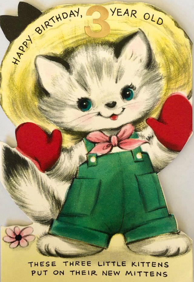
Animals were another favorite motif, especially on cards made for young children. Kittens, puppies, and bunnies brought a playful touch that words alone couldn’t quite manage. A purring cat on the front of a card set the tone for a cheerful, lighthearted celebration before the envelope was even opened.
Cards for women and girls often featured elegant figures — a stylish lady in a flowing dress, a bouquet in hand, surrounded by blooms. The messages inside emphasized beauty, joy, and grace. Short poems were common, written to make the recipient feel both seen and celebrated.
Cards aimed at men and boys took a different direction. Fishing, golf, and cowboys were common themes. A card might show a fisherman knee-deep in a stream or a golfer mid-swing, with a message inside wishing him a day full of fun. The tone was easygoing and often a little humorous.
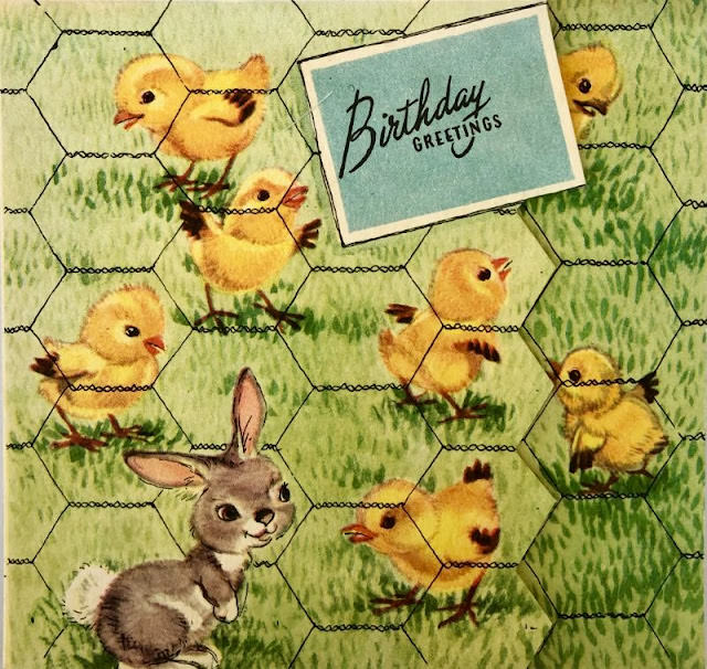
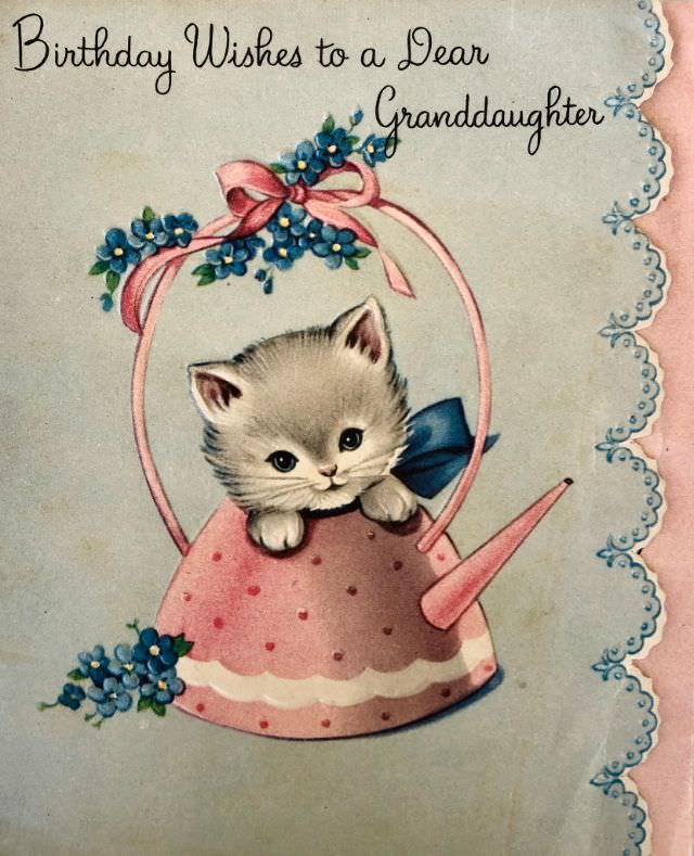
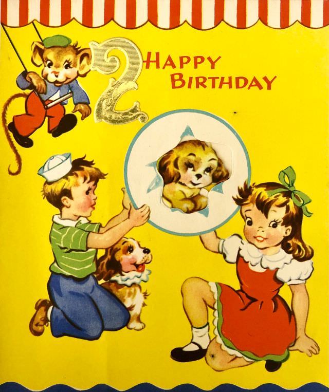
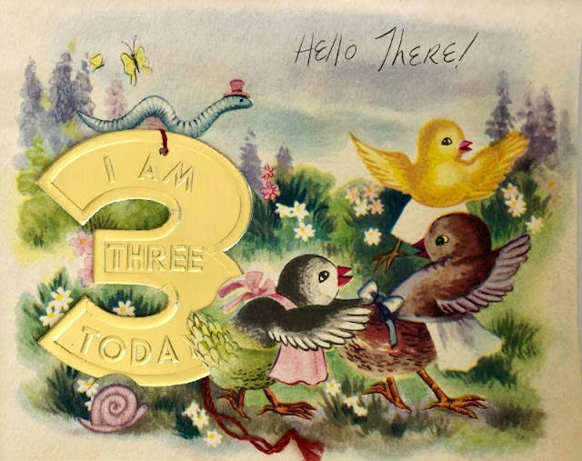
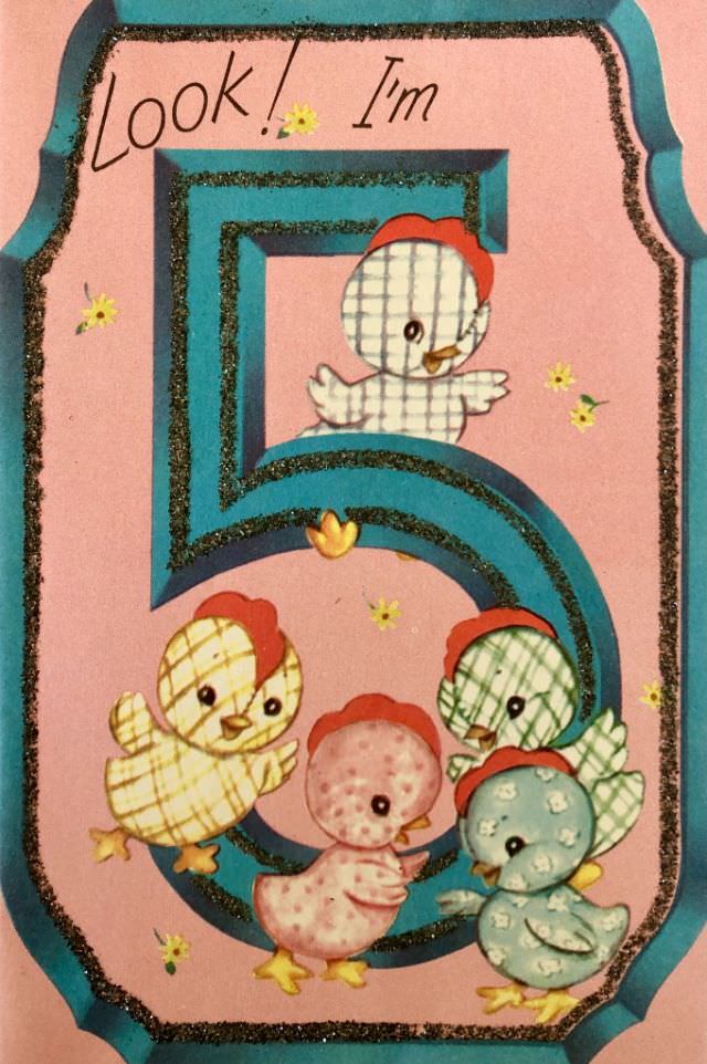
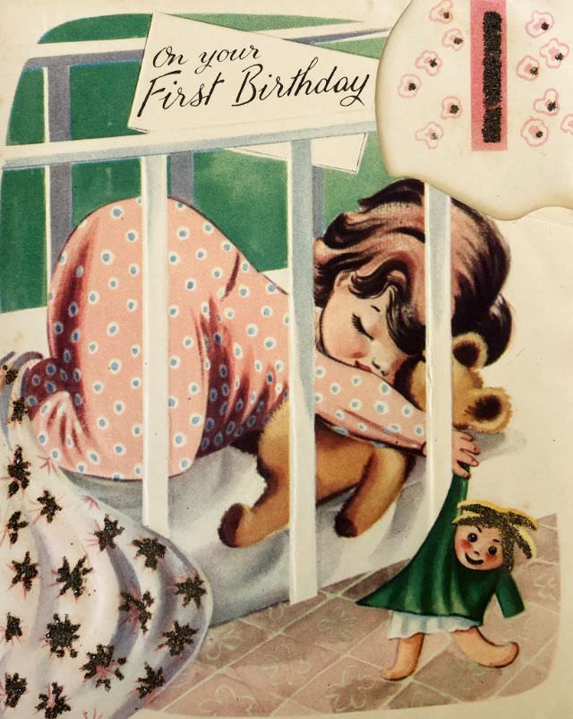
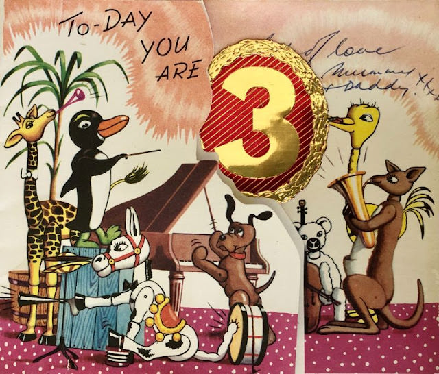
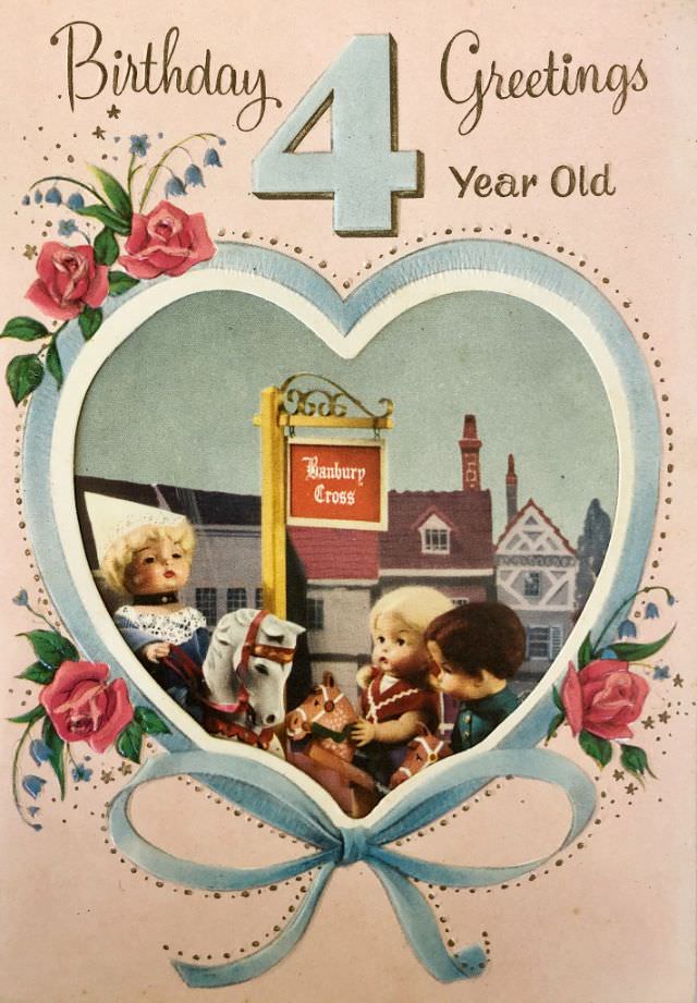
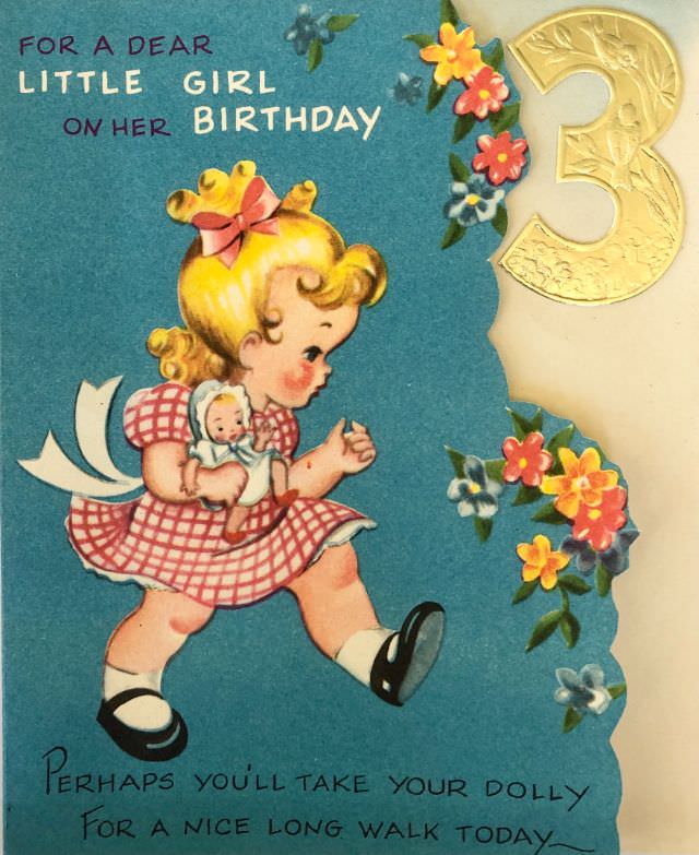
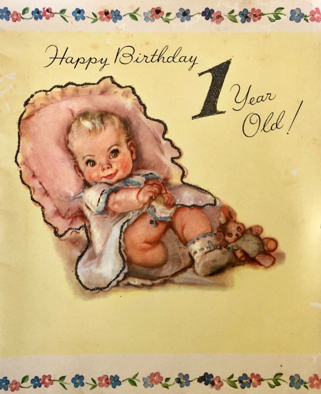
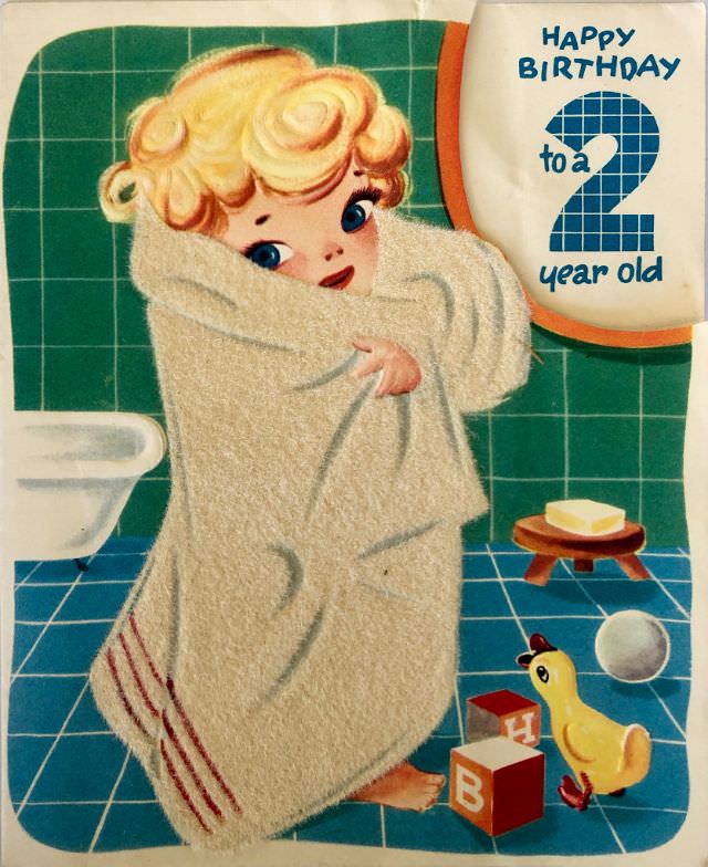
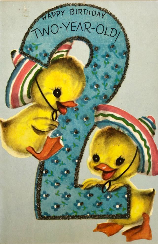
Children’s birthday cards from the decade hold a special charm. Age-specific cards — marking one, two, three, four, or five years old — were widely produced. Each one was tailored to the milestone, often showing a child’s toy, a cartoon animal, or a cheerful scene that matched the age being celebrated.
Humor also had its place in ’50s birthday card culture. Jokes about wrinkles, gray hair, and slowing down were printed alongside cheerful illustrations. Puns and wordplay were reliable crowd-pleasers. These cards reminded recipients — with a wink — that another year wasn’t something to dread.
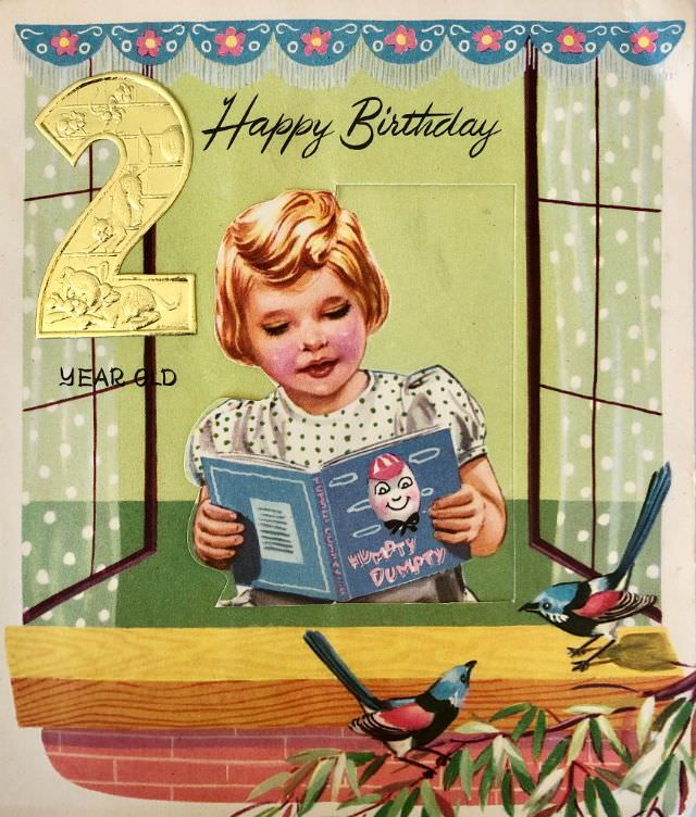
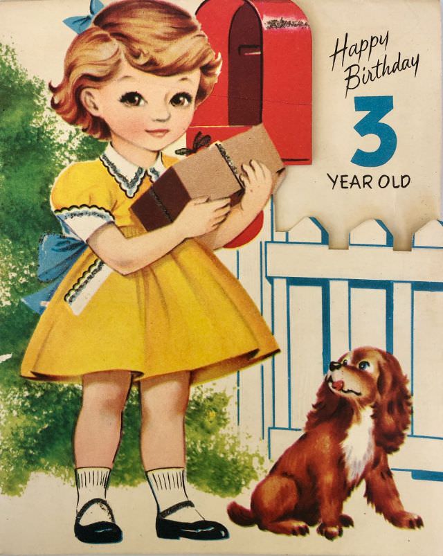
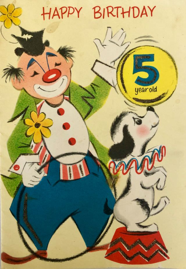
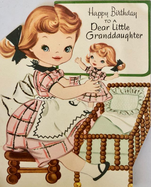
What stands out most when flipping through these old cards is how personal they feel. They weren’t mass-produced in an impersonal way — each design carried intention. Whether the card was for a granddaughter, a little girl next door, or a dear friend, the illustration and message worked together to deliver something genuinely warm.
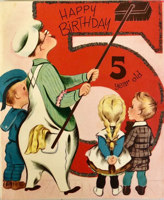
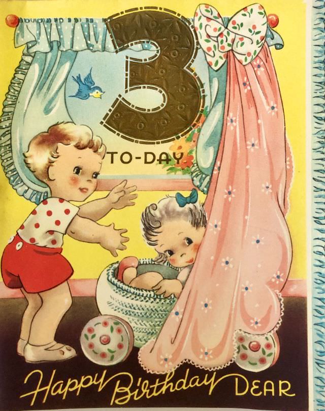
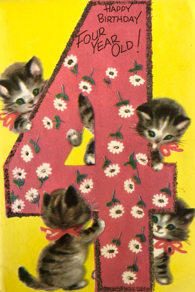
The cards made for the very youngest birthdays — first and second celebrations — leaned into a soft, nurturing aesthetic. Pastel tones, gentle animals, and simple block lettering made these cards easy for little eyes to enjoy alongside their parents. They were keepsakes as much as greetings.
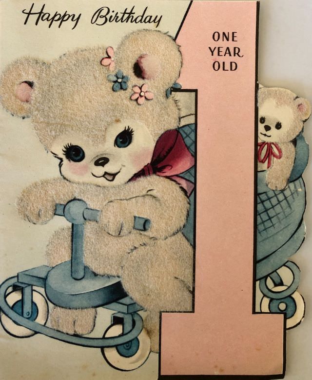
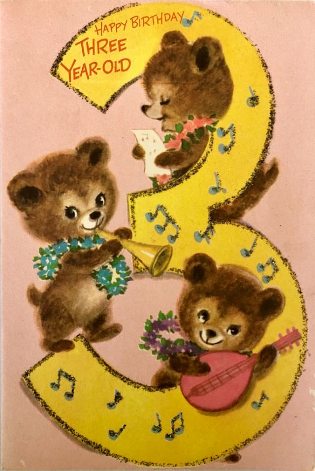
Family relationships were often spelled out directly on the card’s cover. “To a Dear Little Granddaughter” or “For a Dear Little Girl” weren’t just polite phrases — they signaled exactly who the card was meant for, making the connection between sender and recipient clear from the very first glance.
By today’s standards, these cards look modest. No digital animation, no QR codes, no celebrity voice recordings. But that modesty is part of their appeal. A hand-picked card slipped into an envelope and mailed across town carried real effort — and the person receiving it knew it.