
Vanity Fair magazine first hit newsstands in 1913, published by Condé Nast in the United States. From the very beginning, it covered popular culture, fashion, and current affairs with a sharp, lively voice. The magazine ran continuously until 1936, giving it over two decades of covers that tell a vivid story of how American style and humor evolved. Vanity Fair was revived in 1983 and now has five international editions, but its earliest run remains a fascinating chapter in magazine history.
What made the early covers stand out was their sense of wit. Artists used bold illustrations — not photographs — to grab readers’ attention. The figures on these covers were often exaggerated, playful, and clearly designed to raise a smile. This was a magazine that took its own fun seriously. The covers from the mid-1910s show just how quickly that visual personality developed.
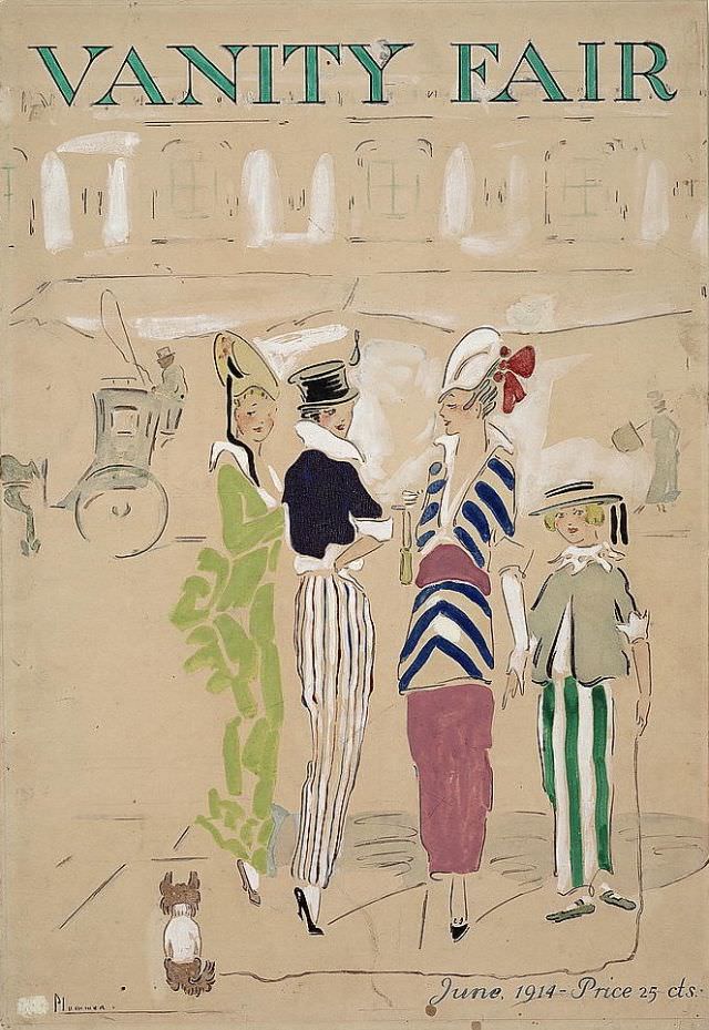
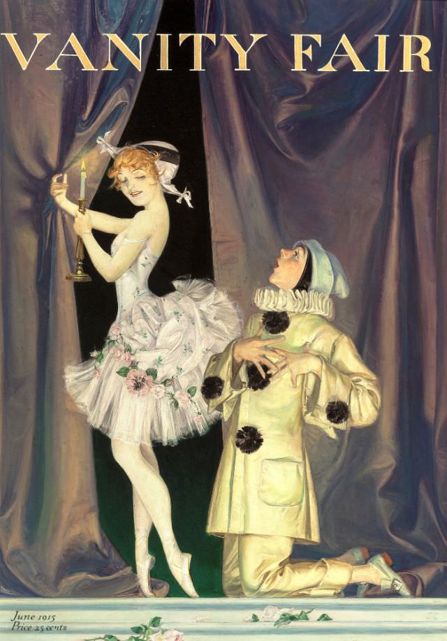
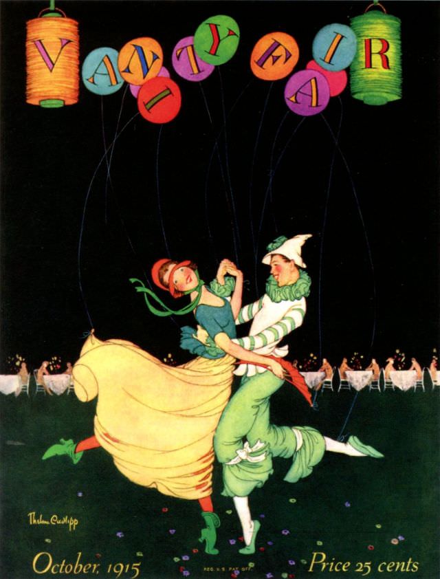
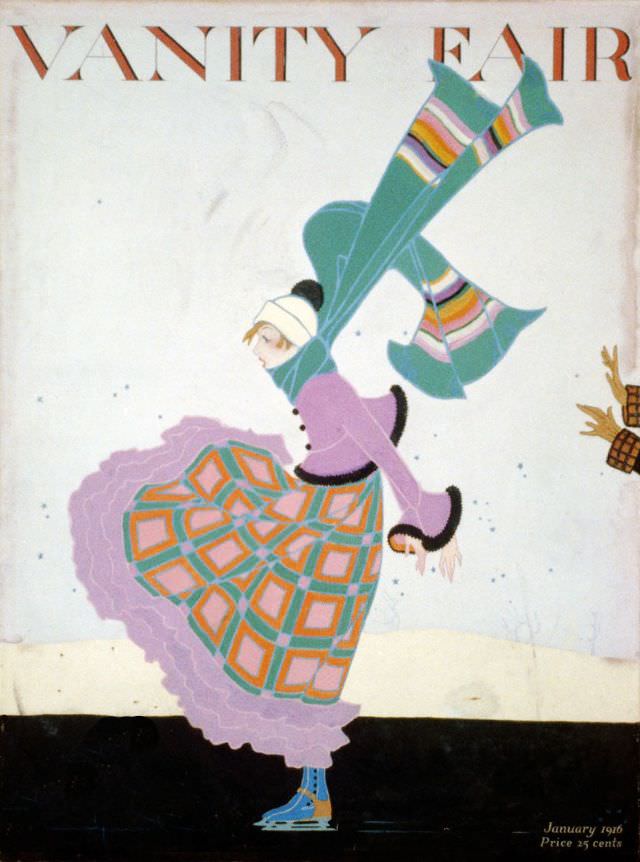
By late 1915 and into 1916, the covers were becoming more confident and stylized. Artists leaned into caricature and costume, often placing figures in absurd or theatrical situations. The humor was light and cheerful — the kind that fit perfectly with a magazine known for its social commentary and in-depth reporting.
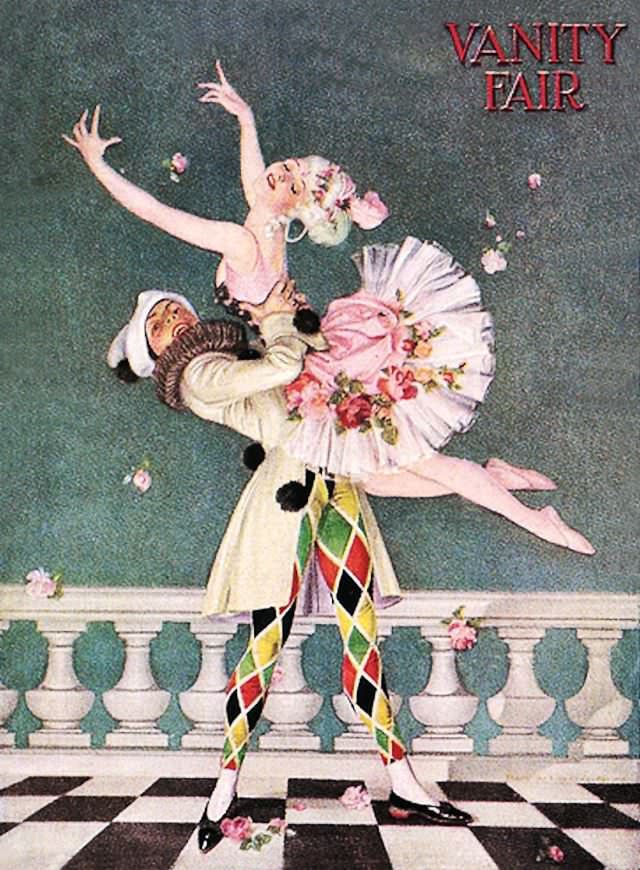
The 1920s brought a new energy to the covers. The decade was one of rapid social change, and Vanity Fair’s artwork reflected that. Covers from this era featured sleek lines, bold colors, and figures that embodied the modern spirit of the Jazz Age. The humor shifted too — becoming a little more knowing, a little more sophisticated.
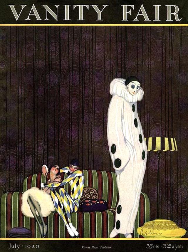
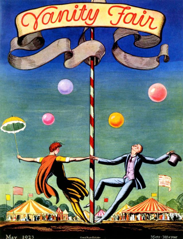
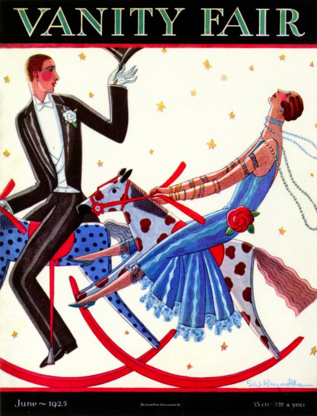
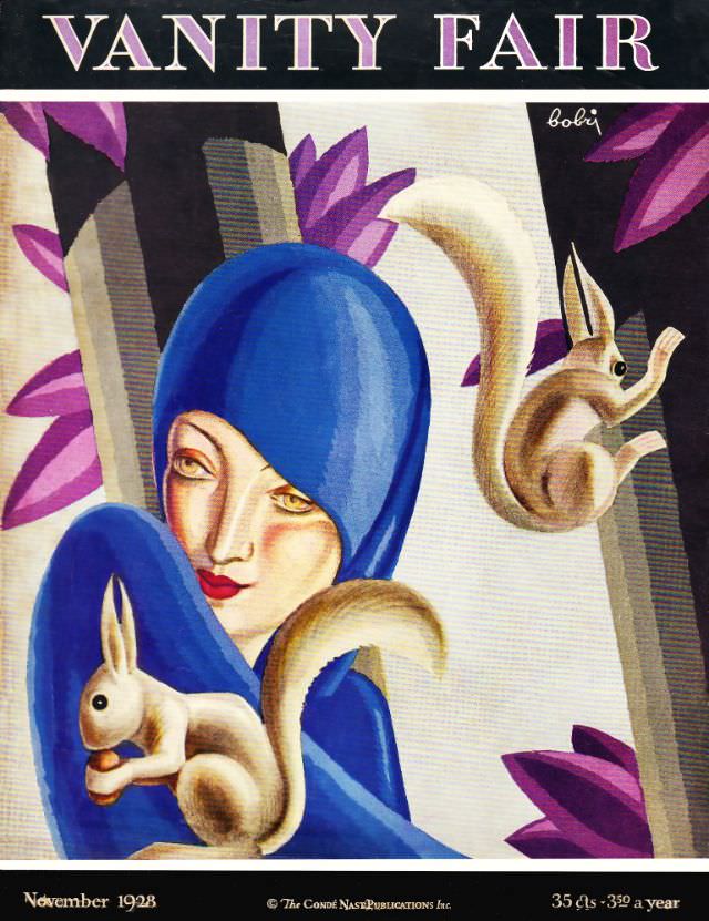
The mid-to-late 1920s saw some of the most inventive cover art in the magazine’s first run. Artists played with perspective, proportion, and costume in ways that were genuinely funny without crossing into crude territory. These were covers designed to delight readers before they even opened the first page.
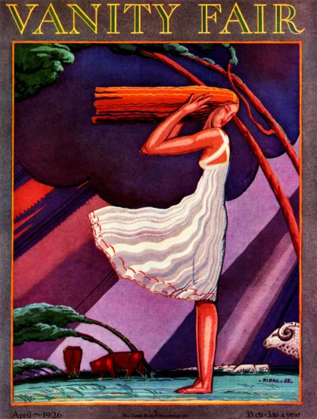
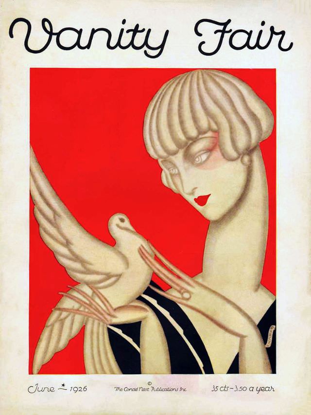
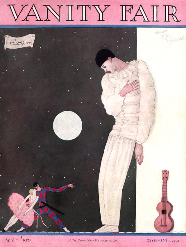
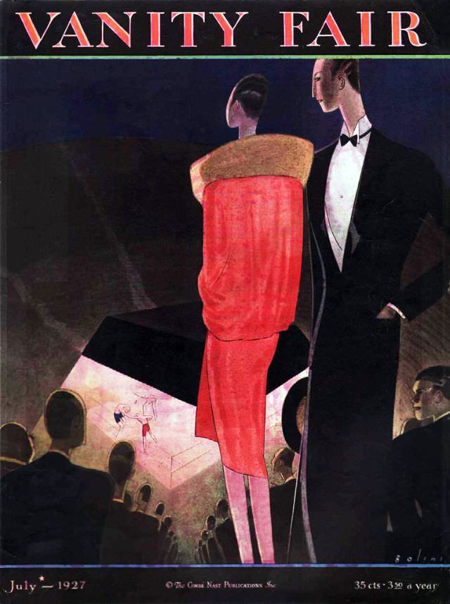
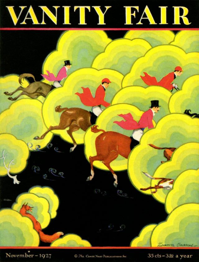
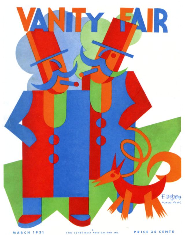
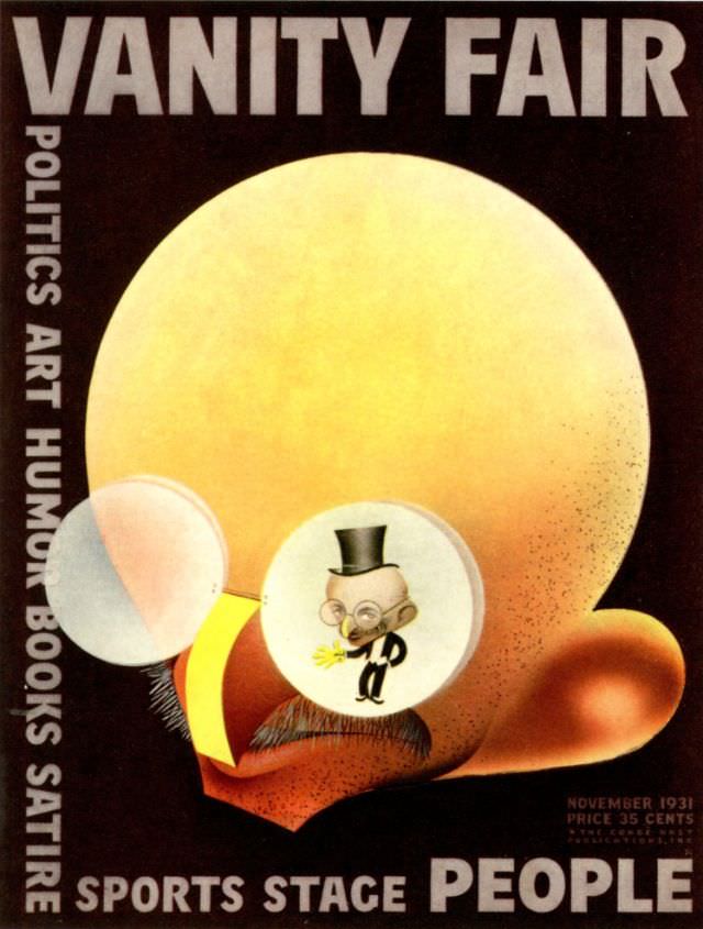
As the 1920s gave way to the 1930s, the covers took on a slightly more polished look, though the playfulness never fully disappeared. The Depression era brought a tighter economy, but Vanity Fair’s covers still carried flashes of wit and visual charm. The magazine continued to use illustration as its primary cover medium, keeping its distinctive identity intact.
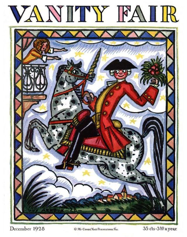
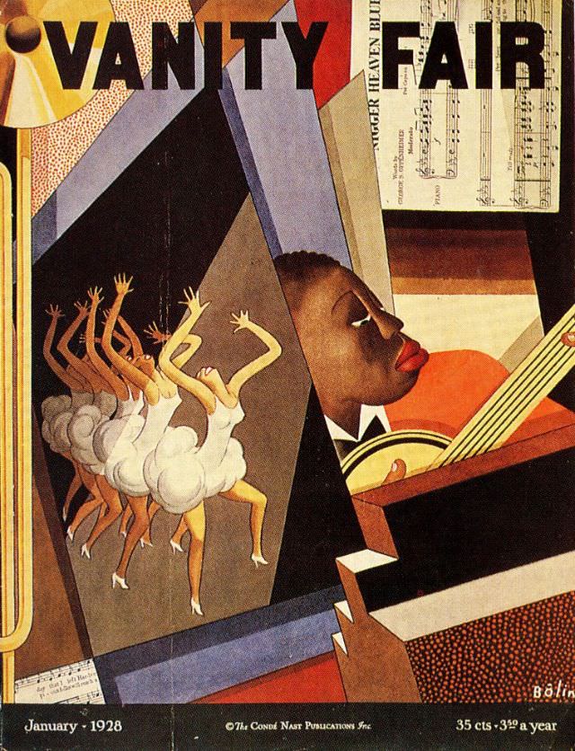
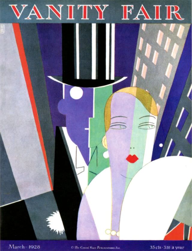
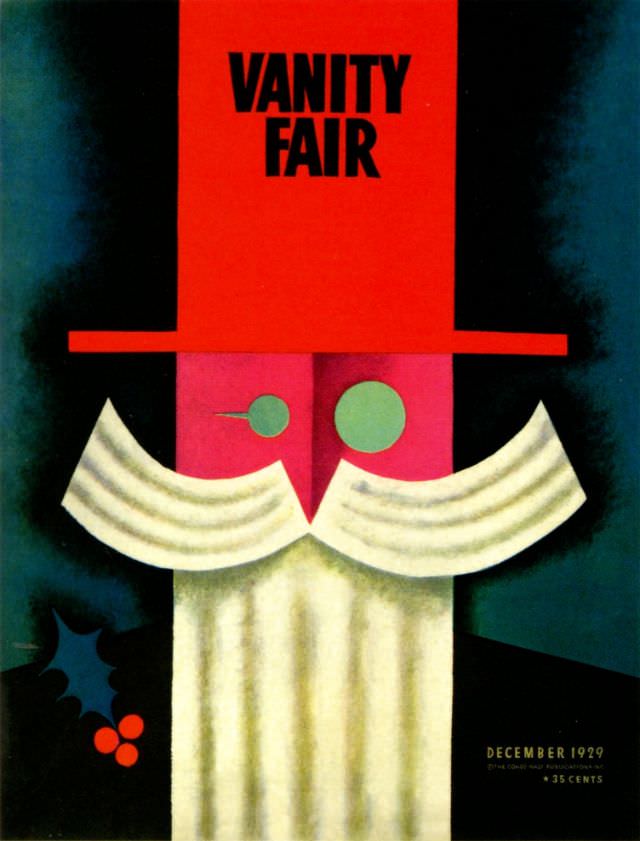
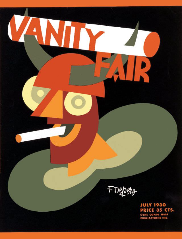
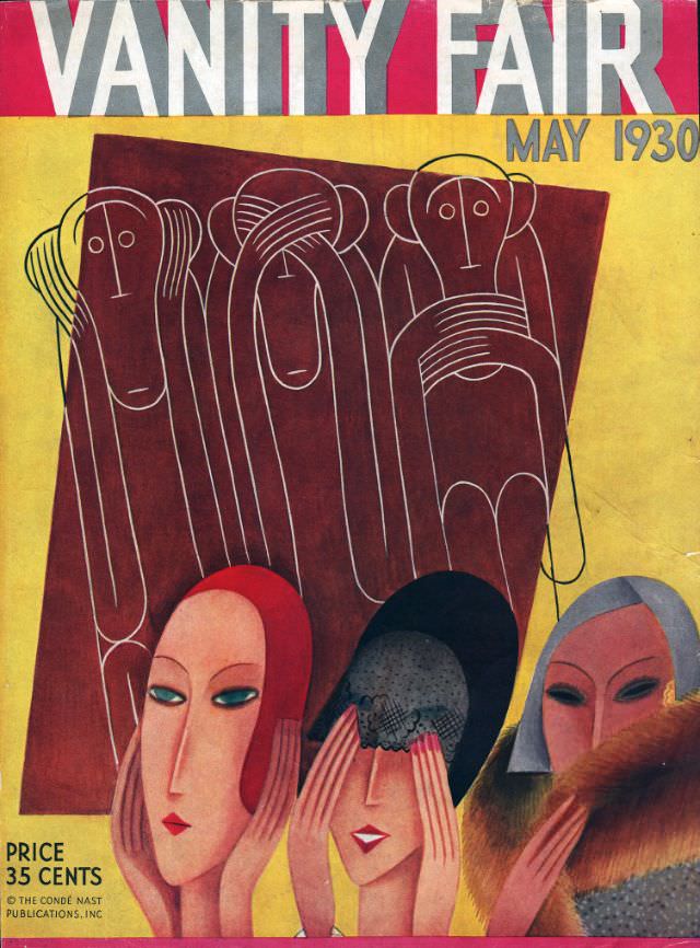
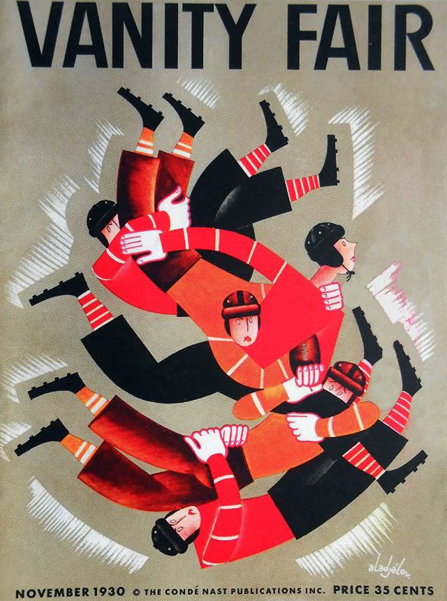
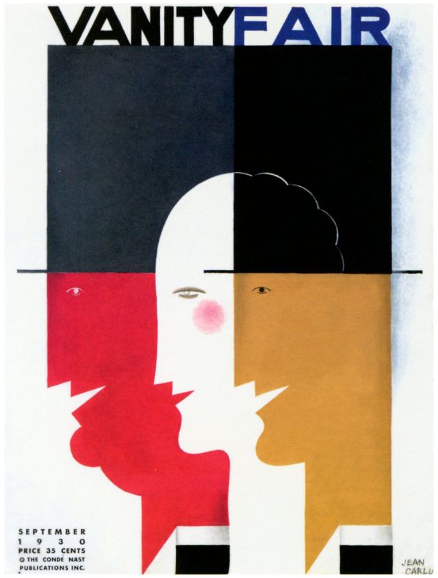
The 1930 covers are a particularly rich batch. Spread across the full year, they show a magazine that was still experimenting with color, composition, and comic timing. From summer scenes to winter themes, each cover used its season as a launchpad for a visual joke or a clever scene.
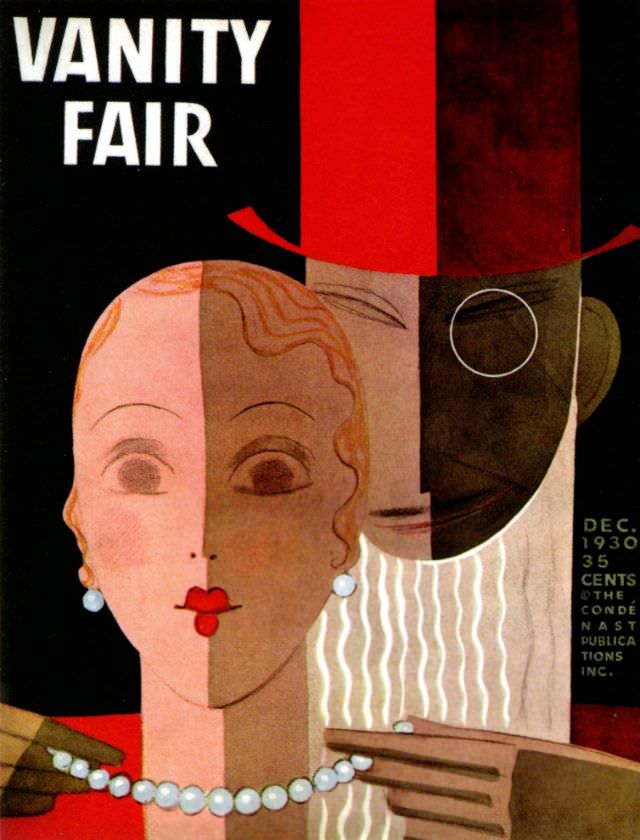
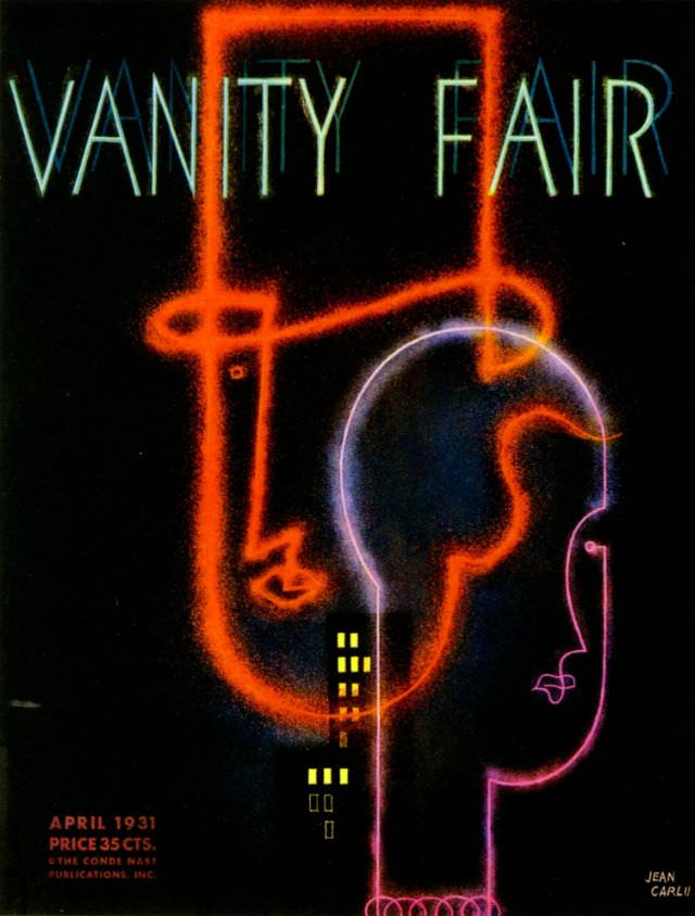
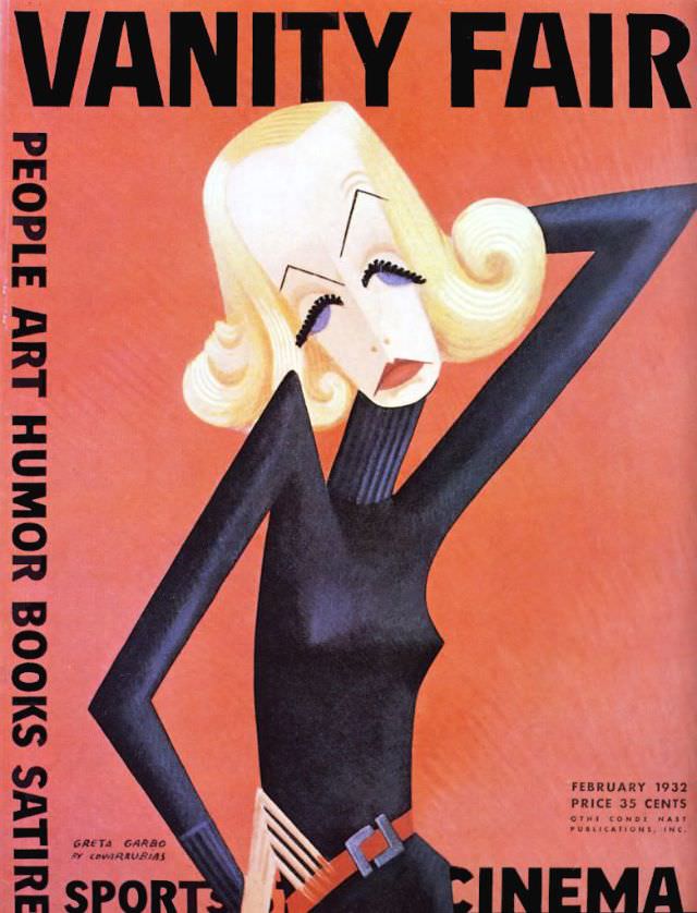
Into 1931 and 1932, the covers kept their comedic edge. Figures were often depicted in amusing social situations — at parties, on the beach, in the city — always with a wink. The illustrators working for Vanity Fair during this period were among the best commercial artists of their generation, and it shows in every brushstroke.
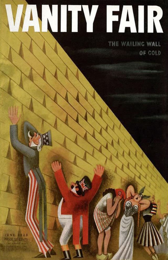
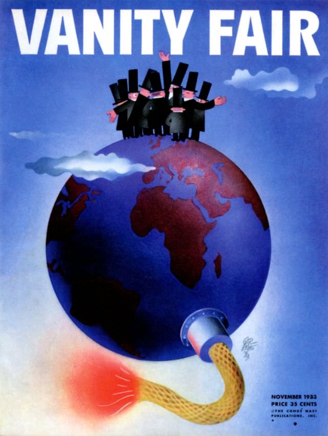
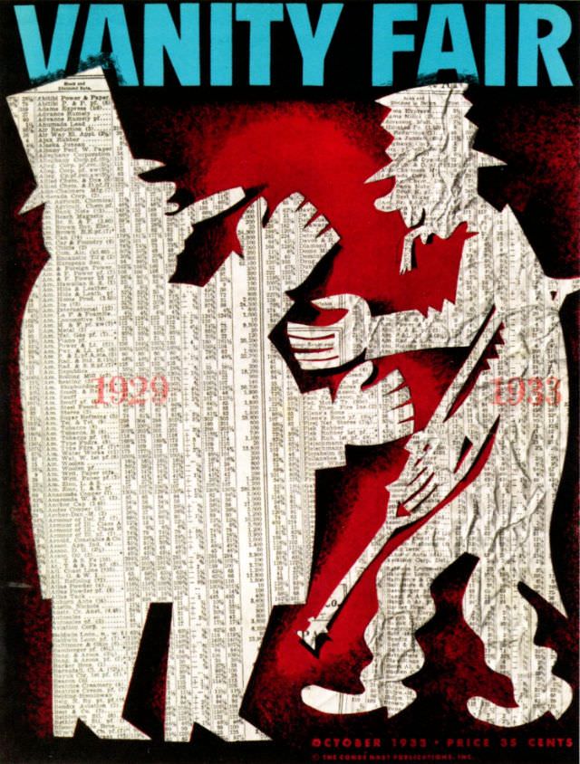
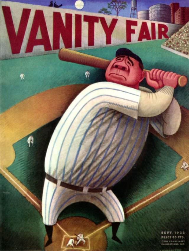
The 1933 covers represent a prolific stretch of creativity. Multiple issues from that year survive, and each one demonstrates the range of styles Vanity Fair embraced. Some covers leaned toward elegant humor while others went for broader, sillier gags. The variety is a reminder that the magazine never locked itself into a single visual formula.

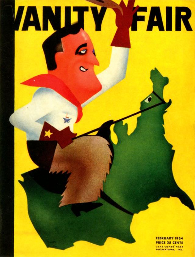
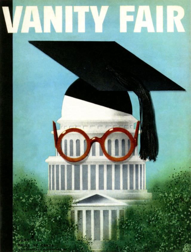
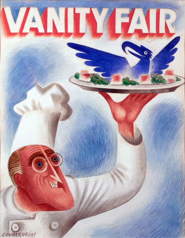
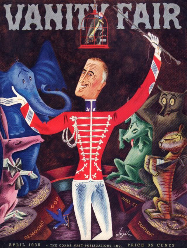
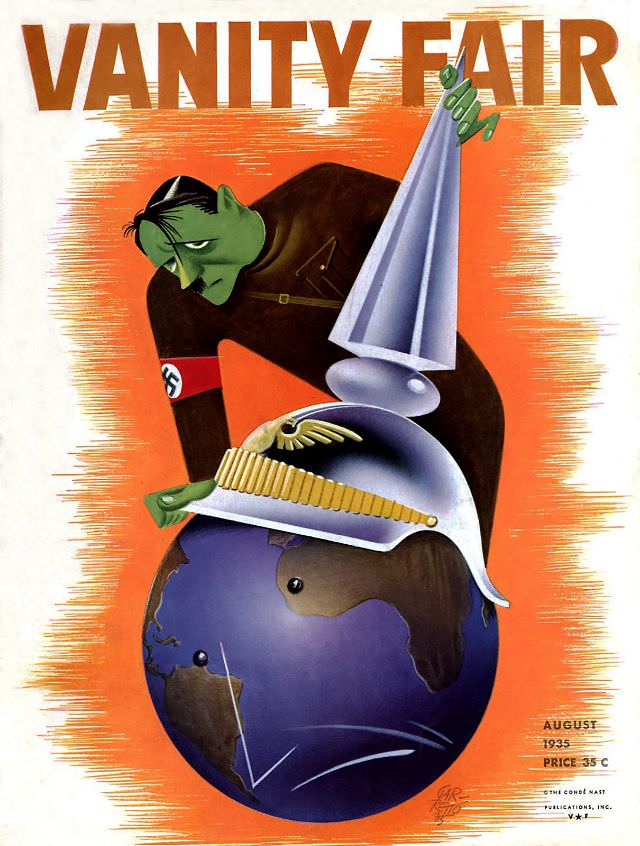
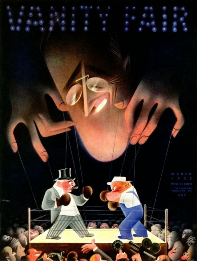
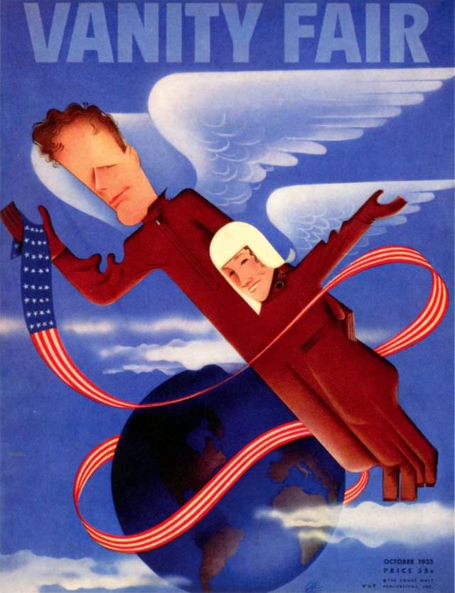
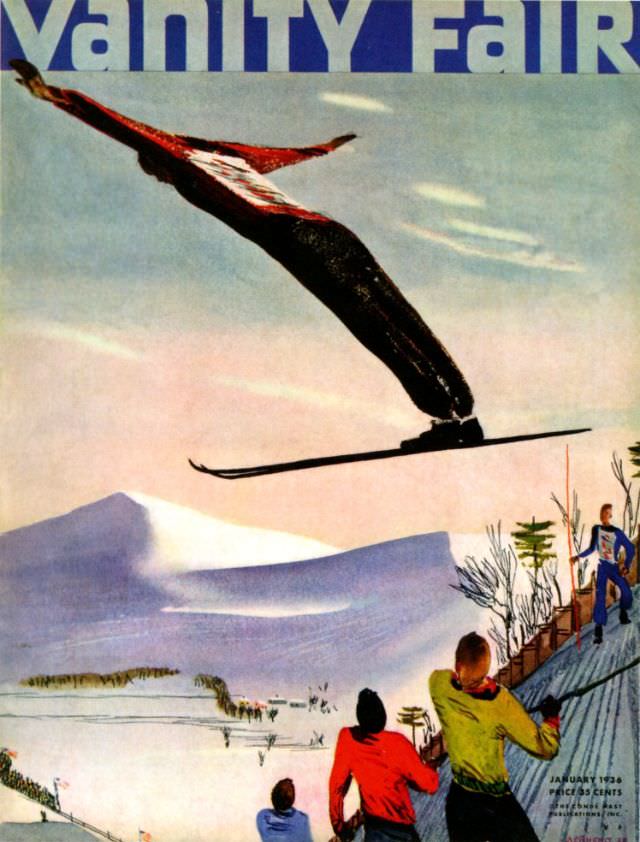
The final years of Vanity Fair’s first run — 1934 through 1936 — produced some of the most polished covers of the entire era. The artwork grew sharper and more refined, even as the subject matter stayed playful. These late covers show a magazine at the height of its visual craft, even as it approached its final issue in 1936.