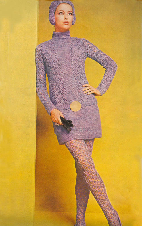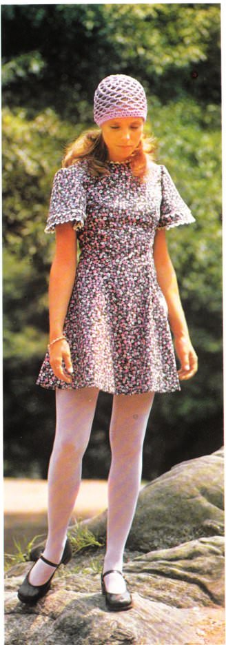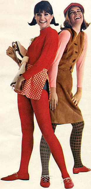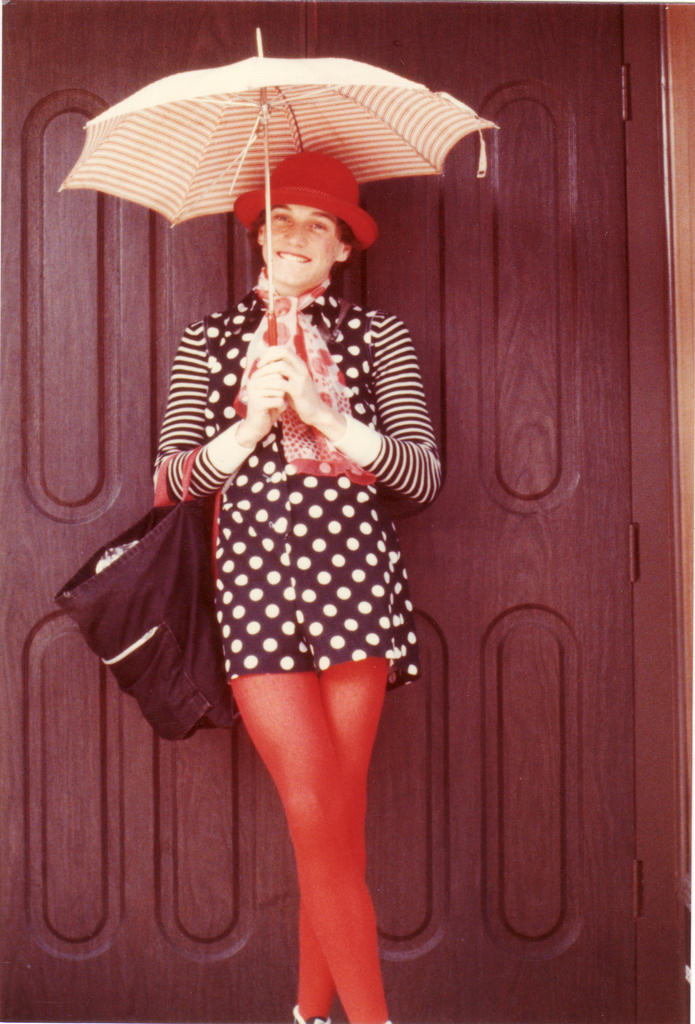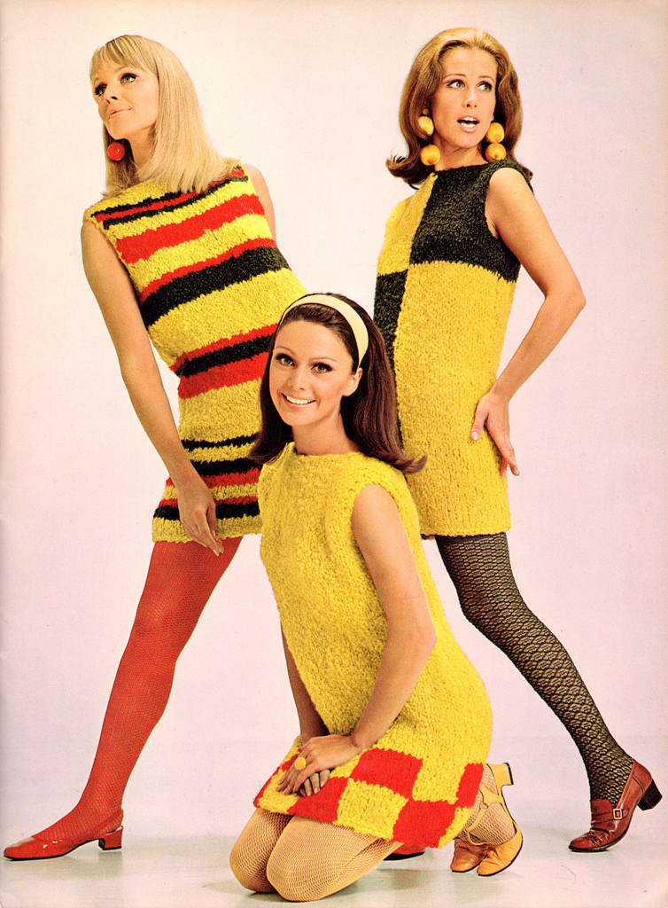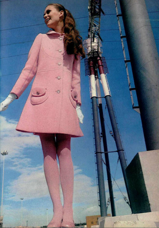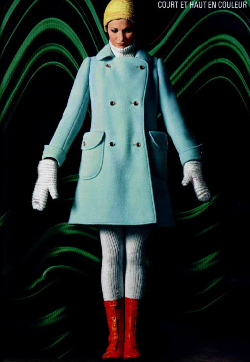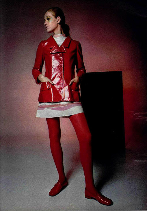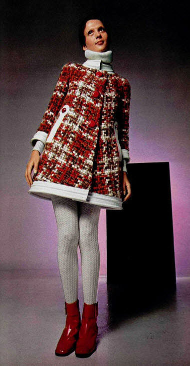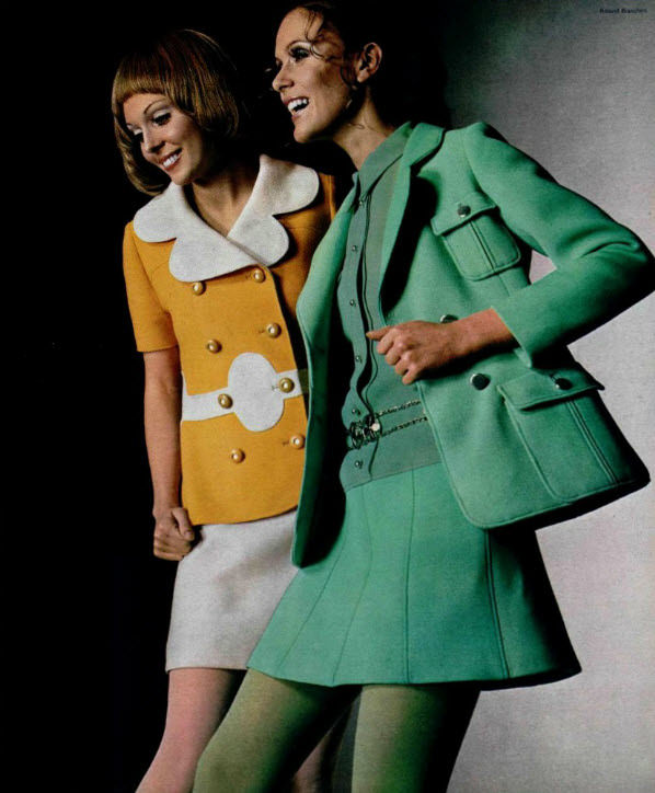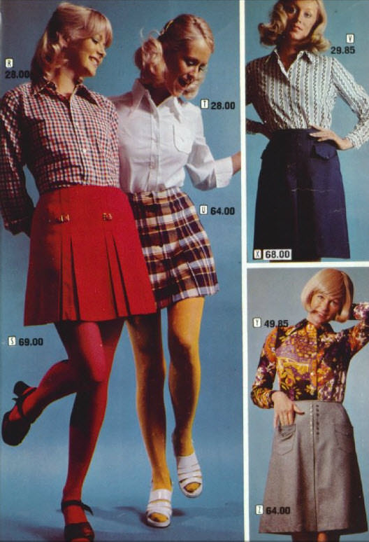

Stocking ads in the 1960s and ’70s were nothing like the clean, simple product shots of today. They were loud, bold, and often deliberately provocative — designed to grab attention in a crowded magazine spread and not let go. Brands like Hanes and Burlington fought hard for every inch of page space, using eye-catching visuals and punchy slogans to win over shoppers.
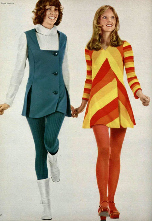
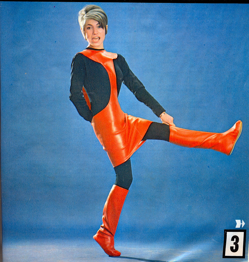
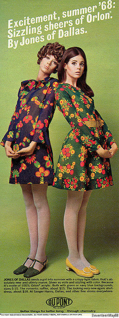
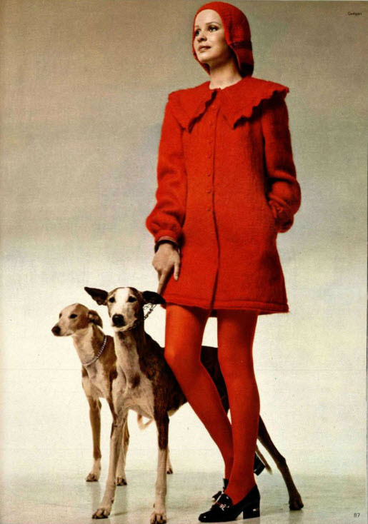
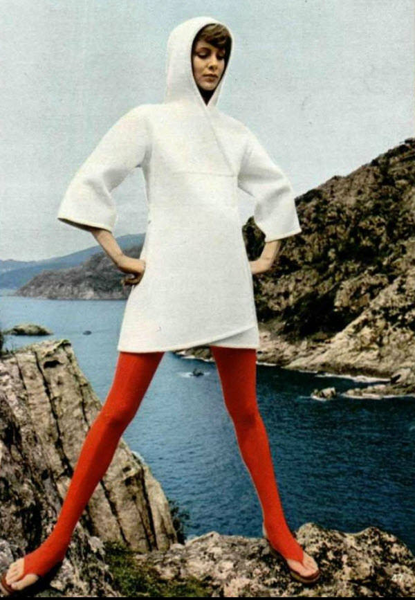
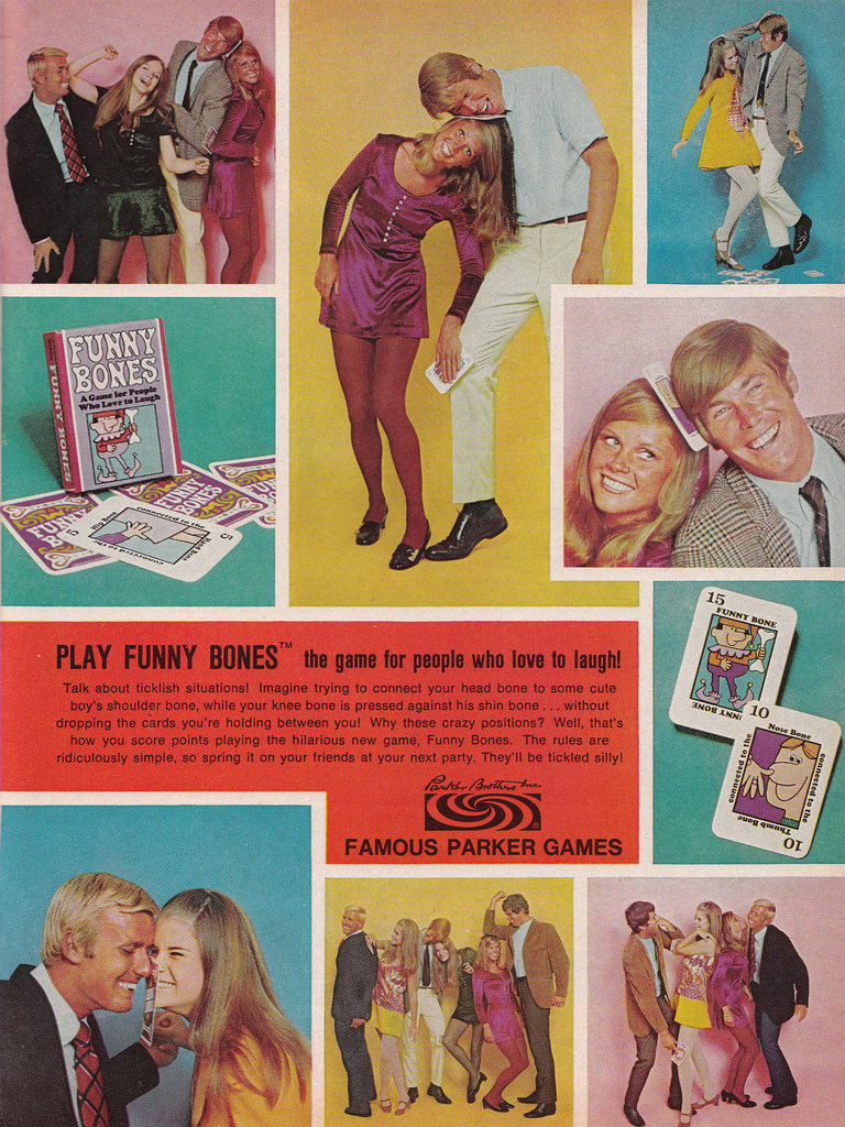
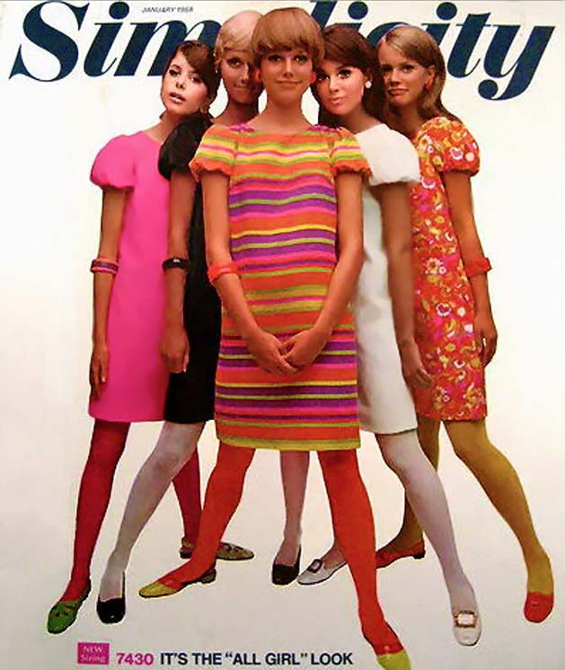
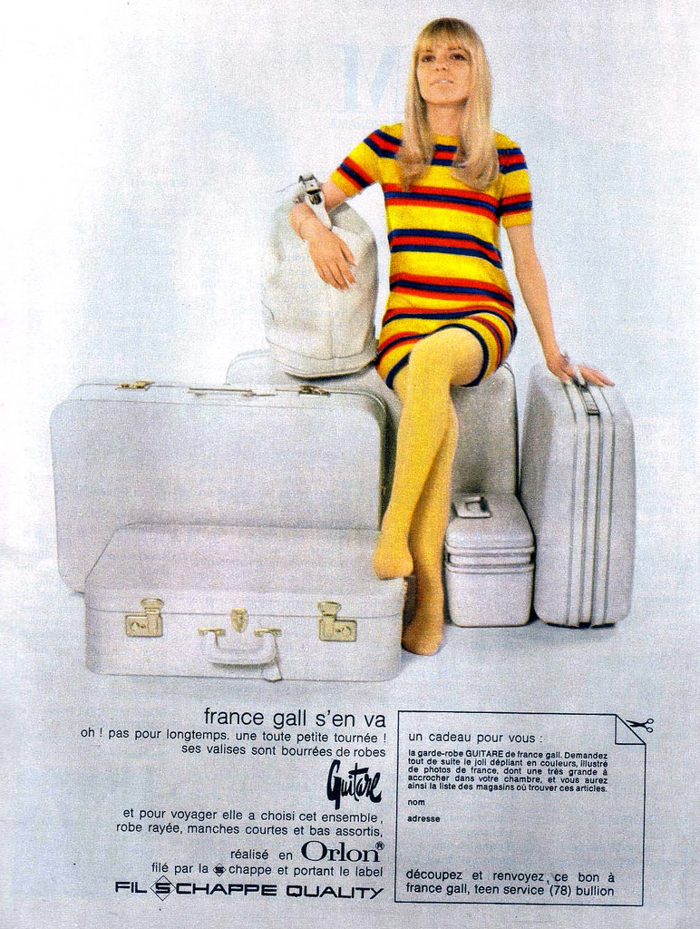
The 1960s set the tone. The miniskirt had arrived, and legs were suddenly front and center in fashion. Stocking ads leaned into this hard, featuring models with long legs posed at dramatic angles. The color palettes were vivid — psychedelic patterns, bright oranges, electric blues, and hot pinks that matched the energy of the decade.
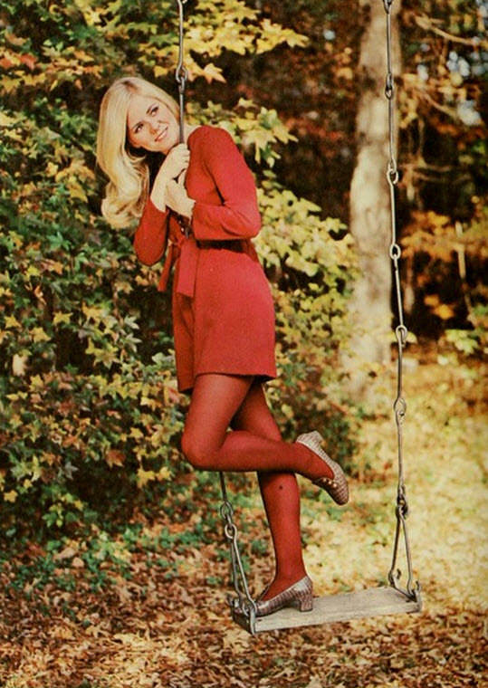
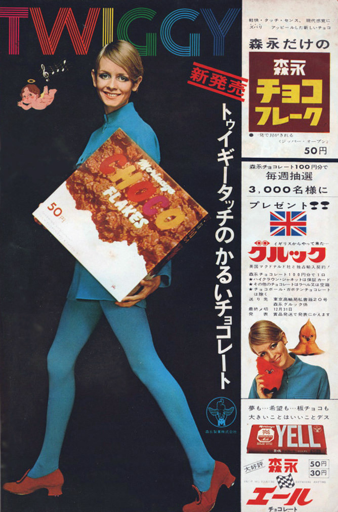
Slogans promised transformation. “Sheer elegance” and “unforgettable legs” were common hooks, telling women that the right pair of stockings delivered confidence with every step. These weren’t just product claims — they were aspirational promises wrapped in glossy photography.
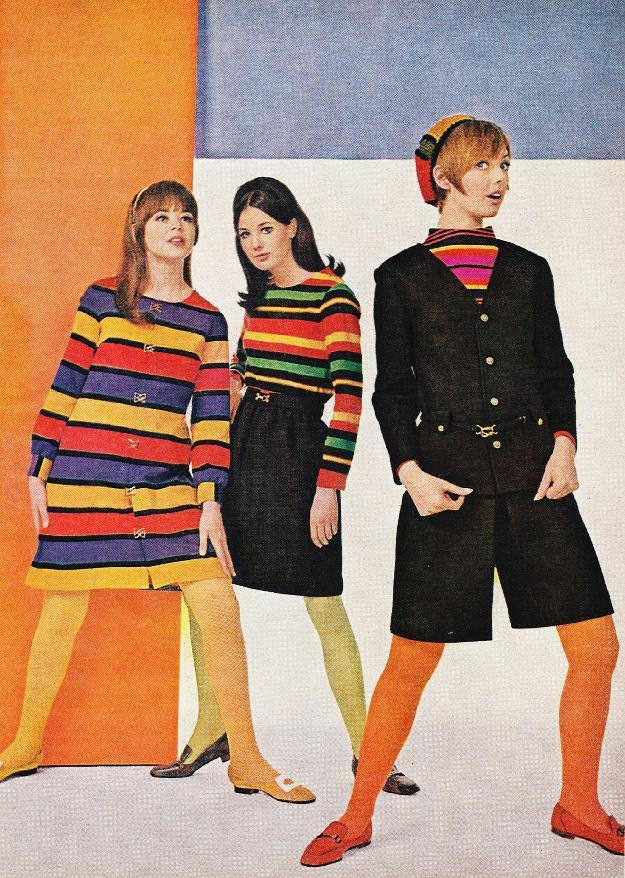
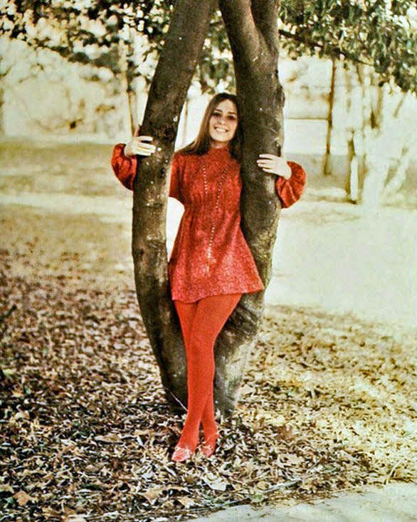
As the 1970s arrived, the tone shifted. The women’s liberation movement was reshaping how brands spoke to female consumers. Ads began showing women in active, confident poses — running, dancing, moving freely. The message moved away from pure allure and toward practicality and independence.
Features like “no-run” nylons and “stay-up” technology became selling points just as important as appearance. Women wanted stockings that worked as hard as they did. The advertising world had to keep up.
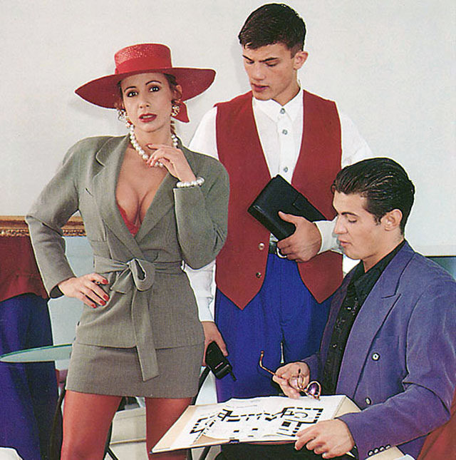
The color choices in ’70s ads reflected a broader cultural shift toward a more mature aesthetic. Earth tones, muted pastels, and classic black and white replaced the neon brightness of the ’60s. The ads felt more grounded, more real.
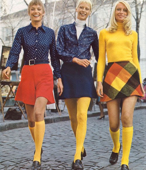
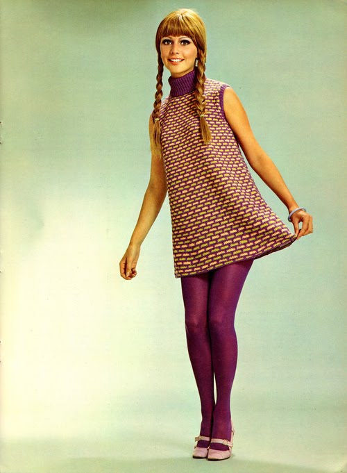
Representation began to change too. Women of different ethnicities and body types started appearing in stocking campaigns, pushing back against the narrow beauty standards that had dominated advertising for decades. It was a slow shift, but a visible one.

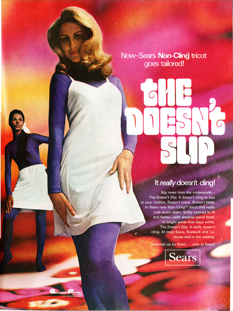
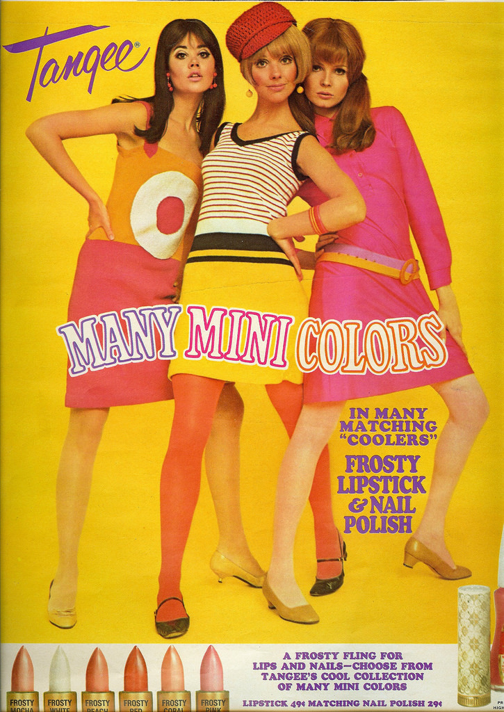
Some ads leaned into humor or novelty to stand out. Strange concepts, unexpected settings, and playful copy gave certain campaigns a memorable edge that straightforward glamour shots couldn’t match.
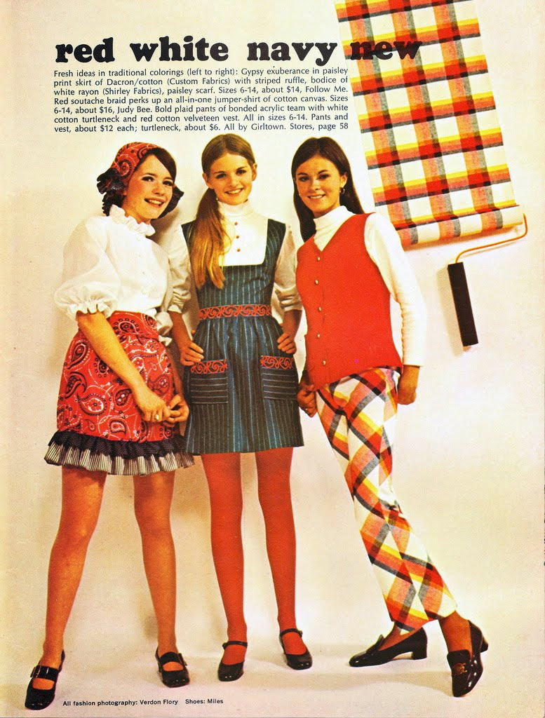
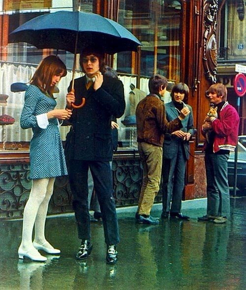
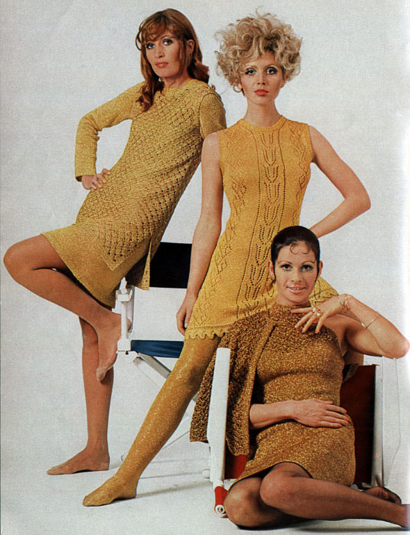
Through both decades, the ads reflected exactly where society was at the time. The ’60s celebrated youth, freedom, and flash. The ’70s asked for something more complex — strength, practicality, and a wider view of what beauty looked like.