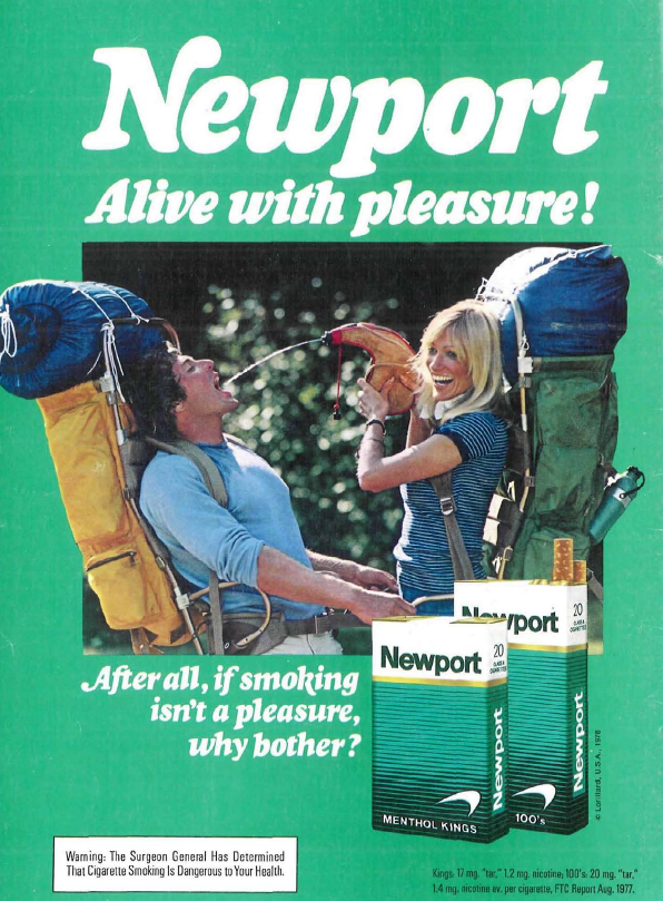
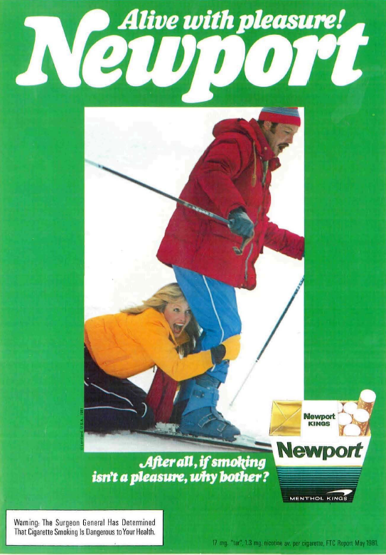
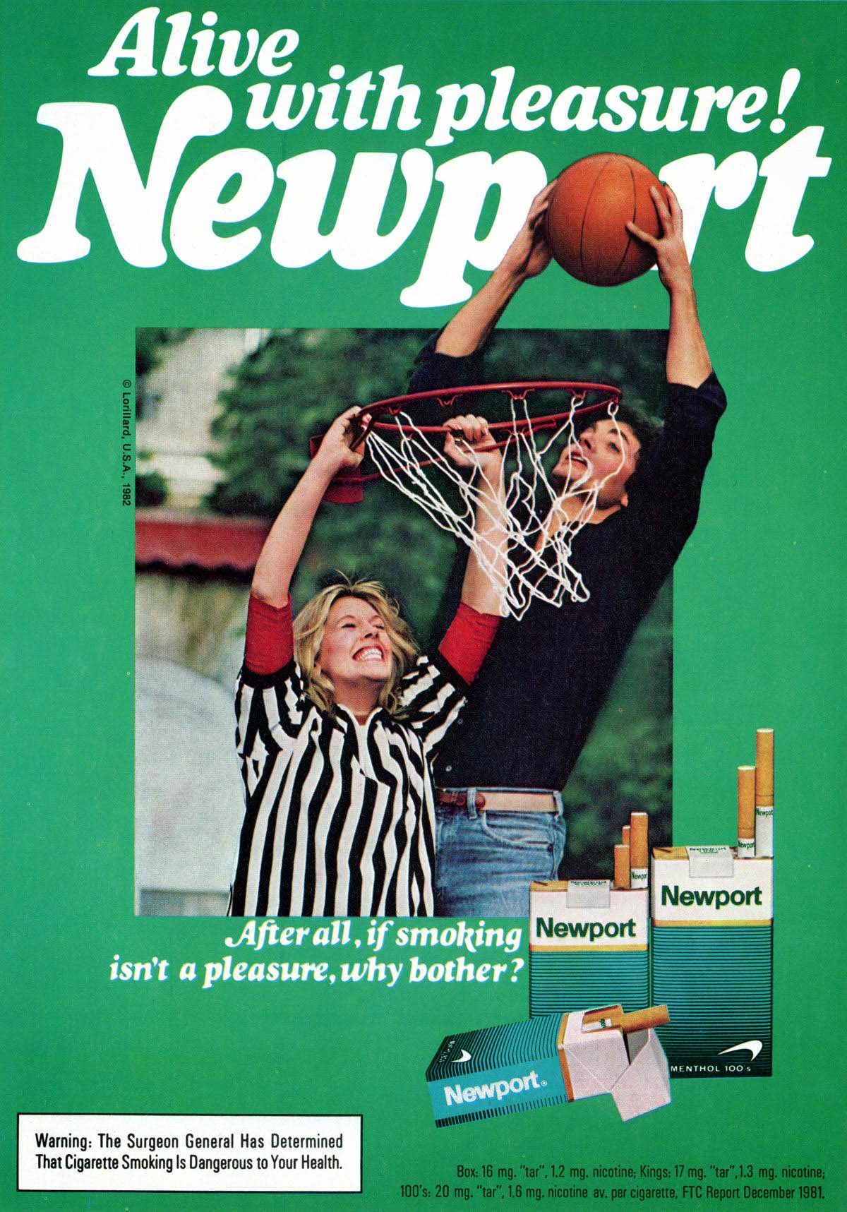
Throughout the 1970s and 1980s, Newport cigarettes ran one of the most recognizable ad campaigns in print media. The slogan “Alive with pleasure!” appeared in nearly every major magazine of those decades. The ads shared a bold, consistent look that made them impossible to miss — a bright, gaudy green background that framed every image and instantly signaled the Newport brand, even before a reader spotted the logo.
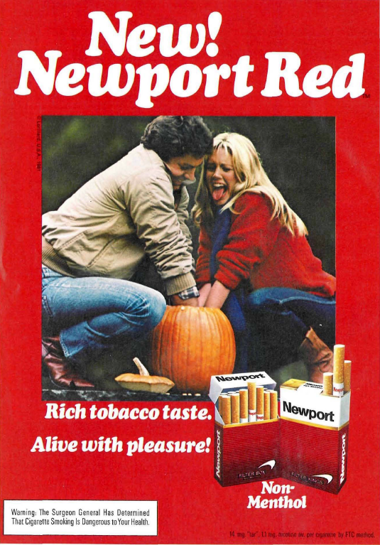
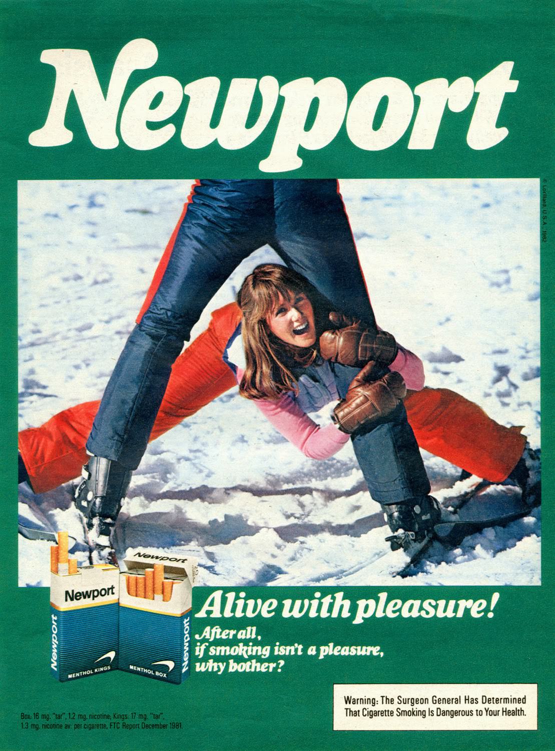
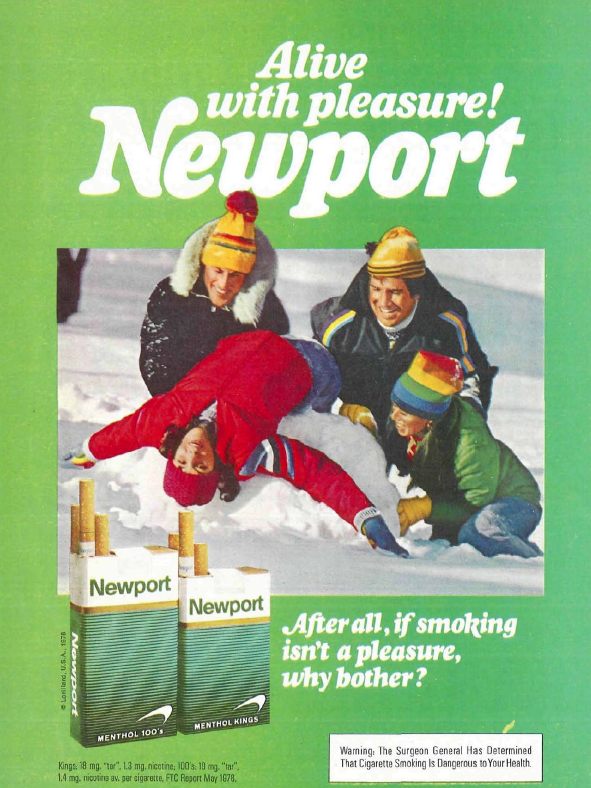
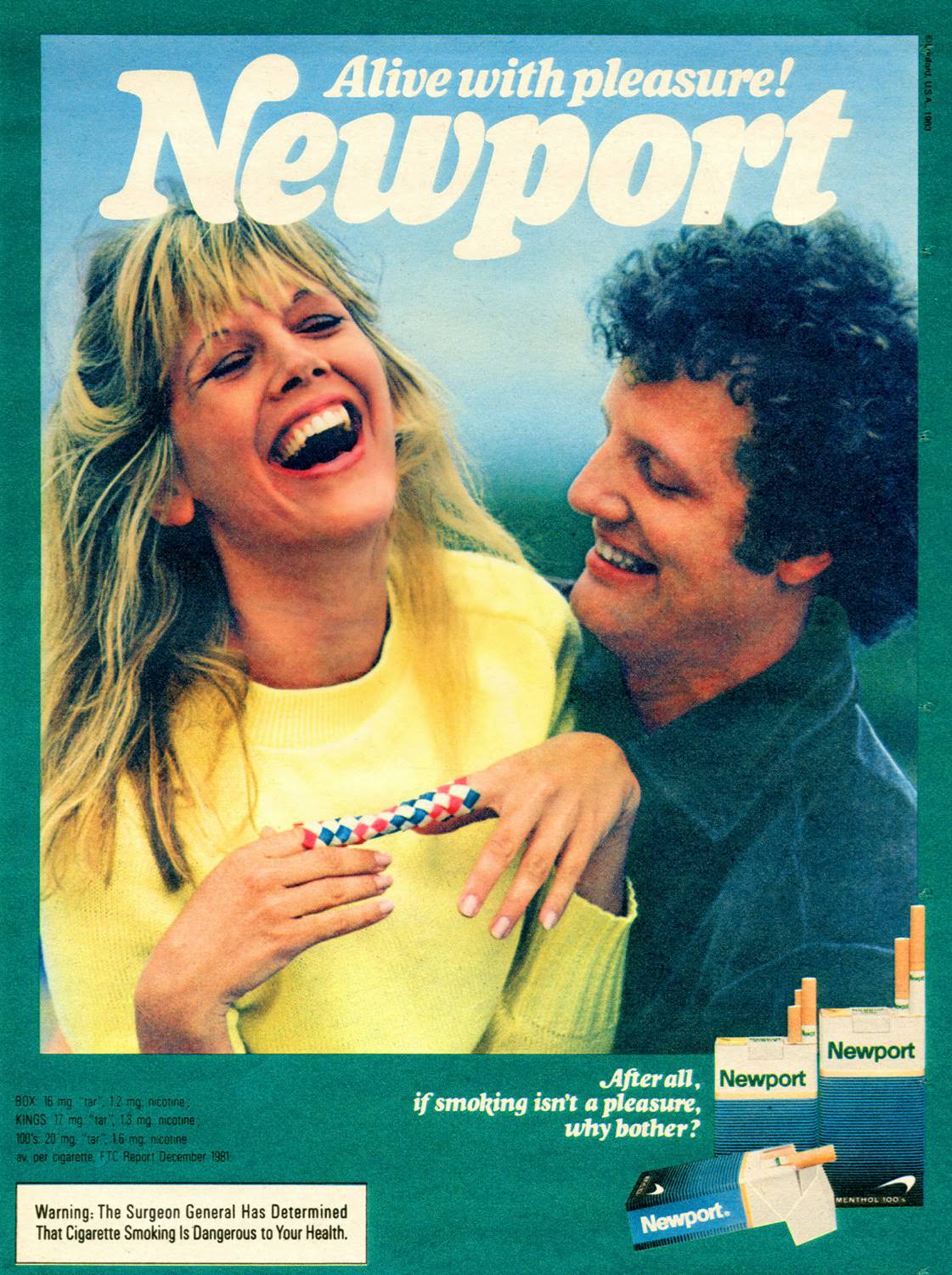
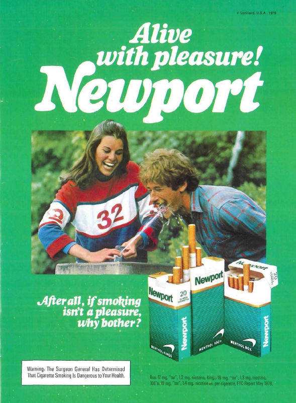
The photography inside those green borders followed a strict formula. Young adults were shown laughing, splashing in water, wrestling in the grass, or carrying each other on their backs. The shots looked intentionally casual — almost like a friend snapped them on a weekend trip. Models always appeared in pairs or small groups, never alone.
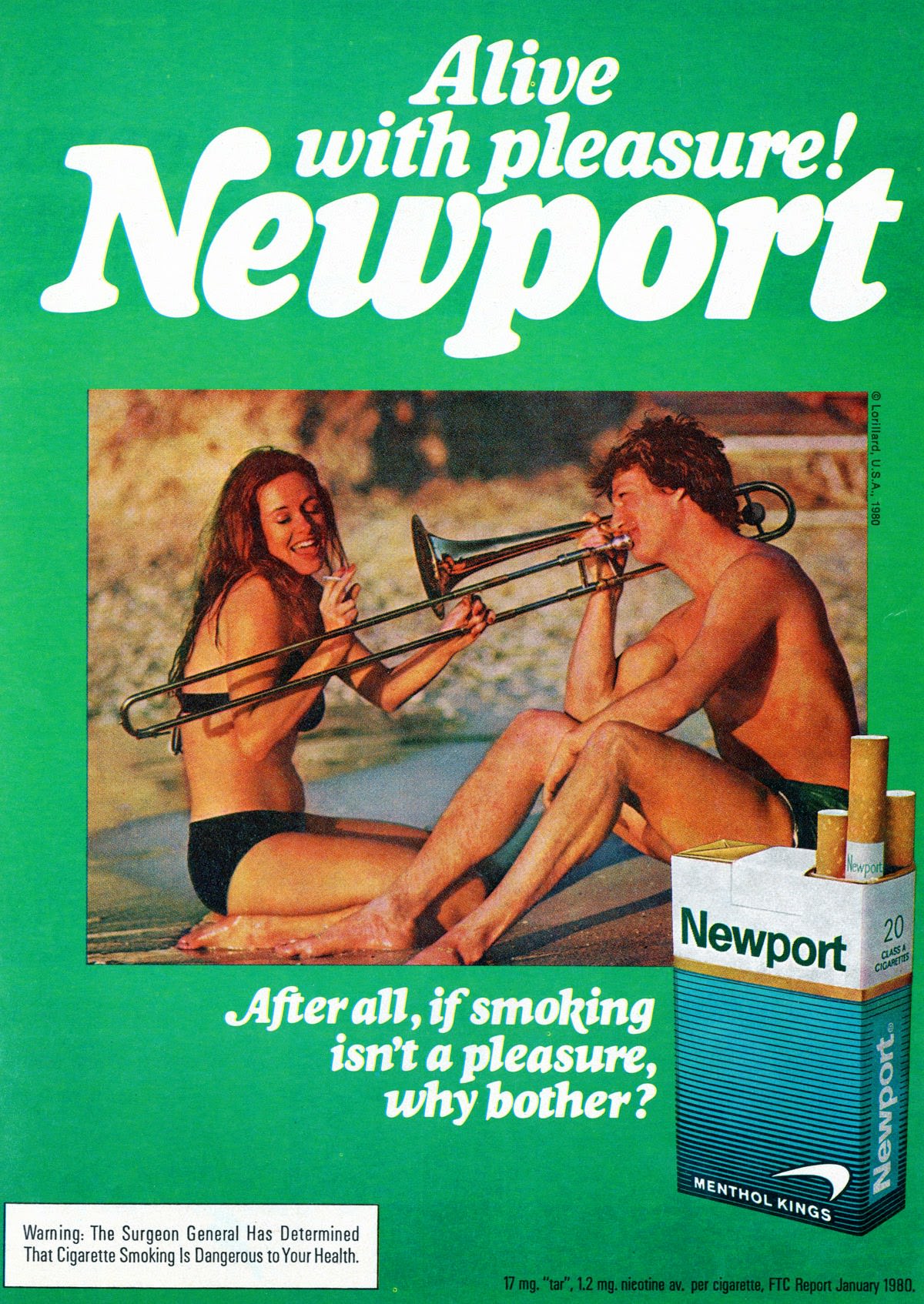
Body language and facial expressions were carefully staged. Poses hinted at physical attraction and social closeness. The strategy was deliberate: link the “pleasure” in the slogan directly to the pleasure of intimacy and being desired. The cigarette itself was secondary to that emotional message.
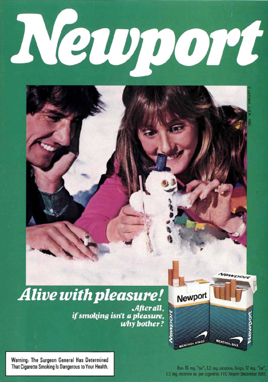
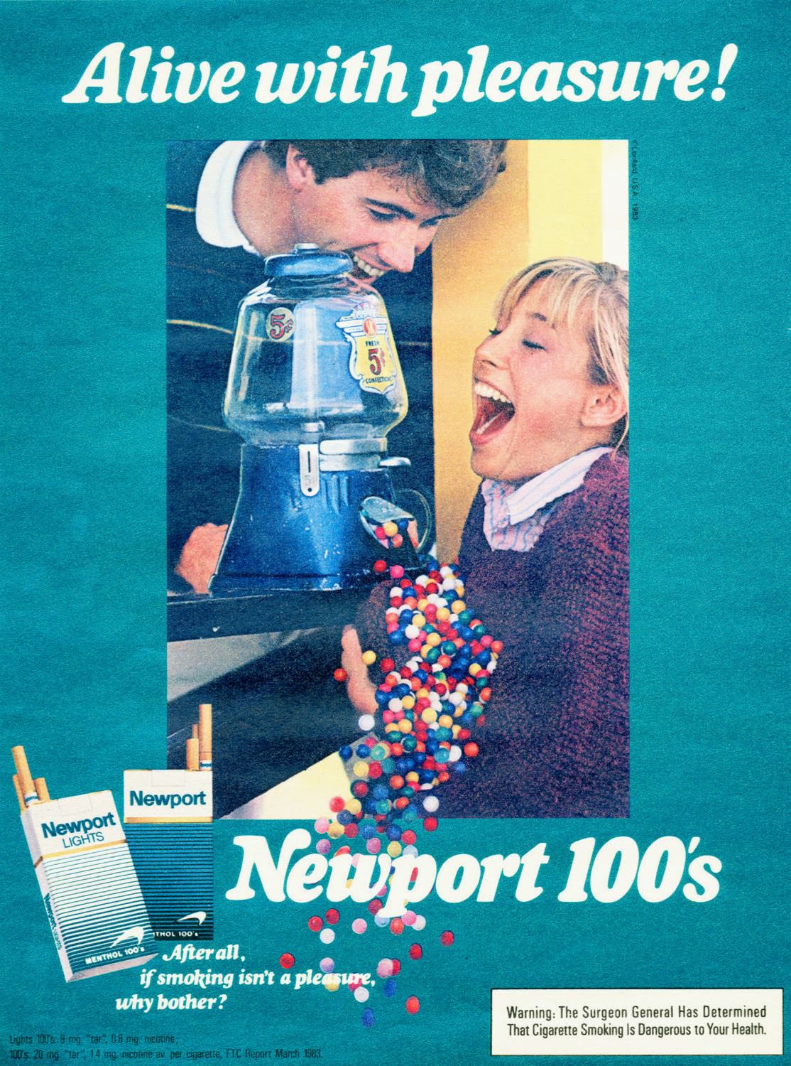
The “Alive with pleasure!” text was printed in bold white type, placed right beside the energetic photos. No ad focused on the taste or quality of the cigarette. The entire pitch was built around youth, energy, and attractiveness.
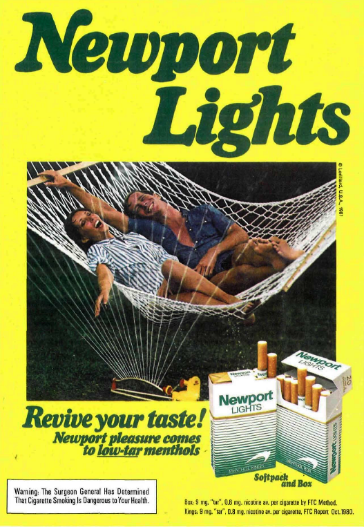
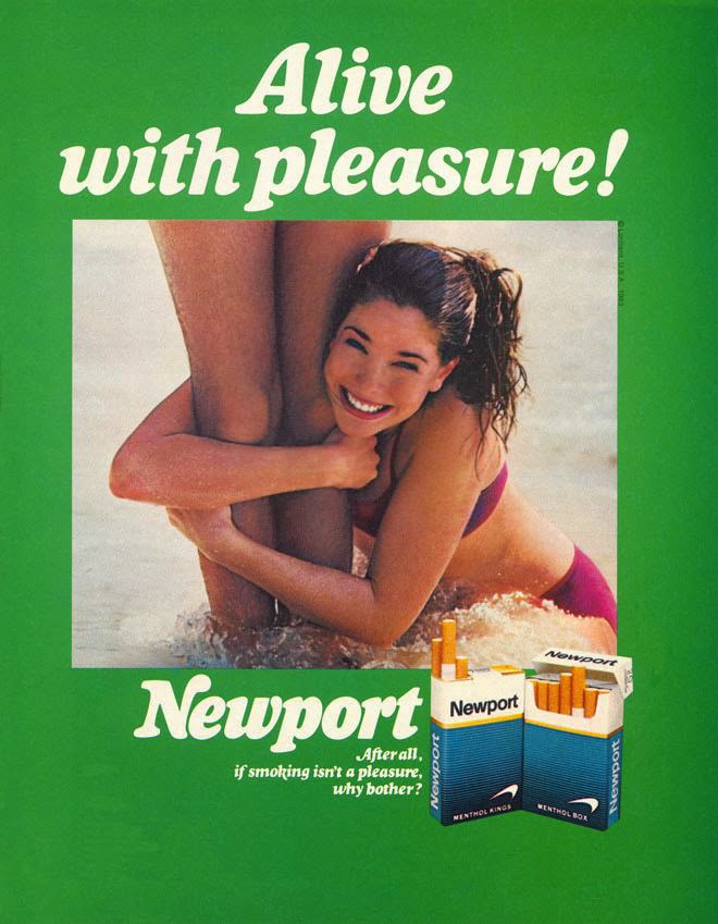
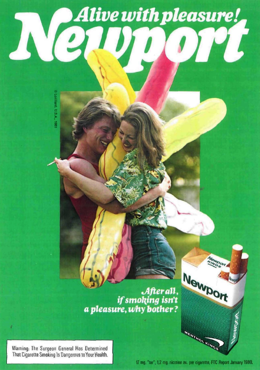
The green border served as a branding tool on its own. Readers learned to associate that specific shade of green with Newport before reading a single word. It was a simple but effective visual shortcut that worked across hundreds of individual ads.
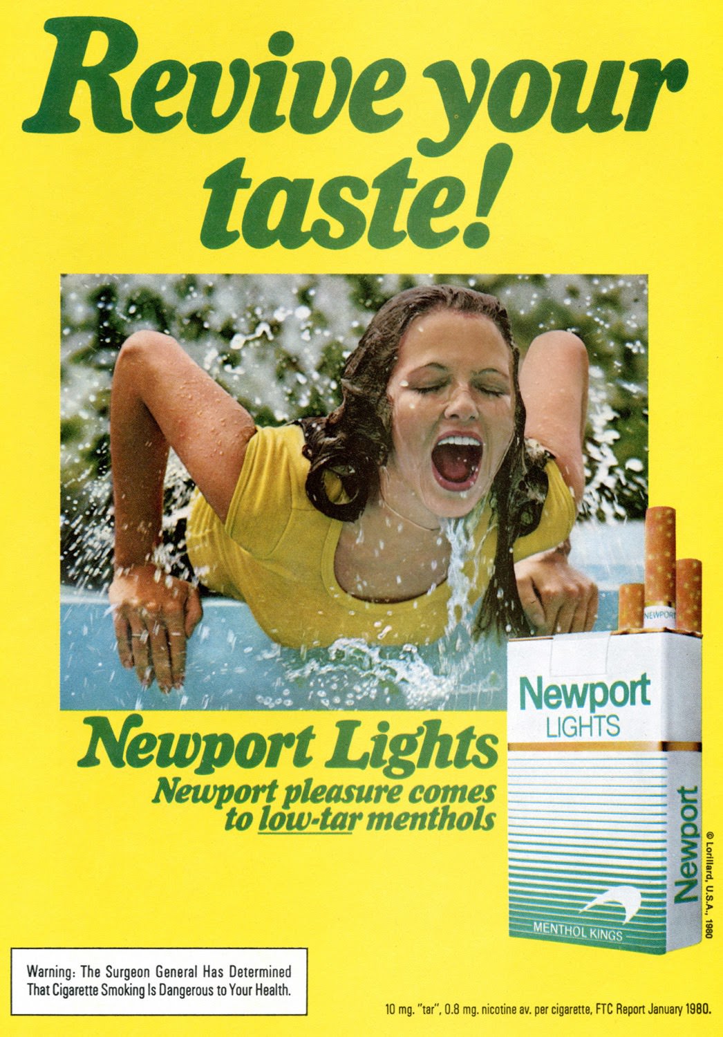
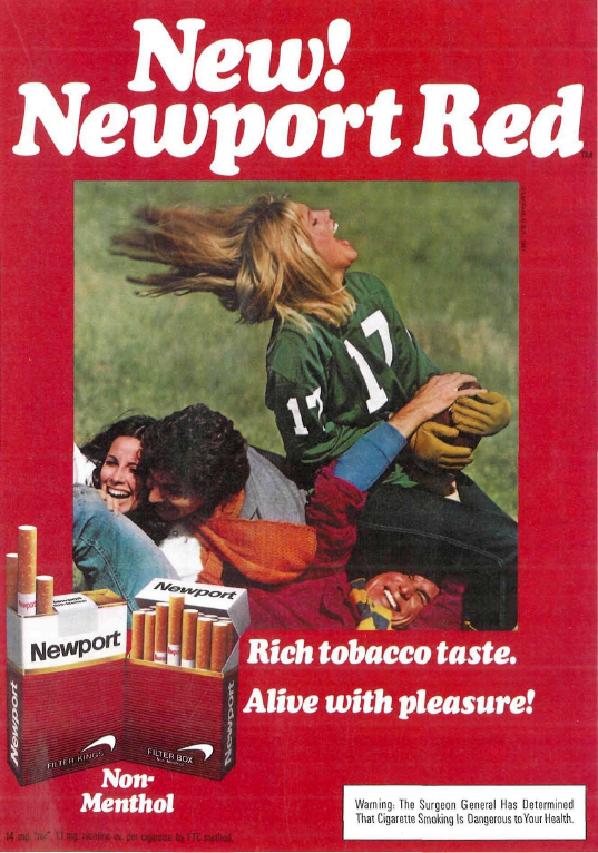
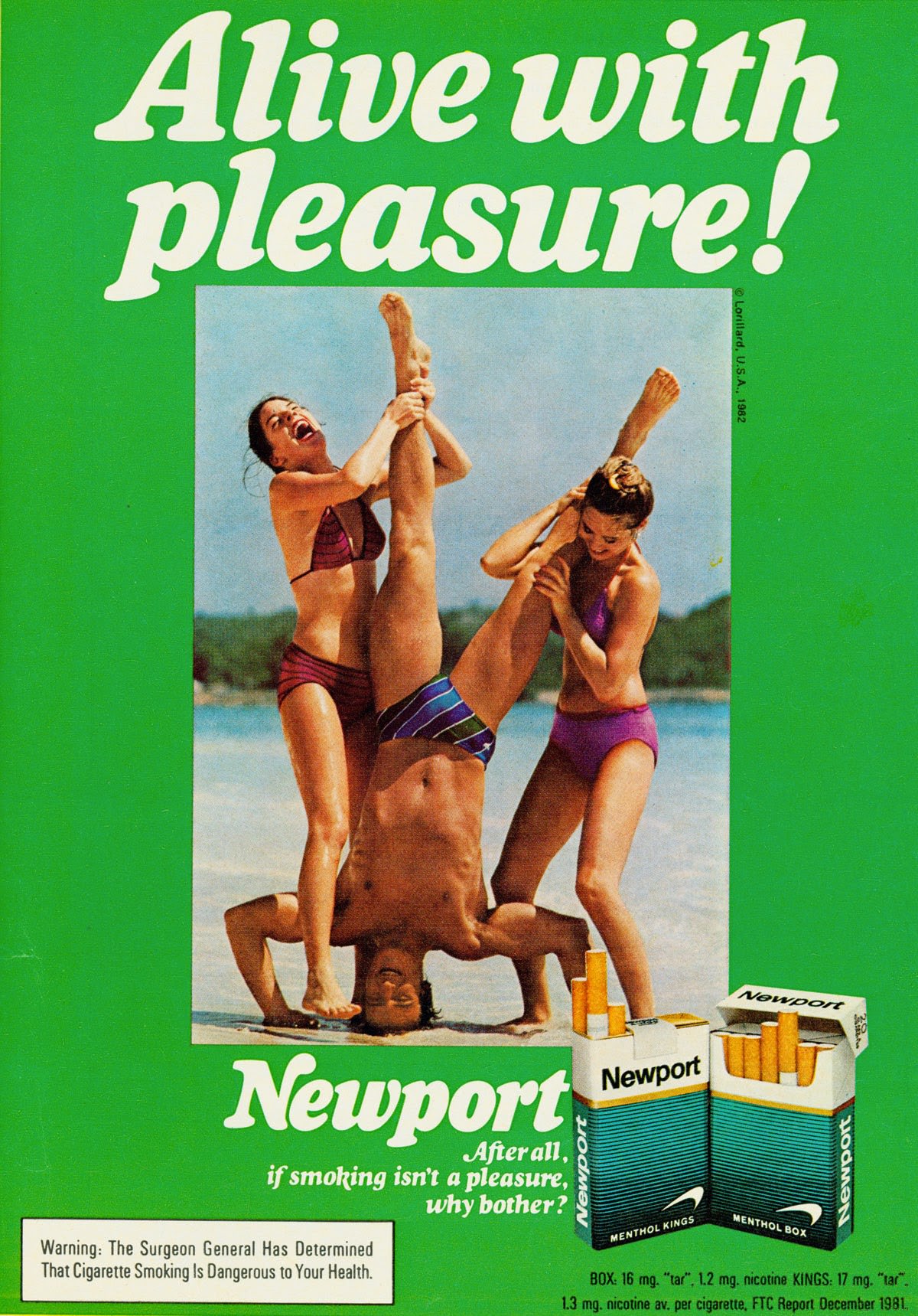
Each ad in the campaign recycled the same core elements — the green frame, the candid-style photo, the bold slogan — while swapping in new scenes and models. This kept the campaign feeling fresh while reinforcing the same brand identity year after year across the full run of the 1970s and 1980s.