
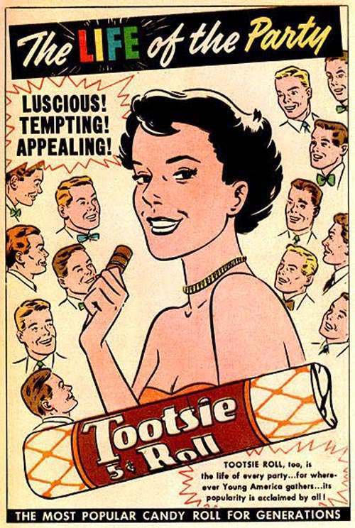
Old advertisements were built on one goal: grab attention fast. Designers used bold colors, punchy slogans, and eye-catching illustrations to sell everything from soap to cereal. Nobody was sitting around thinking about how a slogan might read decades later. That blind spot left behind some truly memorable mistakes.
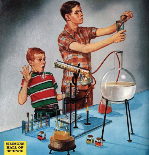
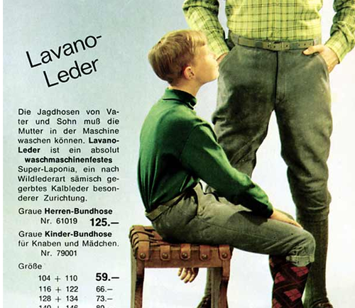
Product names were a common trap. A word that sounded perfectly normal in 1955 could land very differently today. When you pair an awkward name with a smiling model and a bold tagline, the result writes its own joke. Catalog pages were especially guilty of this, since they crammed as many products as possible onto a single page with minimal design review.
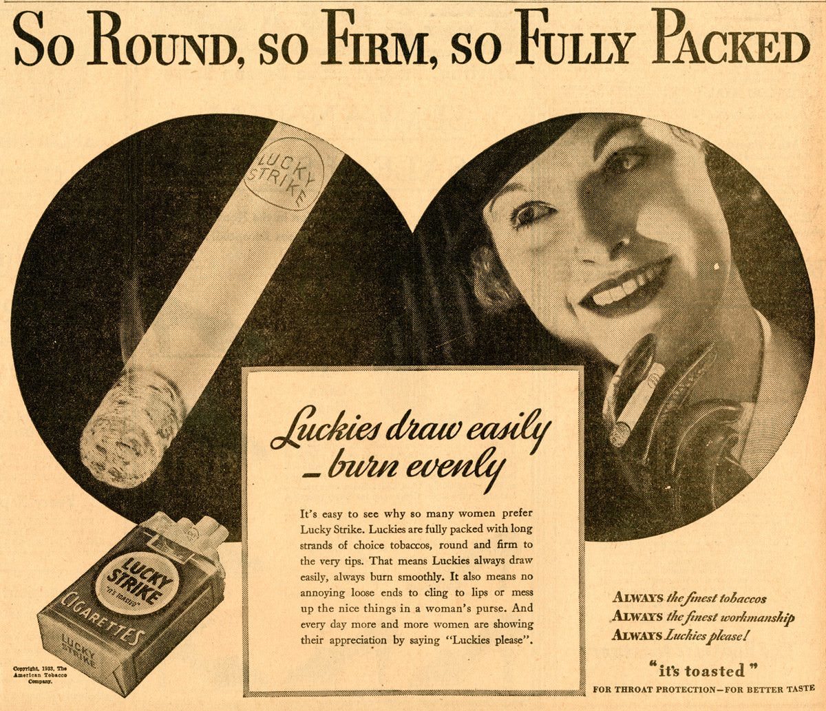
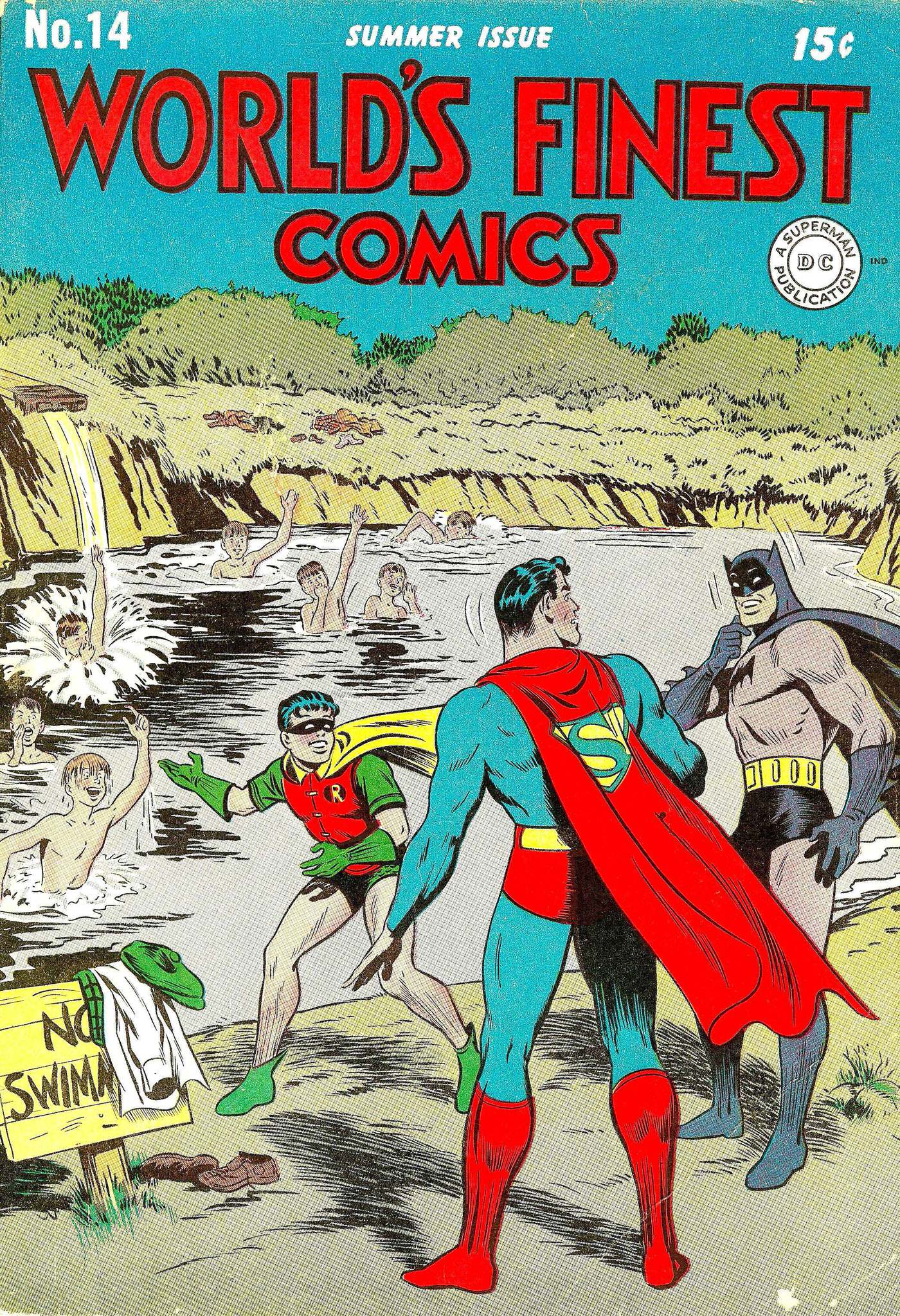
Comic book covers had their own set of problems. Artists drew superheroes in tight costumes, action poses, and dramatic scenes — all without much thought about how the final composition would look. Strange camera angles and cluttered backgrounds created visual jokes that editors somehow approved and printed.
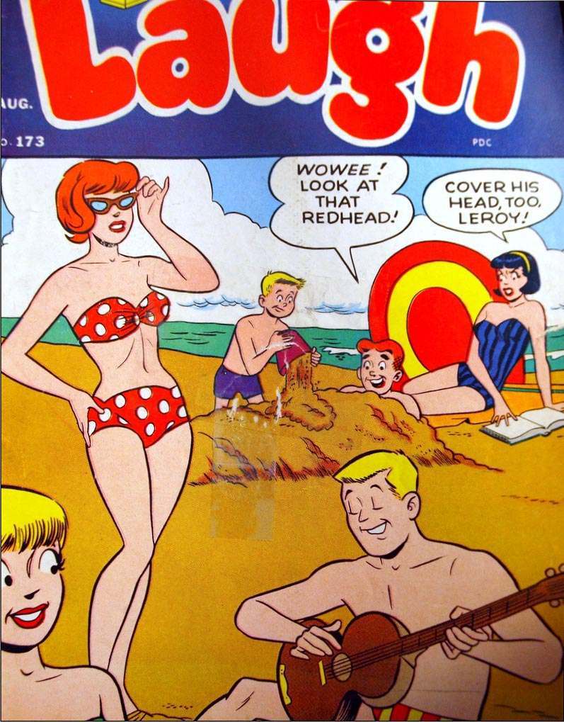
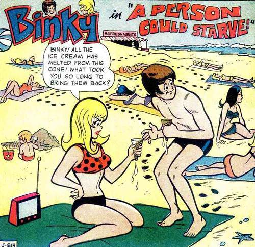
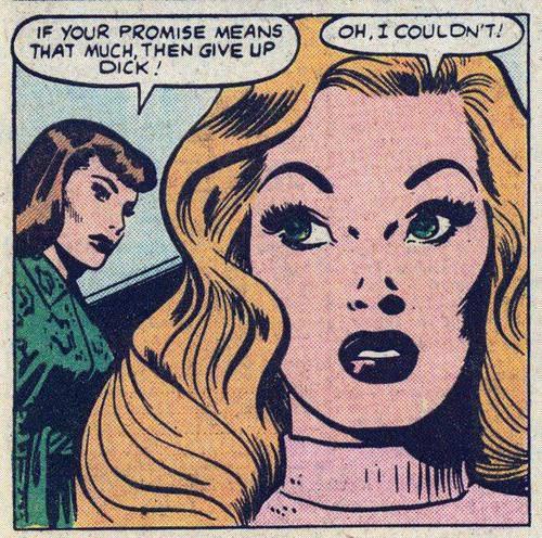
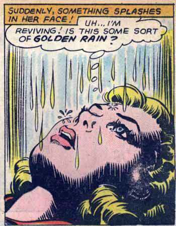
Characters placed too close together, or gripping an oddly shaped prop, regularly produced covers that look nothing like what the artist intended. Children’s comics were not immune either. Some of the most unintentionally suggestive images ever printed appeared in books aimed squarely at kids.
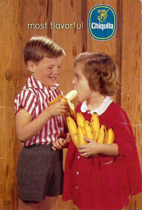
Greeting cards leaned on puns and wordplay to get a laugh. That strategy backfired when the joke involved anything related to size, gifts, or physical contact. Holiday cards about “big packages” and birthday cards with winking illustrations crossed a line their writers never noticed they were approaching.
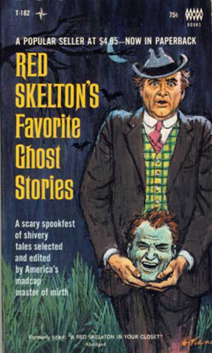
Movie posters from past decades brought their own awkward moments. Studios wanted drama and romance, so designers posed actors in close, intense positions. Bold taglines meant to sound thrilling sometimes read as something else entirely when placed next to two bodies pressed together.
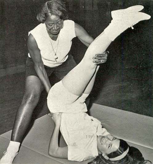
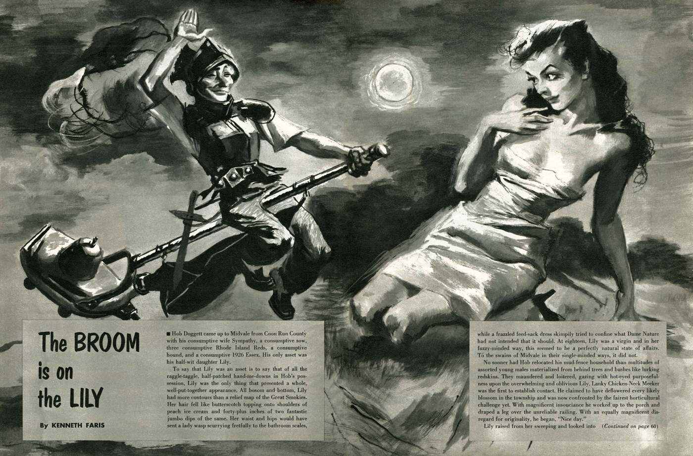
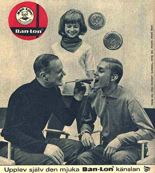
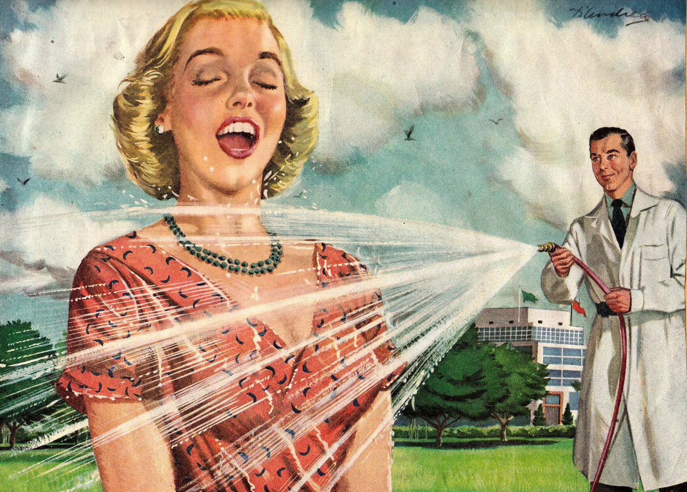
Print ads for household products were another goldmine of accidental humor. Appliance ads, food packaging, and hardware catalogs all featured real people demonstrating products in ways that, with a slightly different eye, look far less innocent than intended.

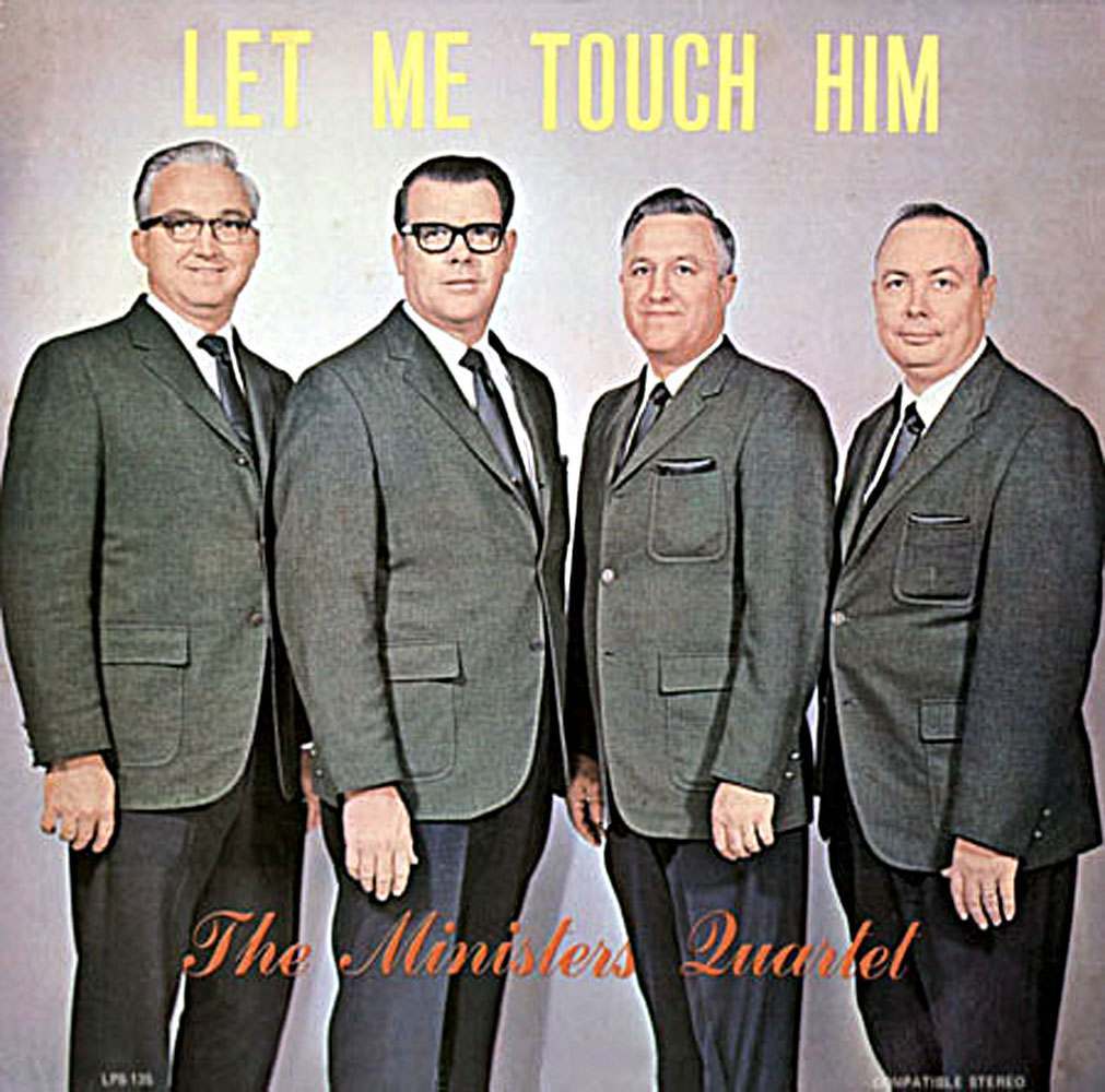
The pattern is always the same: a designer focused entirely on the product, a copywriter chasing a clever line, and no one in the room thinking about the bigger picture. The results got printed, distributed, and are now preserved forever in archives and collections.
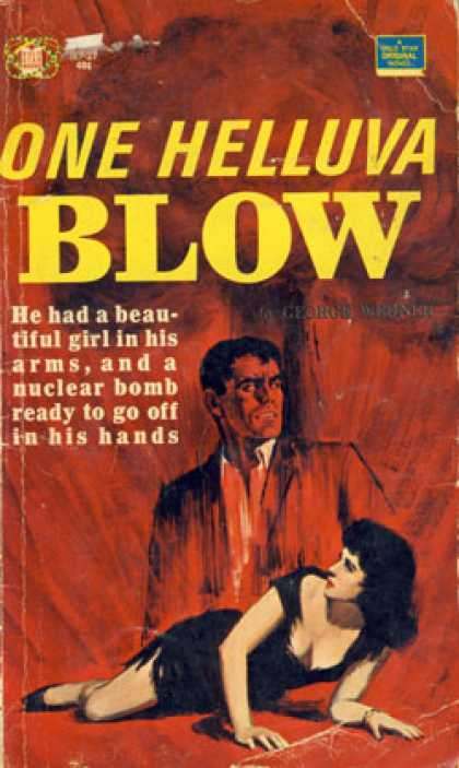
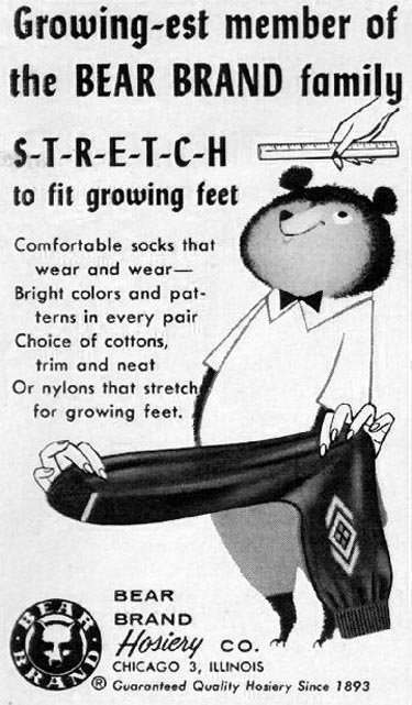
Some of these images circulated widely at the time and raised no eyebrows at all. Tastes and language shift over decades, and what felt neutral then feels loaded now. That gap between original intent and modern reading is exactly what makes these pieces so striking.