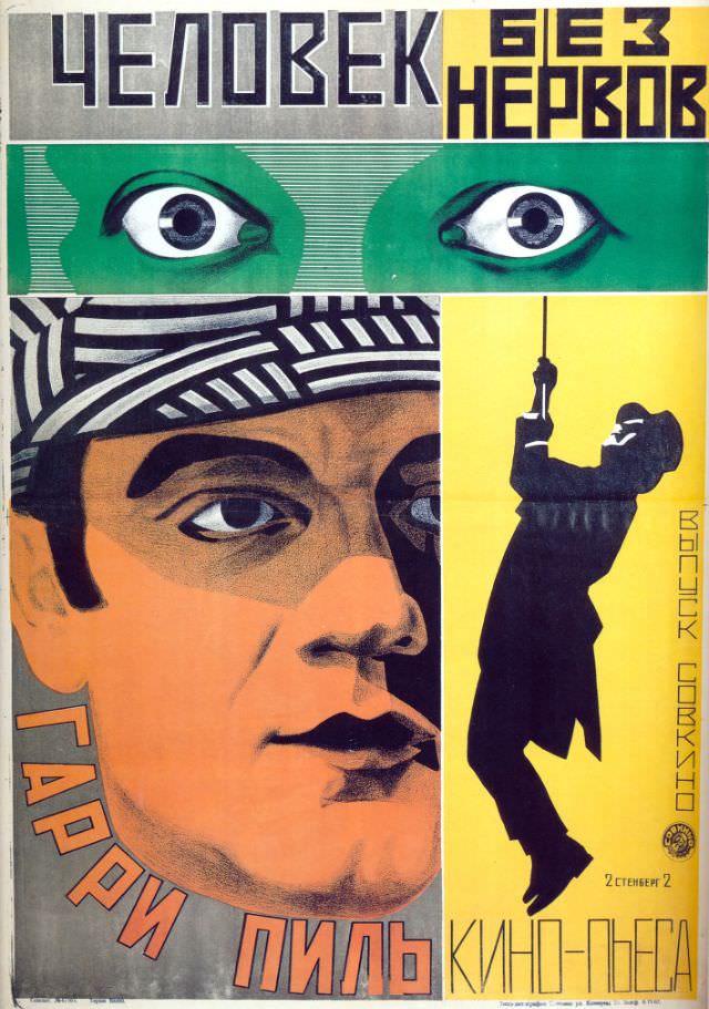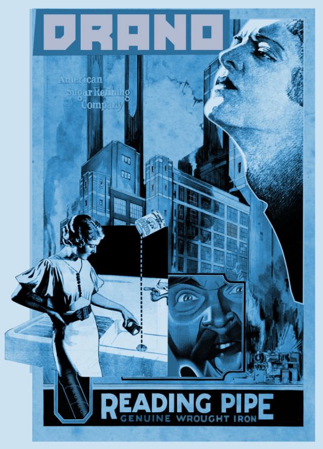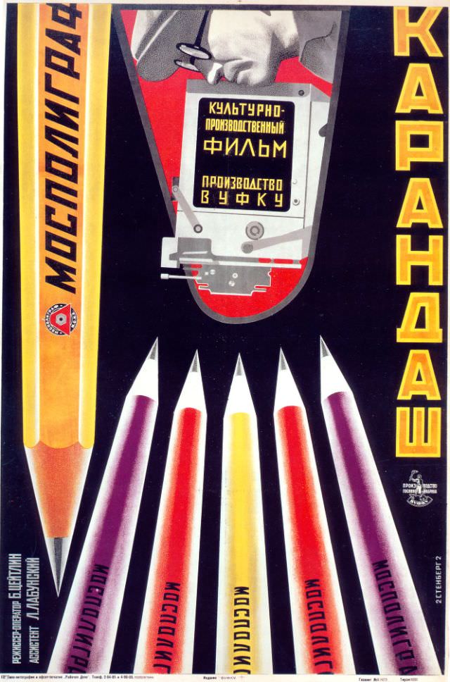

Vladimir and Georgii Stenberg were two of the most inventive designers working in Soviet Russia during the 1920s. Their output spanned sculpture, theater design, architecture, fashion, and industrial design. But it was their film posters that made them truly stand out. At a time when most promotional art told a story in a straightforward, almost illustrative way, the Stenberg Brothers took a completely different path.
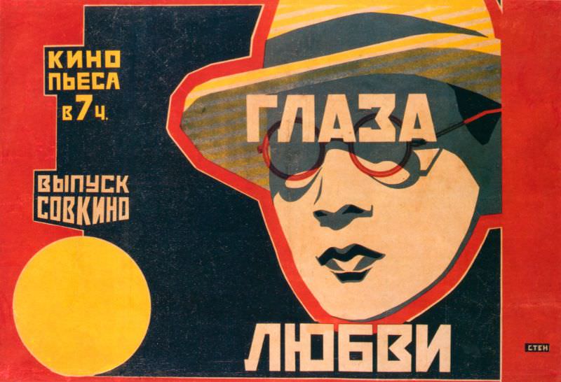
Their approach was bold and deliberate. Vladimir described it plainly: “We deal with the material in a free manner… disregarding actual proportions… turning figures upside-down; in short, we employ everything that can make a busy passerby stop in their tracks.” That philosophy drove every design decision they made. Figures were flipped, stretched, and cropped. Scale was exaggerated. Nothing was accidental.
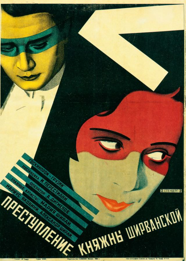
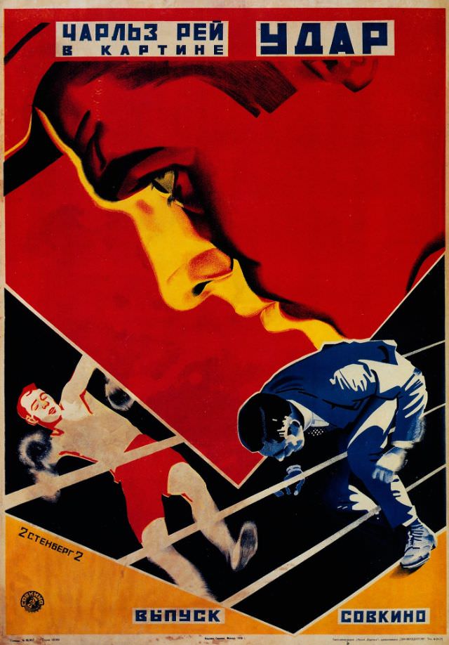
The brothers rooted their work in constructivism and productivism — two movements that valued art as a tool for real-world communication rather than pure aesthetics. They frequently pulled stills directly from the films they were promoting, then manipulated those images using creative cropping and distorted perspectives to generate a sense of energy and motion on a flat surface.
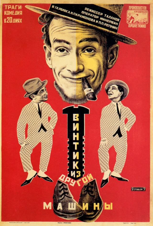
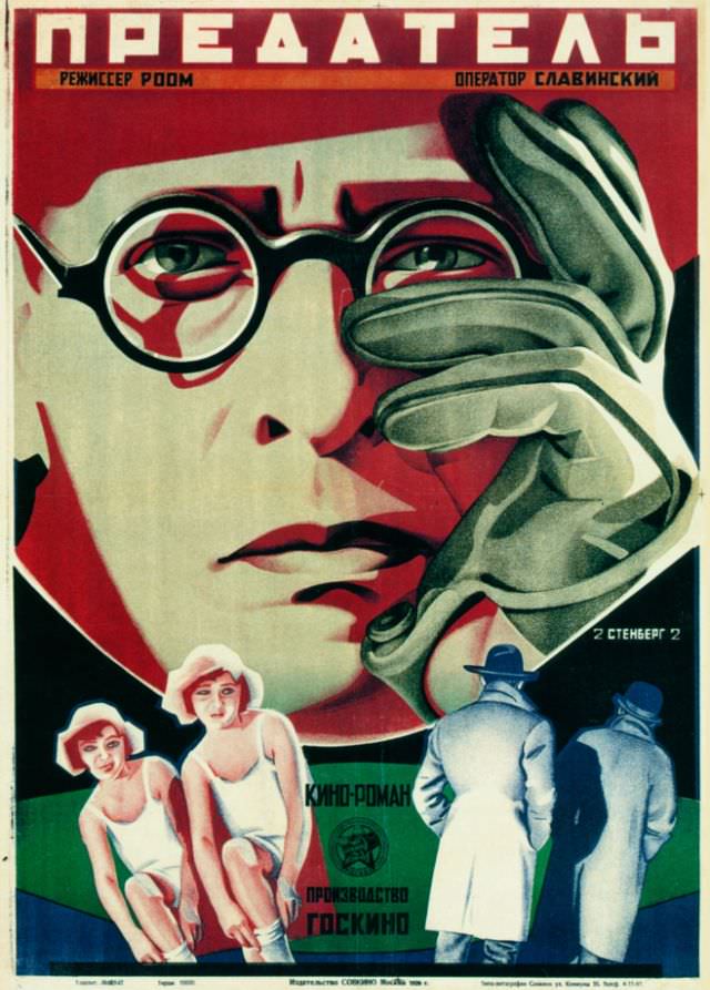
Color was another key weapon in their toolkit. The Stenbergs used striking, often unnatural color combinations that had no interest in realism. Their typography was equally aggressive — text was angled, scaled unevenly, and integrated into the composition rather than simply placed on top of it. The result was a visual language that was entirely their own.
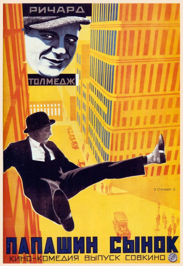
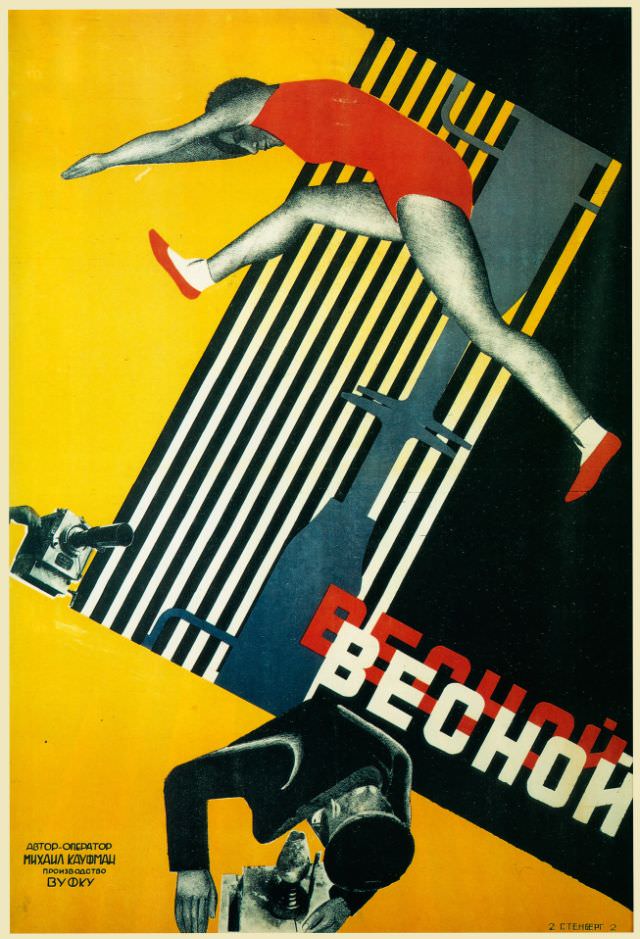
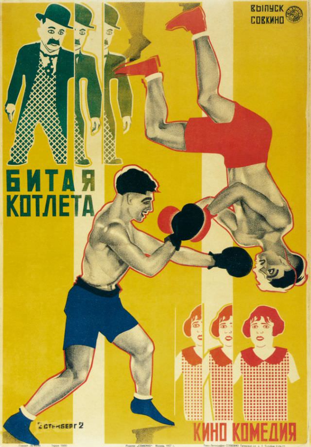
They also drew on Dada photomontage techniques, combining fragments of images through collage and assemblage to build compositions that didn’t follow a single narrative thread. This gave their posters a fractured, high-energy quality that matched the pace of urban Soviet life. Directors like Sergei Eisenstein and Dziga Vertov, whose films pushed cinematic boundaries, were among the filmmakers whose work the brothers promoted.
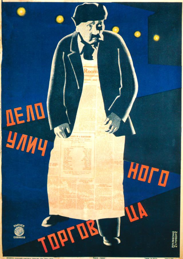
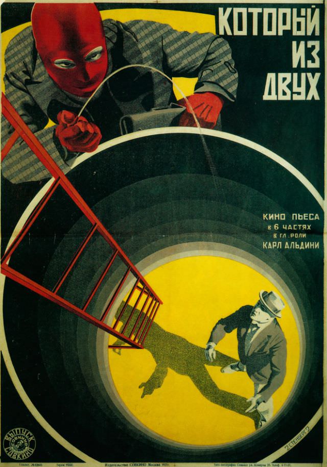
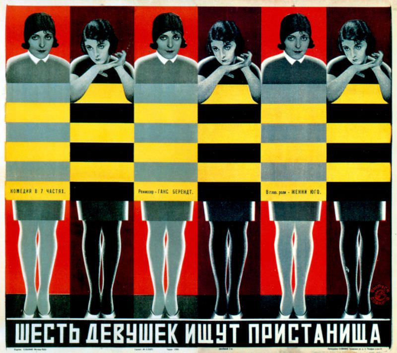
By 1928, the brothers were producing posters at a remarkable pace. Their designs covered a wide range of films — comedies, dramas, and documentaries alike — yet every poster carried the same unmistakable energy. Faces were often rendered in close-up, eyes staring directly outward, demanding the attention of anyone passing by on the street.
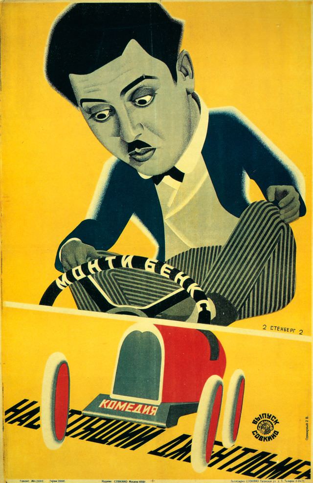
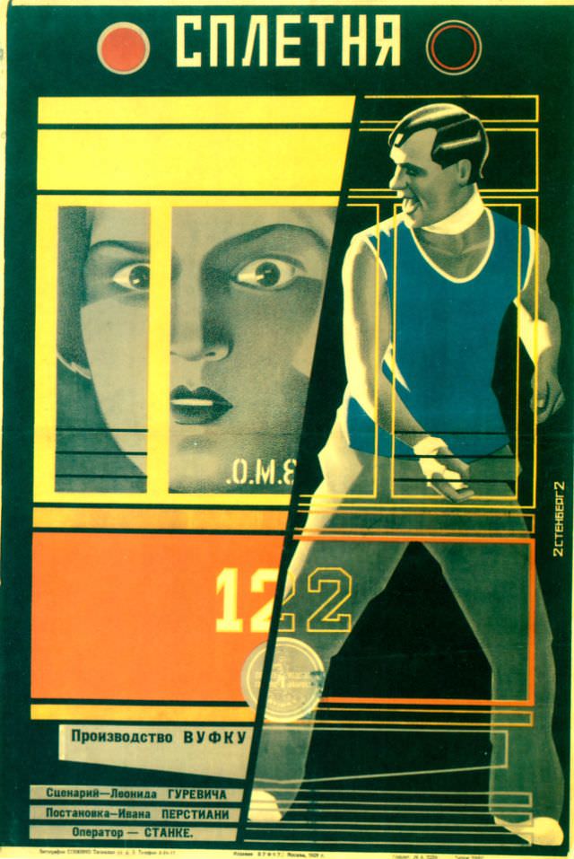
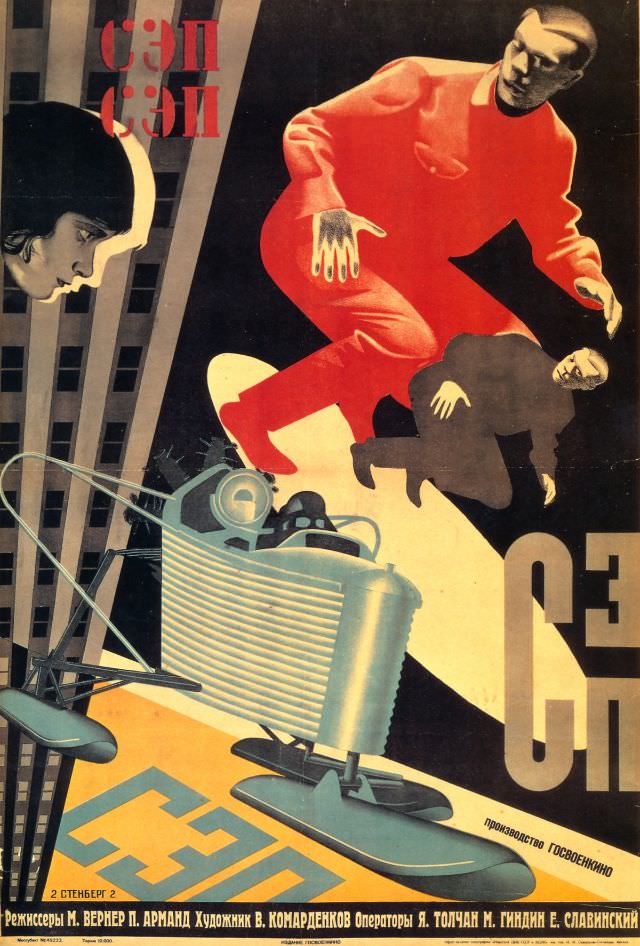
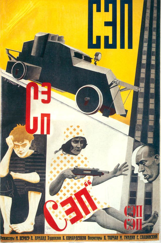
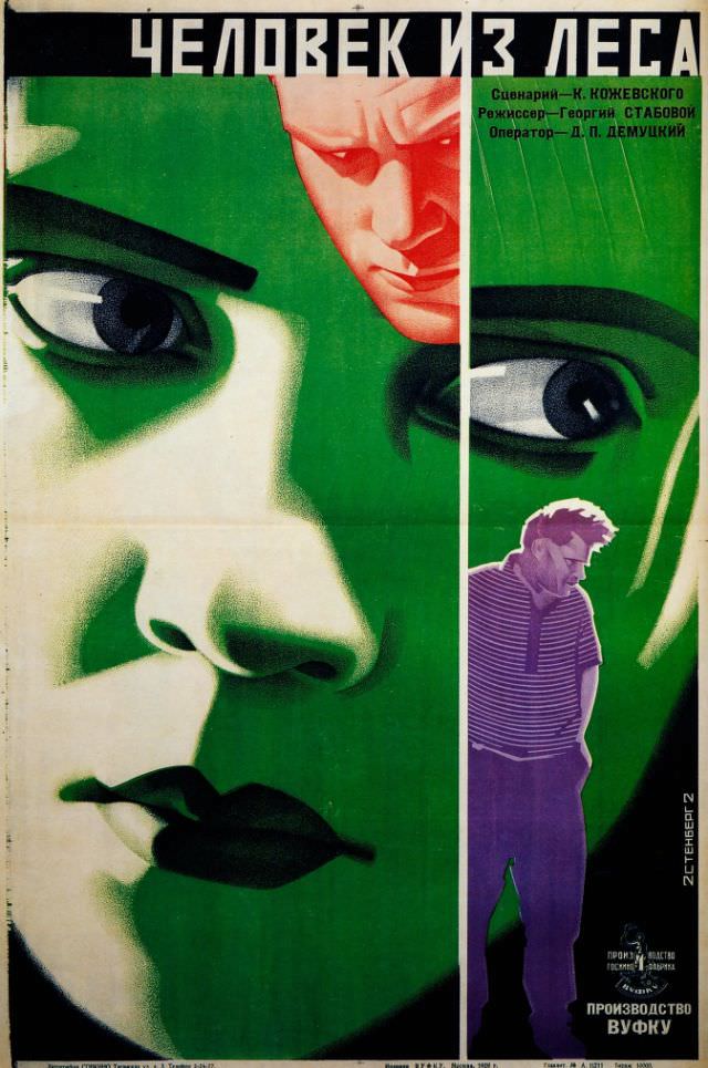
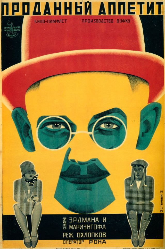
Each poster was designed for a specific public context — pasted on walls and kiosks across Soviet cities where foot traffic was constant. The Stenbergs understood that a poster had only a fraction of a second to register. That constraint pushed them to make every element count, from the angle of a figure’s gaze to the weight of a single letterform.
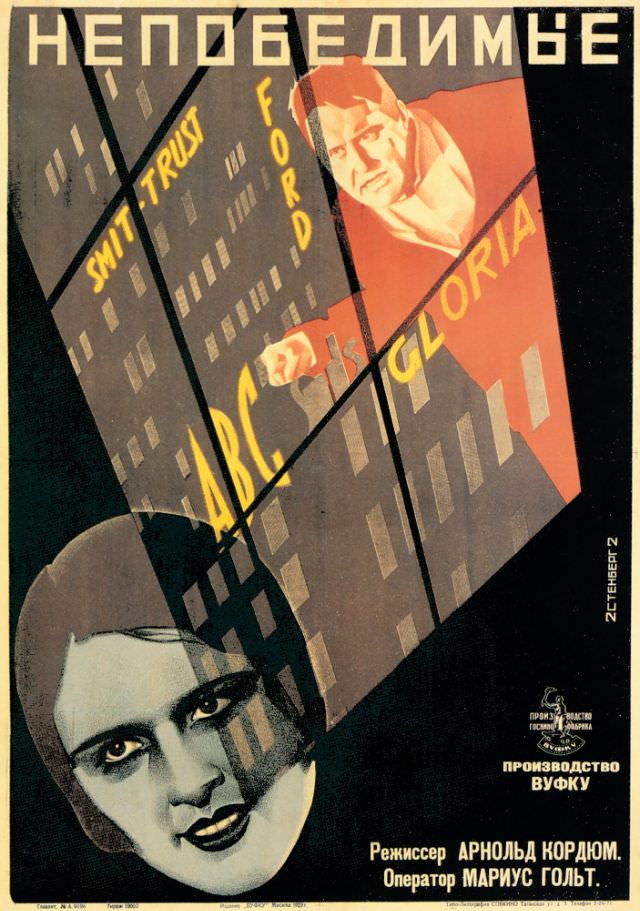
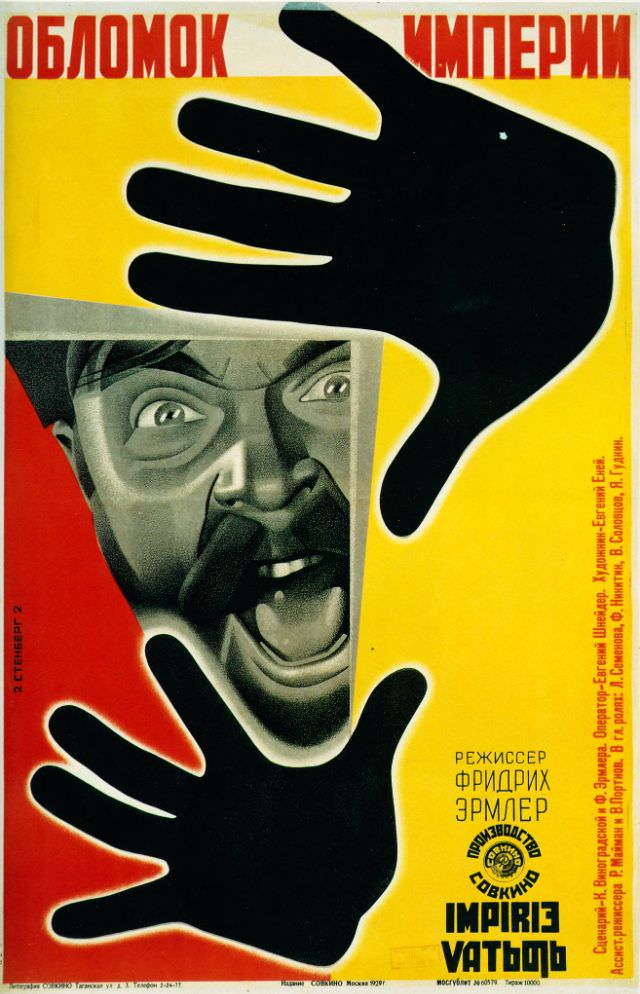
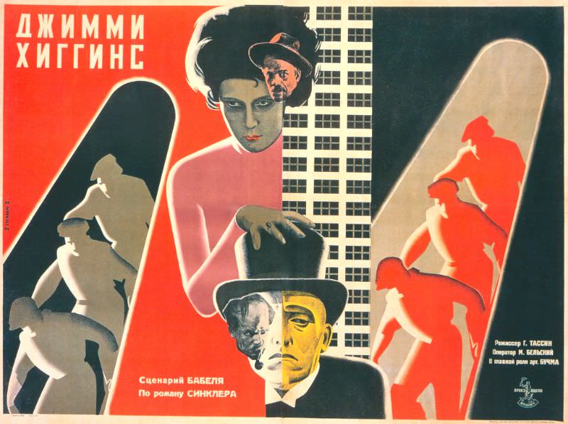
Their 1929 poster for Dziga Vertov’s Man with the Movie Camera is among the most recognized works of Soviet graphic design. The film itself was a documentary experiment with no plot and no actors — and the Stenberg Brothers matched its radical spirit with a composition that was equally restless and fragmented. That same year, they produced multiple posters for Buster Keaton’s The General, including an alternate version, demonstrating both their range and their international scope.
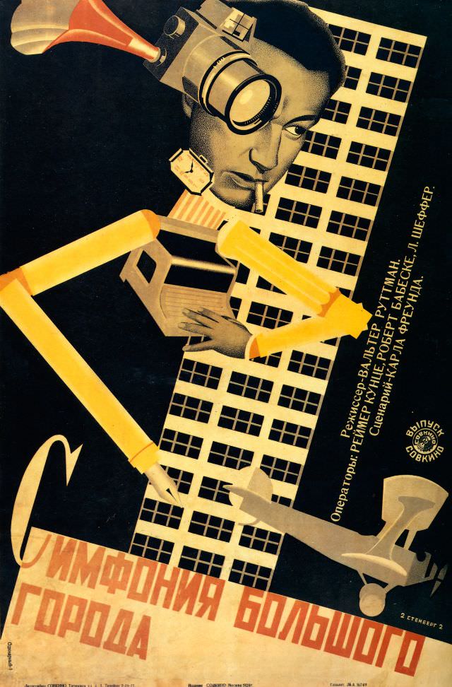
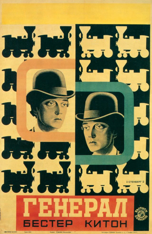
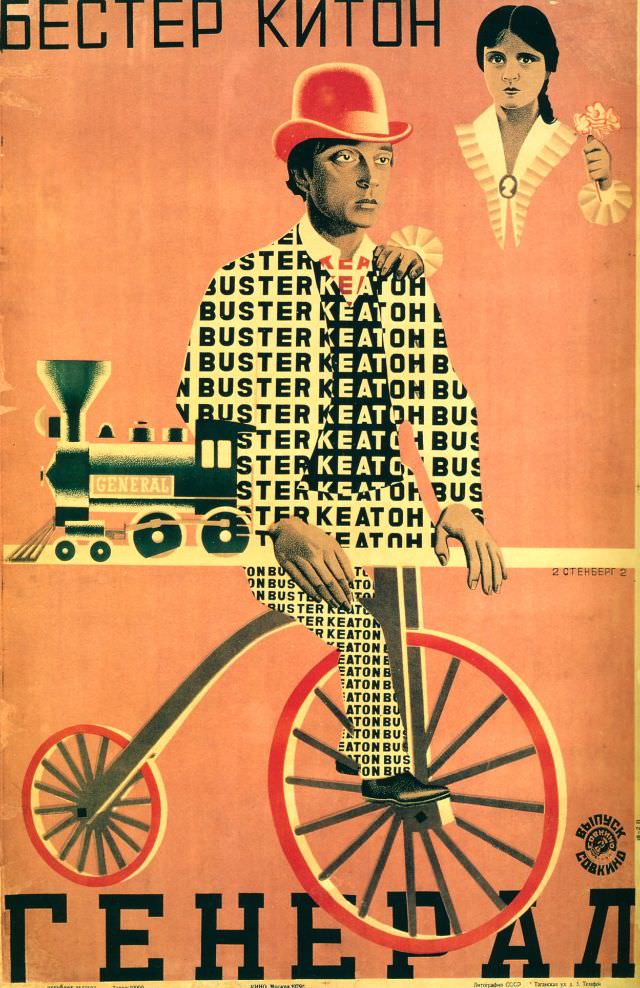
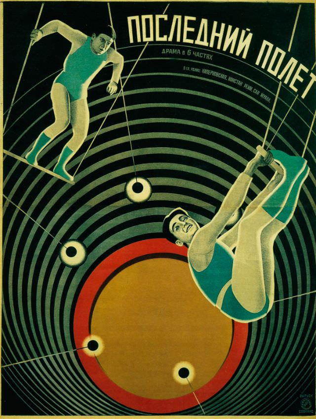
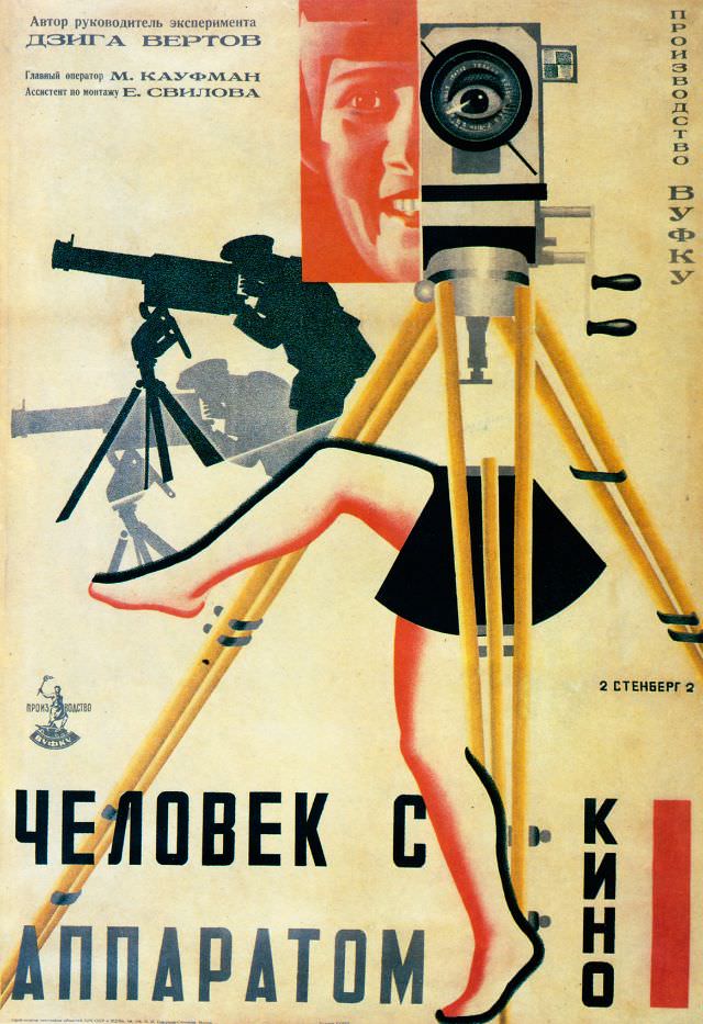
Across the decade, the Stenberg Brothers produced hundreds of posters. Their work covered foreign imports and domestic productions without changing their visual standards. Whether the film was a comedy or a political drama, the poster communicated urgency, movement, and a clear point of view — qualities that set their designs apart from anything else being produced at the time.