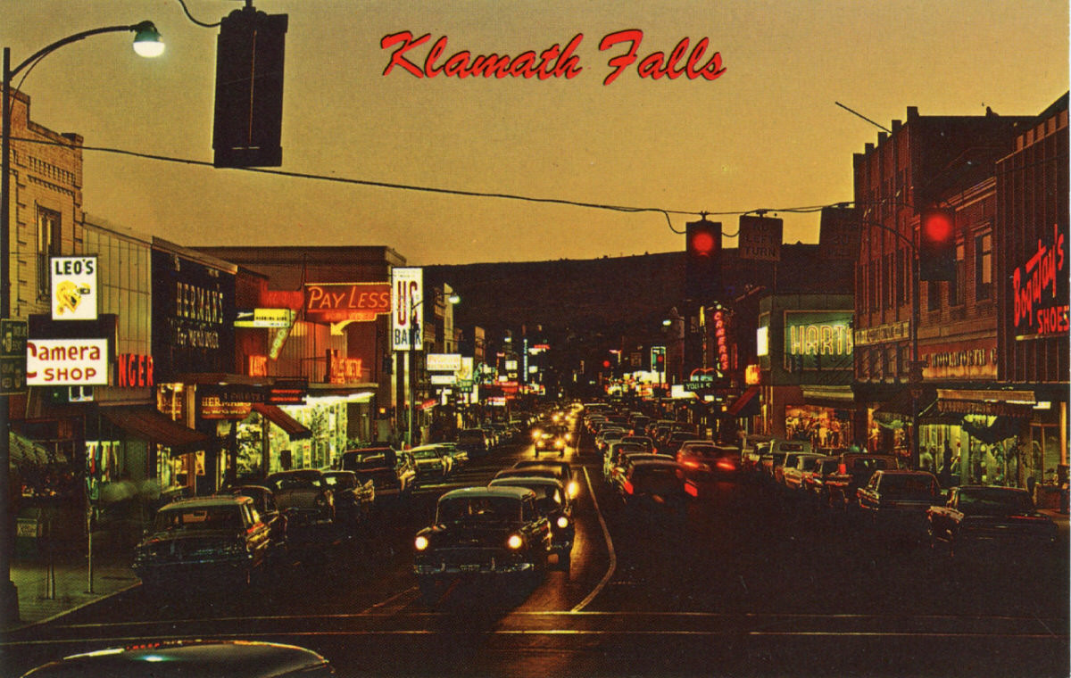
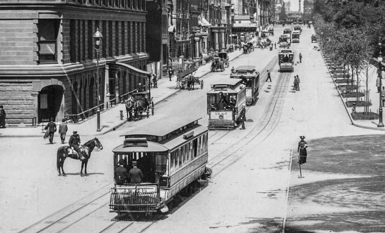
Long before smartphones and social media, postcards were one of the fastest ways to share a moment with someone far away. They exploded in popularity in the late 19th and early 20th centuries, giving ordinary people a simple, affordable way to communicate. A quick message on the back, a stamp on the front, and a vivid image of somewhere new — that was all it took.
By the 1960s, postcards had entered what collectors call the “chrome” era — a name shortened from Photochrom. This era began around 1939, but chrome cards didn’t fully take over the market until about 1950, partly because World War II caused material shortages that slowed production. These cards featured images based on color photographs and were easy to spot: they had a glossy, almost jewel-like surface that made colors pop.
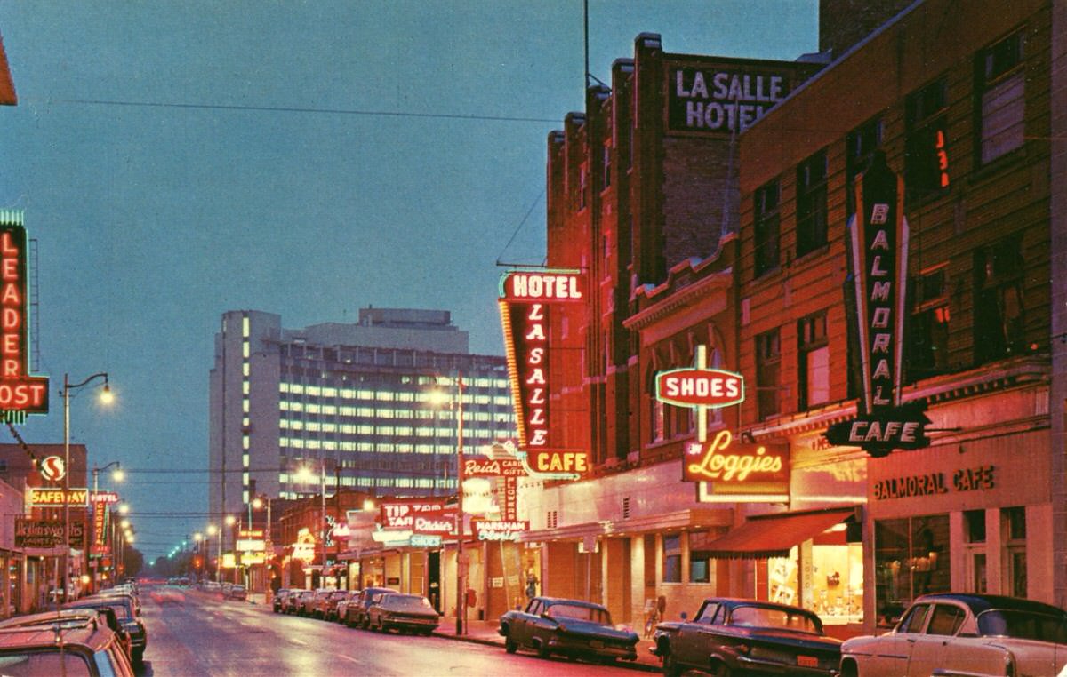
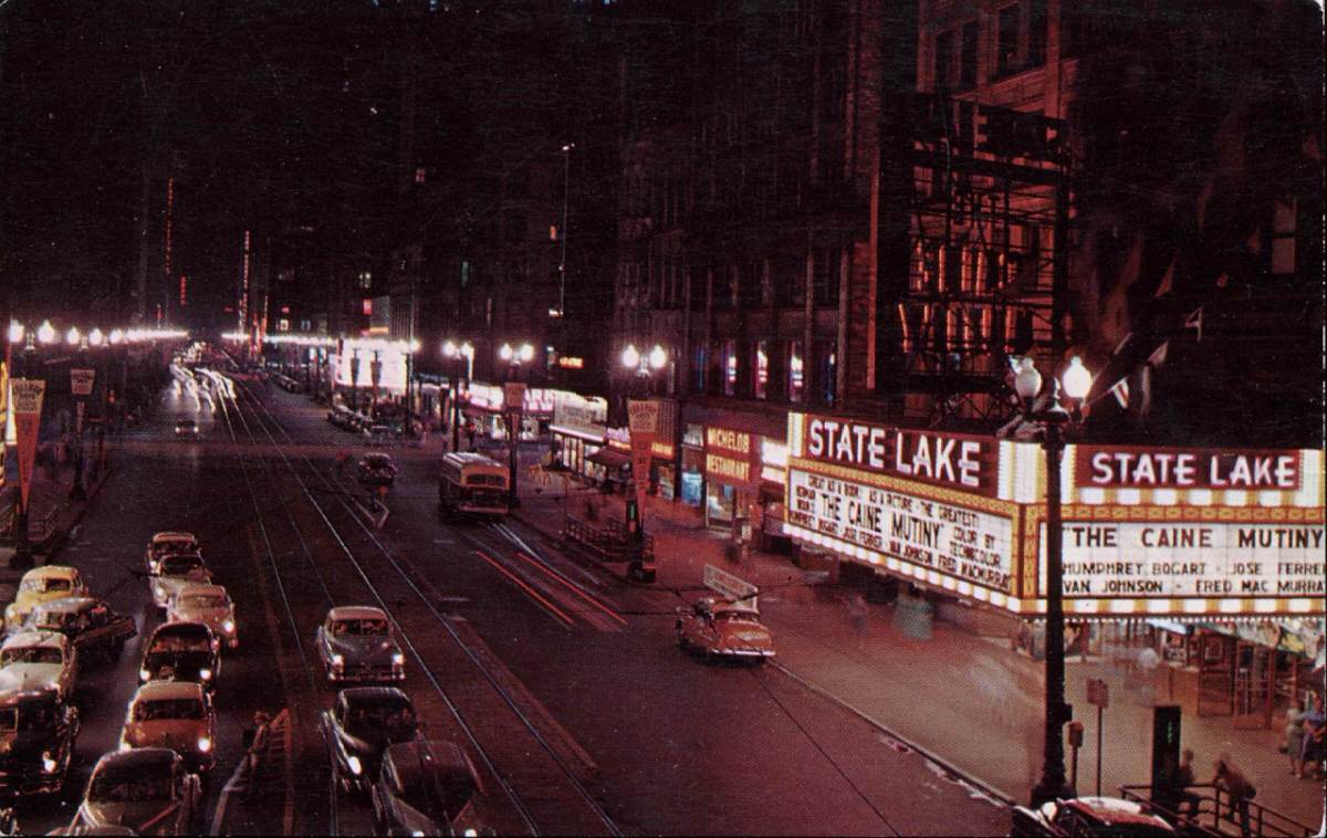
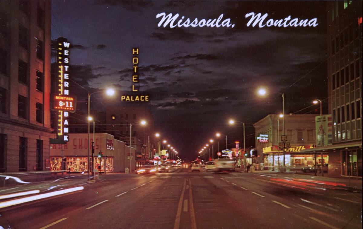
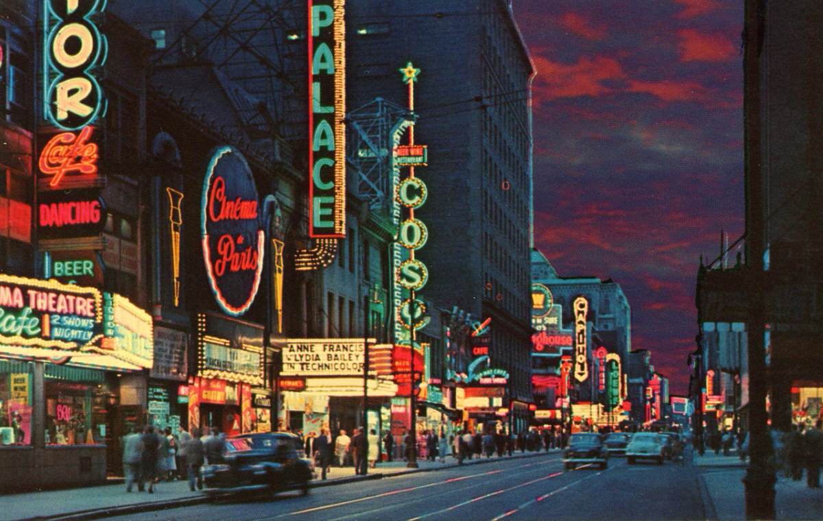
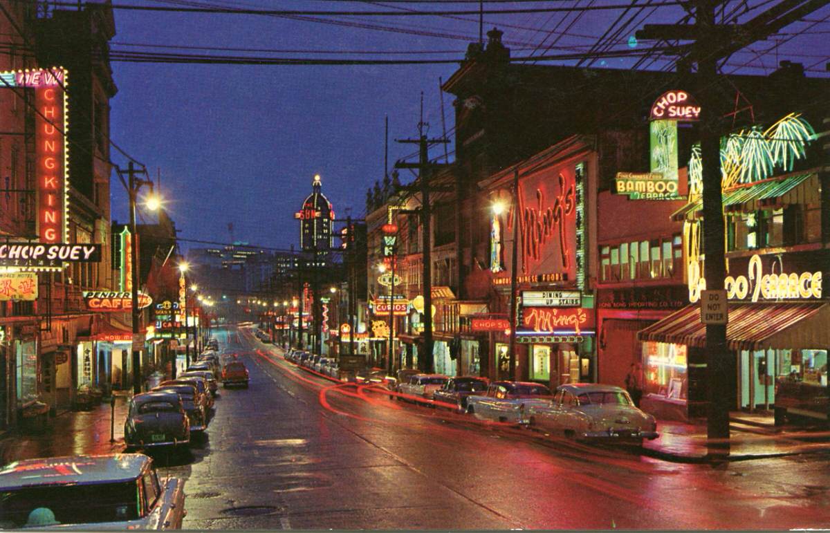
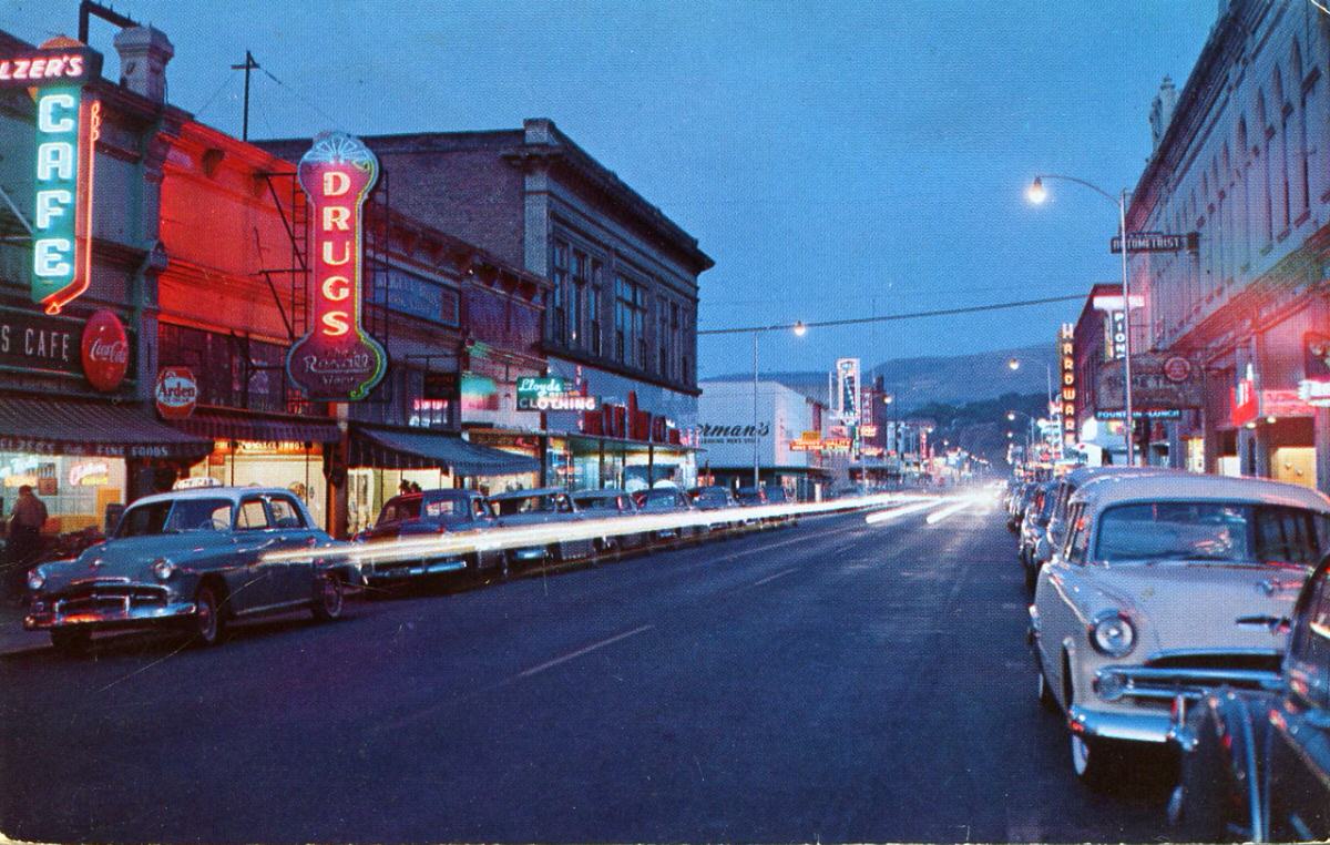
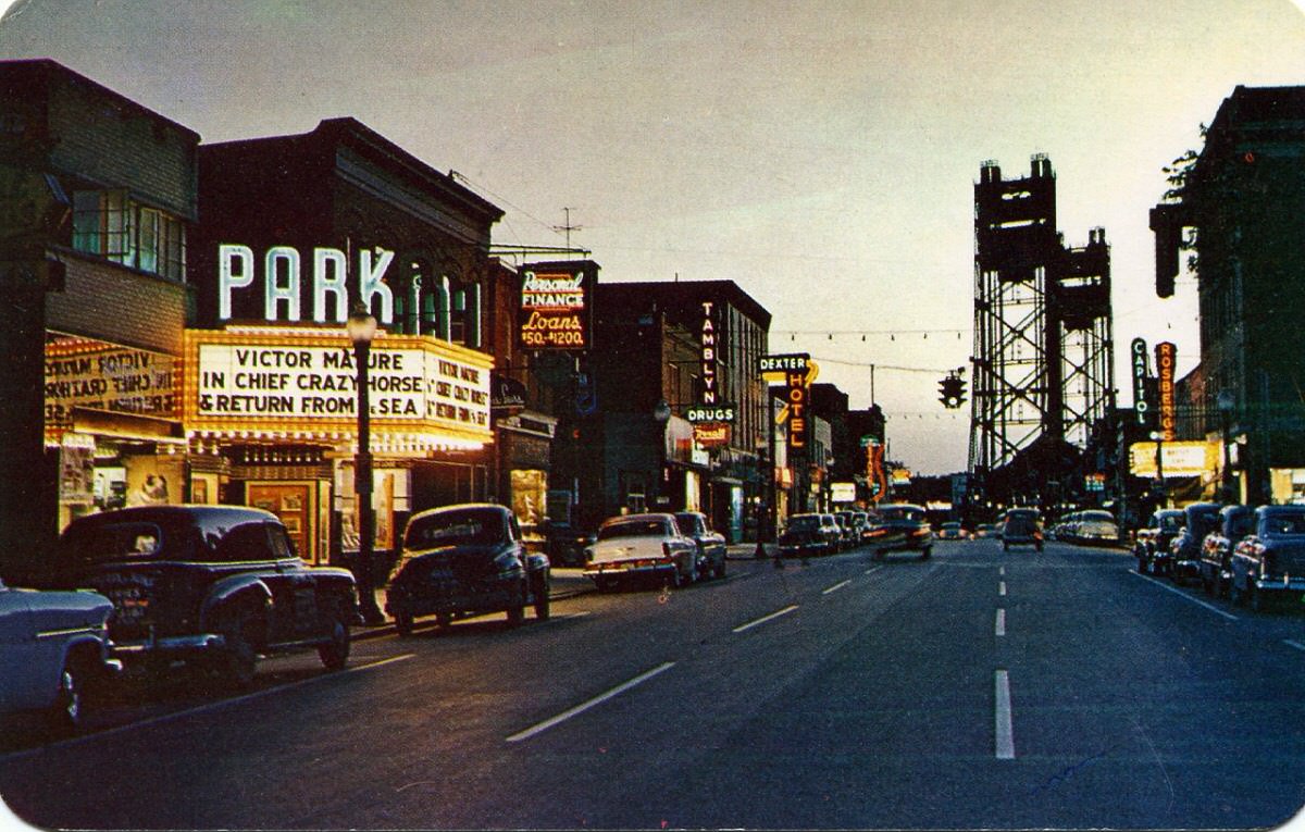
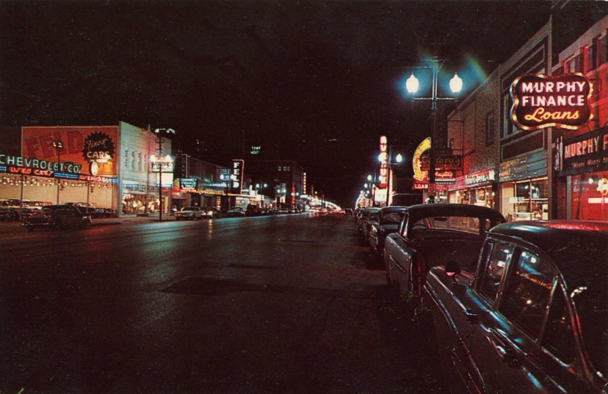
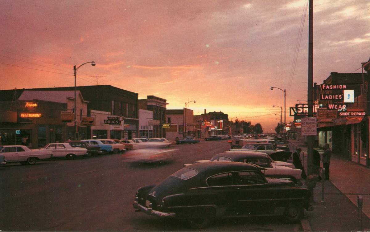
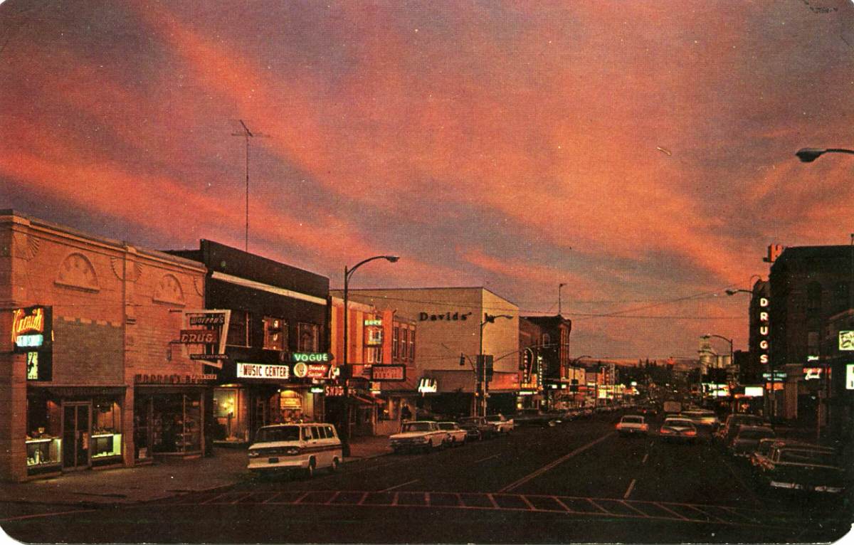
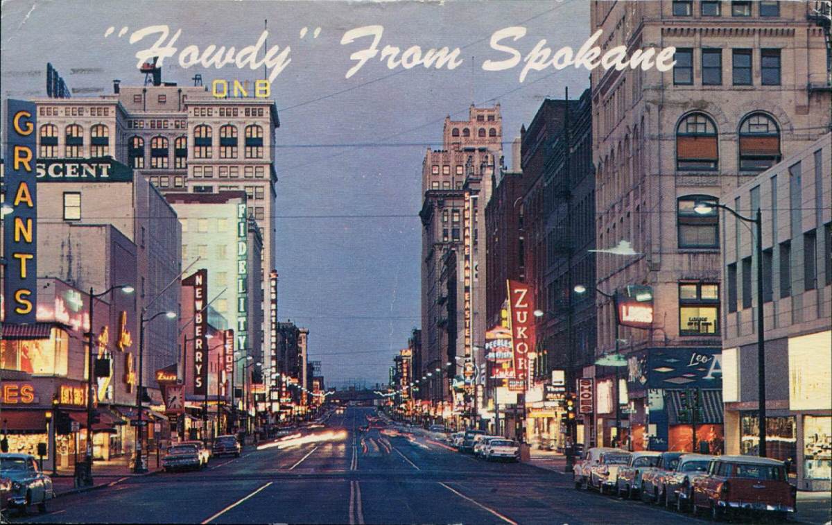
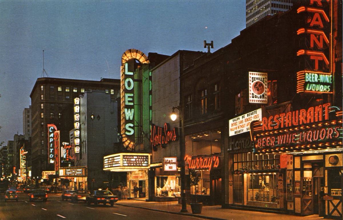
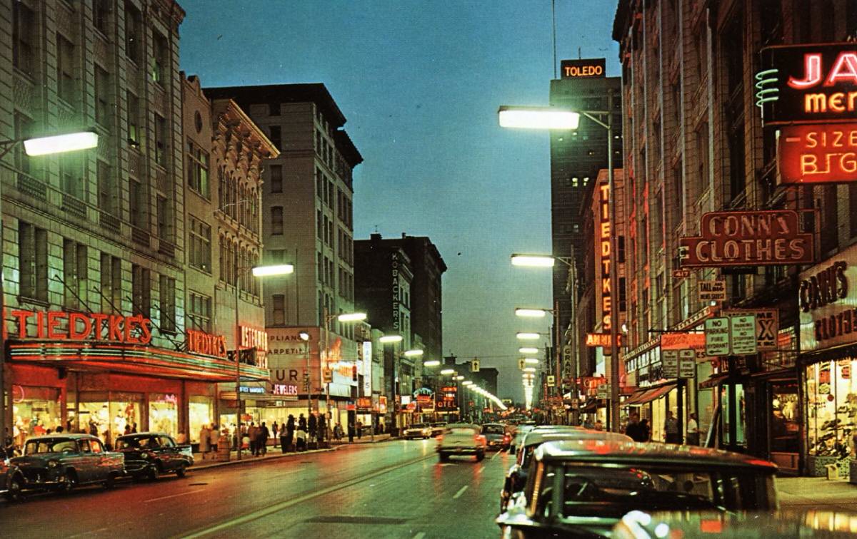
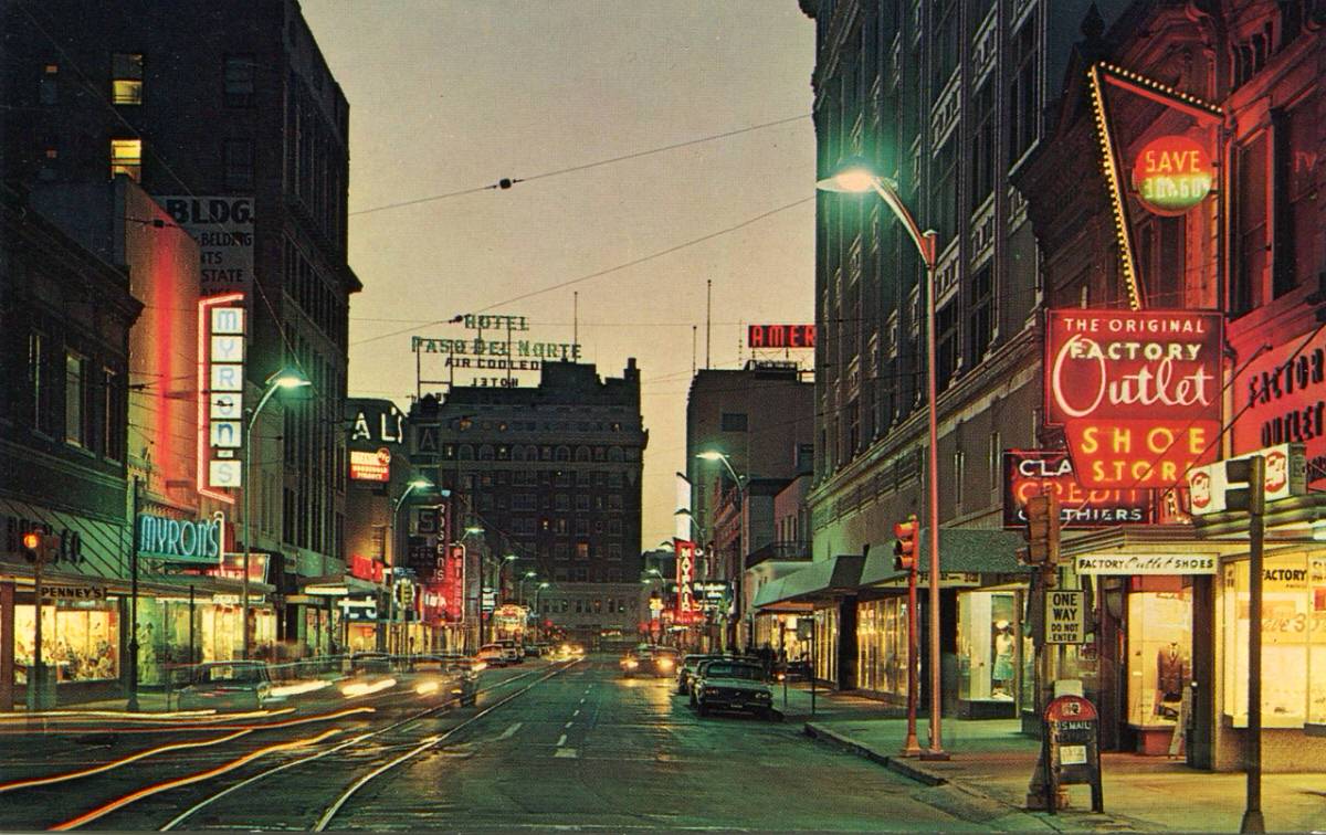
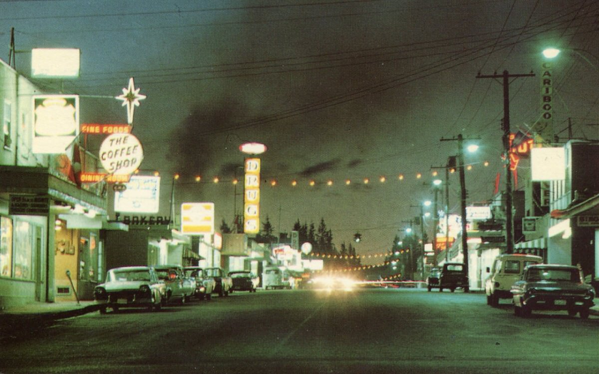
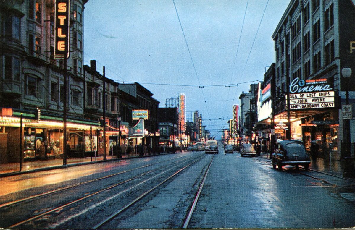
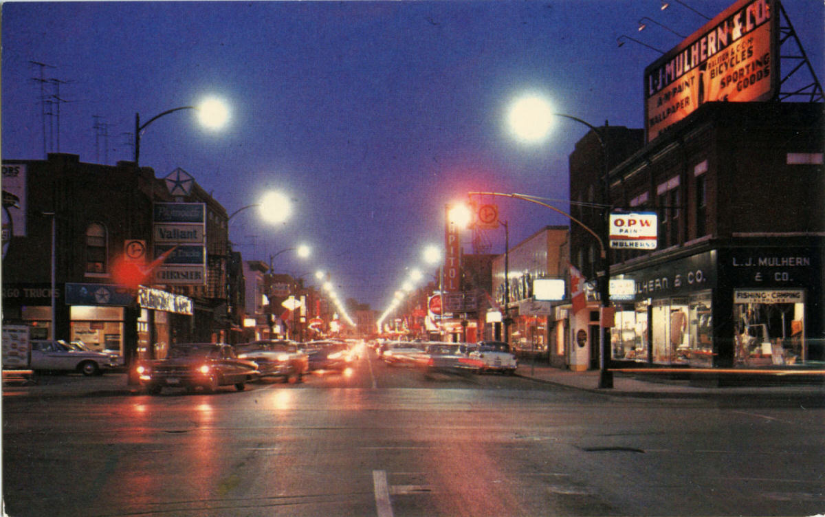
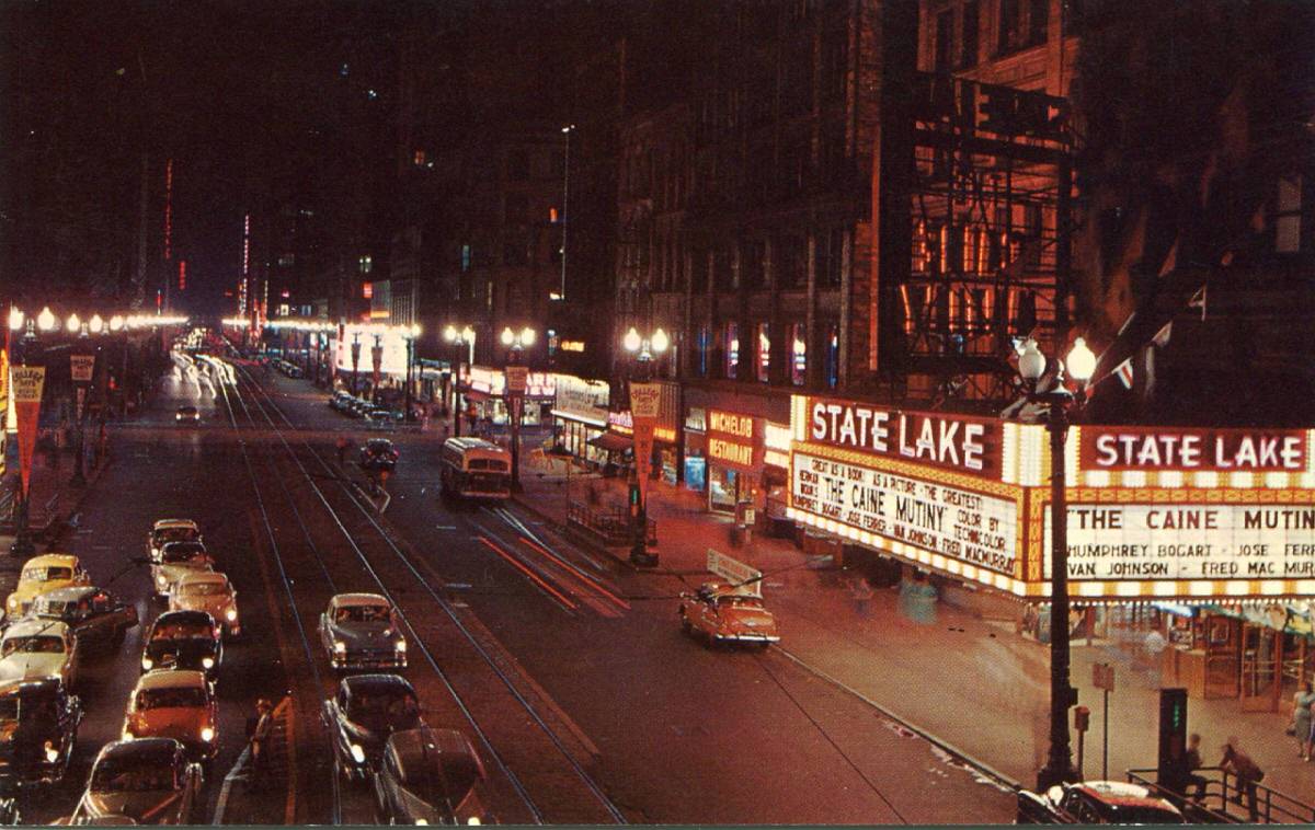
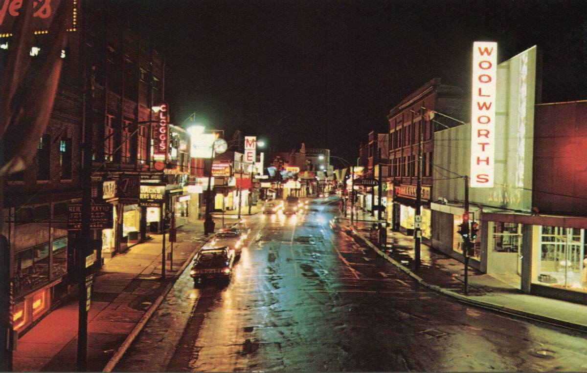
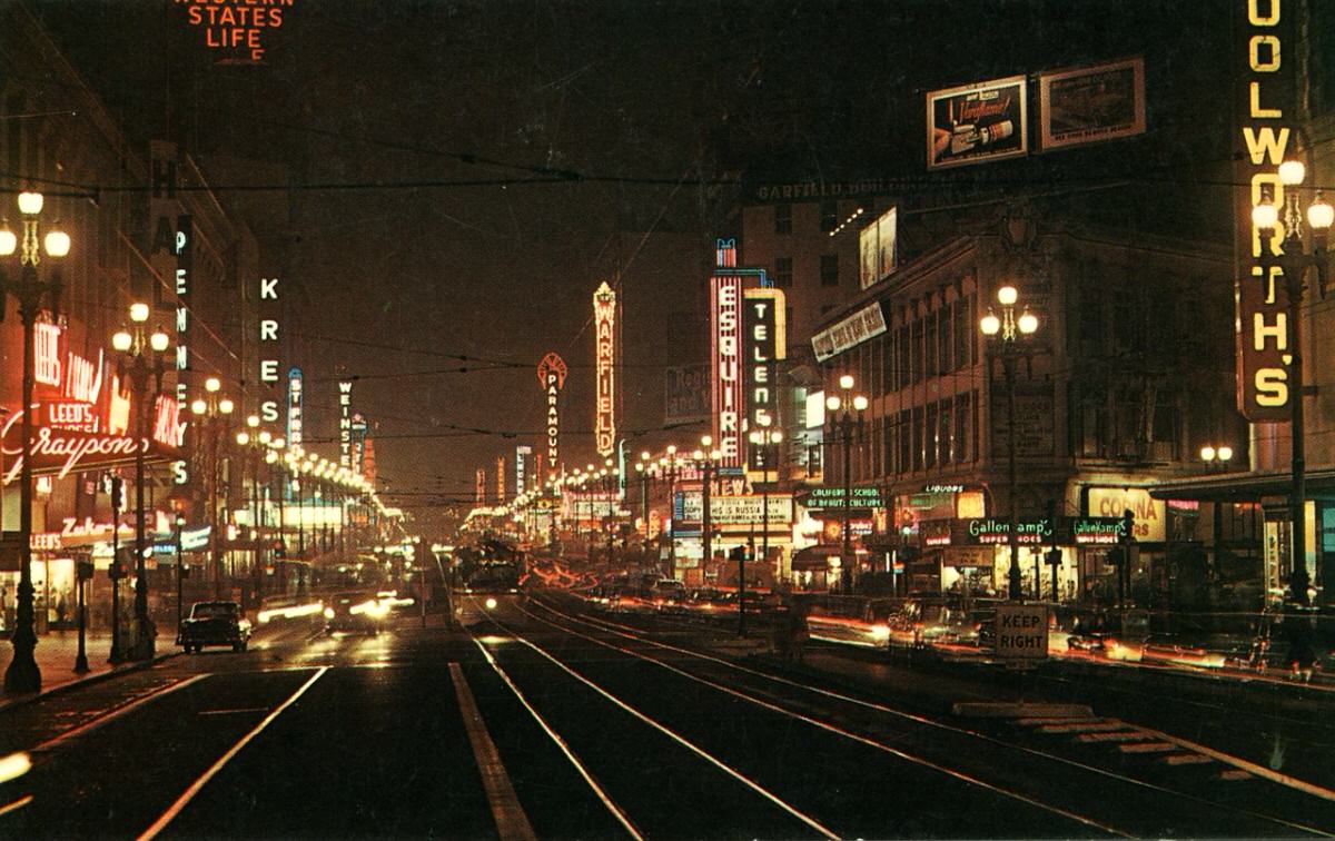
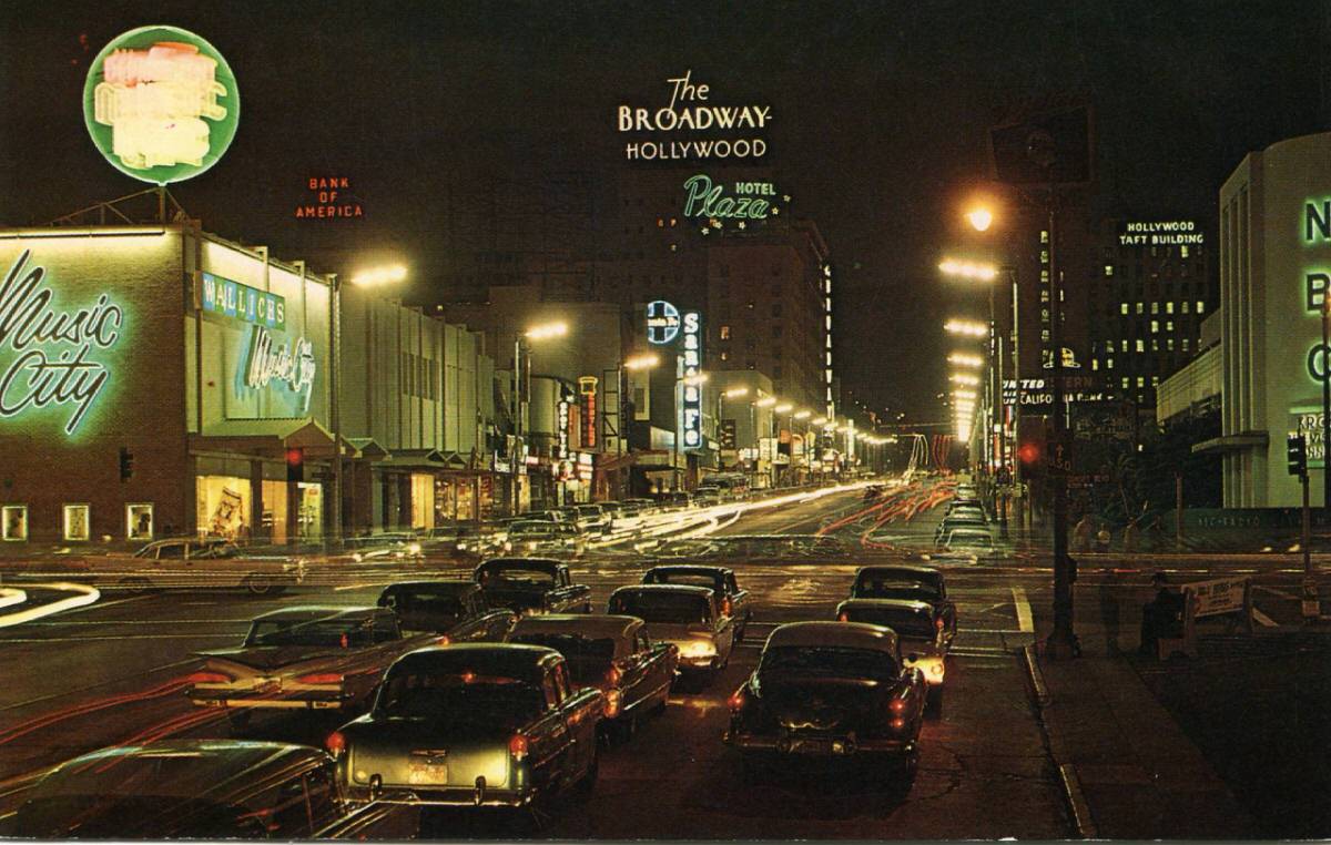
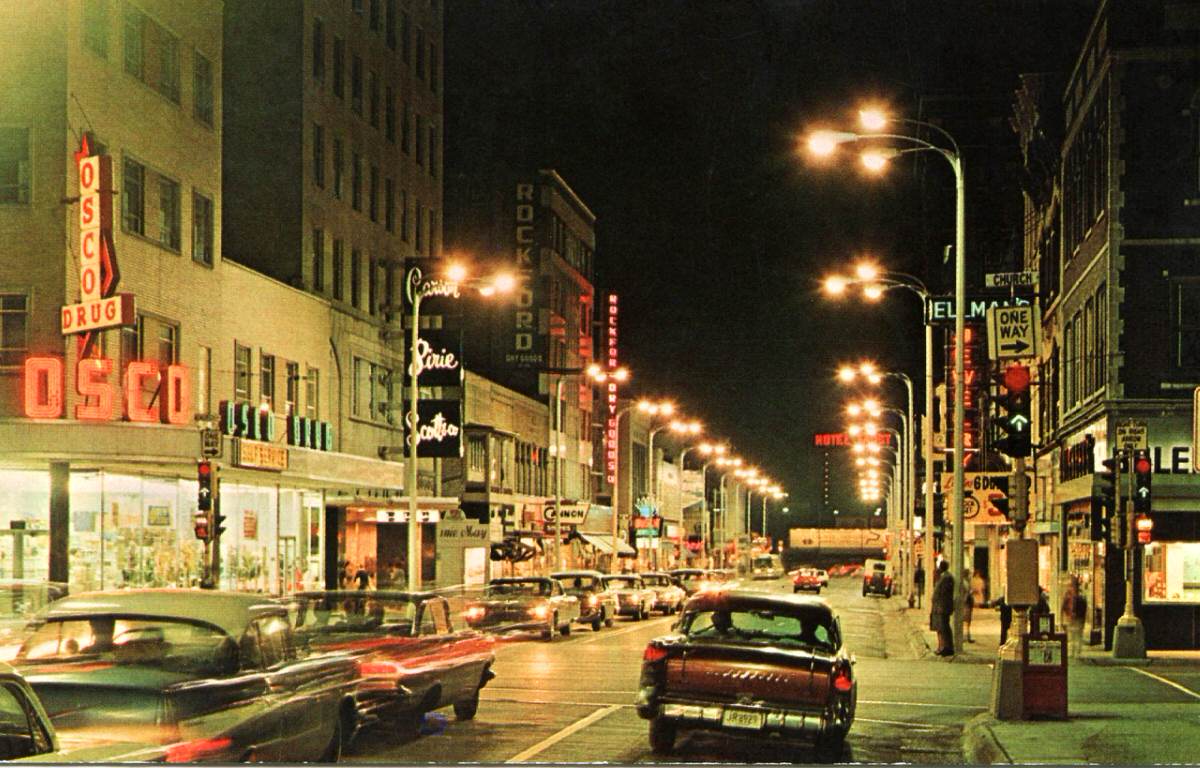
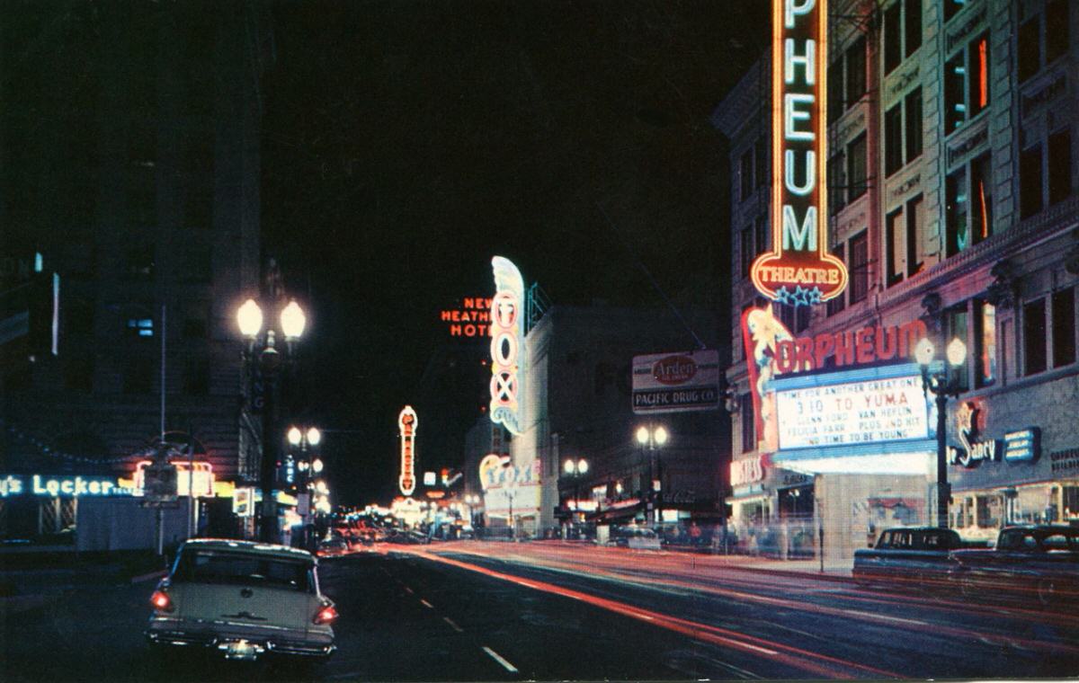
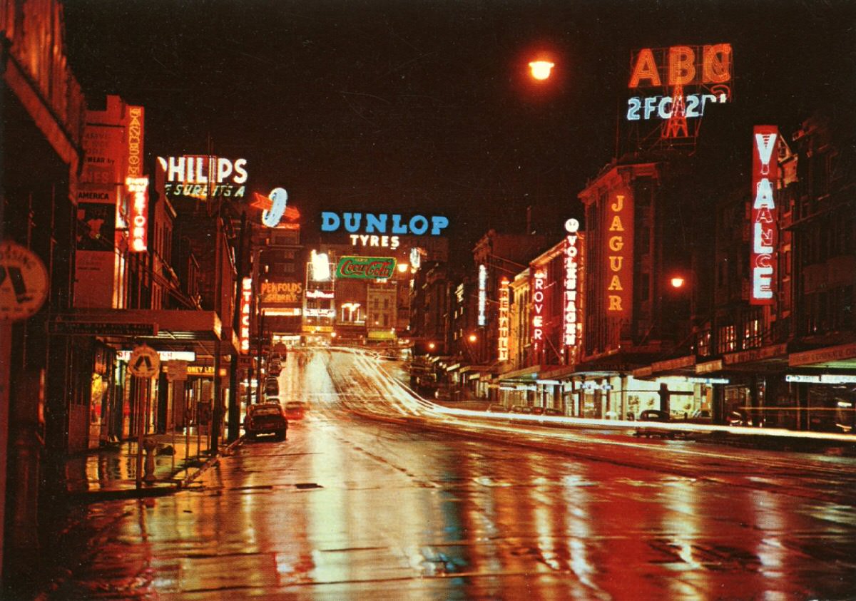
Night scenes were a favorite subject for chrome-era postcard makers. City streets after dark, lit up by neon signs, storefronts, and passing cars, translated beautifully onto glossy card stock. The long streaks of headlights, the warm glow of restaurant windows, and the reflections on wet pavement all became part of the appeal. Cities across North America — from small prairie towns to major urban centers — were captured this way.
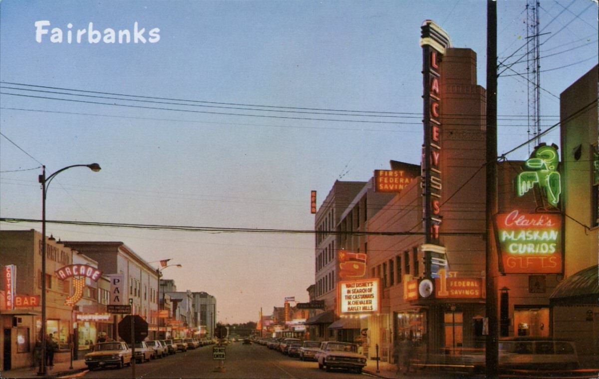
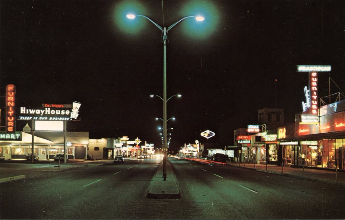
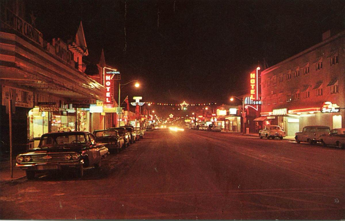
In smaller cities and towns, these postcards served a point of local pride. A well-lit main street on a chrome card told the world that your town was alive and thriving. Shops, theaters, and diners all competed for space in the frame.
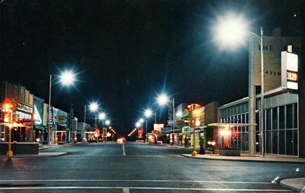
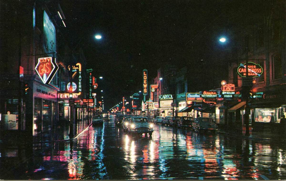
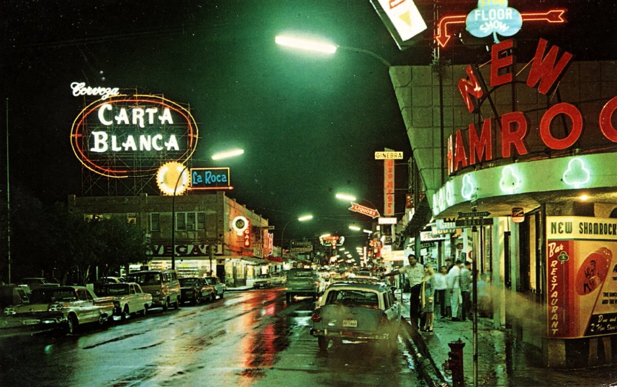
The chrome postcard’s glossy coating came from a special paper treatment applied during printing. This coating gave the finished card a sheen that plain photo postcards — known as Real Photo Postcards, or RPPCs — simply didn’t have. The result was a product that looked polished and professional, even when depicting a quiet two-lane street in a small Canadian or American town.
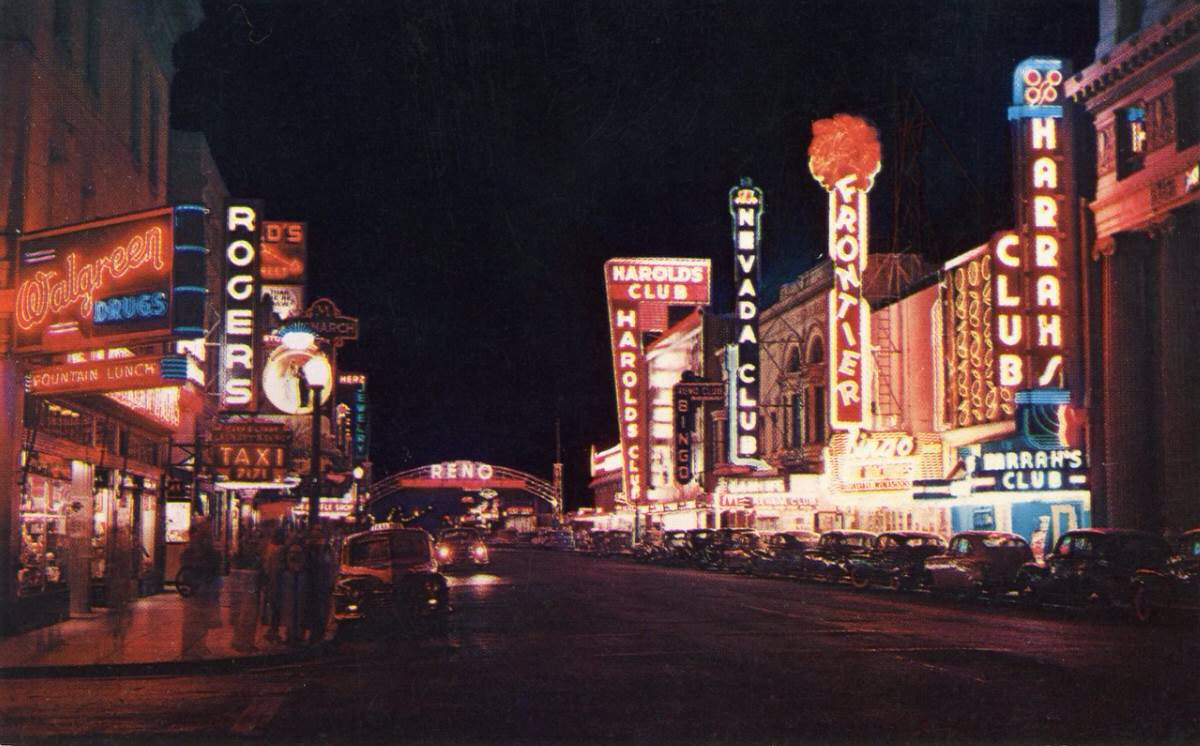
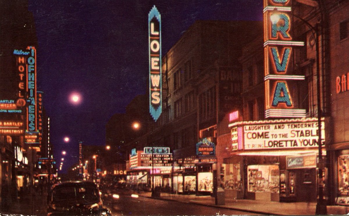
The biggest cities got some of the most dramatic treatment. Places like Times Square in New York and State Street in Chicago were natural fits for the night postcard format — their dense neon signage and heavy foot traffic made every frame feel electric.
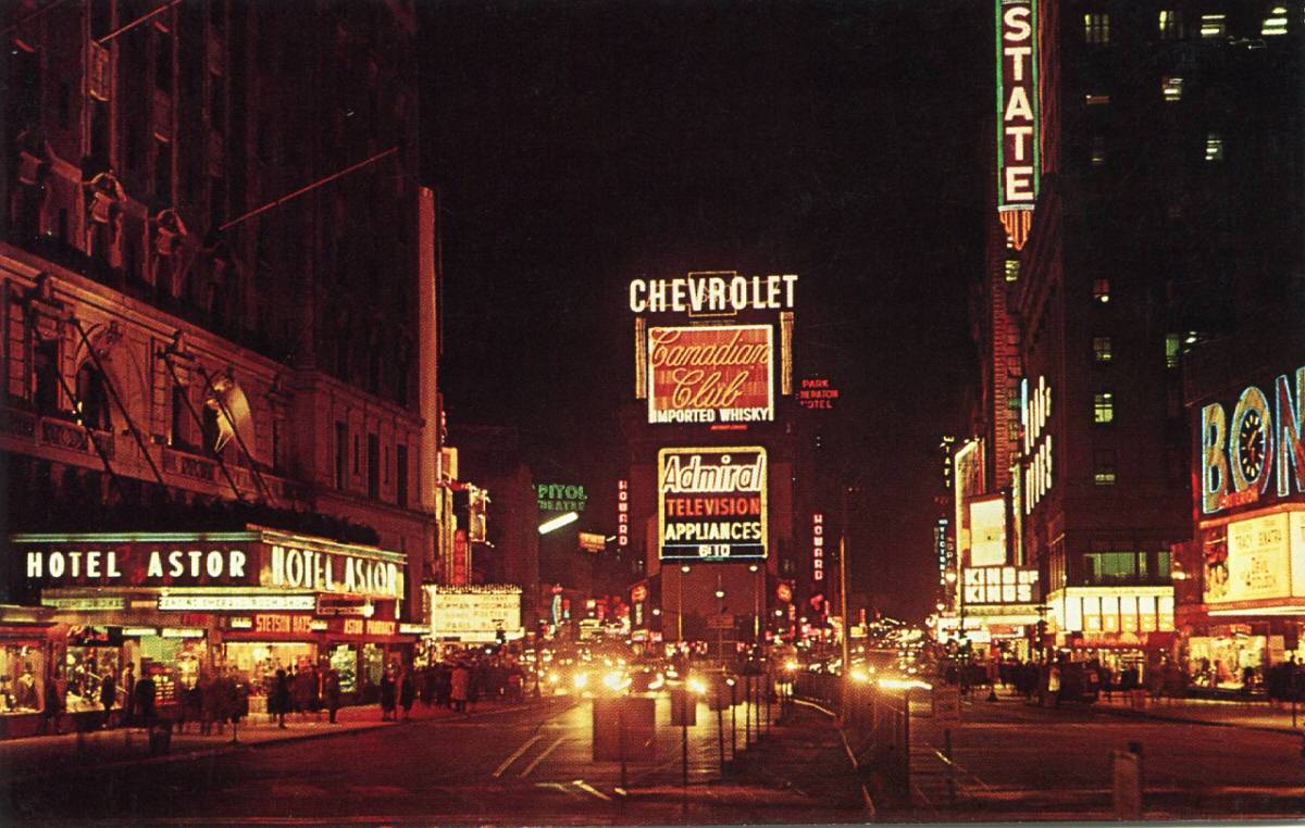
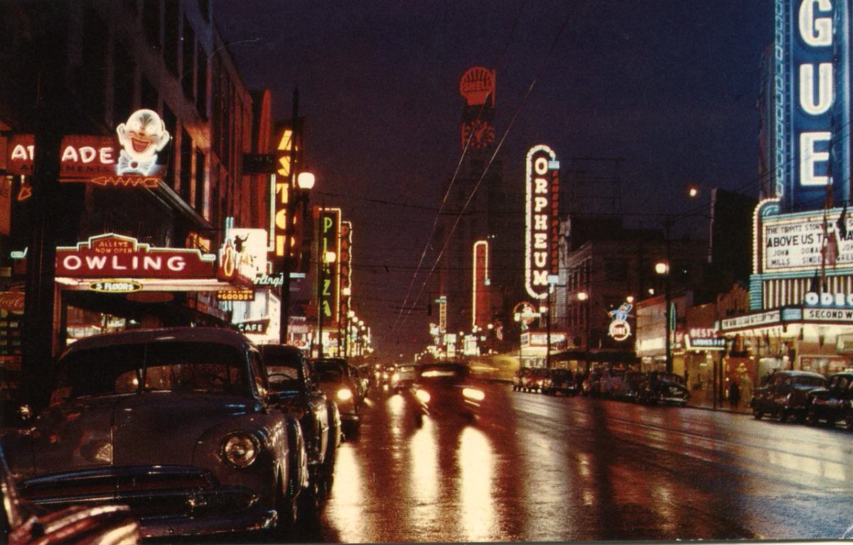
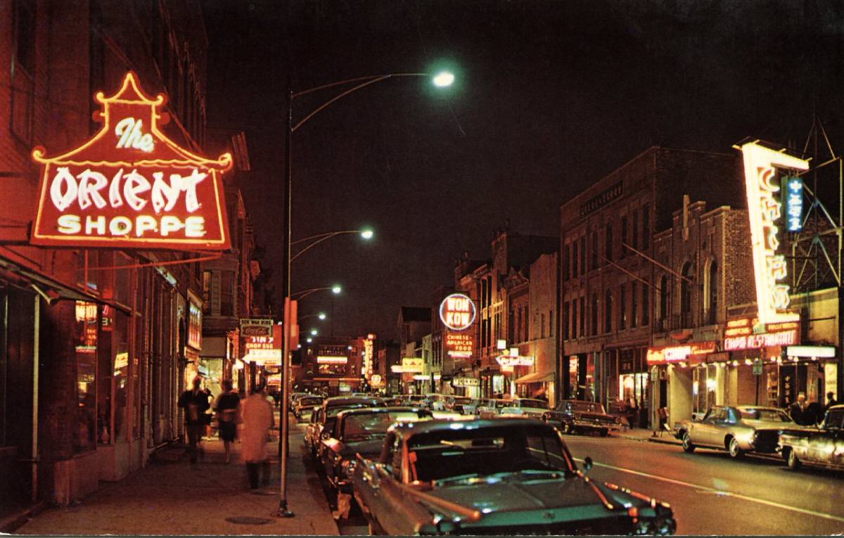
Ethnic neighborhoods also made their way onto postcard racks. Chicago’s Chinatown and Vancouver’s Chinatown were both photographed at night, their lanterns and bilingual signs giving the images a distinct character that stood apart from standard downtown street scenes.
West Coast cities from San Francisco to Portland gave photographers a wide range of backdrops. Market Street in San Francisco and Broadway in Portland both appeared on popular cards sold throughout the decade.
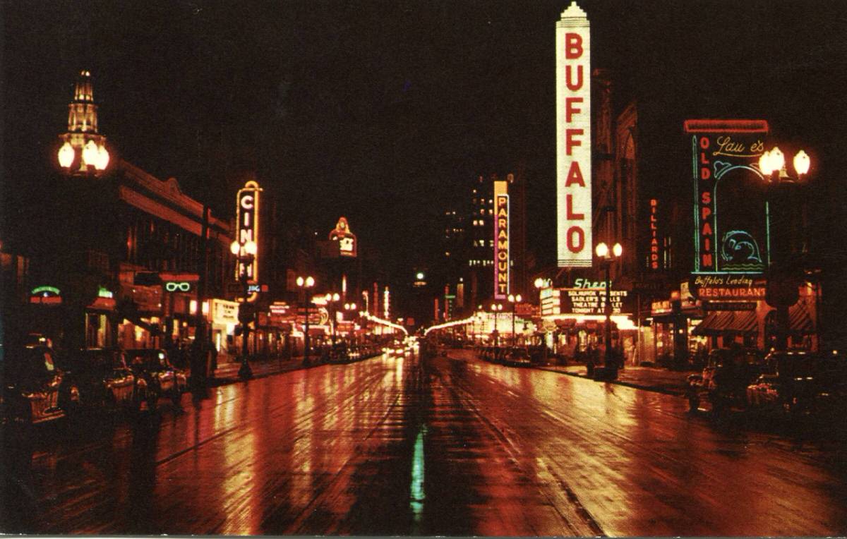
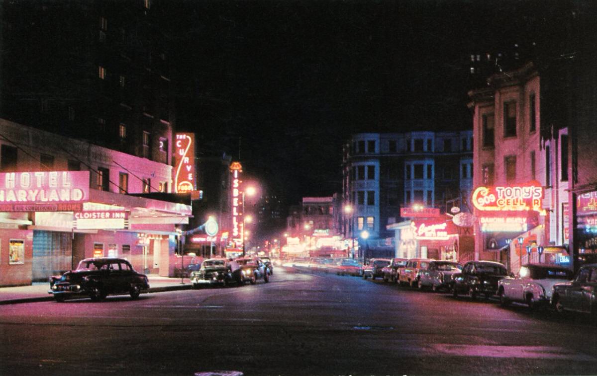
Hollywood, naturally, had its own postcard identity. The intersection of Sunset and Vine became one of the most recognizable night-scene images of the era — a symbol of the entertainment industry’s glamour made accessible on a 3.5-by-5.5-inch card.
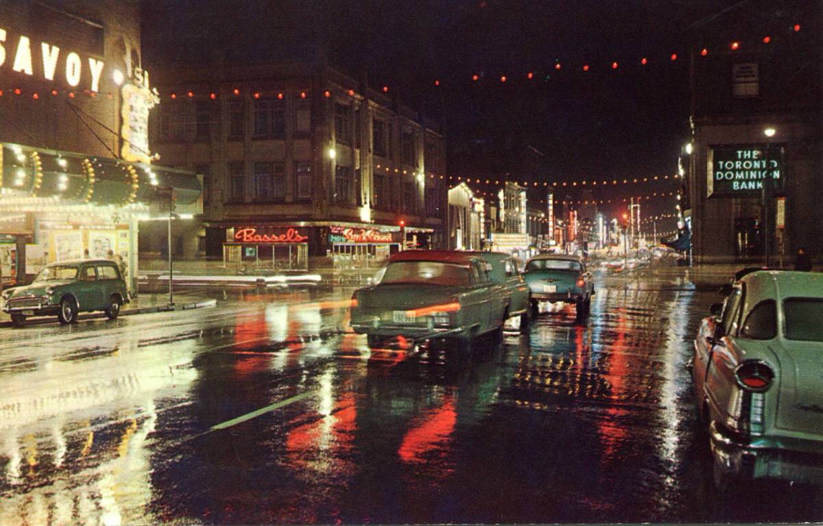
Canadian cities showed up in force across the chrome postcard market. Toronto’s Yonge Street, Montreal’s St. Catherine Street, and Vancouver’s Granville Street all received the glossy nighttime treatment, sitting alongside cards from smaller centers like Vernon, Moncton, and Welland.
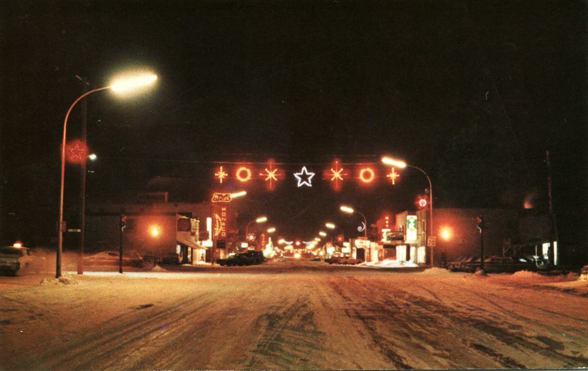
Even remote or modest towns made the cut. Chibougamau, Quebec — a small mining city in northern Canada — appeared on a chrome night postcard, its main street lit just enough to make the frame work. The same was true for towns like Estevan, Saskatchewan and Moscow, Idaho.