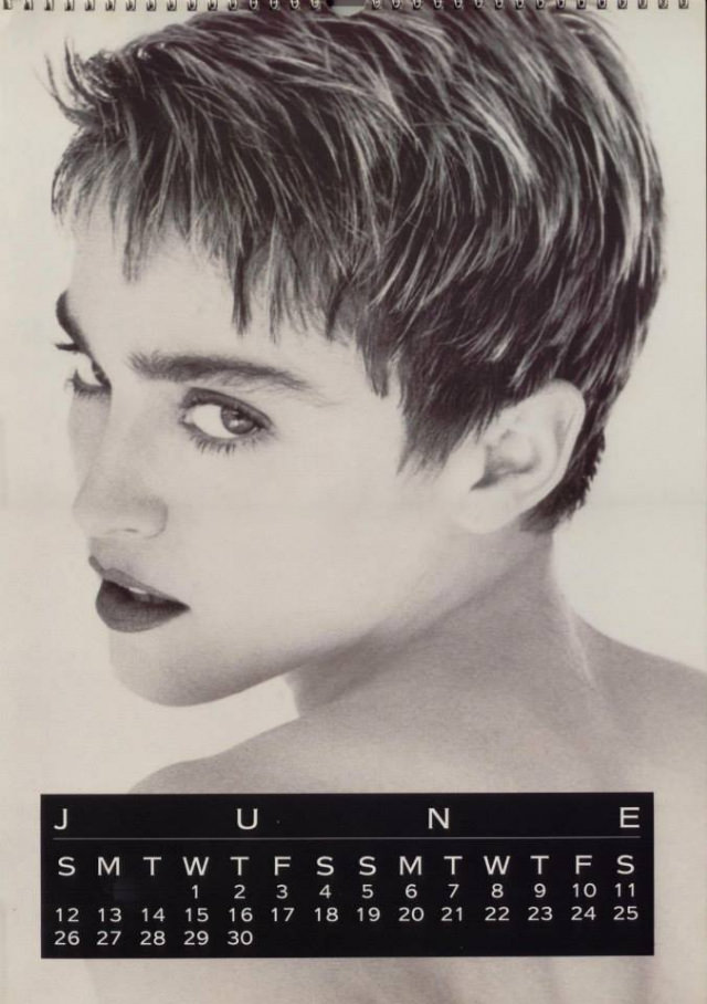
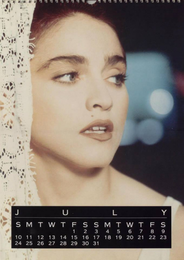
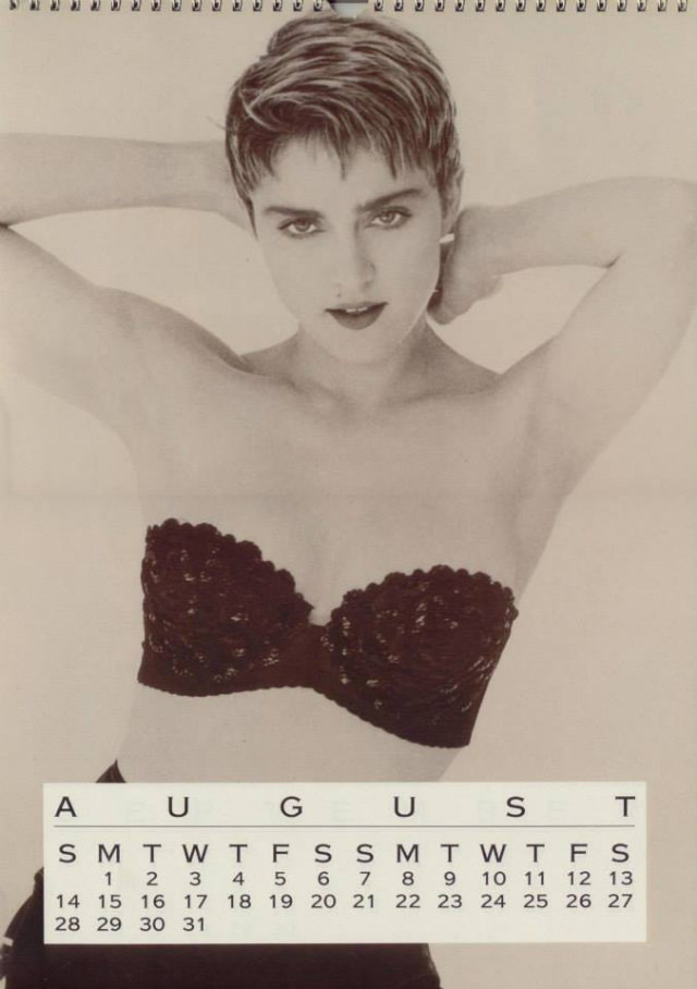
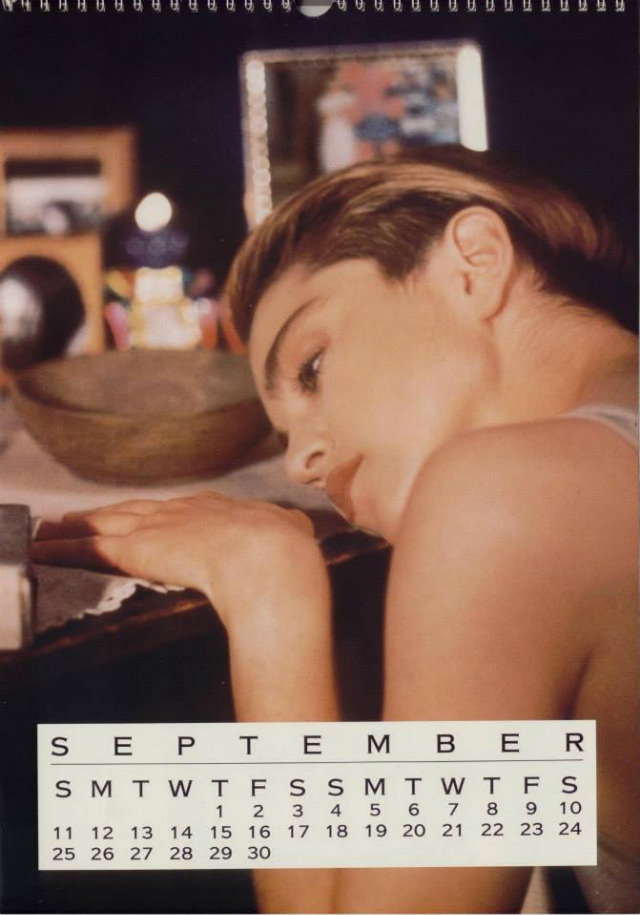
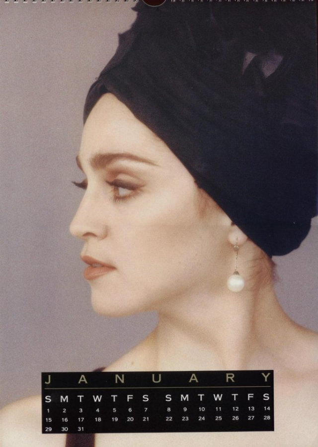
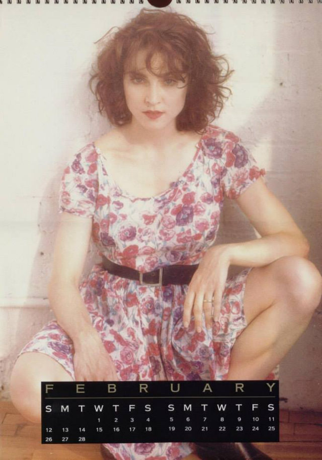
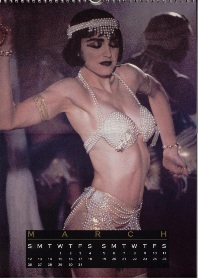
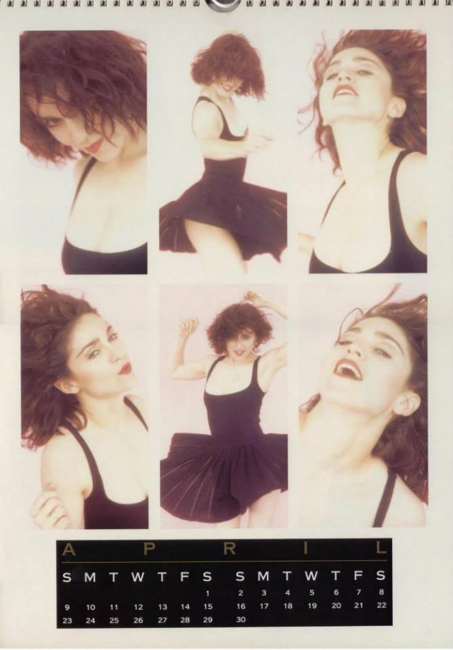
By the mid-1980s, Madonna was one of the most photographed women in the world. Her face sold magazines, her videos dominated MTV, and her merchandise flew off shelves. Among the most popular items in her official product line were her annual calendars, released each year from 1986 through 1989. They weren’t just promotional tools — they were carefully curated visual records of one of pop music’s most image-driven careers.
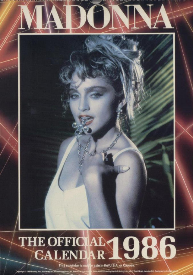
Each calendar was produced as part of Madonna’s official merchandise line, meaning the photos inside were vetted and approved as part of her public image strategy. Fans weren’t getting paparazzi snapshots. They were getting polished, intentional photographs that showed exactly the version of Madonna she wanted the world to see.
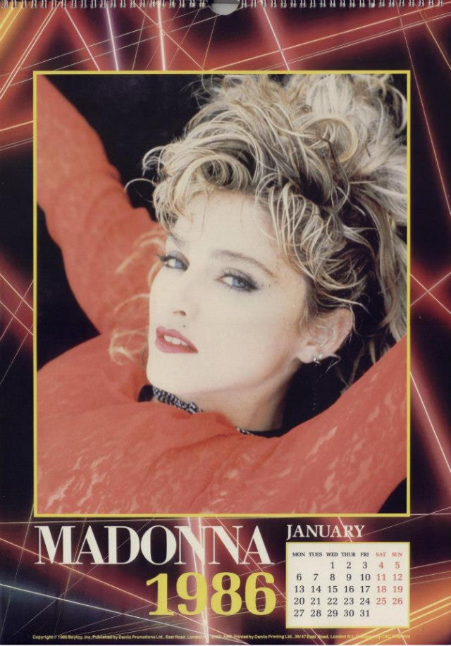
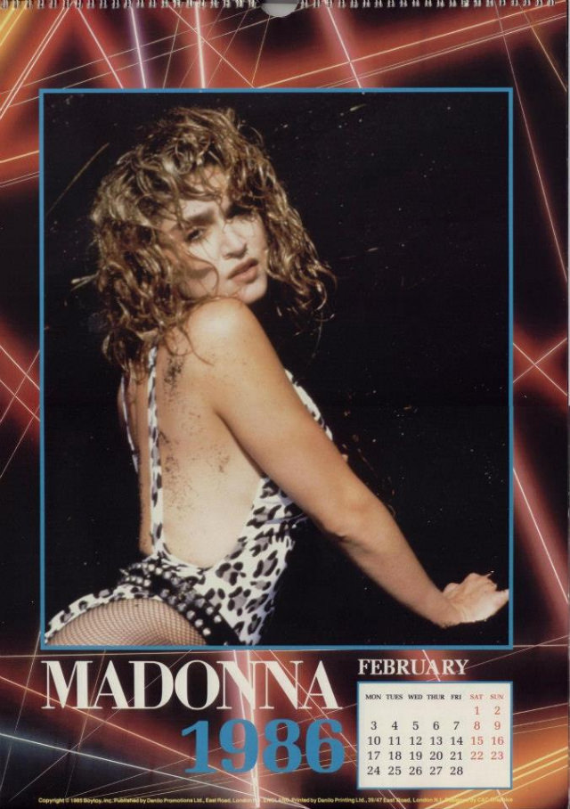
The 1986 calendar arrived at a pivotal moment. Madonna had just wrapped the Virgin Tour in 1985 and her film debut in “Desperately Seeking Susan” had hit theaters that same year. The photos from that period reflected a bold, layered look — lace gloves, crucifixes, teased hair, and heavy eye makeup. The style was street-meets-glamour, and it was entirely her own.
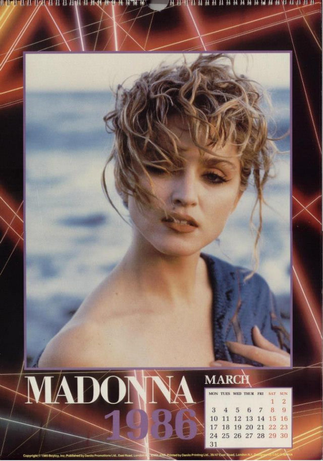
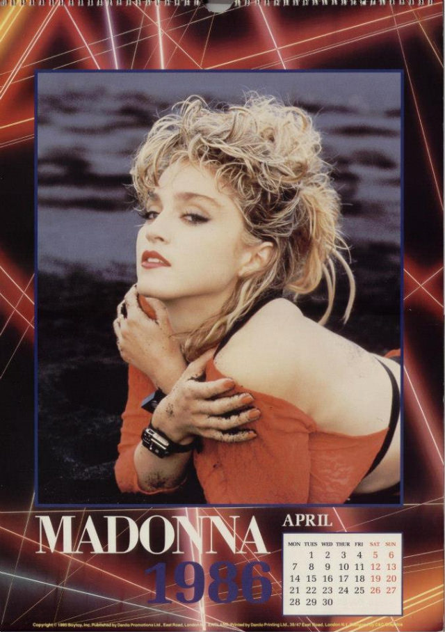
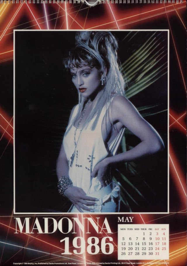
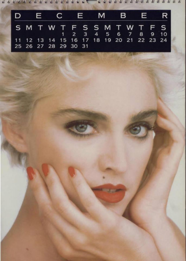
By 1987, her look had shifted. The “True Blue” album era brought a cleaner, more polished aesthetic. Platinum blonde hair replaced the darker, messier styles of her early years. The calendar images from this period leaned into that transformation — sharper fashion choices, more controlled styling, and a confidence that matched her growing global profile.
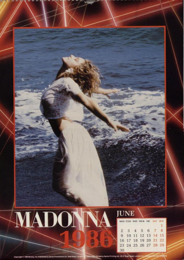
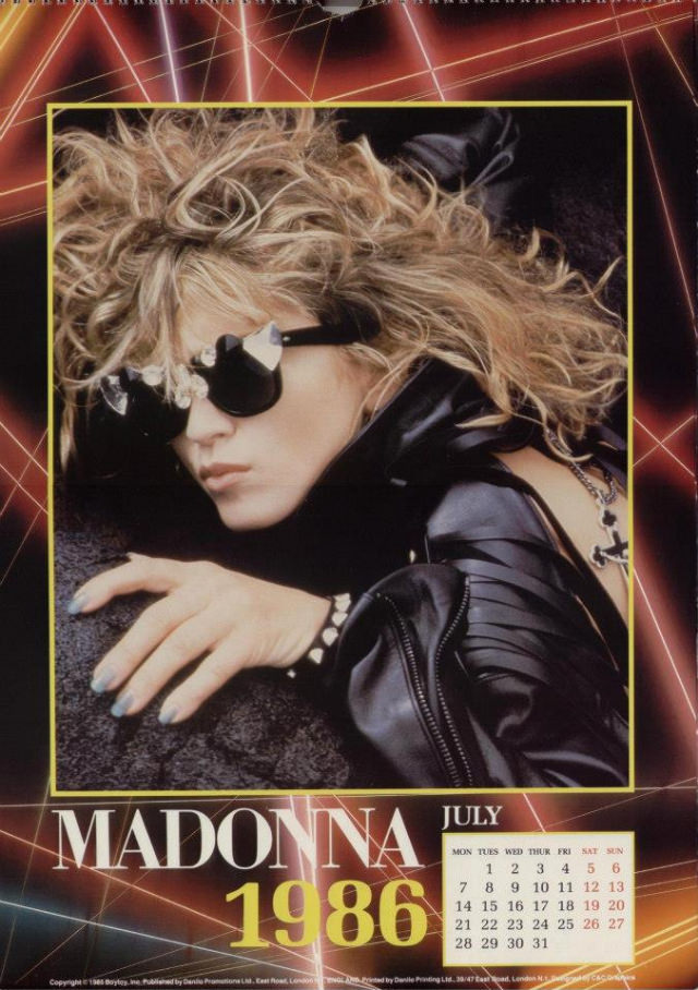
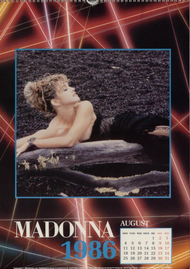
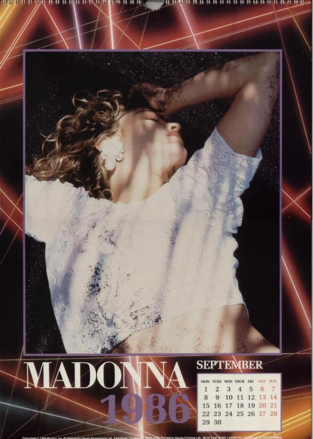
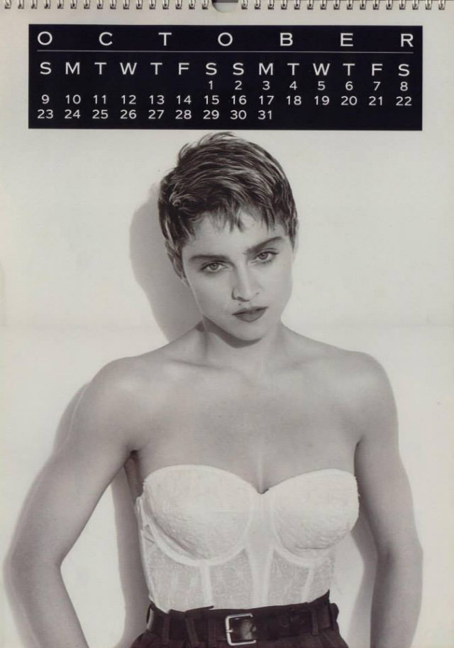
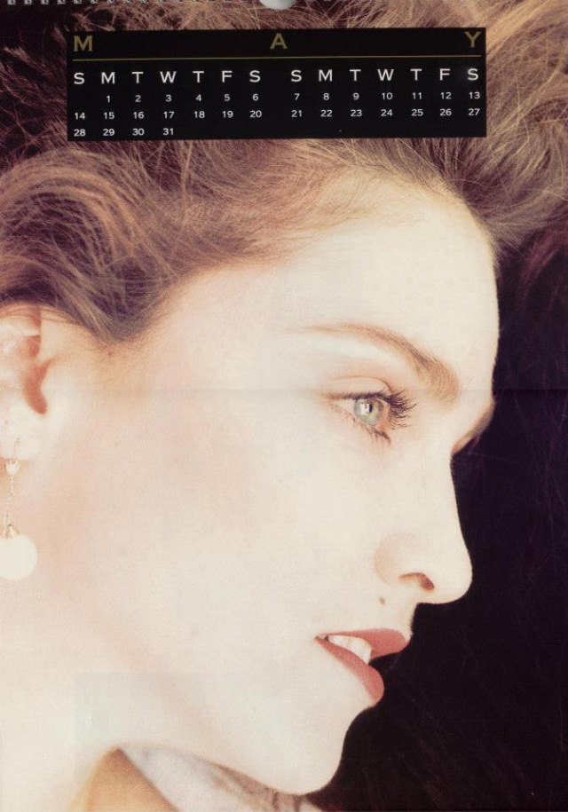
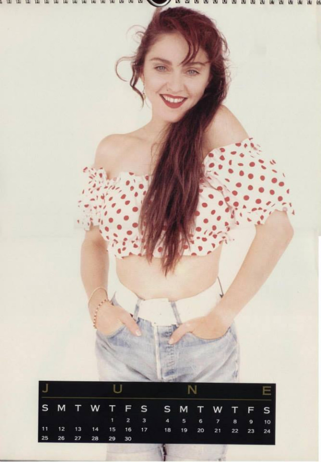
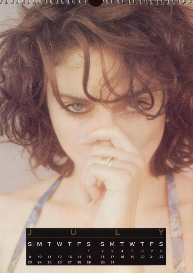
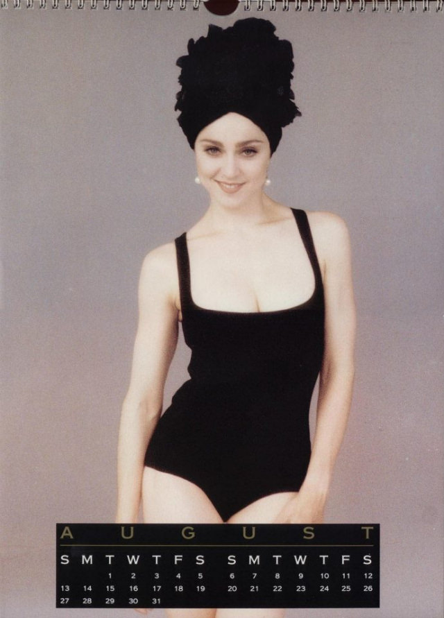
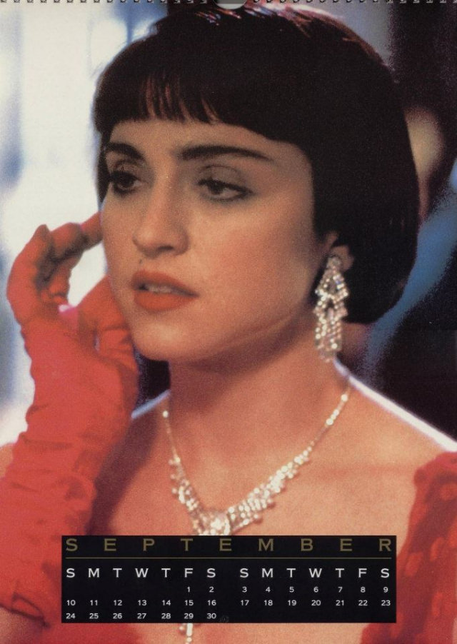
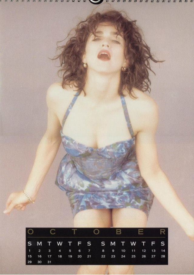
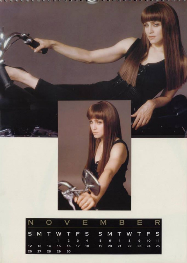
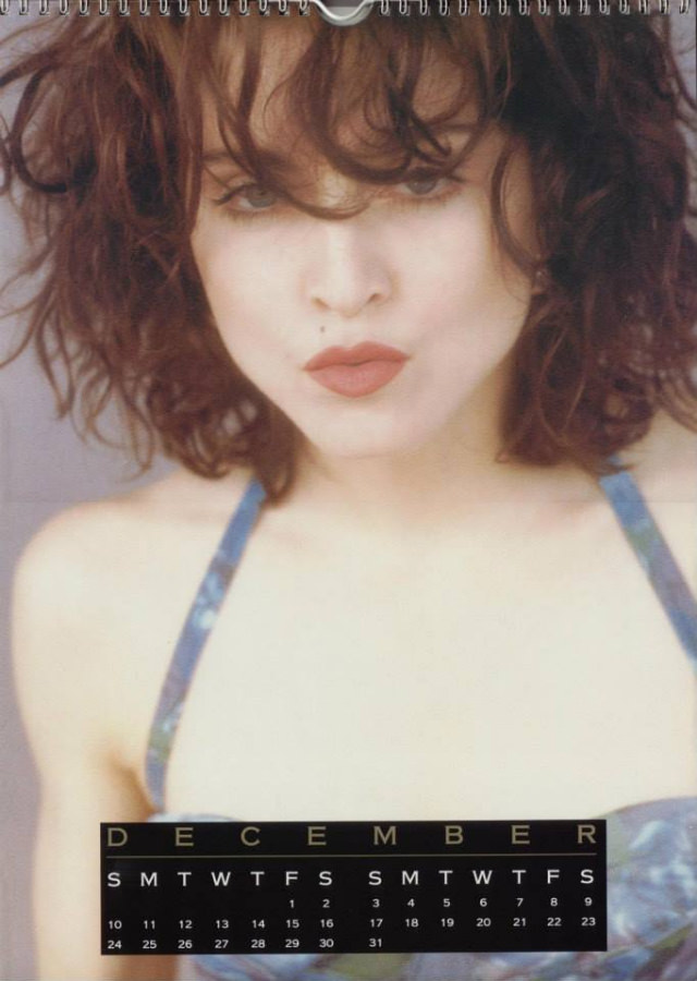
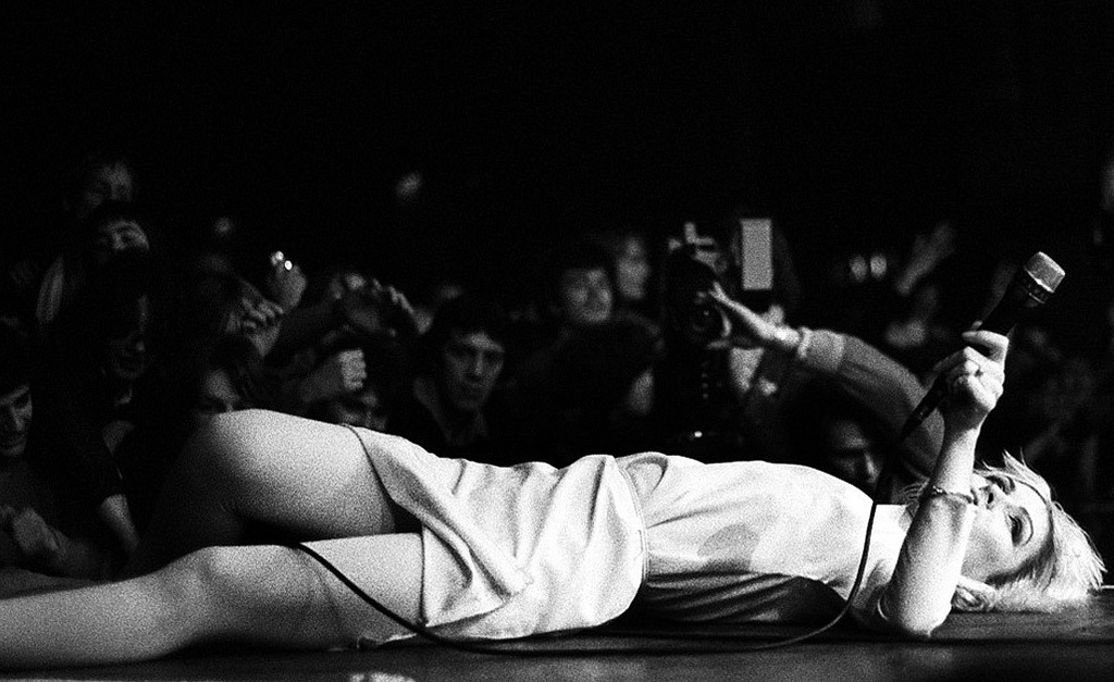
The photo selection across all four calendars mixed several types of shots. Glamour photographs made up the majority — studio-lit images designed to highlight her fashion and makeup. But the calendars also included performance stills pulled from concert footage and promotional shoots. These gave fans a sense of Madonna in motion, not just posed.
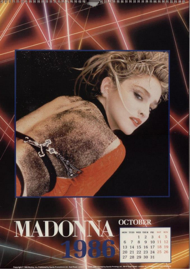
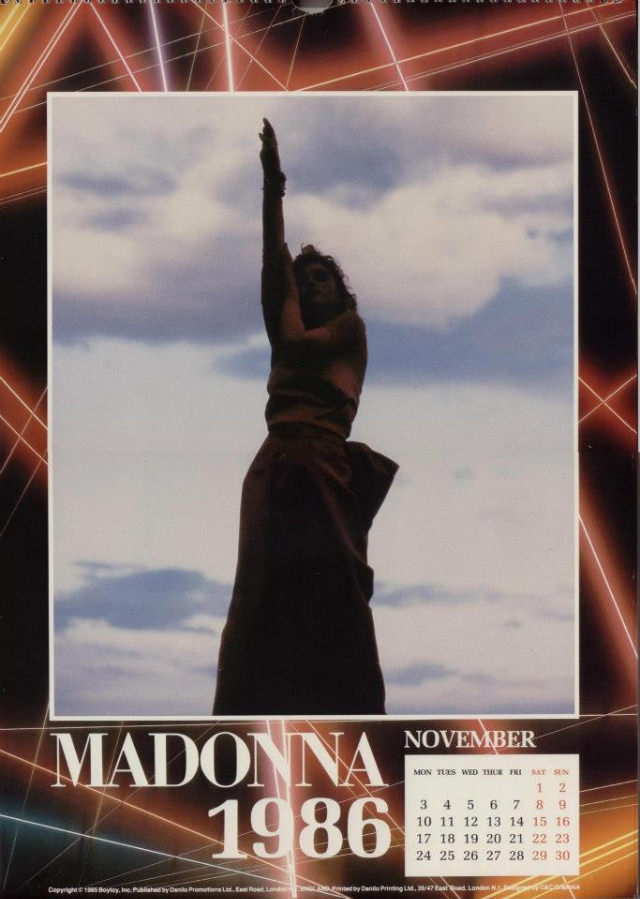
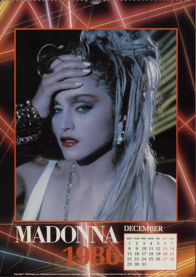
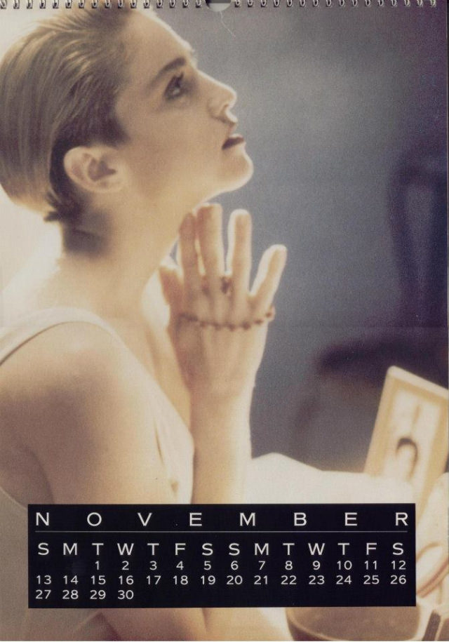
Some images had a more candid feel — less formal, shot in ways that suggested an off-duty moment rather than a staged setup. These were popular with fans because they felt closer to the real person behind the star. Of course, they were still official releases, so nothing was truly accidental.
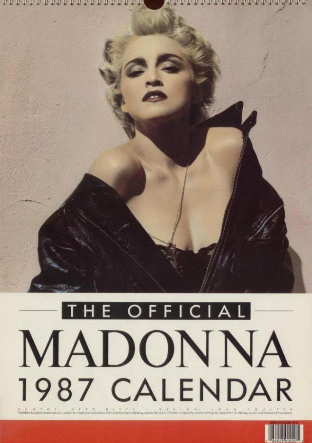
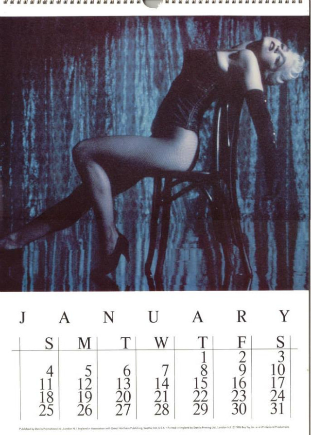
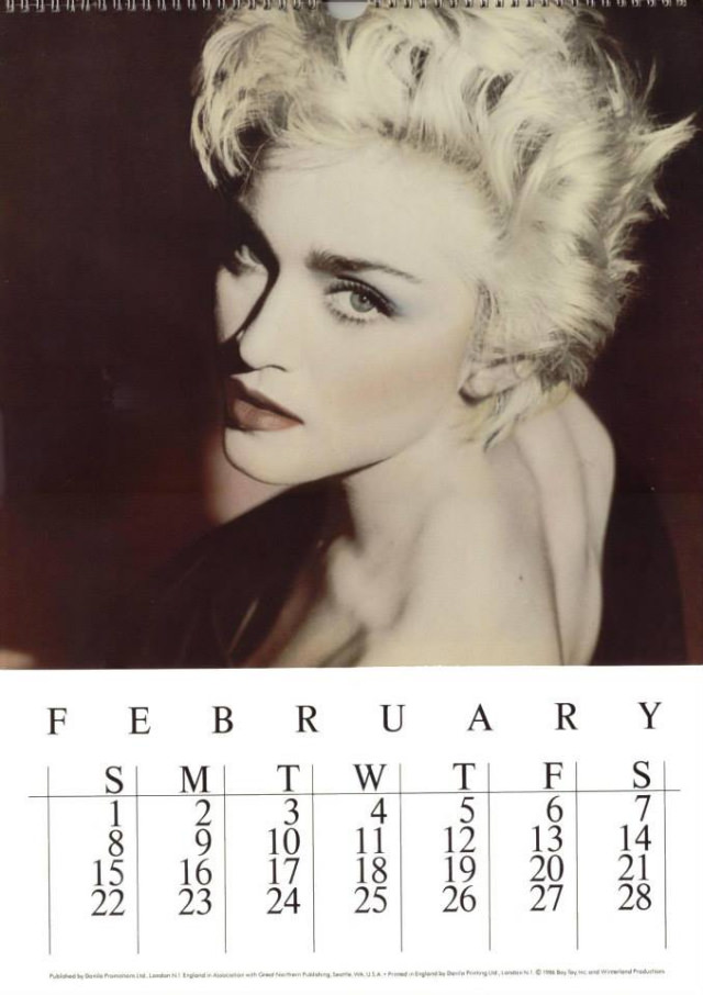
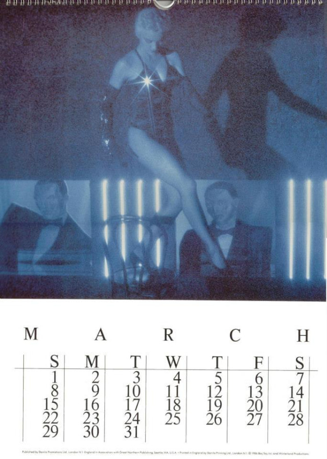
The 1988 calendar coincided with the “Who’s That Girl” era and the world tour of the same name. Madonna’s look during this stretch borrowed from 1950s Hollywood glamour — red lips, penciled brows, and form-fitting outfits that nodded to screen sirens of an earlier generation. The calendar images from this year carry a noticeably different energy from those just two years prior.
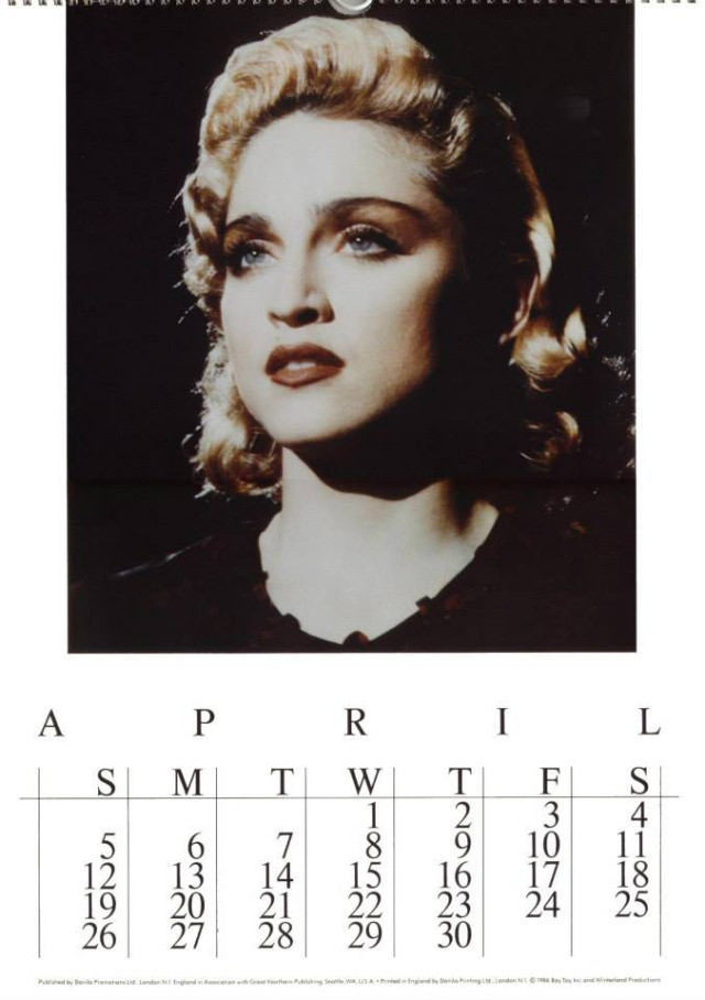
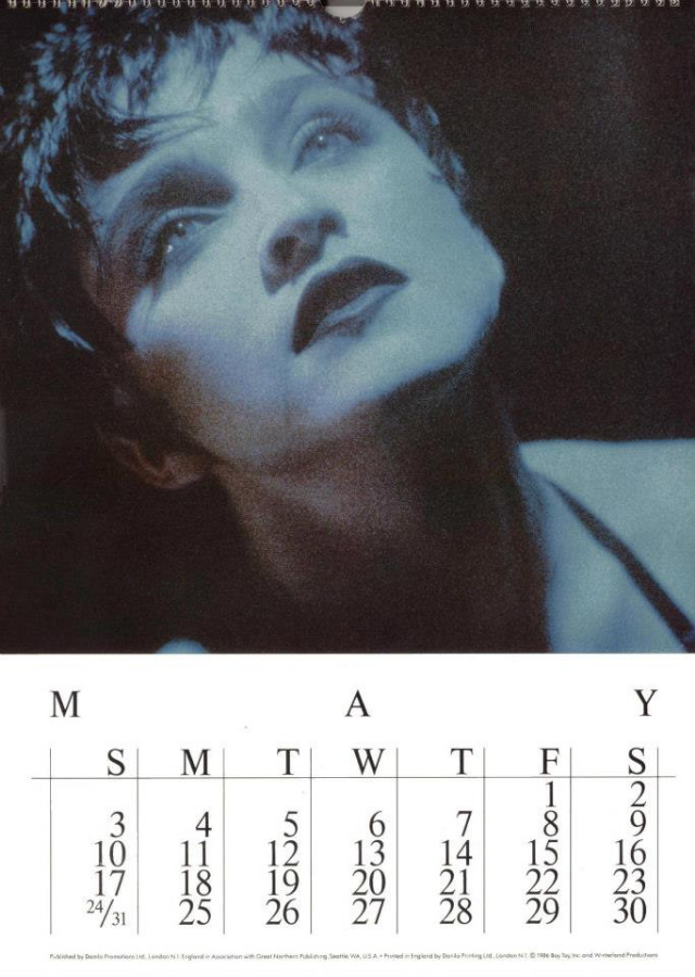
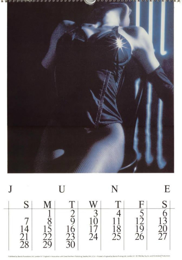
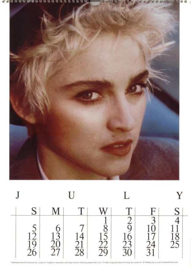
Collectors today treat these calendars as legitimate pop culture artifacts. They document a four-year window during which Madonna’s image changed more dramatically than almost any other artist of the era. Each edition is a time stamp — a record of what she looked like, how she styled herself, and what visual story she was telling at that specific moment.
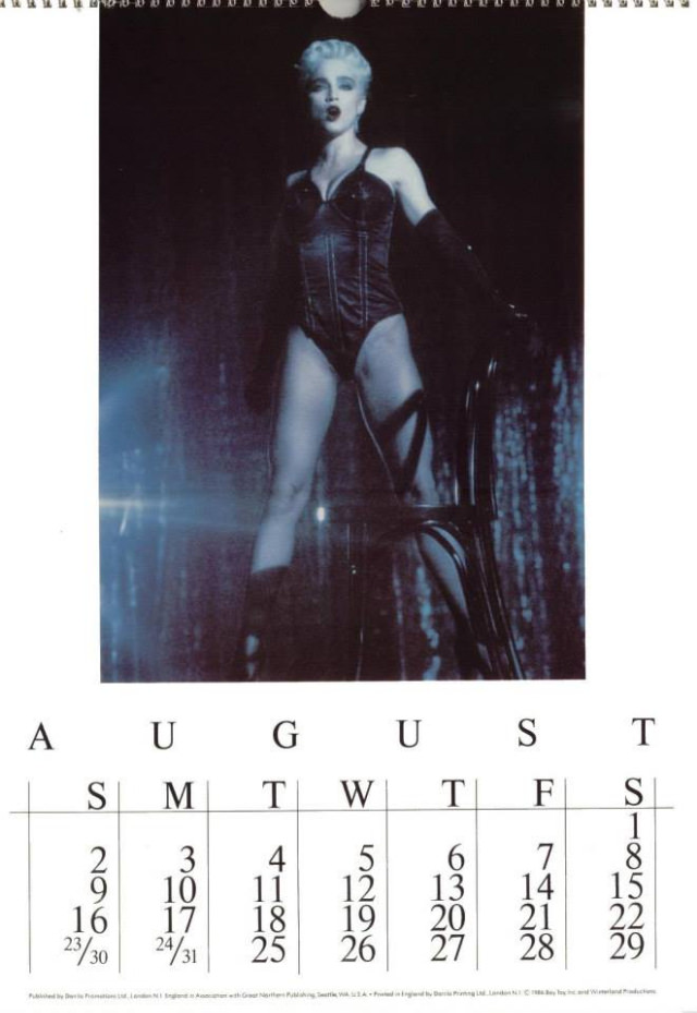
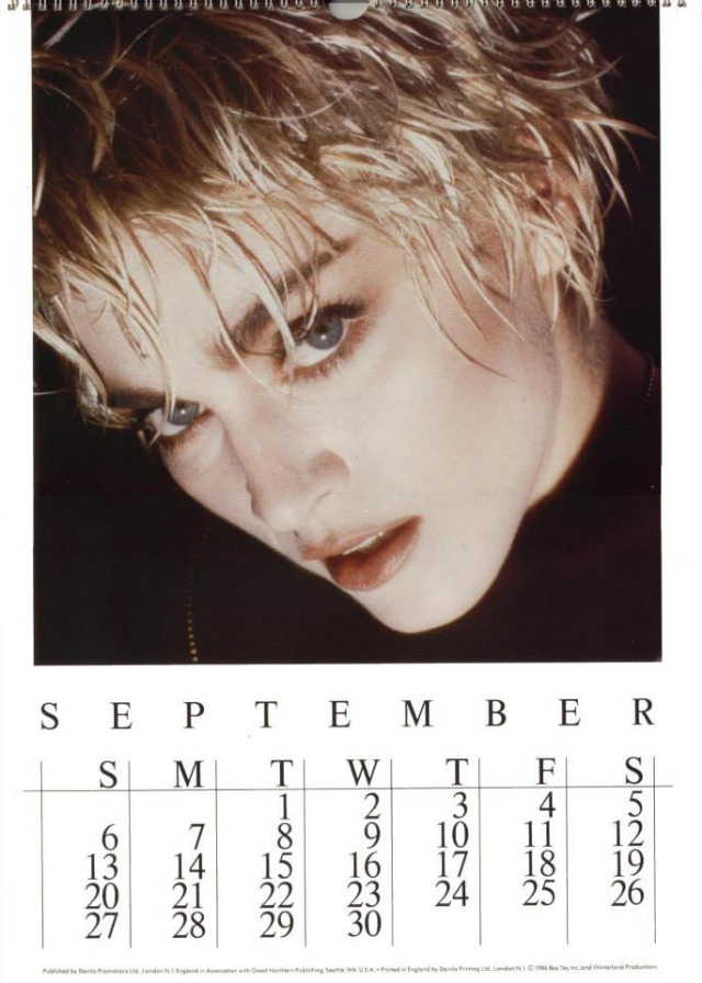
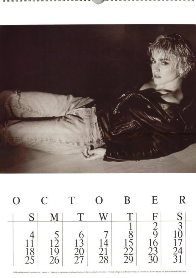
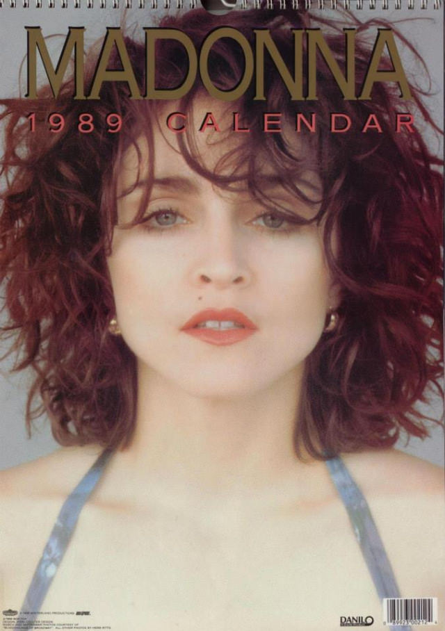
The 1989 calendar arrived as Madonna was moving into the “Like a Prayer” period — a dramatic visual and artistic shift. The religious imagery, darker themes, and more provocative styling that would define that album were already visible in her look by late 1988. The final calendar in this four-year run captured her right at the edge of that change.
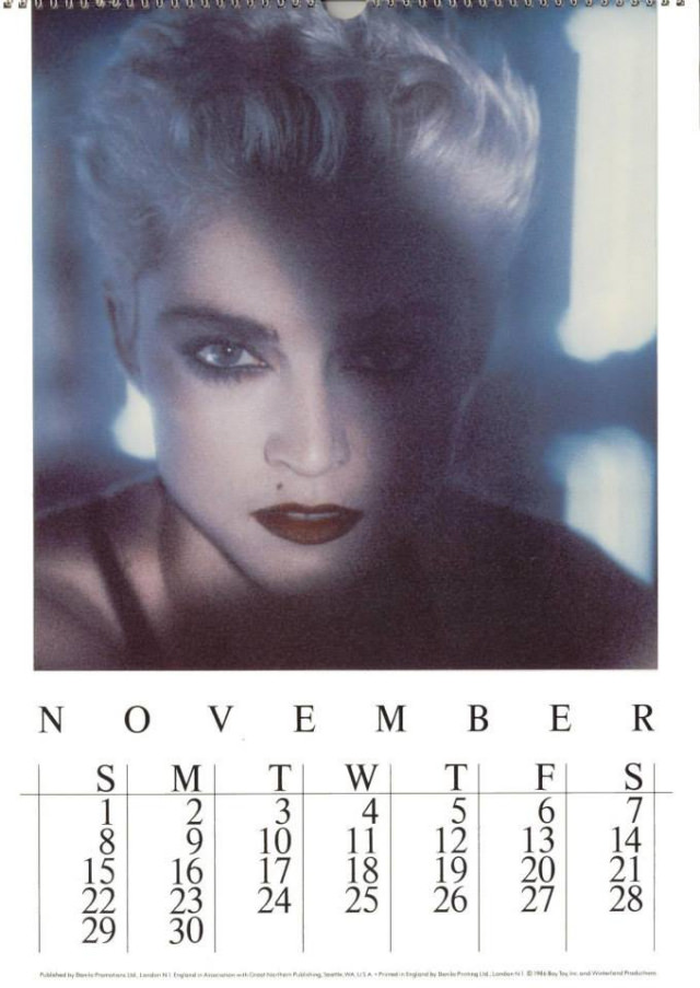
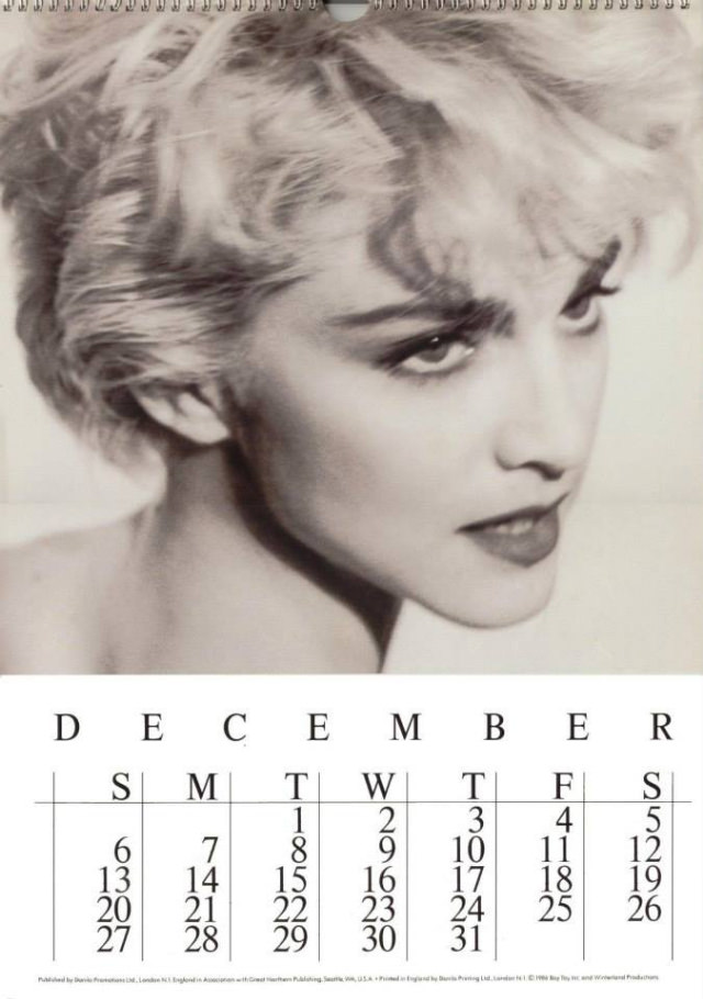
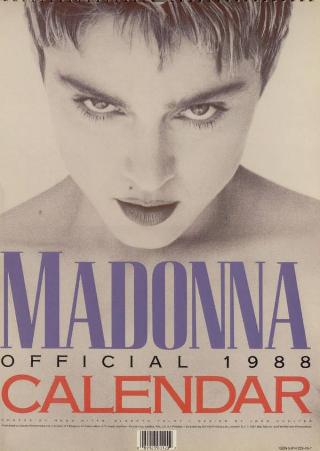
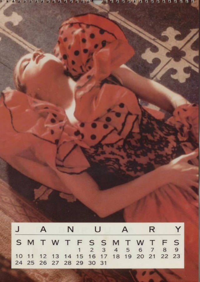
For fans at the time, owning one of these calendars meant having an officially sanctioned piece of Madonna’s world on their wall for an entire year. They were widely available through record stores, fan clubs, and general retail, making them accessible to a broad audience rather than a limited collector’s market.
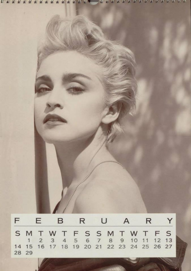
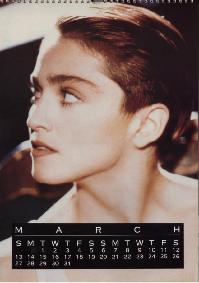
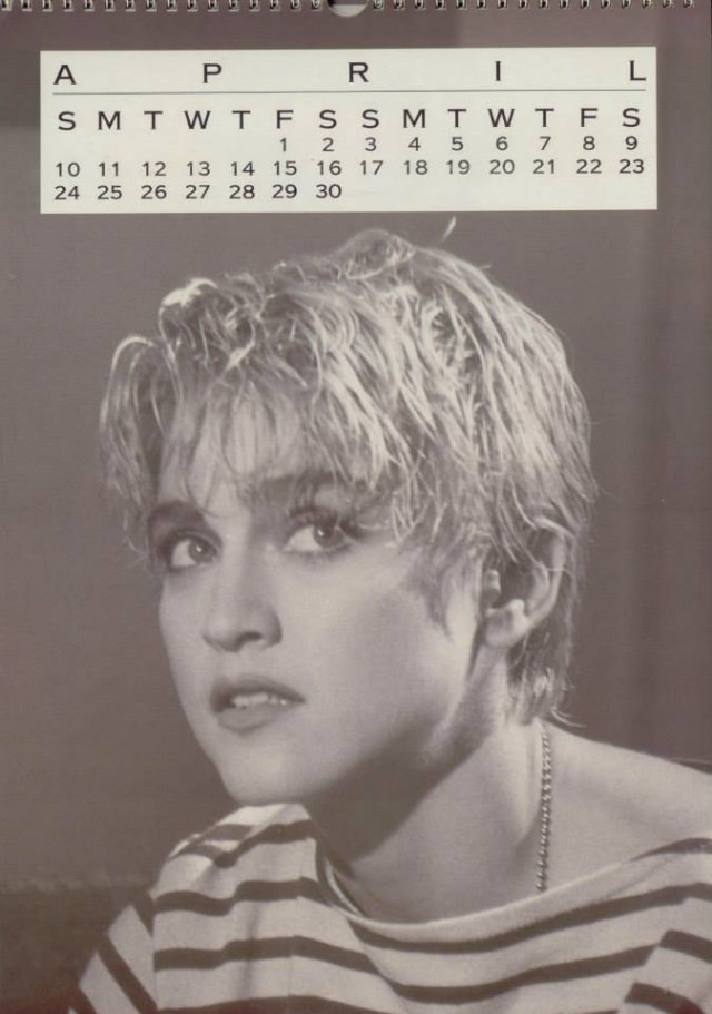
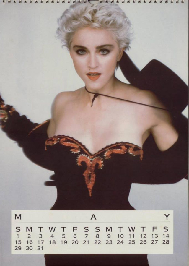
Viewed together, the four calendars form a visual timeline that spans some of the most productive and image-defining years of Madonna’s career. The shift from the 1986 edition to the 1989 edition is stark — different hair, different styling, different photographic tone. That range is exactly what makes them worth looking at closely.