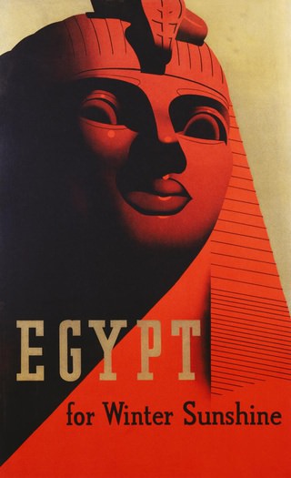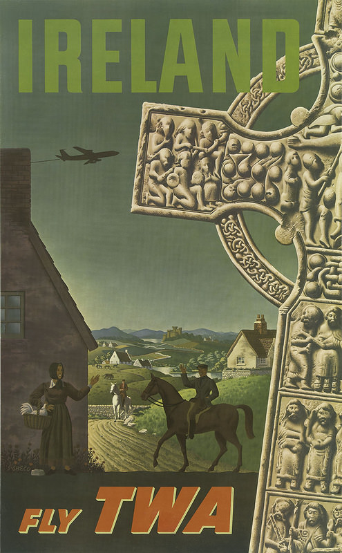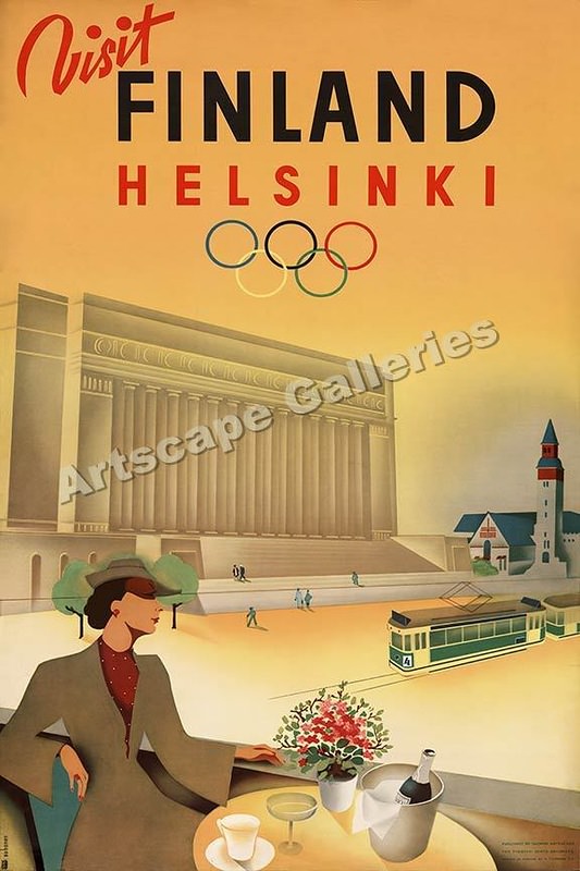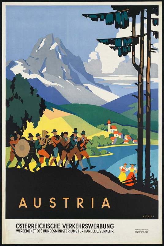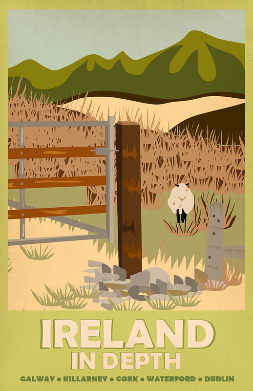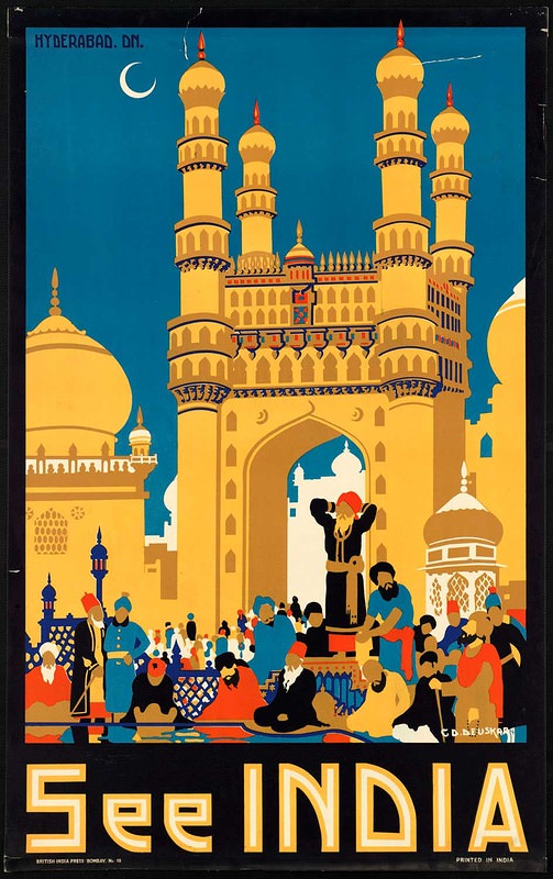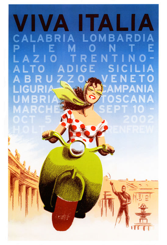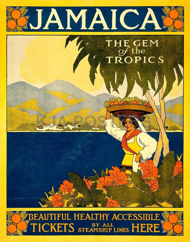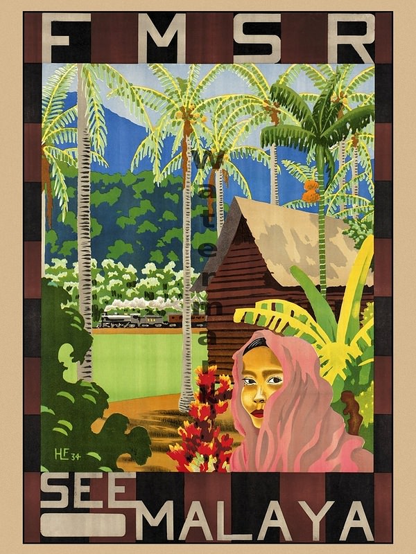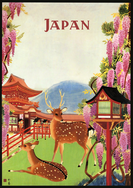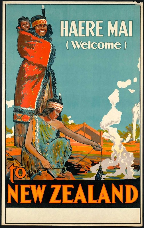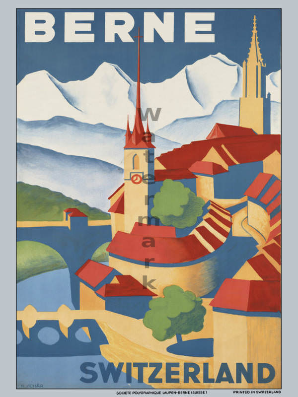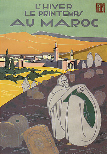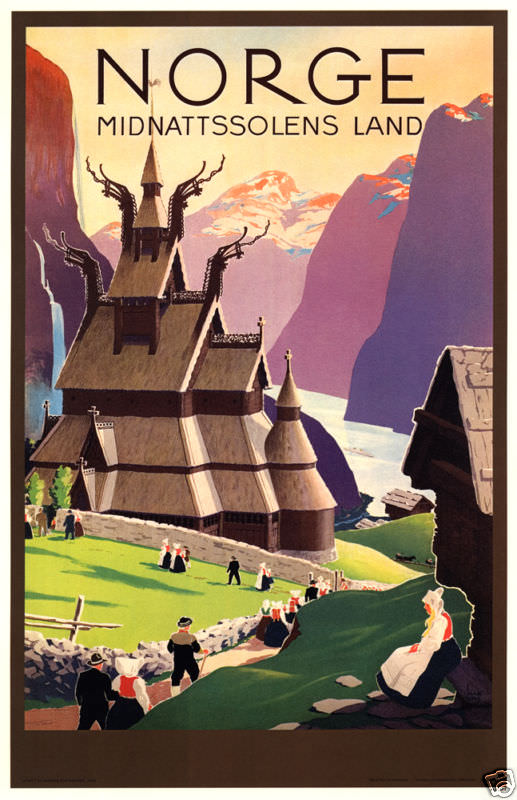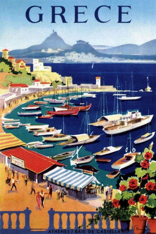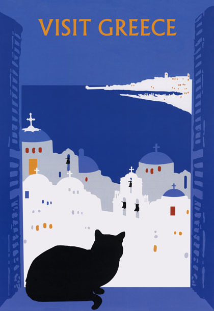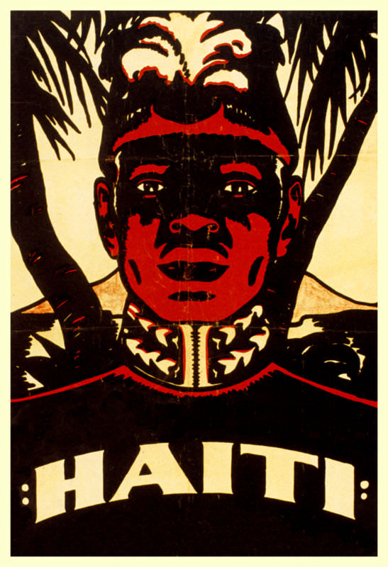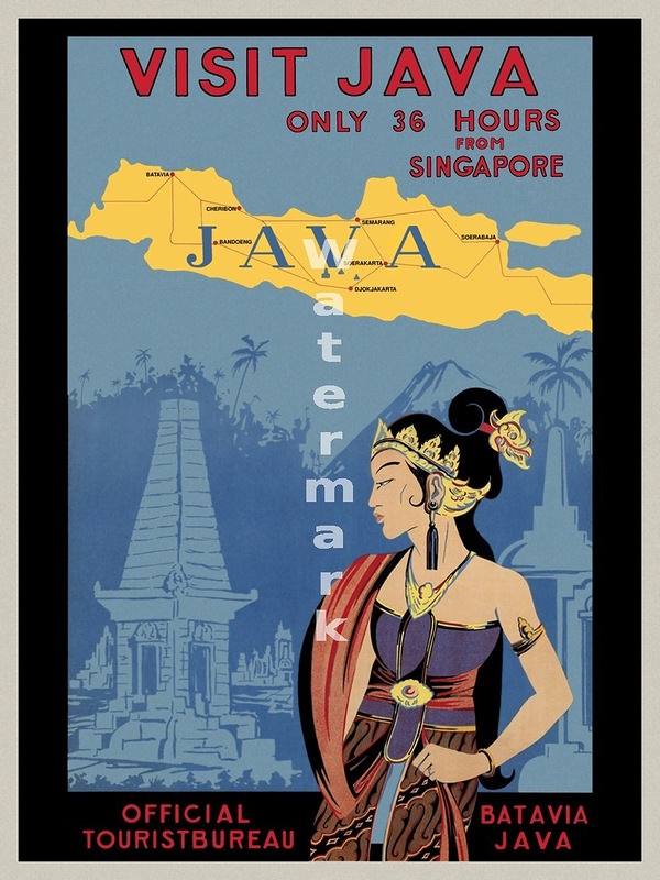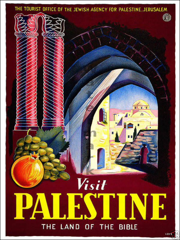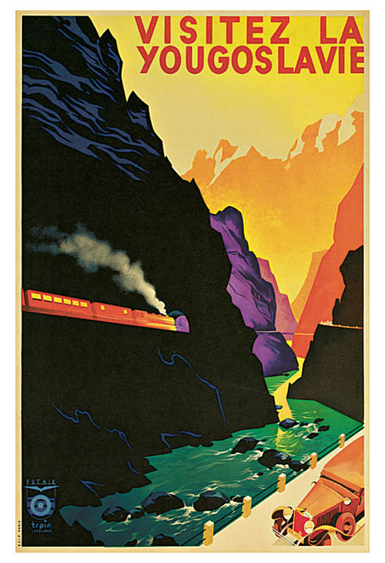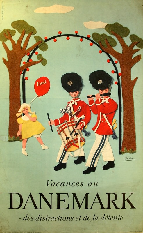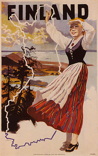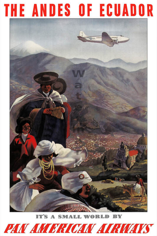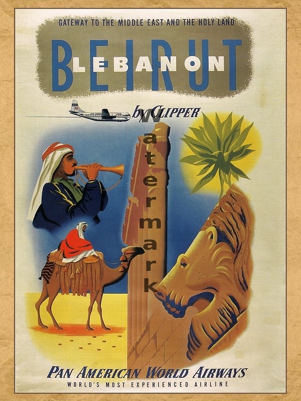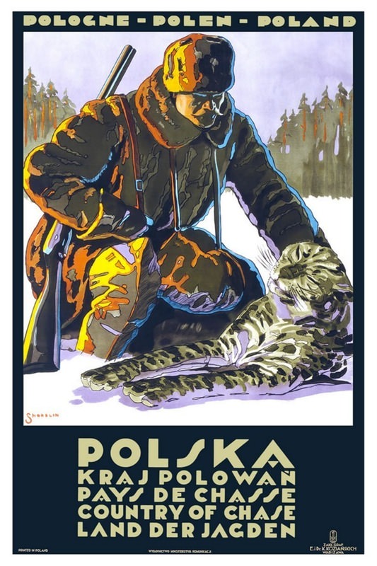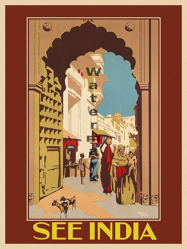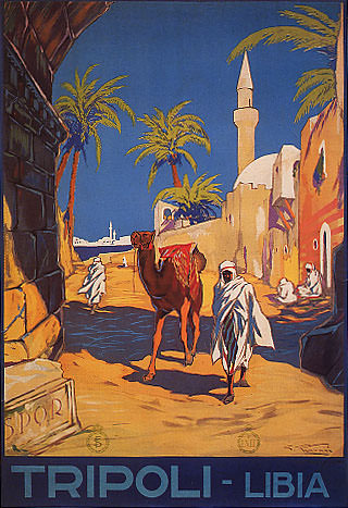

Before the internet and television, travel posters were a major way to advertise destinations. These weren’t just simple ads. They were often works of art. They showed exciting places around the globe. They aimed to convince people to visit.
These posters used bright colors and bold designs. Artists created images that captured the feeling of a place. They didn’t just show what a place looked like. They showed what it ‘felt’ like to be there. This was key to making people want to travel.
A poster for a beach might show sunbathers and clear blue water. A poster for a mountain resort might feature snowy peaks and skiers. The goal was always to make the location look irresistible. The text was usually simple. It often included just the name of the place and maybe a short slogan.
Different Styles for Different Places
The style of these posters varied depending on the location and the time period. Some posters from the early 1900s used Art Nouveau style. This style had flowing lines and natural forms. Later, Art Deco became popular. Art Deco posters used geometric shapes and a more modern look.
These vintage posters advertised places all over the world. You could find posters promoting travel to European cities like Paris and Rome. There were posters for exotic locations in Asia and Africa. Posters also advertised destinations within the United States, like national parks and sunny beaches.