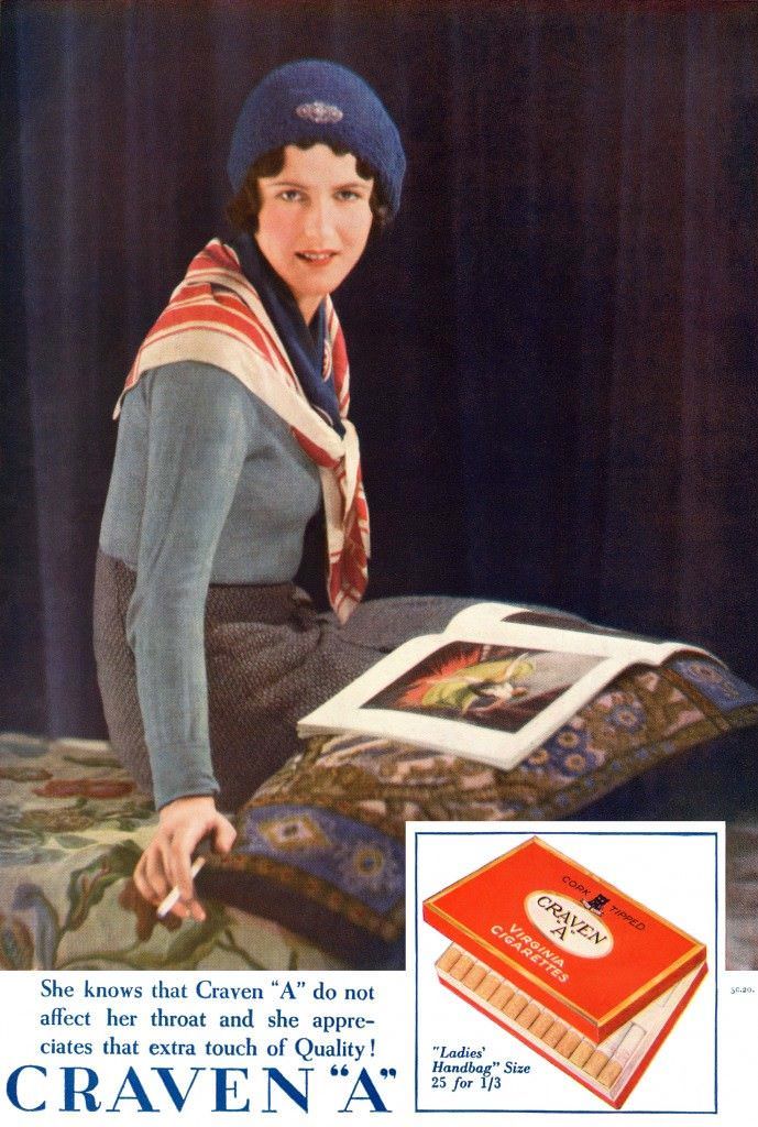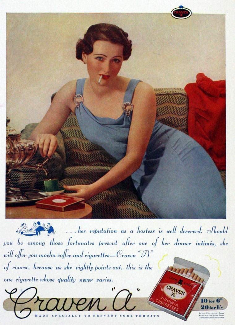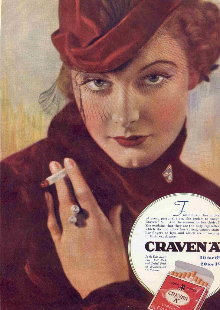

Craven ‘A’ was one of the most recognized cigarette brands of the early 20th century. By the 1930s, the brand had built its entire advertising identity around a single, bold promise: their cigarettes were kind to your throat. The slogan “For Your Throat’s Sake!” appeared across print ads throughout the decade, directly addressing one of smokers’ most common complaints — irritation.
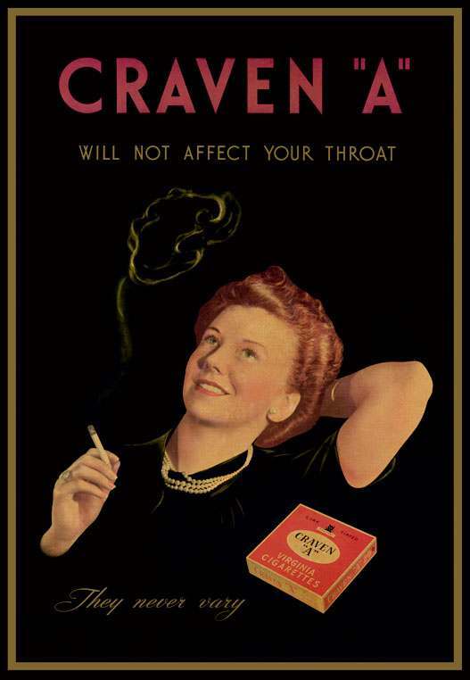
Throat irritation was a real concern for smokers at the time, and Craven ‘A’ ads leaned into that anxiety. The messaging positioned the brand as the sensible, gentler choice. Rather than avoiding the discomfort of smoking as a topic, the ads confronted it head-on and offered Craven ‘A’ as the solution.
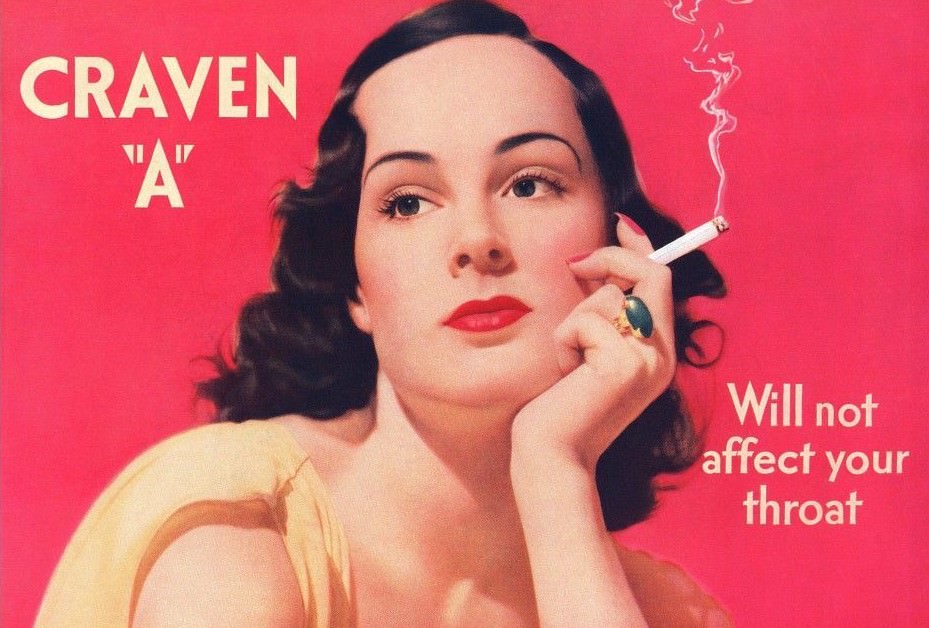
One physical feature of Craven ‘A’ cigarettes appeared in many of these ads: the cork tip. At a time when most cigarettes were plain paper-tipped or untipped entirely, the cork tip set Craven ‘A’ apart. Advertisers connected it directly to the throat-comfort claim, presenting it as the reason the smoke was smoother.
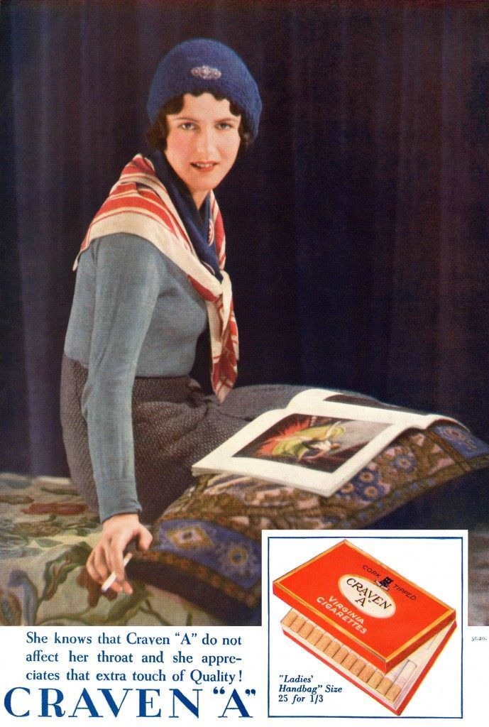

The visual design of the ads matched the refined tone of the copy. Clean layouts, elegant illustrations, and prominent displays of the cigarette pack gave the brand a polished, upscale feel. The imagery suggested quality and sophistication rather than indulgence.

Craven ‘A’ ads targeted both men and women — a broad audience united by the desire for a more comfortable smoking experience. The brand didn’t sell glamour or rebellion. It sold comfort, framing cigarette choice as a matter of personal care.
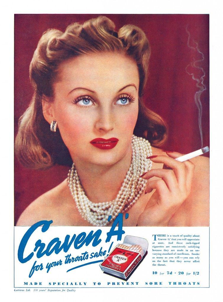
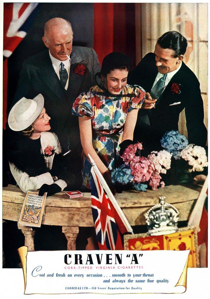
Across the decade, the core message stayed consistent. Whether the ad ran in 1930 or 1939, the promise was the same: Craven ‘A’ was the thoughtful smoker’s choice, a cigarette that acknowledged throat discomfort and claimed to address it.