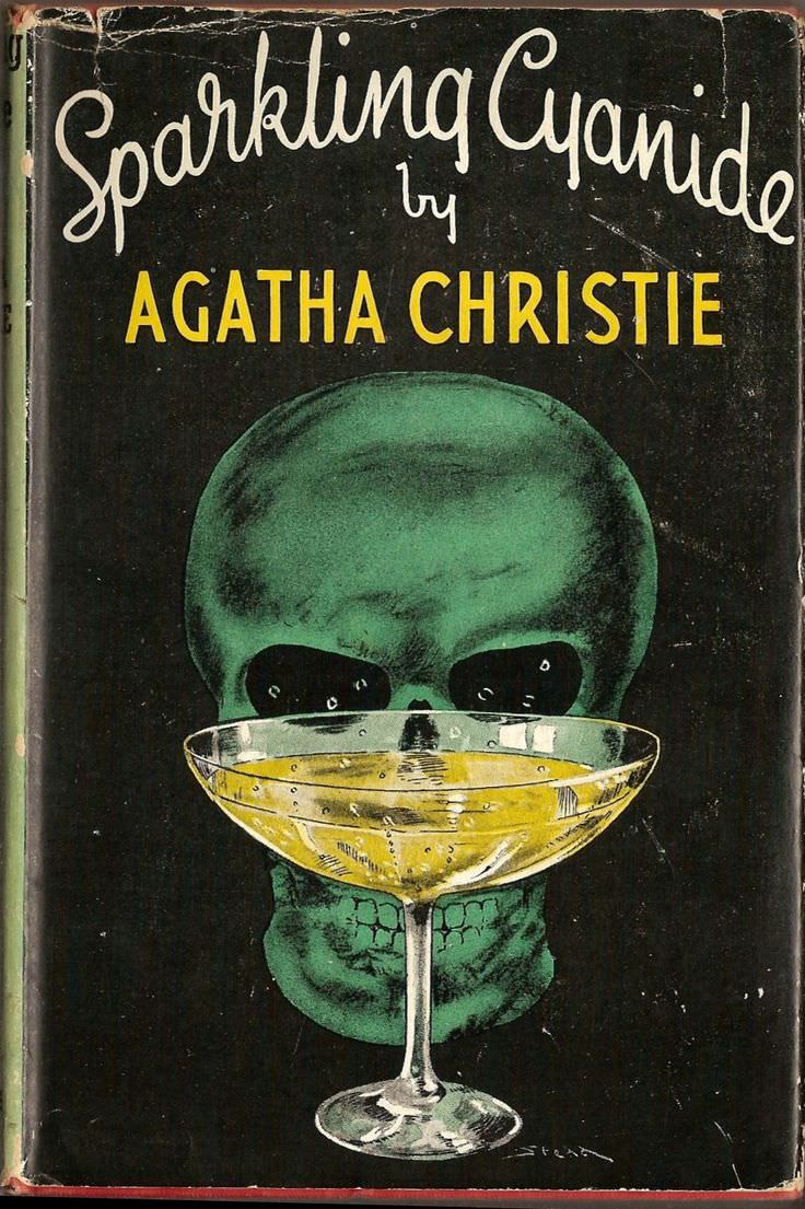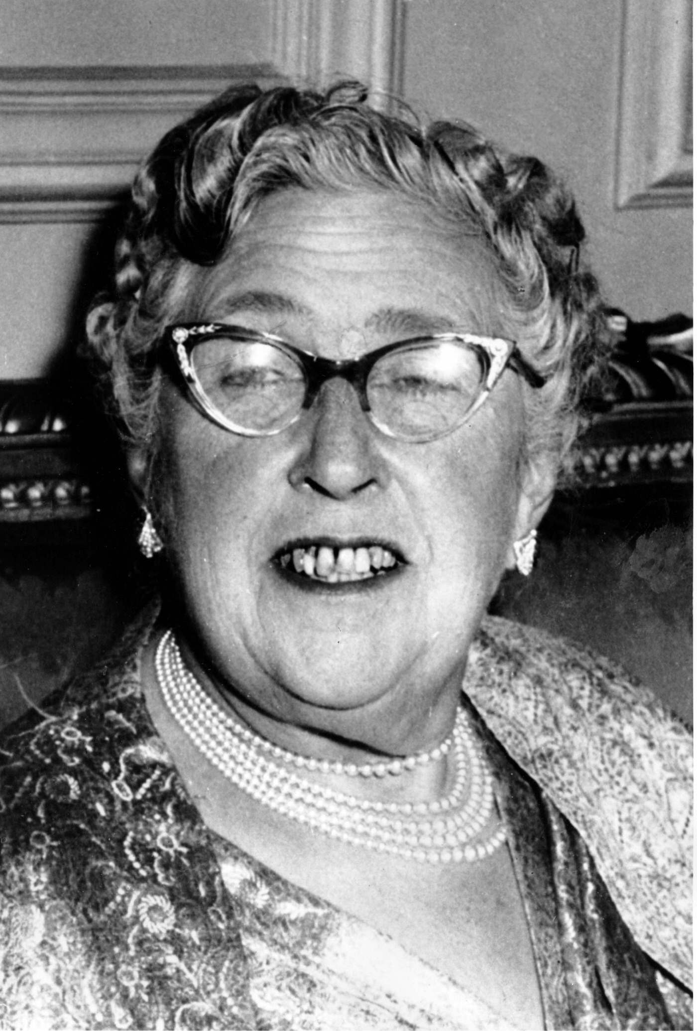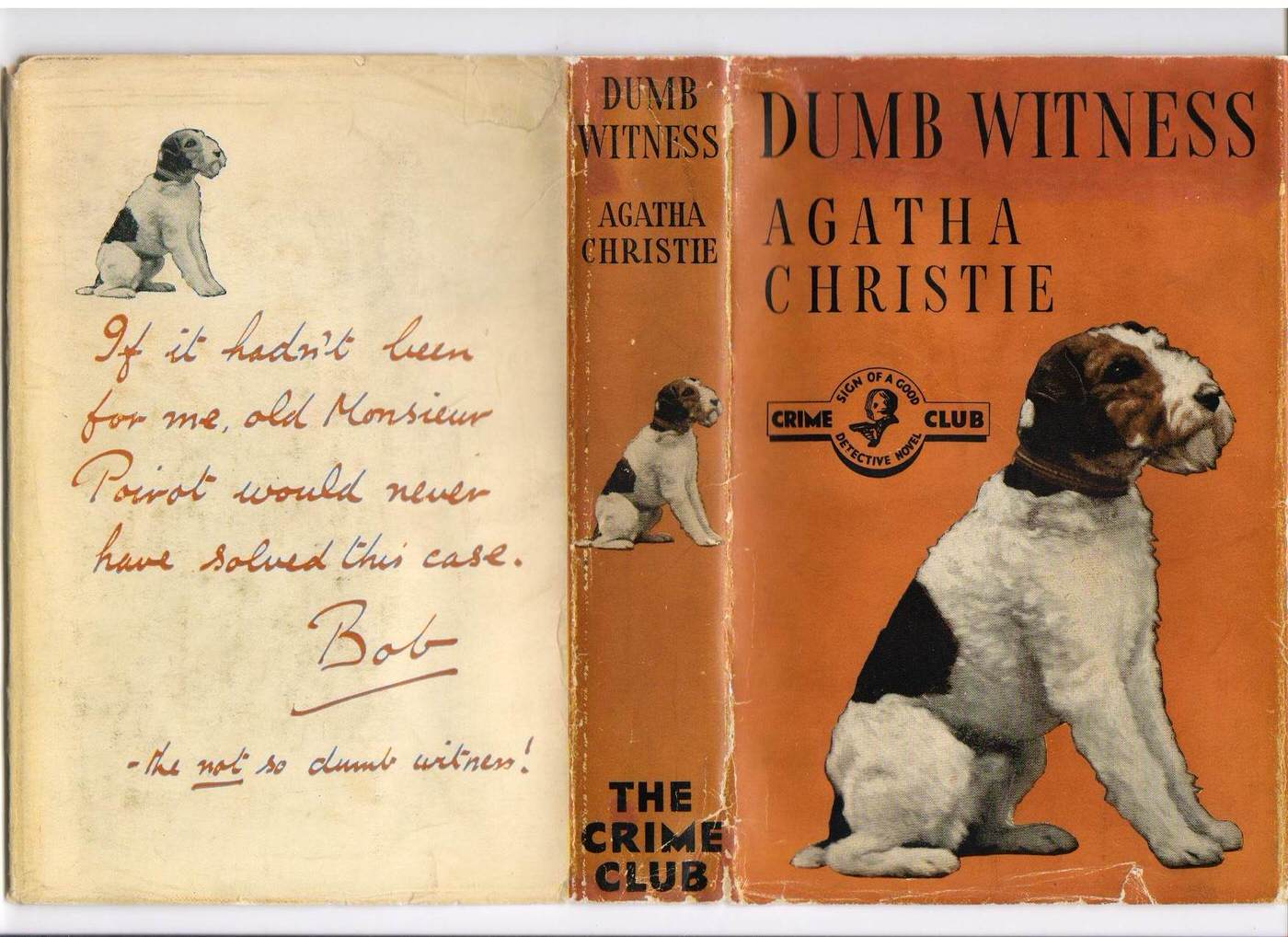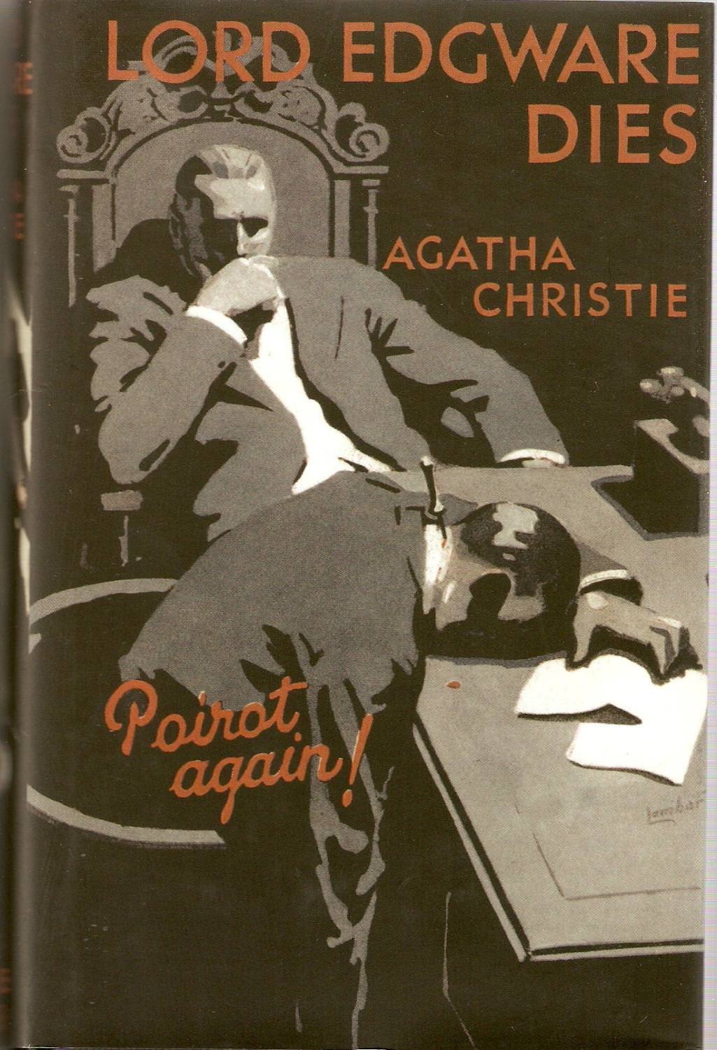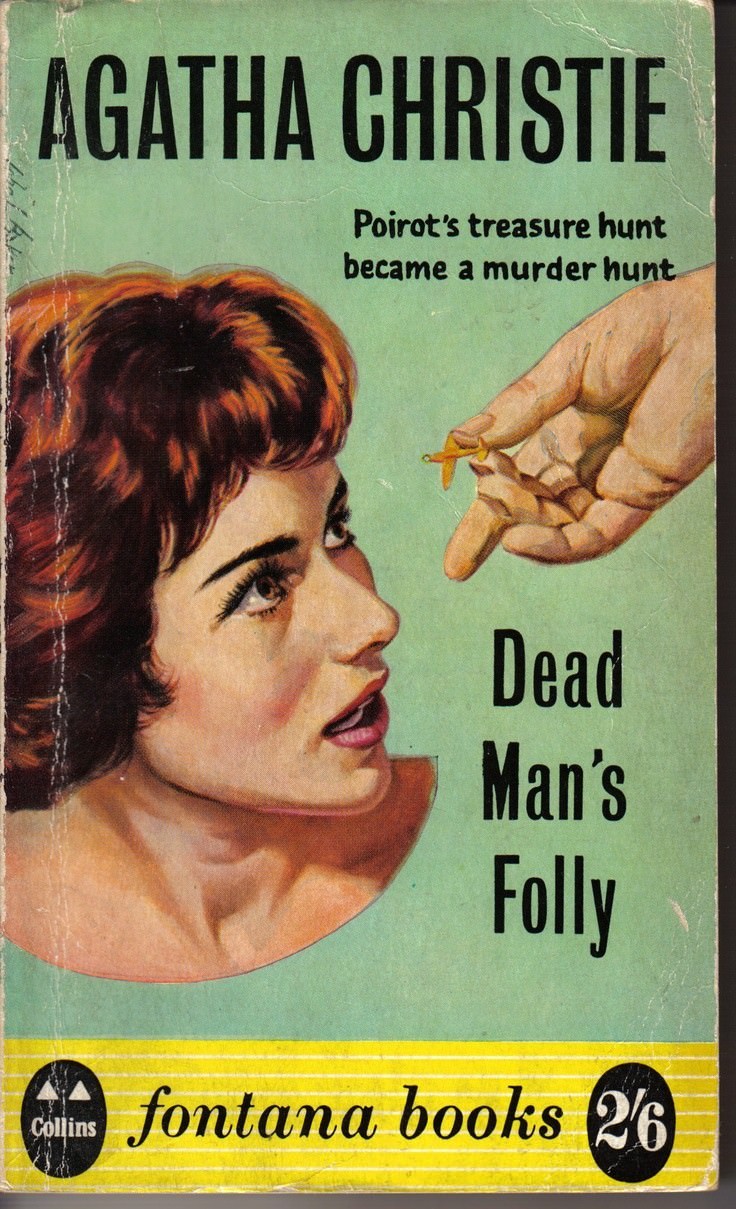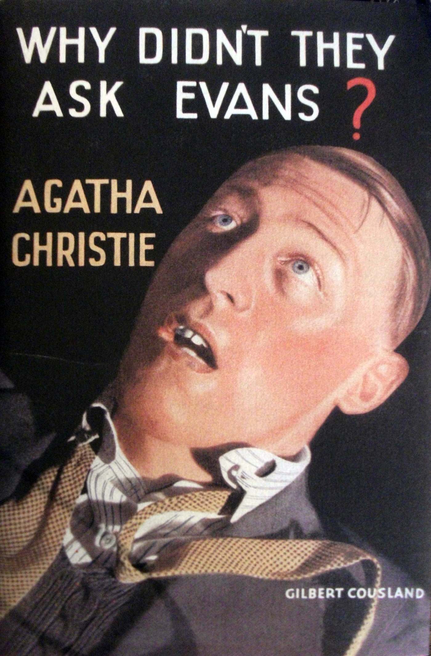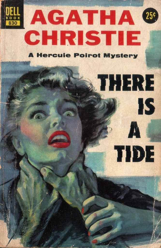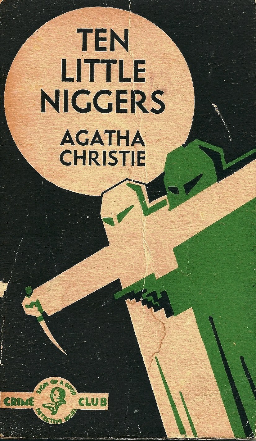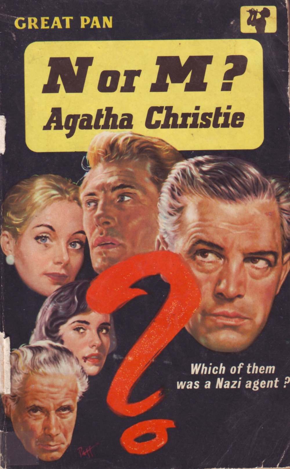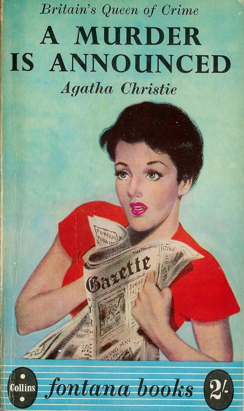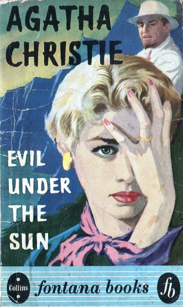

Agatha Christie is known around the world as one of the most famous mystery writers ever. She wrote a very large number of novels and collections of short stories, creating famous detectives like Hercule Poirot and Miss Marple. Because she wrote for many decades, the covers of her books changed a lot over the years, reflecting the different styles of book design and illustration popular at the time.
When Agatha Christie’s first books were published early in the 20th century, book covers often featured illustrations that gave a visual idea of the story inside. These early covers for her mysteries might show a scene from the plot, a character, or a symbolic image related to the crime or puzzle. The artwork was often hand-drawn, with a style typical of book illustrations from the 1920s, 30s, and 40s. They aimed to look intriguing and suggest the kind of mystery the reader would find within the pages.
As the mid-20th century arrived, particularly in the 1950s and 1960s, book cover design started to change. Covers became bolder and used more graphic design elements. Illustrations were sometimes more stylized, or designers began to incorporate photographic elements. The covers for Christie’s books during this period often used striking images and colors to create a sense of suspense or drama. They aimed to grab attention on bookshelves and suggest the cleverness of the mystery.
In the later decades of the 20th century, from the 1970s through the 1990s, book cover design shifted even further. Photography became more dominant, and covers often featured realistic images. For Agatha Christie’s mysteries, this meant covers might show close-ups of objects that were clues in the story, dramatic settings where a crime occurred, or carefully staged scenes that hinted at the plot without giving too much away. The style became more about creating a strong atmosphere or focusing on a key visual element of the puzzle.