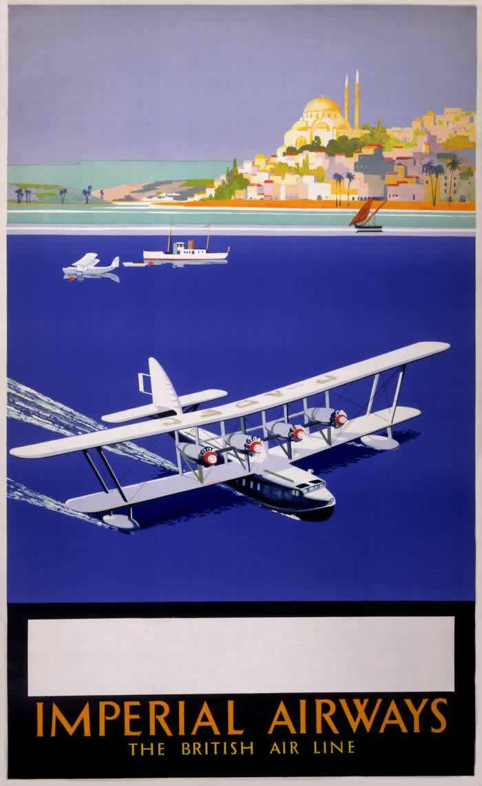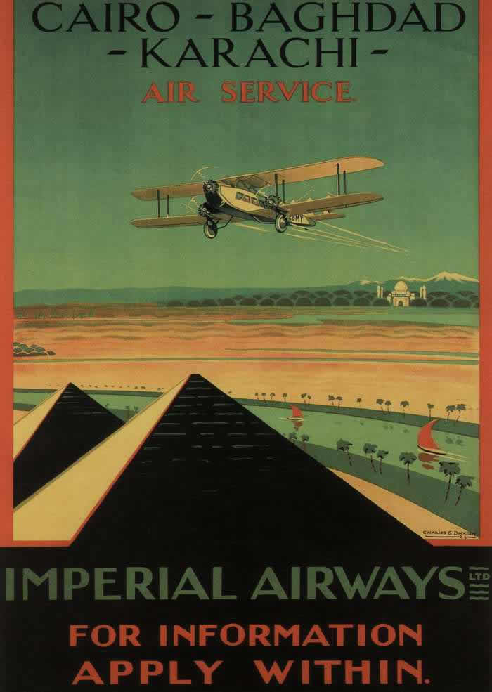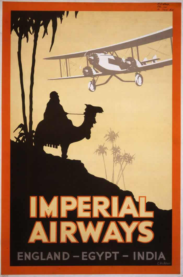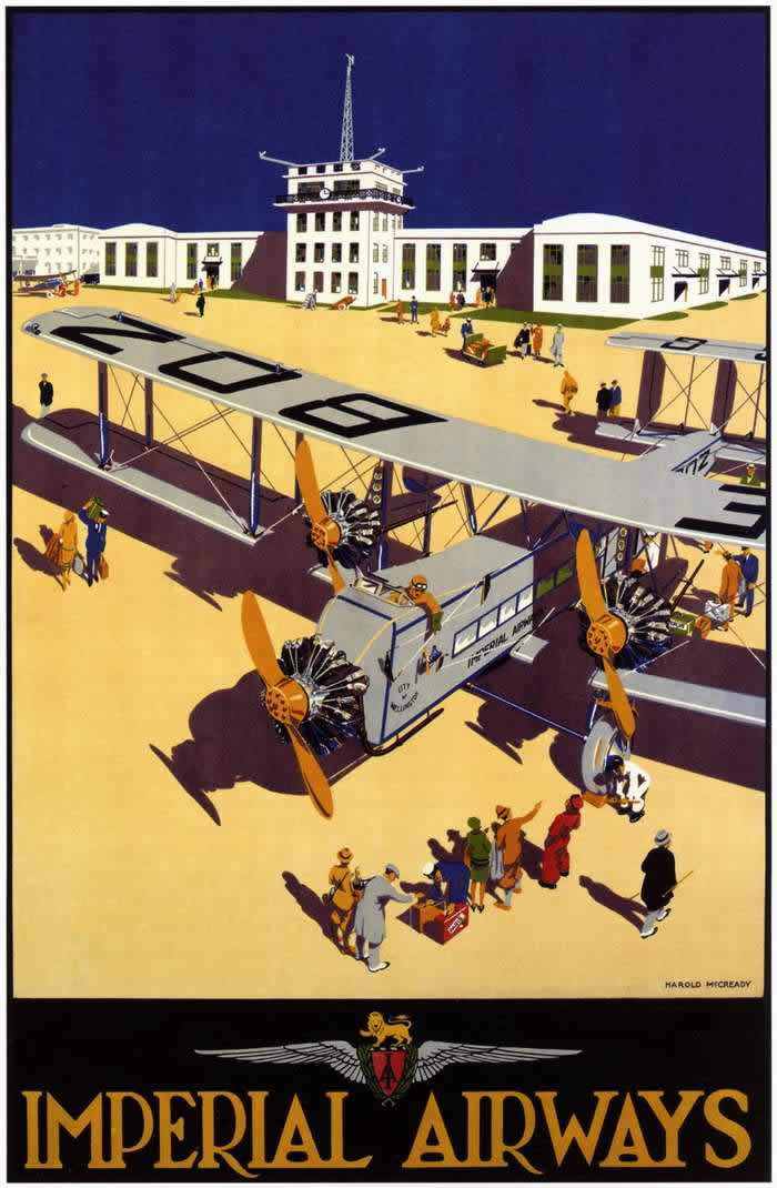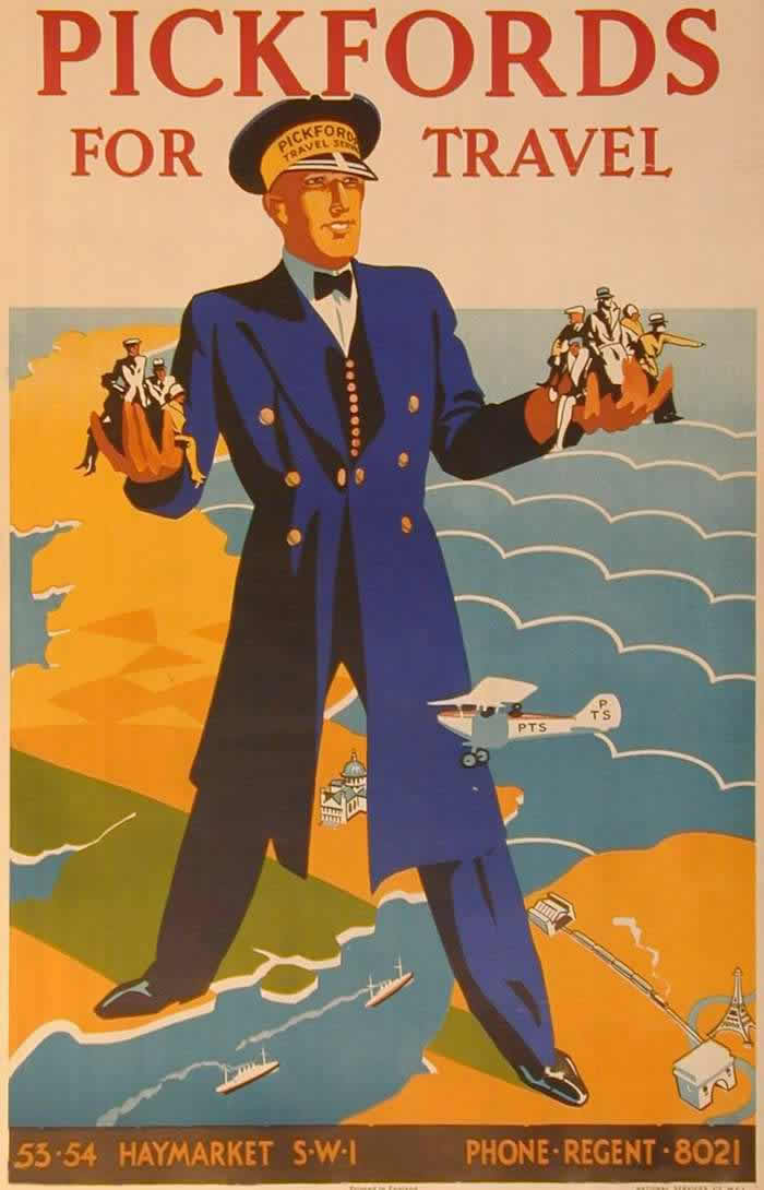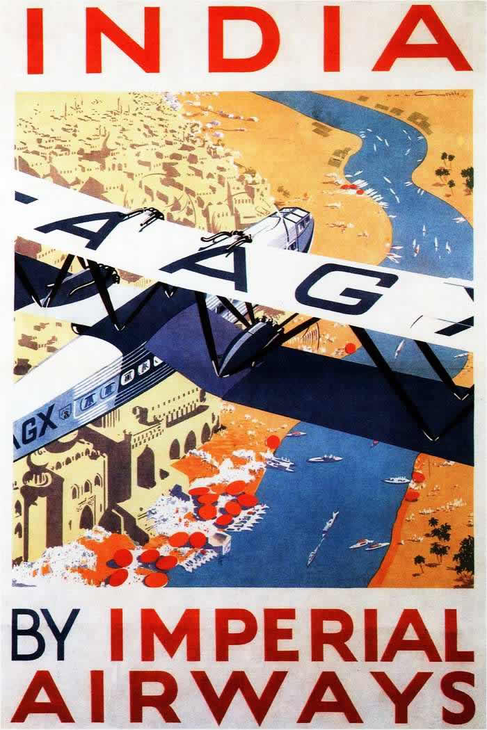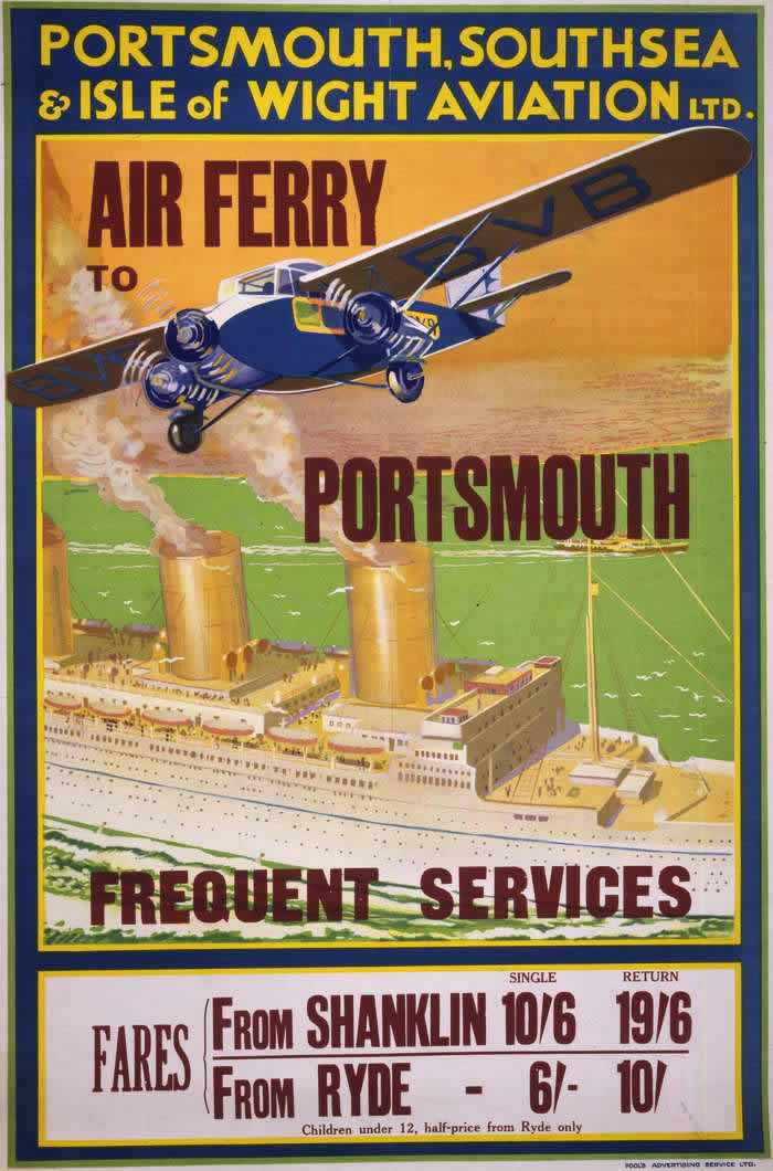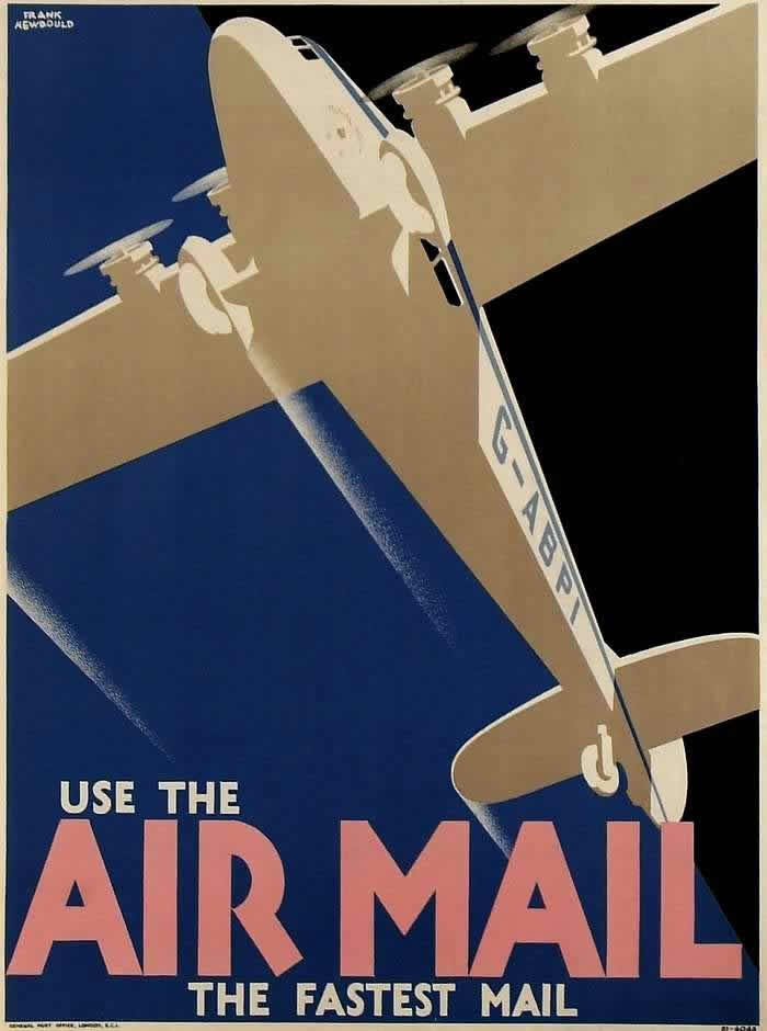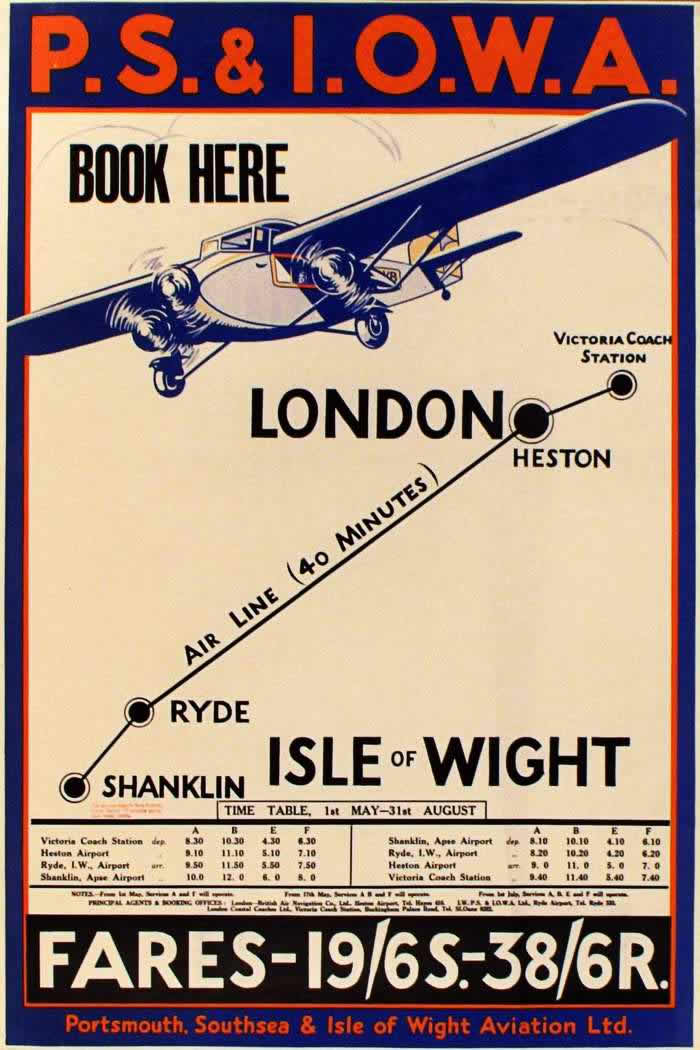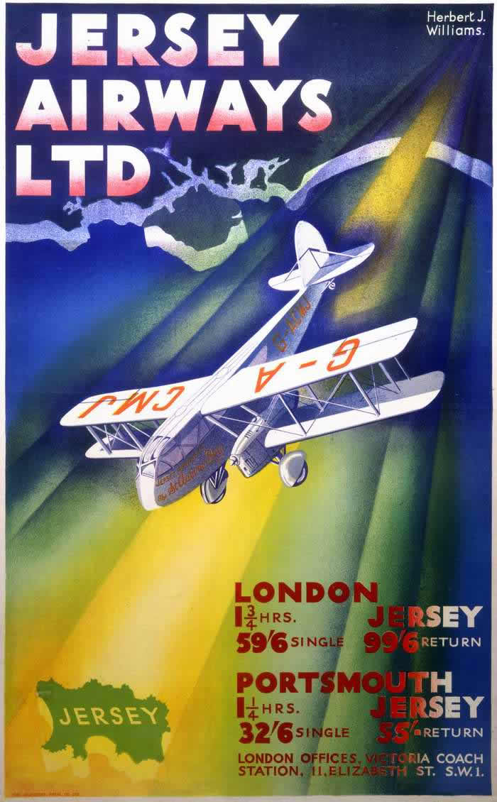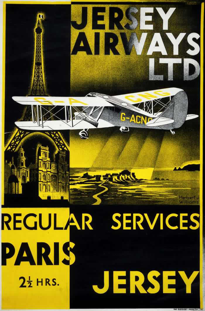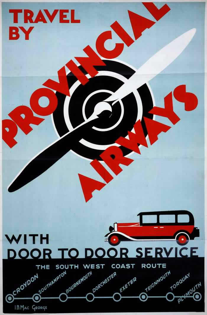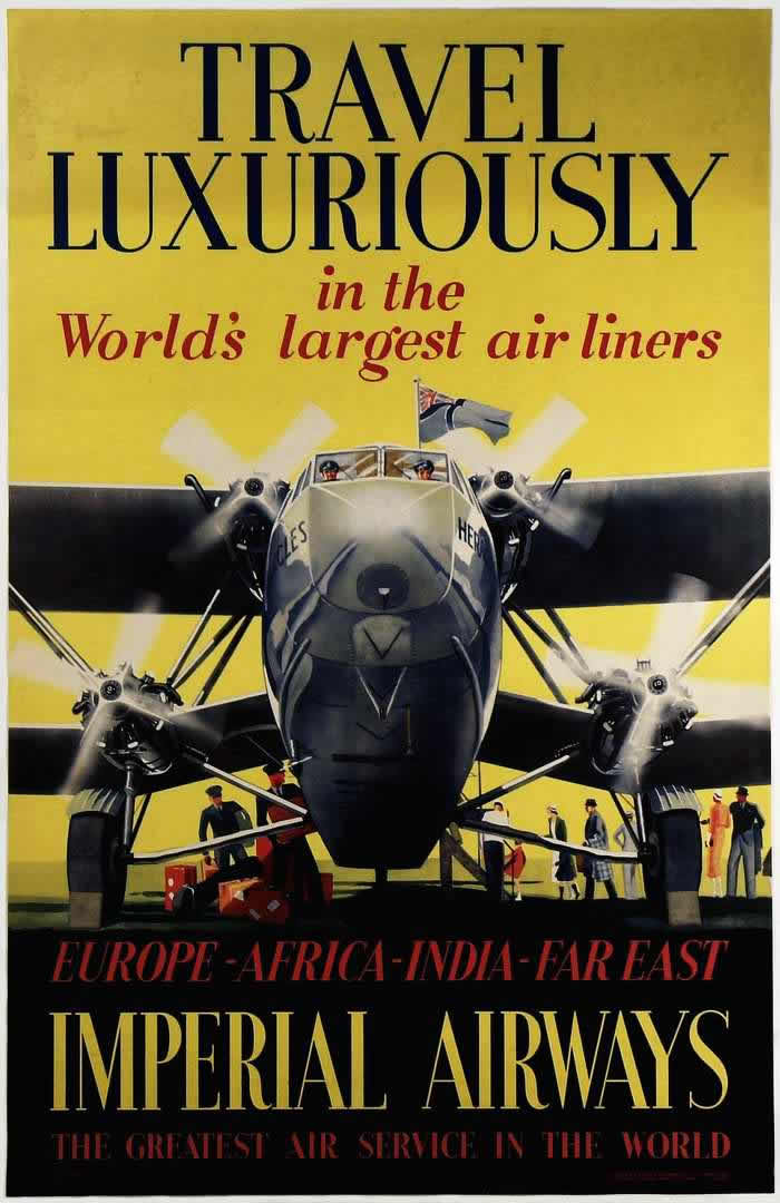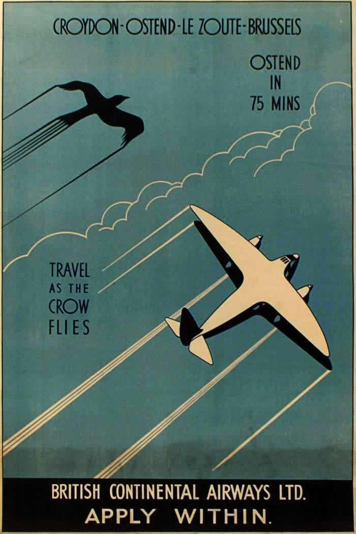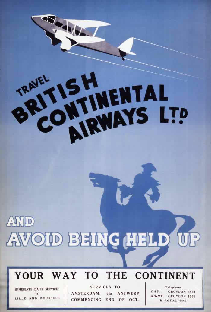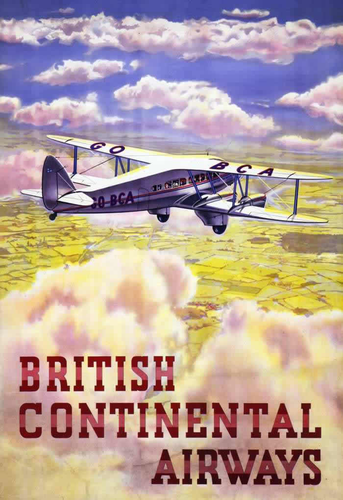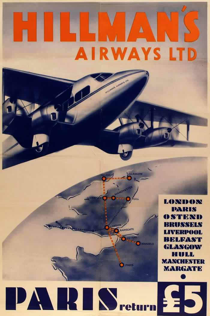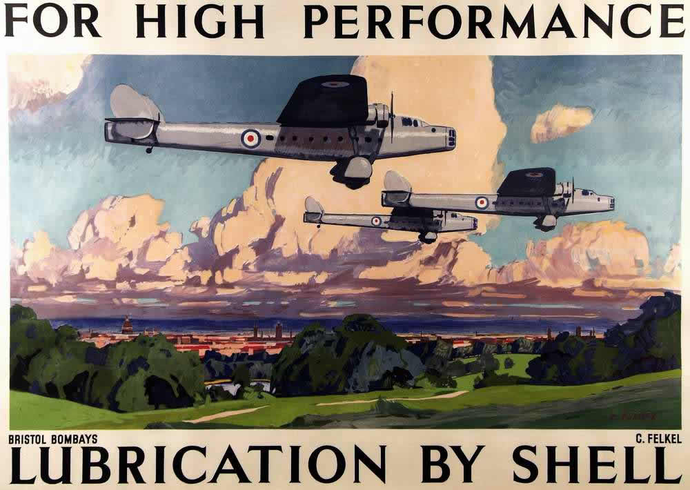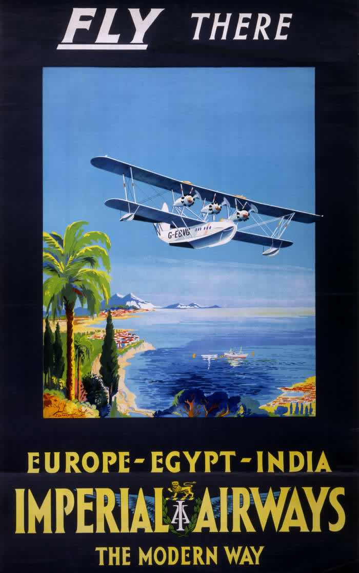

Imperial Airways was a pioneering British airline operating throughout the 1920s and 1930s. It was the main British company for long-distance air travel during this time, running from 1924 to 1939. Air travel was still quite new, exciting, and considered a marvel of technology. To attract passengers and promote their services, Imperial Airways used eye-catching posters. These posters give us a fascinating look into the world of early commercial aviation and the places people could reach by air in that era.
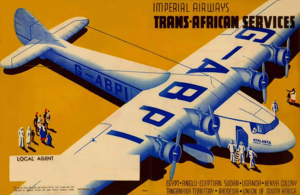
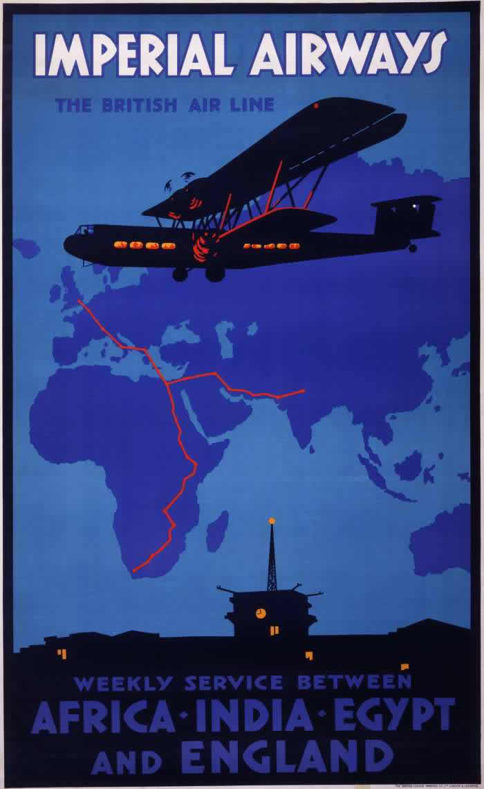
Imperial Airways focused heavily on connecting Britain with the distant parts of the British Empire. While they had some routes within Europe, their main focus was on reaching destinations far away. The posters clearly highlighted these ambitious long-range journeys. They advertised routes stretching across continents to places like South Africa, India, and countries in the Far East, including Malaya and Hong Kong. They also connected with partner airlines like Qantas in Australia and TEAL in New Zealand to extend travel even further across the globe.
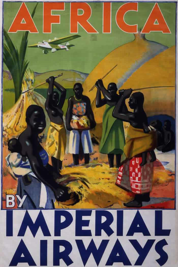
The destinations featured on the posters were exotic and exciting for people living in Britain or other parts of the Empire. A poster might show the iconic Taj Mahal in India, hinting at adventure and culture. Another could depict wildlife or dramatic landscapes in Africa, suggesting thrilling journeys. Posters for Malaya or Hong Kong would often portray vibrant local scenes, tropical settings, or busy harbors. The goal was to make these faraway places seem accessible and appealing to potential travelers.
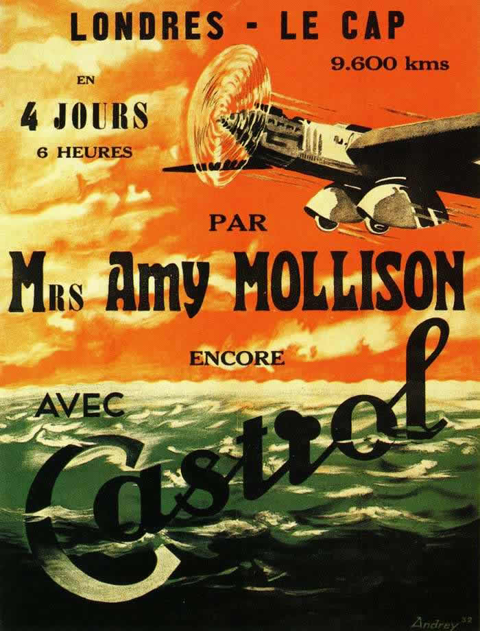
The art style of these posters was typical of the period between the World Wars. They featured bold, graphic designs with strong lines and vibrant colors. The style sometimes leaned towards Art Deco, which was popular at the time, giving the posters a modern and stylish feel. The text on the posters was usually minimal and direct, clearly stating the airline’s name, the destination, and sometimes a short phrase promoting the speed or comfort of the journey.