
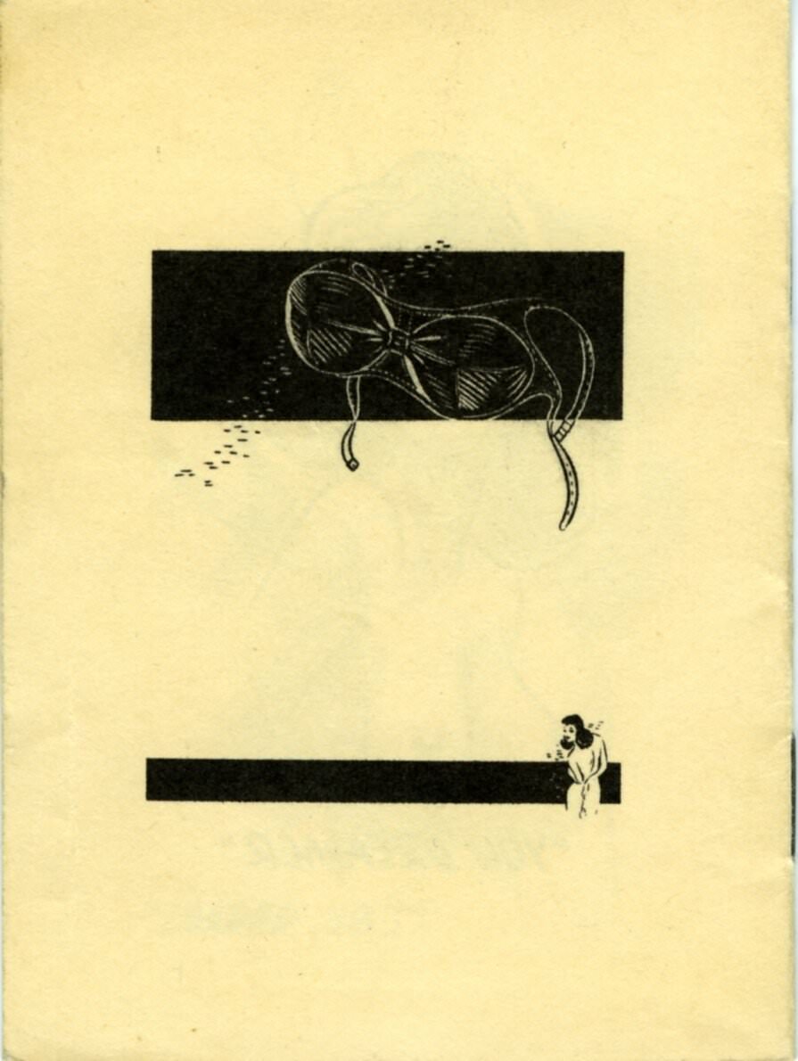
Few artifacts capture the crude humor of mid-20th century American burlesque culture quite like this small, flimsy pocket comic book from the 1940s. Cheap to produce and meant to be passed around for laughs, it classified different shapes and sizes of women’s breasts using a series of ridiculous and often offensive nicknames. Names like “Heavy Artillery,” “Spaniel Ears,” “Bee Stings,” “Full Moon,” and “Rock in Sock” were printed alongside cartoonish illustrations, turning the female body into a punchline.
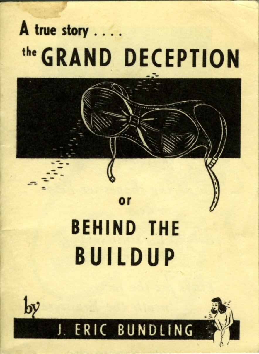
The booklet opens with a verse that sets the tone immediately: “A flimsy wisp of gossamer / Sheltering shapes we hold so dear / Behold the truth and shed no tear / These are the facts ‘neath the Brassiere.” That introduction alone tells you everything about the audience this was made for — men attending ribald comedy shows or burlesque theaters, looking for a souvenir to pocket on the way out.
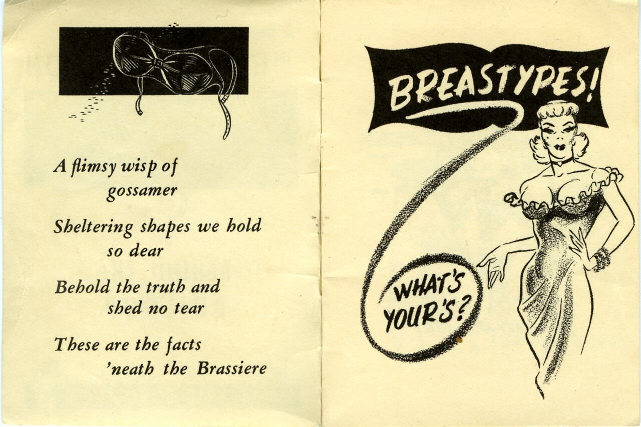
This booklet almost certainly originated as a souvenir item sold at a burlesque theater or a similar adult entertainment venue. These kinds of venues were enormously popular in the United States during the 1930s and 1940s. They featured striptease performers, slapstick comedians, and off-color humor aimed squarely at working-class male audiences. Cheap printed novelties like this one were part of that world.
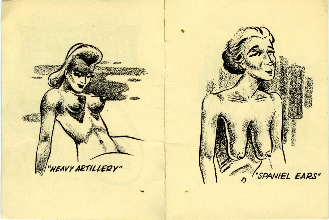
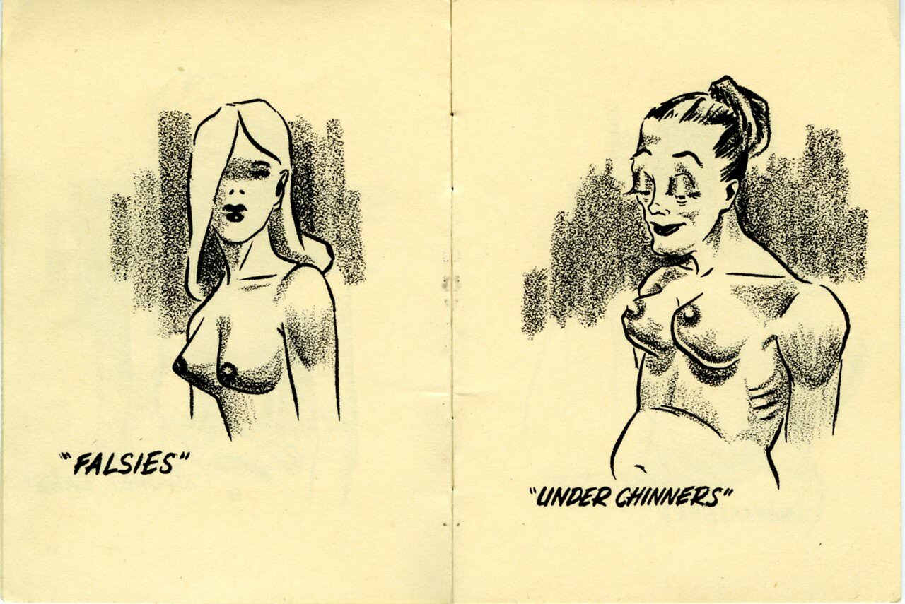
Each page of the comic presents a new “type,” giving it two name options as if offering the reader a choice of insults. “Falsies or Under Chinners,” “Smorgasbord or Bee Stings,” “Hot Water Bottles or Sweet Potatoes” — the naming system is relentless and follows a consistent pattern of comparing women’s bodies to food, household objects, or animals. The humor is blunt and deliberately lowbrow, which was entirely the point.
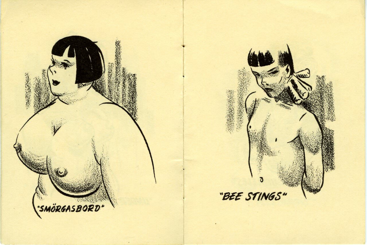
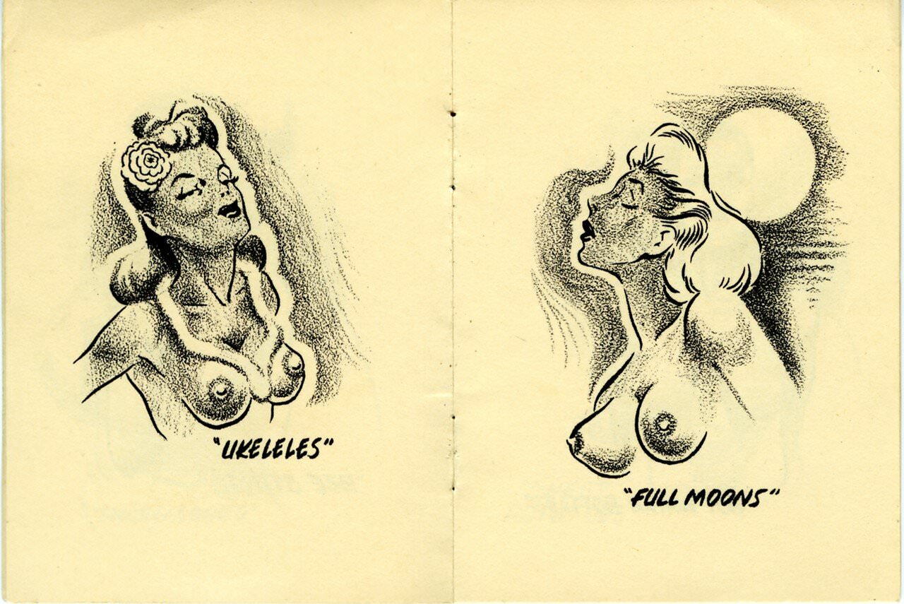
The booklet’s illustrations are cartoonish and exaggerated, drawn in the rough style typical of cheap novelty print runs of the era. There was no artistic ambition here. The goal was a quick laugh in the pocket of a man leaving a show. Similar items — gag cards, dirty joke books, and novelty photographs — were sold widely at tobacco shops, newsstands, and backstage at burlesque halls across the country.
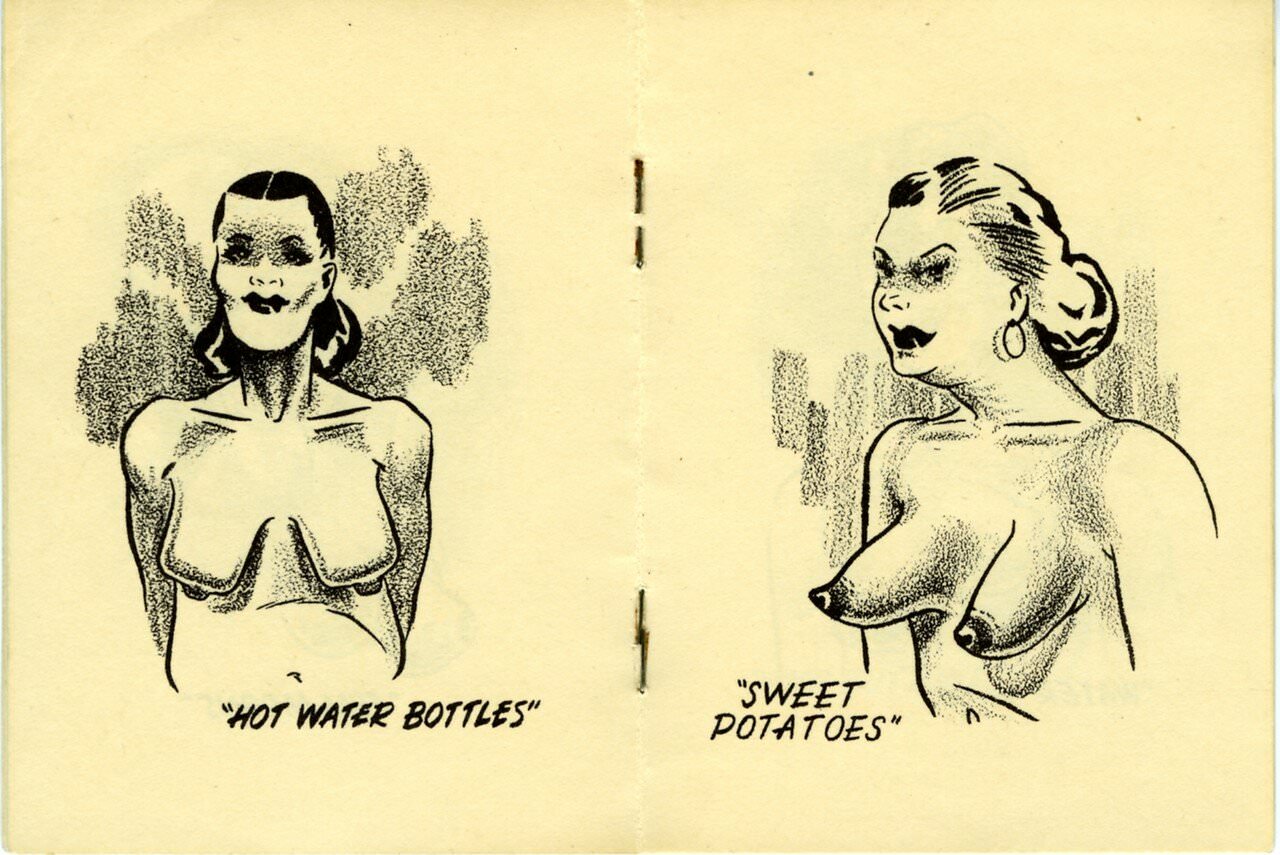
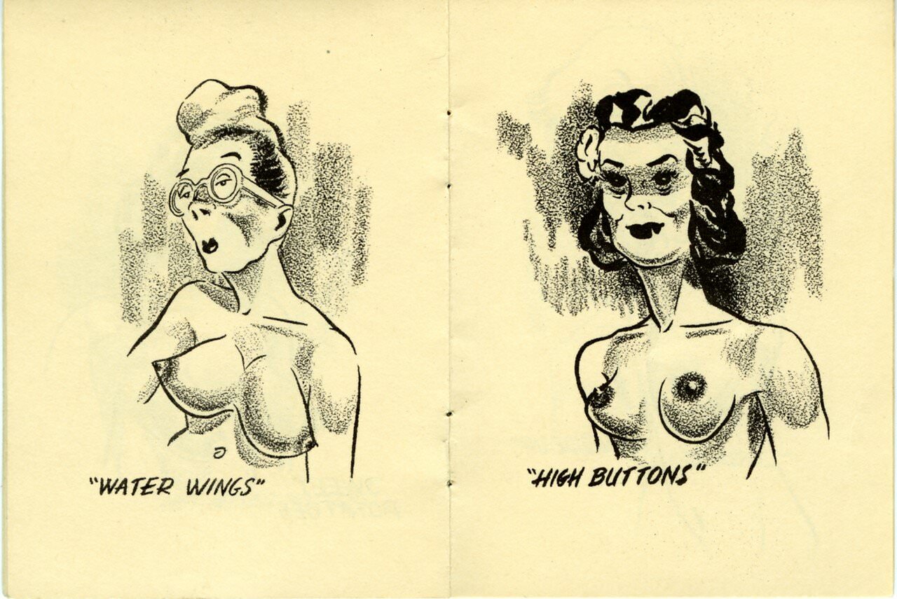
The categories keep coming: “Water Wings or High Buttons,” “Sunnyside Up or Cranberries,” “Pumpernickel or Cupcakes.” Each pairing offers a large version and a small version of the same label concept. Size is the constant obsession throughout the booklet, and no size escapes mockery. The joke works in both directions — too large, too small, everything in between gets a name.
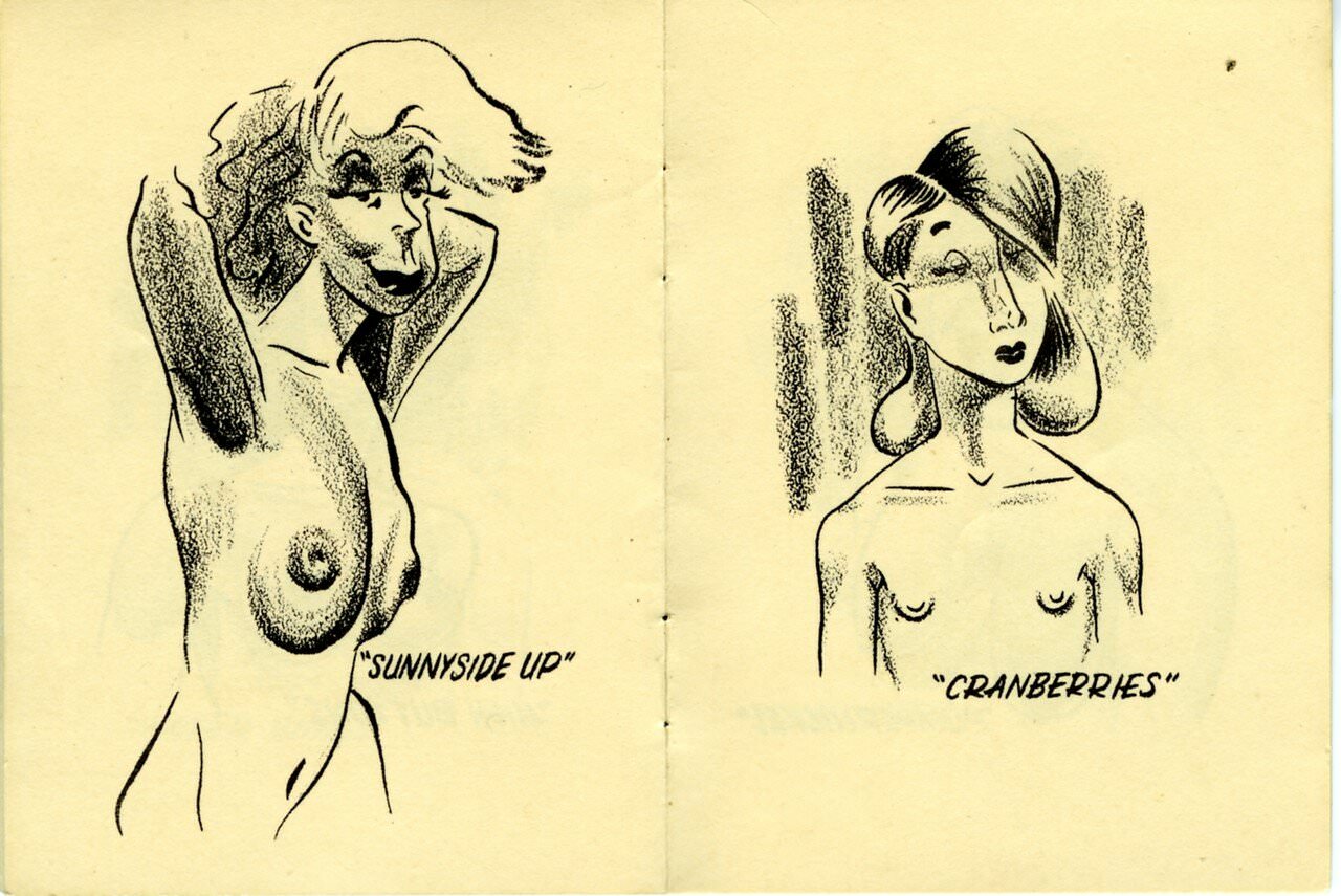
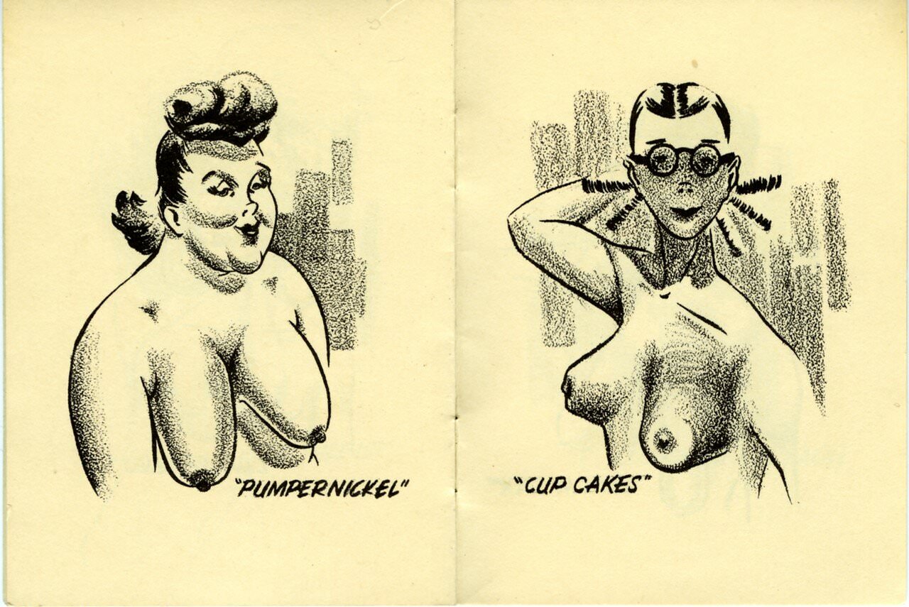
The booklet also takes aim at female “types” more broadly, not just body shapes. It reflects a wider mid-century comedy tradition of classifying and stereotyping women for male amusement — a style that ran through vaudeville, burlesque, early television, and pulp magazine humor. As a historical document, it is straightforwardly sexist by modern standards, and it was designed to be provocative even by the standards of its own time.
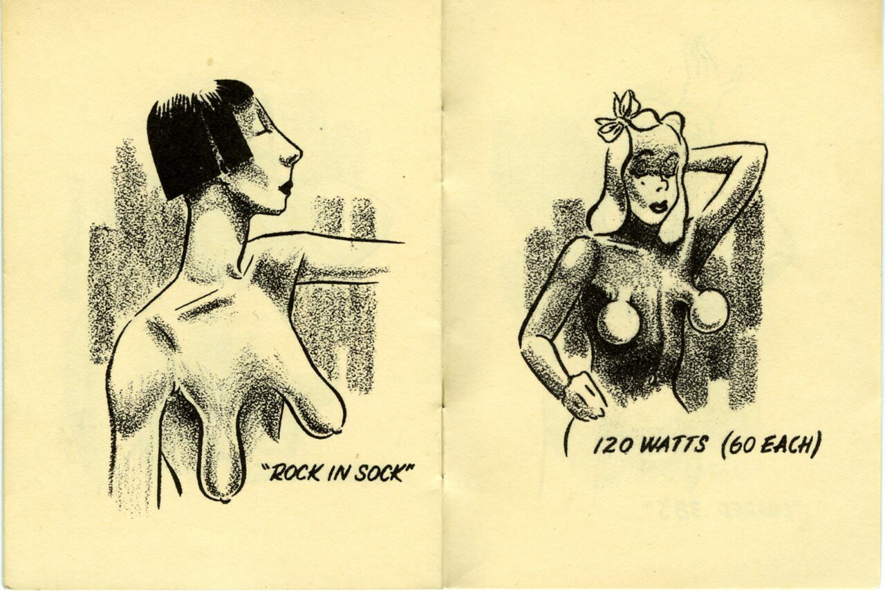
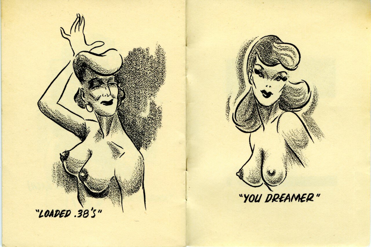
What survives today is a genuine artifact of 1940s popular culture — crude, mass-produced, and utterly disposable by design. The fact that copies still exist is a small historical accident. Most were thrown away or worn to pieces. This one made it through the decades intact, offering a clear and unfiltered window into a specific strain of mid-century American humor that was widely consumed and rarely questioned at the time.

The man who drew these has never seen natural naked breasts.
The drawing choices are pretty interesting (OK, I’m a straight male, so perhaps the subject matter adds some appeal, but…): This is packaged as descriptive communication, but at every turn, it screams “prescriptive.”. The overly stylized, sometimes exaggerated breasts may contribute to this. An individual who reflects their worldview while shaping others’ as well.
Even insofar as the joke was concerned, they aren’t accurate exaggerations/caricatures of existing shapes so much as someone who has only seen clothed breasts shaped differently by undergarments would imagine they would look naked. In this comic, many of the breasts have the bullet-bra shape, which was popular in fashion at the time, and bullet-bra was popular partly because natural breasts don’t have that shape.
It’s funny to see a caricature of someone if you know who it’s supposed to be. Likewise, these would be much more comical if they were based on “real” breast shapes instead of what the artist imagines naked boobs to look like.
We’re probably talking about the same thing, you mention that you think this is prescriptive or what the artist would like to see, and I agree.
I believe I understand your meaning, and I agree with you. I stand by my comment. It seems that men (especially in Western Europe and the United States during the Victorian and postwar eras) were more invested in idealized representations of women than is the case today. That part of that was the unrealistic representation of their bodies. Your comment that these look like breasts shaped like undergarments seems spot on.
I read the title of the book like it was a Greek name. Like “Breast-i-pees”
To illustrate which kinds of breasts you should think are attractive and not, the artist used heavy-handed “ugly” and “pretty” stereotype shortcuts. I guess that’s how culture works.
Lol okay beta cuck
This is so weird, and yet highly entertaining.
Wow this is weird all boobs are the best boobs.
1940s* You may be thinking of the apostrophe in ’40s