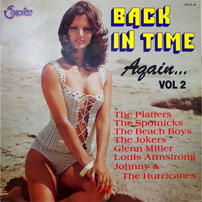
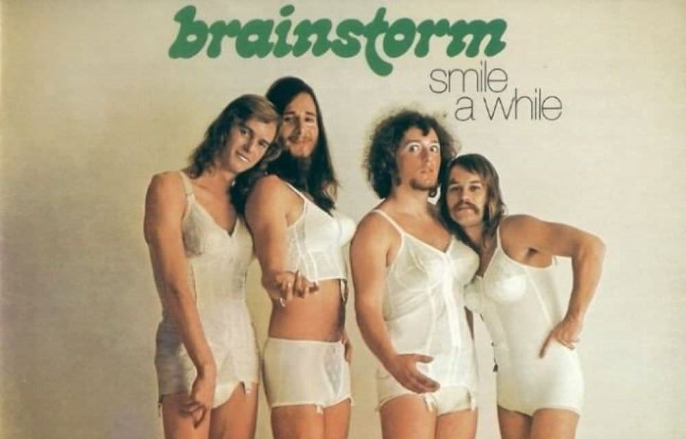
Before streaming services and digital playlists, the album cover was everything. It sat in a bin at the record store, competing with dozens of other sleeves for a shopper’s attention. Labels knew they had only a few seconds to make someone stop, pick it up, and buy it. So they got creative — sometimes brilliantly, sometimes absurdly.

One strategy that record companies returned to again and again from the 1960s through the 1980s was the beach theme. Sun, sand, and women in bikinis became a reliable formula. It didn’t matter much whether the music inside had anything to do with the ocean. The image sold the record.


The early 1960s surf craze gave this trend a legitimate home. Bands riding the wave of surf rock genuinely needed beach imagery — it matched the music. Artists like The Beach Boys made the California coastline a cultural symbol, and album art reflected that world directly.
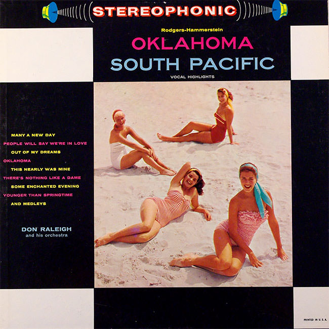

But the trend quickly spread far beyond surf music. Easy listening compilations, lounge records, and even country albums started appearing with women in swimsuits on the cover. The connection to the actual music became thin — sometimes nonexistent. The bikini cover became its own genre of marketing.

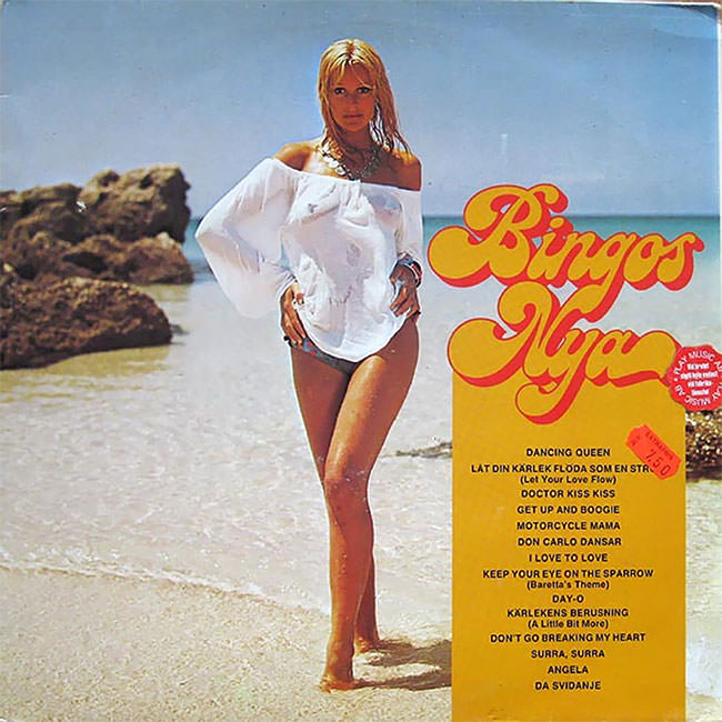
Record labels in the 1960s operated in a competitive, fast-moving market. A strong visual could push a record from the back of the bin to the front of someone’s collection. Photography was cheap compared to illustration, and shooting on a sunny beach was a straightforward production.
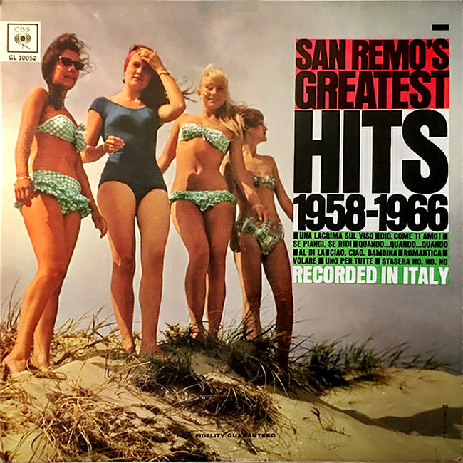

By the 1970s, the look evolved. Covers became more polished and professionally shot. Airbrushing was common. The women featured on covers were styled more deliberately, and the photography leaned toward a glossy, aspirational aesthetic that matched the decade’s broader design trends.



Smaller regional labels used the formula just as freely as major ones. A local pressing of a dance band or a regional pop act would get the same beach treatment. It was a shortcut to looking commercially viable, no matter the size of the budget behind it.


Some of these covers are genuinely well-composed photographs. Others are awkward, low-budget, or oddly staged. A few feature settings that are clearly not a real beach at all — studio backdrops, painted scenes, or indoor pools standing in for the Pacific.
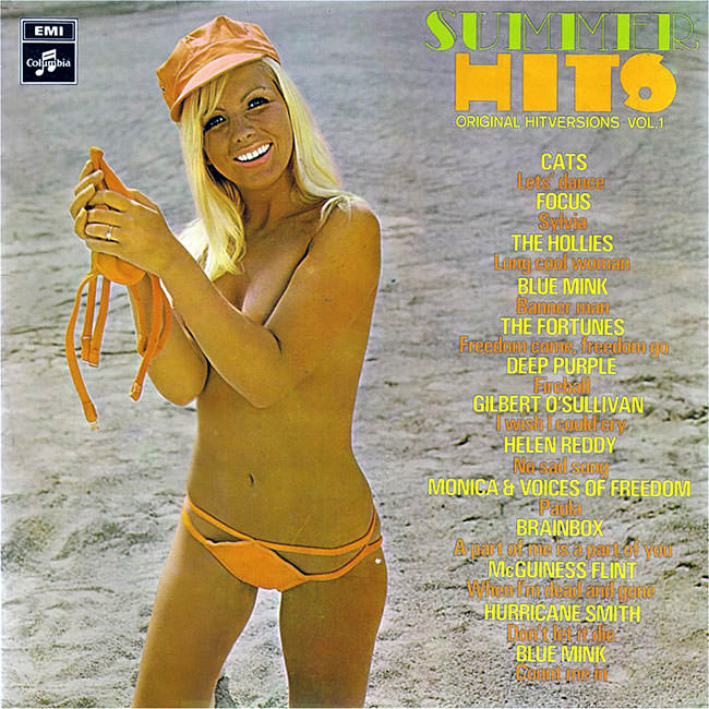


Into the 1980s, the bikini cover took on a flashier, neon-tinged character. The soft, sun-soaked tones of the 1960s gave way to bolder colors and harder lighting. MTV had changed what audiences expected visually, and album art responded to that shift.


Not all of these albums were obscure flops. Some moved serious units. The cover art was part of the commercial package, and for many buyers flipping through a record crate, a striking beach image was reason enough to pull a sleeve out and take a closer look.



The women featured on these covers were rarely credited on the sleeve itself. They were models, session workers, or in some cases girlfriends or acquaintances of the band. Their faces became part of the visual identity of records they often had no personal connection to.

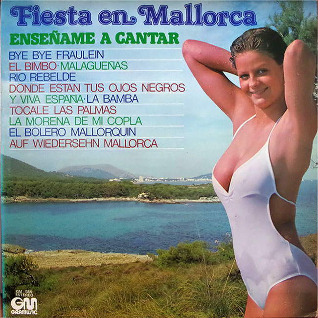
Looking at these covers together, you get a clear picture of how the music industry used visual shorthand. The beach stood for freedom, youth, and leisure — exactly the feelings that record labels wanted buyers to associate with their product.



The sheer volume of albums that used this approach across three decades shows just how effective — or at least how trusted — the formula was. Designers and label executives kept coming back to it because it worked consistently enough to justify the choice.
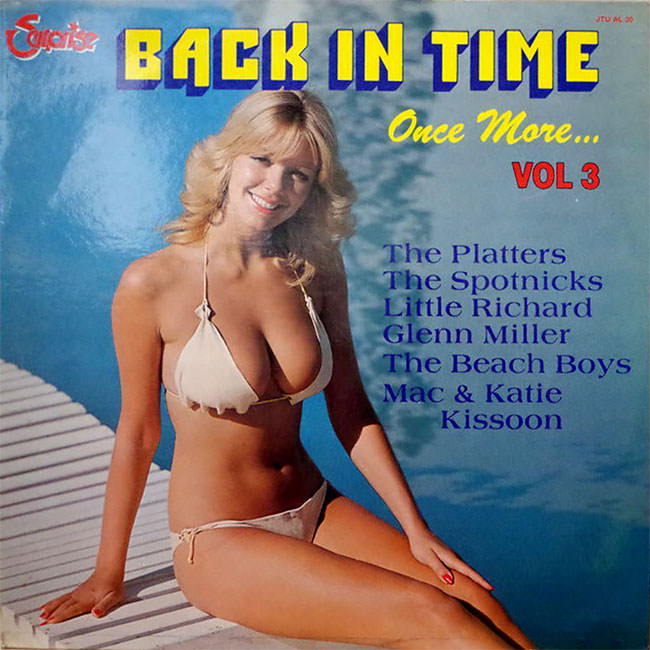

These records are now sought-after collector items, valued as much for their cover art as for the music inside. Thrift stores, garage sales, and online auction sites regularly surface examples from all three decades, each one a small snapshot of how pop culture looked and sold itself at that moment.