Peter Birkhäuser was a Swiss graphic designer born in Basel who trained at the Basel School of Design under teachers like Fritz Schleifer. That foundation gave him a precise command of form, color, and composition that would define his entire career. By the 1930s, he was already producing posters with a confidence well beyond his years.
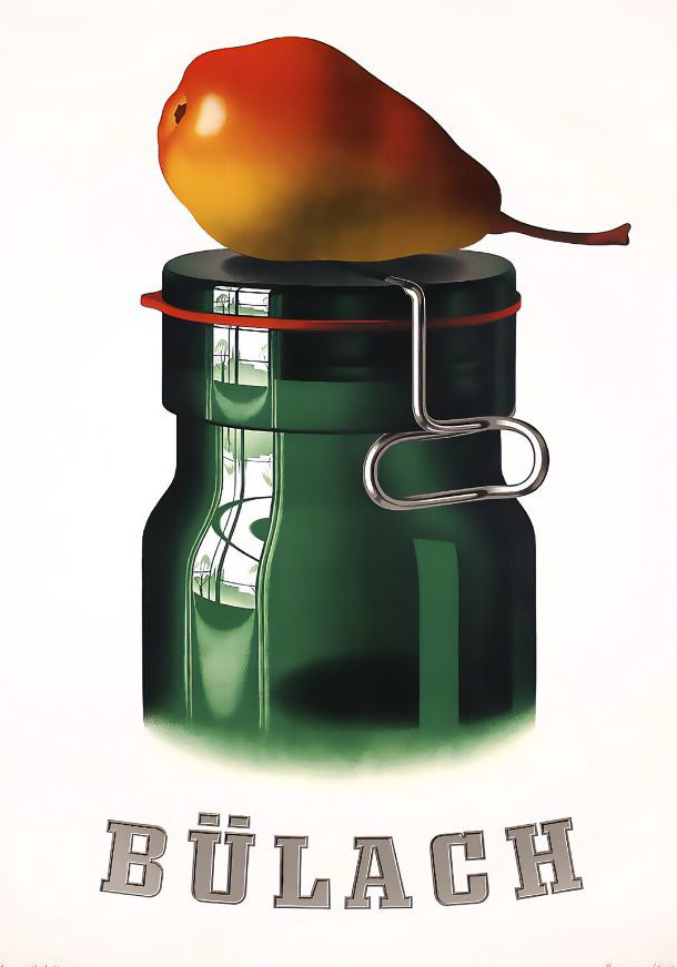
Birkhäuser’s style relied on clean lines, balanced layouts, and bold color choices. He blended traditional artistic techniques with the sharper demands of commercial graphic design, producing work that communicated instantly and stayed with the viewer. His posters were not decorative — they were built to do a job.
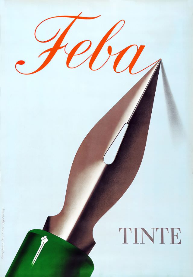
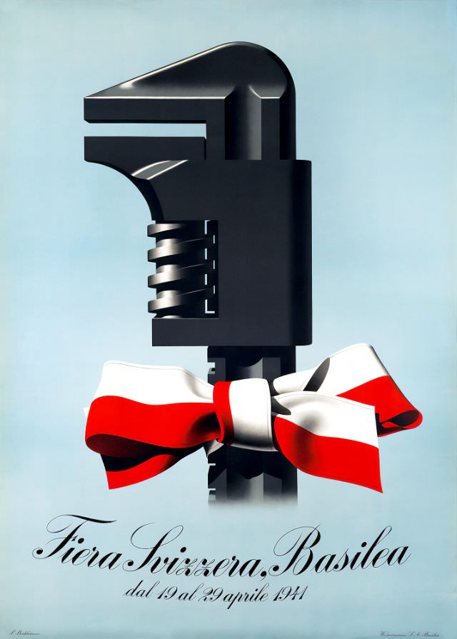
The early 1940s saw Birkhäuser producing at a rapid pace. He designed for perfume brands, department stores, and trade fairs — each assignment handled with the same visual discipline. His ability to strip a message down to its most powerful visual form made him highly sought after by commercial clients across Switzerland.
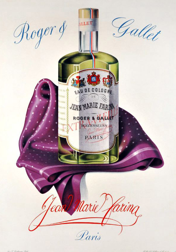
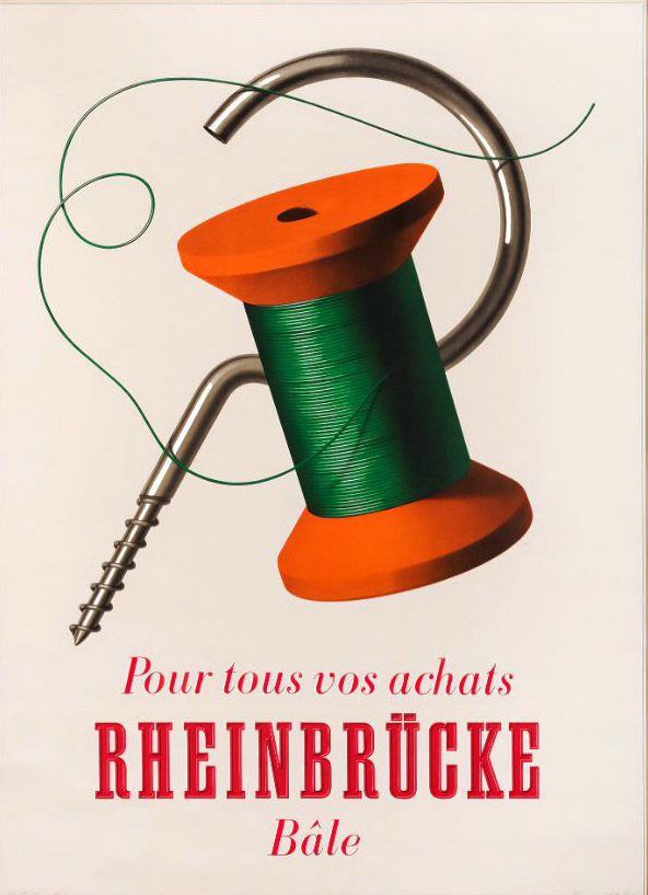
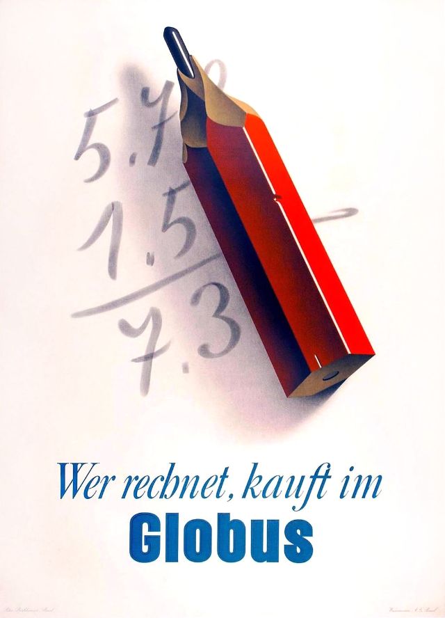
In 1943 alone, Birkhäuser produced a remarkable range of work — from a public health campaign for tuberculosis aid to advertisements for the bitter digestif Fernet-Branca and thermal knitwear brand Hisco. Each poster used a completely different visual language while maintaining his signature precision.
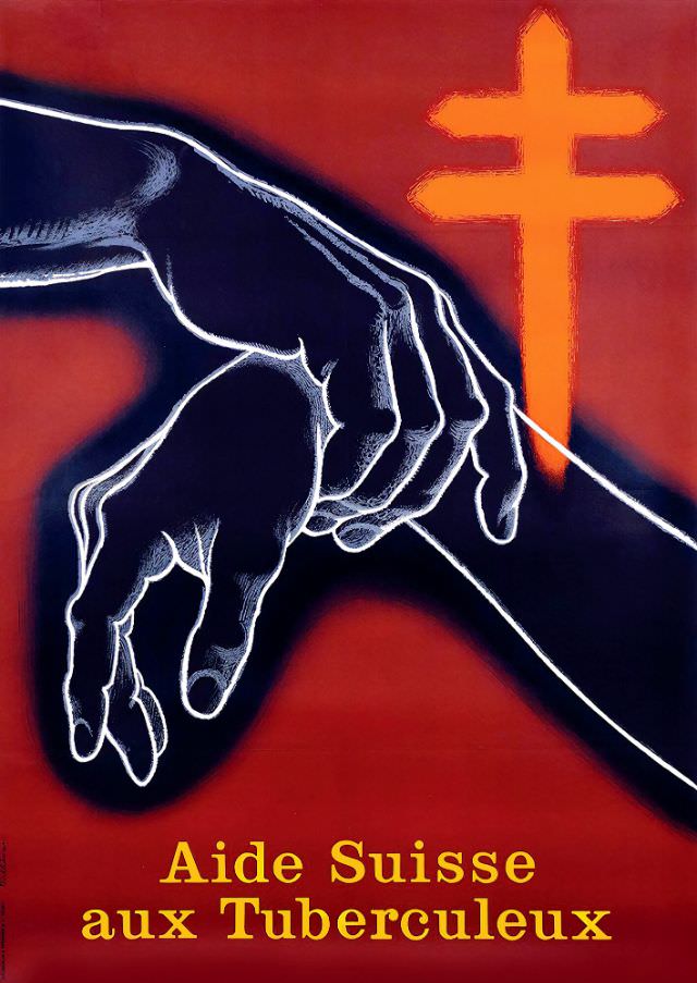
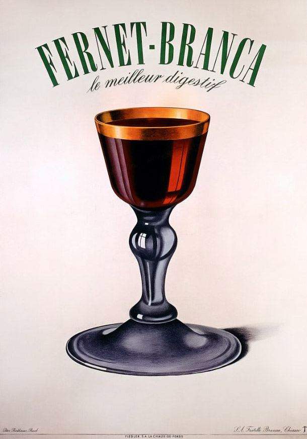
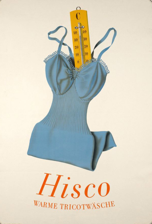
Birkhäuser also took on utilitarian product advertising — including a pest control poster for Surux around 1945. No matter the subject, he approached each brief with the same graphic rigor, turning even an exterminator ad into a visually arresting image.

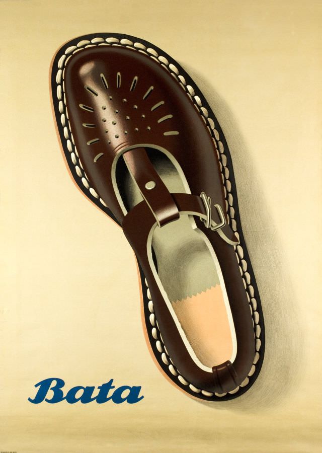
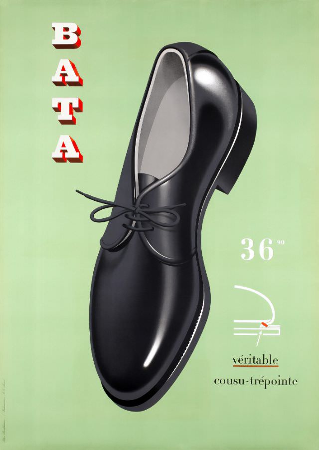
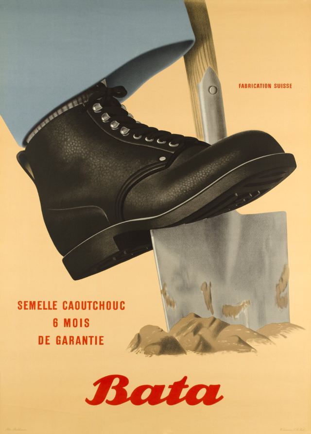
The shoe brand Bata became one of Birkhäuser’s most consistent clients. In 1947, he produced multiple distinct posters for the company — covering galoshes, the Möhlin AG line, and general advertising. He continued designing for Bata well into the 1950s, producing campaigns for sandals, rubber-soled shoes, and welt-stitched footwear.
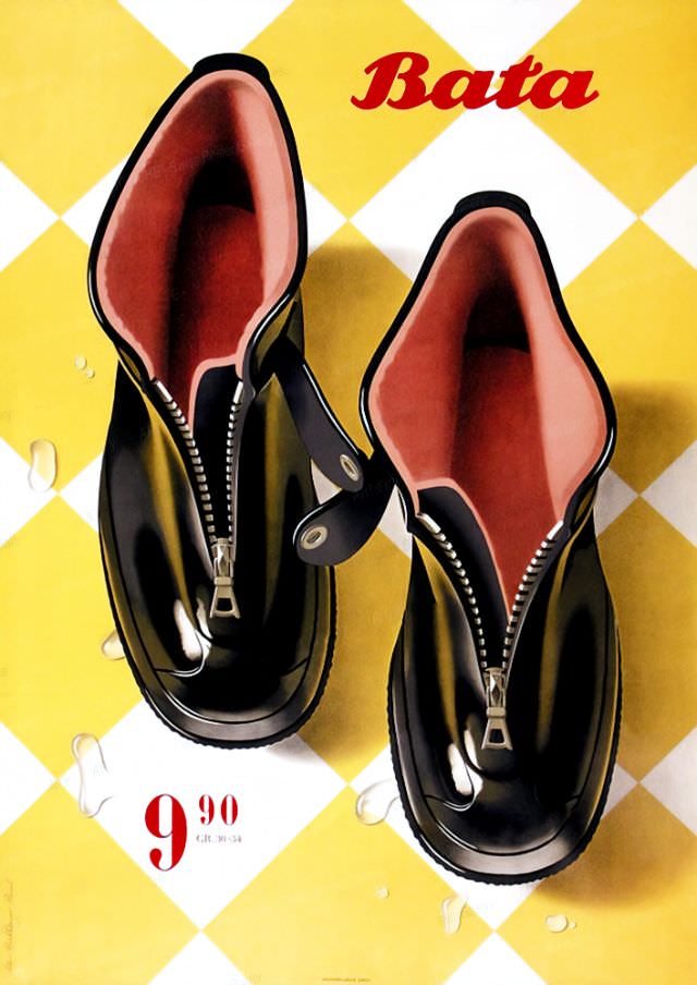
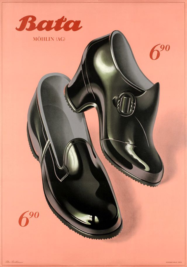
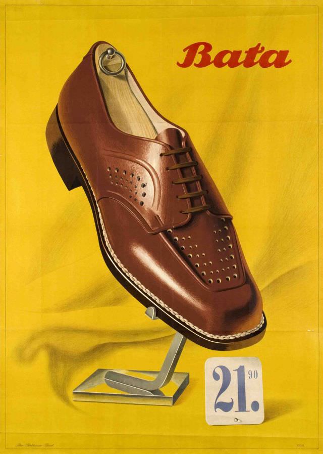
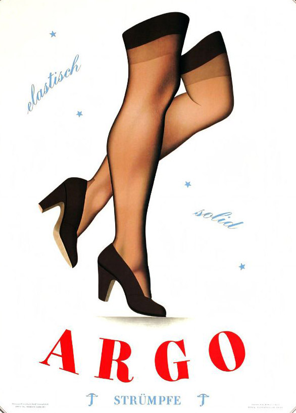
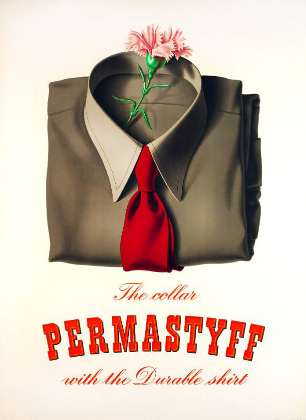
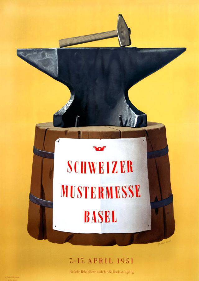
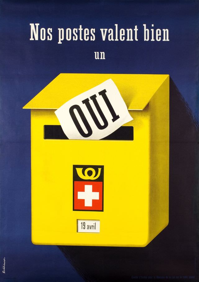
Into the 1950s, Birkhäuser’s output remained broad and inventive. He designed advertising for shirt brands, the Basel Trade Fair, a Swiss postal referendum poster, and food products — all while maintaining the visual economy that made his work so effective.

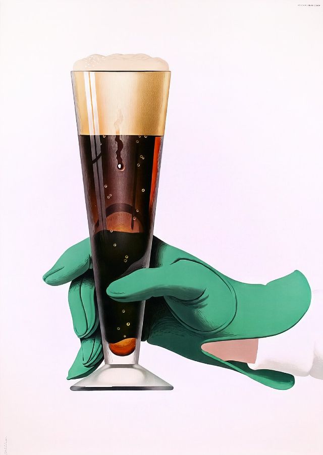
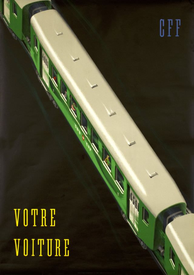
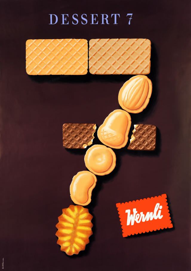
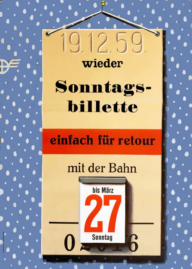
By the late 1950s, Birkhäuser was producing some of his most memorable work. His two beer posters for the Swiss Brewery Association in 1957 — each featuring a dramatically lit gloved hand — showed his mastery of high-contrast imagery. That same year he designed for Swiss Federal Railways and a dessert brand. His 1959 Sunday rail ticket poster closed the decade with the same sharp wit that had opened it.