Collier’s magazine was born in 1888, founded by Irish-American publisher Peter Fenelon Collier. It started life as Collier’s Once a Week, a modest weekly aimed at a broad American readership. By 1895, it had grown enough to earn a new identity — Collier’s Weekly: An Illustrated Journal — and was positioning itself as a serious, illustrated publication for the general public.
The name changed once more in 1905, becoming Collier’s: The National Weekly. That title said it all. By then, the magazine had a nationwide footprint and was competing for space on newsstands alongside the biggest publications in the country. Its covers were a key part of its identity, featuring bold illustrations and eye-catching artwork that reflected the tastes and culture of early 20th-century America.
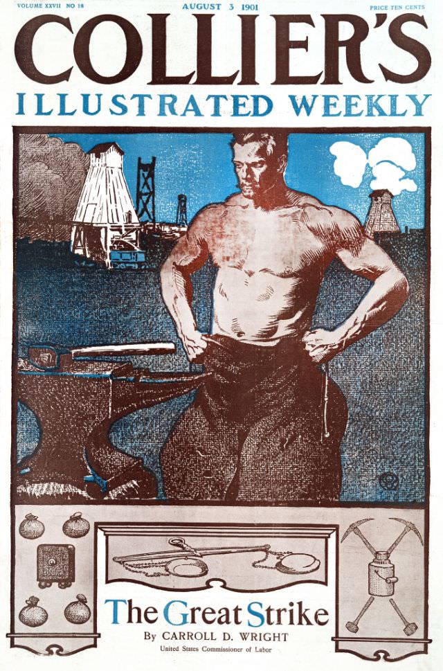
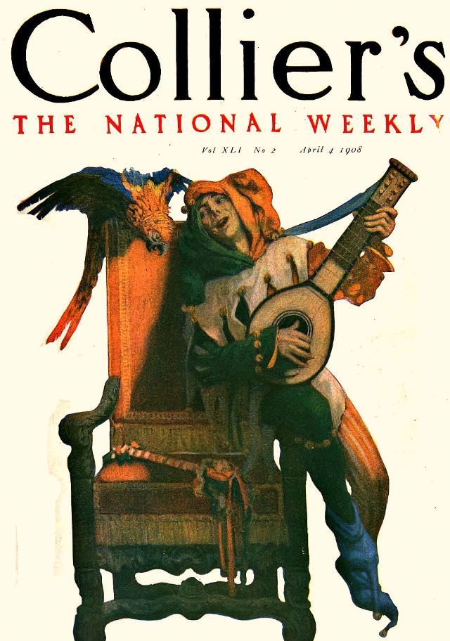
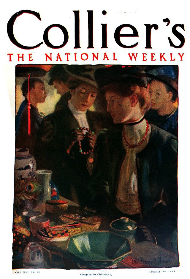
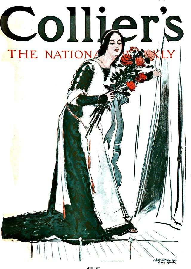
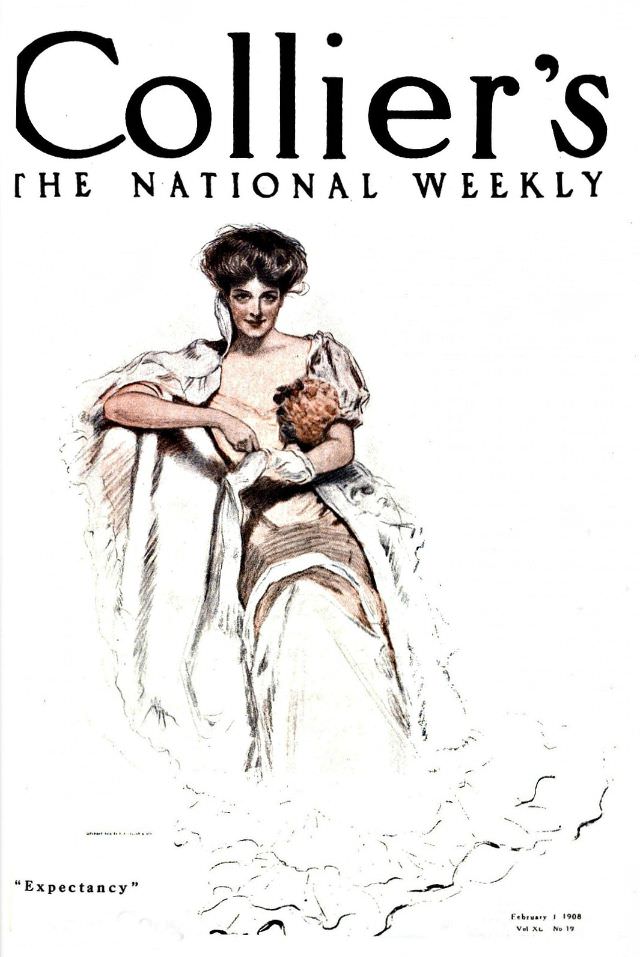
The covers from the early 1900s showcase a particular style of illustration that was common before photography dominated print media. Artists crafted scenes and portraits that were vivid and detailed, designed to grab attention at a glance. Each cover told a small story on its own.
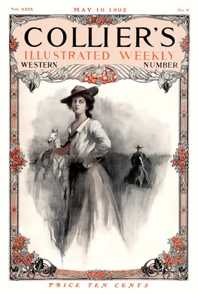
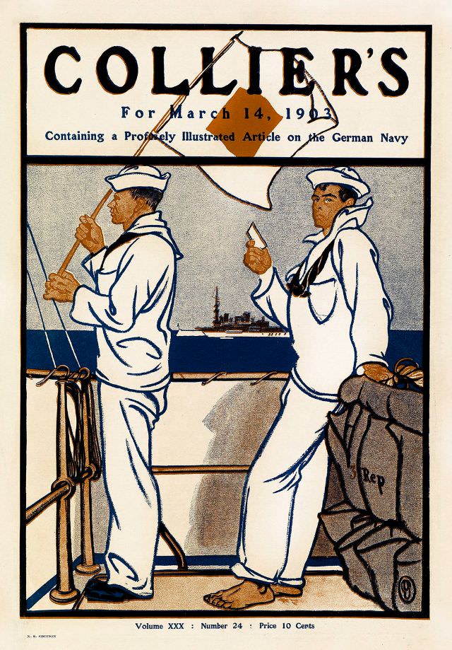
The magazine’s 1903 covers show how quickly illustration styles were evolving. Artists were experimenting with color, composition, and subject matter, moving from stiff formal portraits toward livelier, more dynamic scenes that felt immediate and modern for the time.
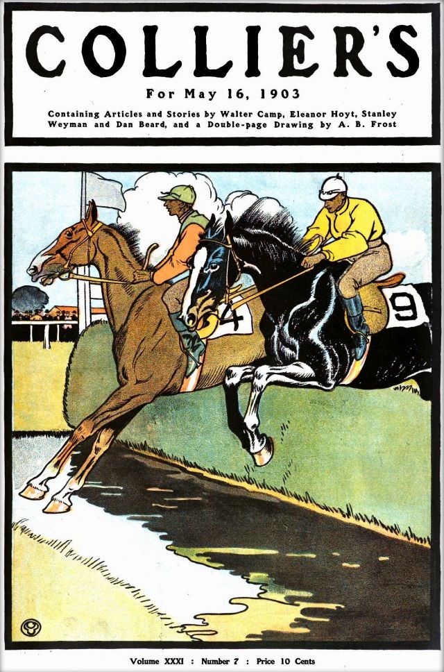
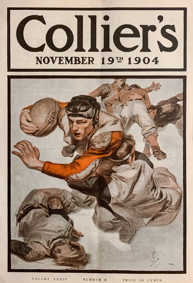
By 1905, the year Collier’s officially became The National Weekly, its cover art had developed a confident, polished look. The magazine was no longer just a local or regional publication — it was speaking to the entire nation, and its covers reflected that ambition.
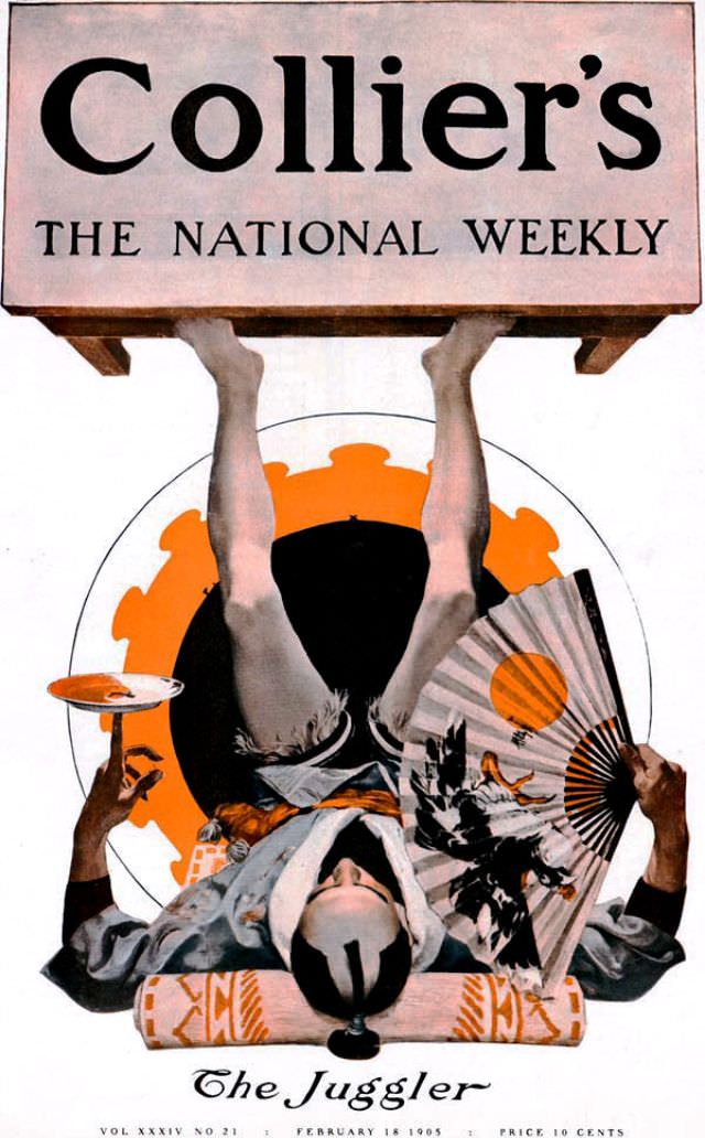
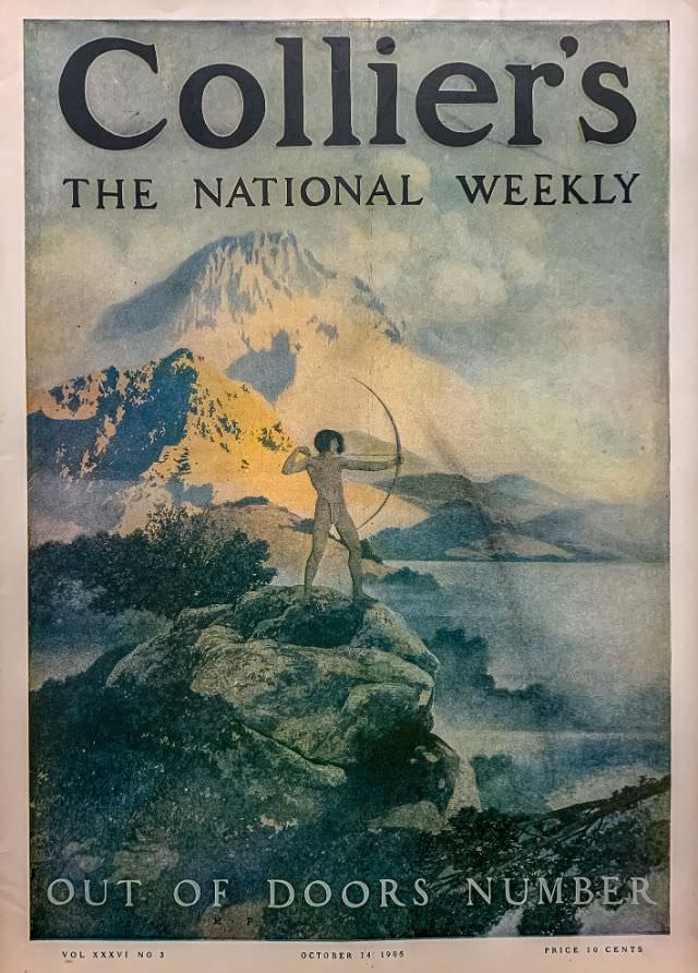
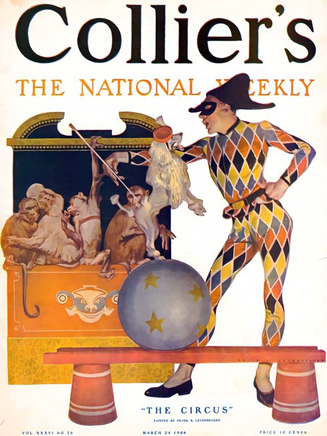
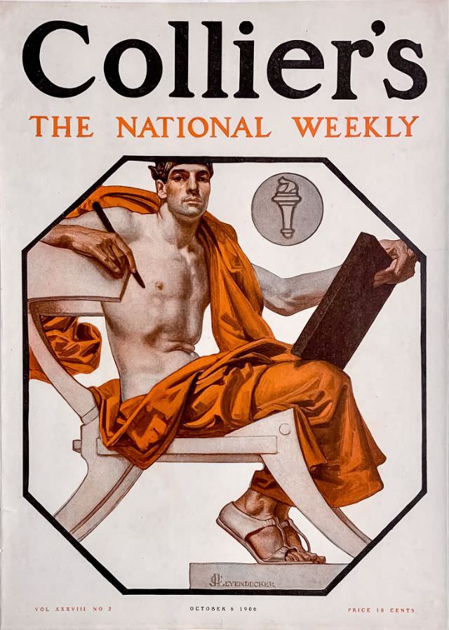
The 1906 issues reveal a magazine at the height of its visual creativity. The covers from this year range widely in tone and subject, from graceful figures to dramatic outdoor scenes, showing just how versatile Collier’s artists were.
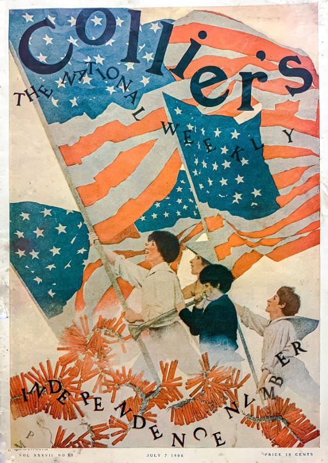
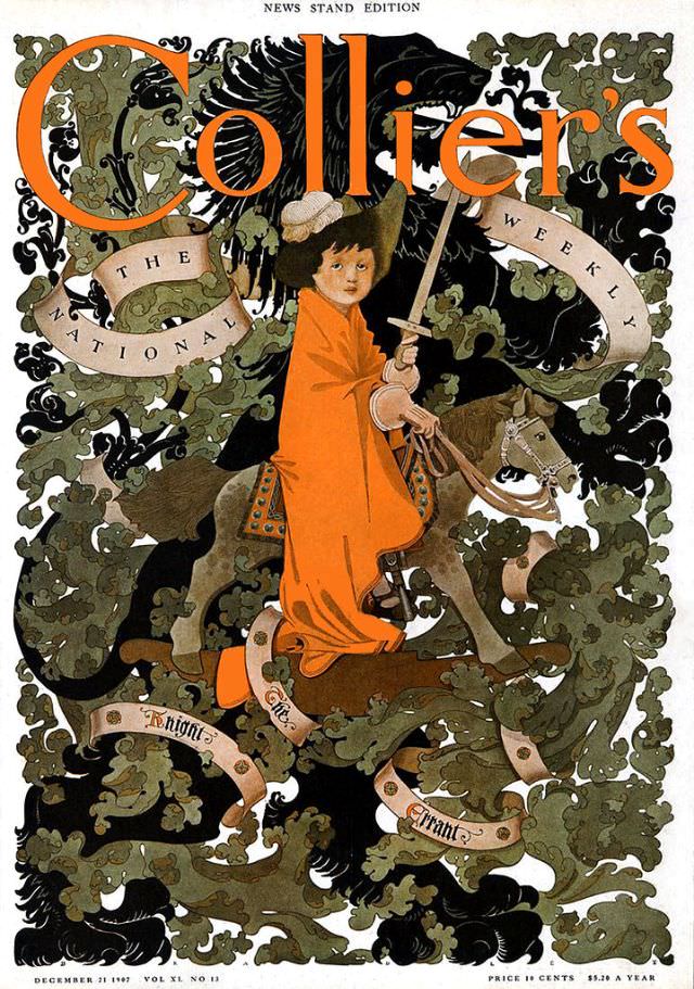
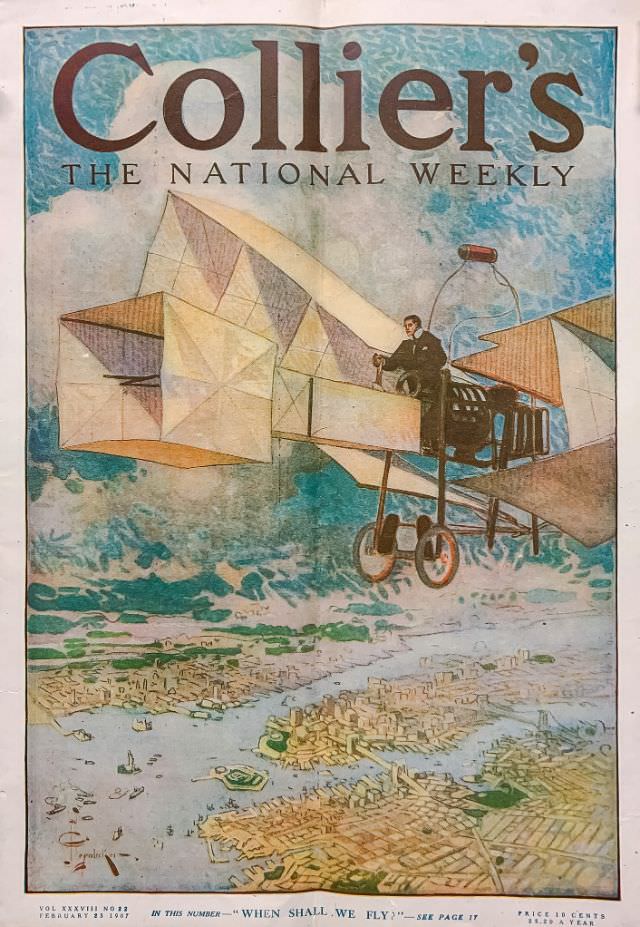
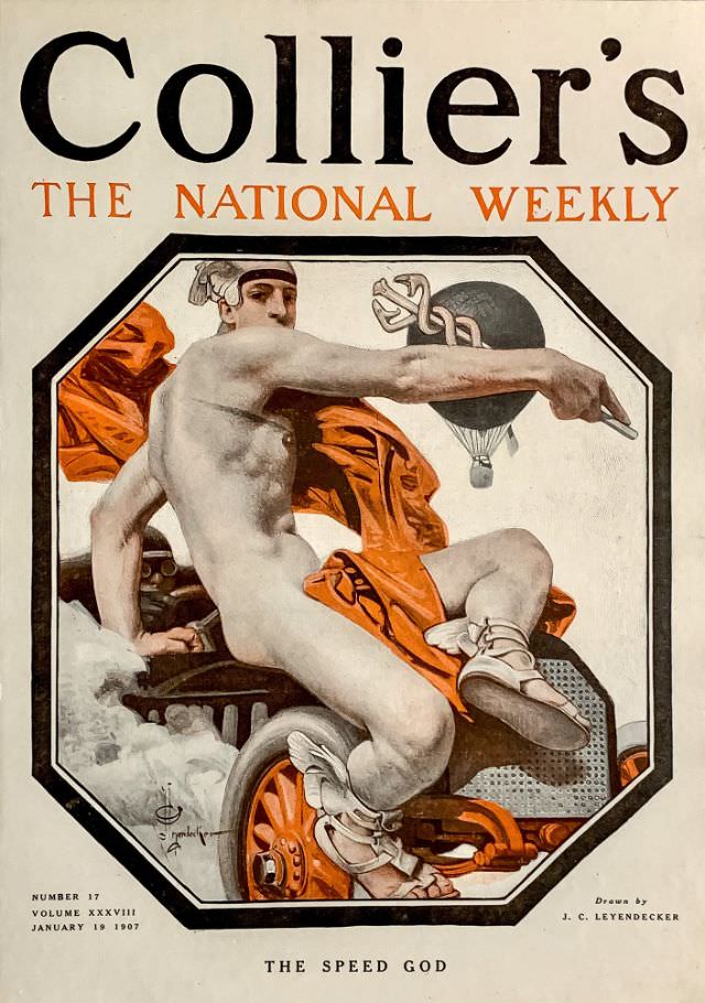
The 1907 covers continued the tradition of strong, illustration-driven design. December of that year produced one of the more striking holiday issues, while the January and February covers leaned into the clean, composed style that had become a Collier’s trademark.
The year 1908 was one of Collier’s most productive periods for cover art. Across the span of that single year, the magazine produced dozens of visually distinct covers, each one a snapshot of popular American illustration at the time. The range of subjects — from seasonal themes to portraits to action scenes — made 1908 a standout year.
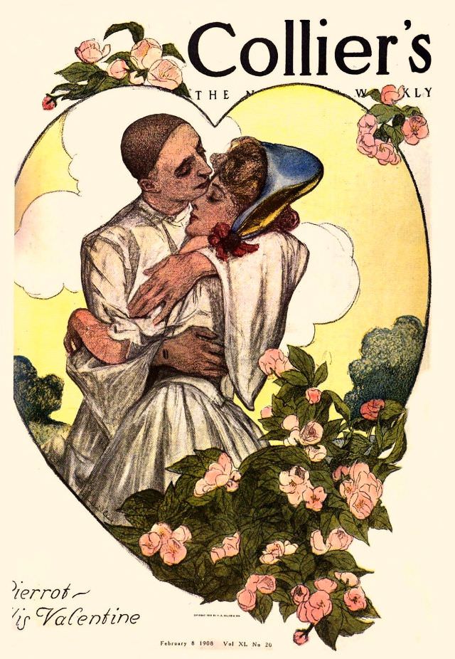
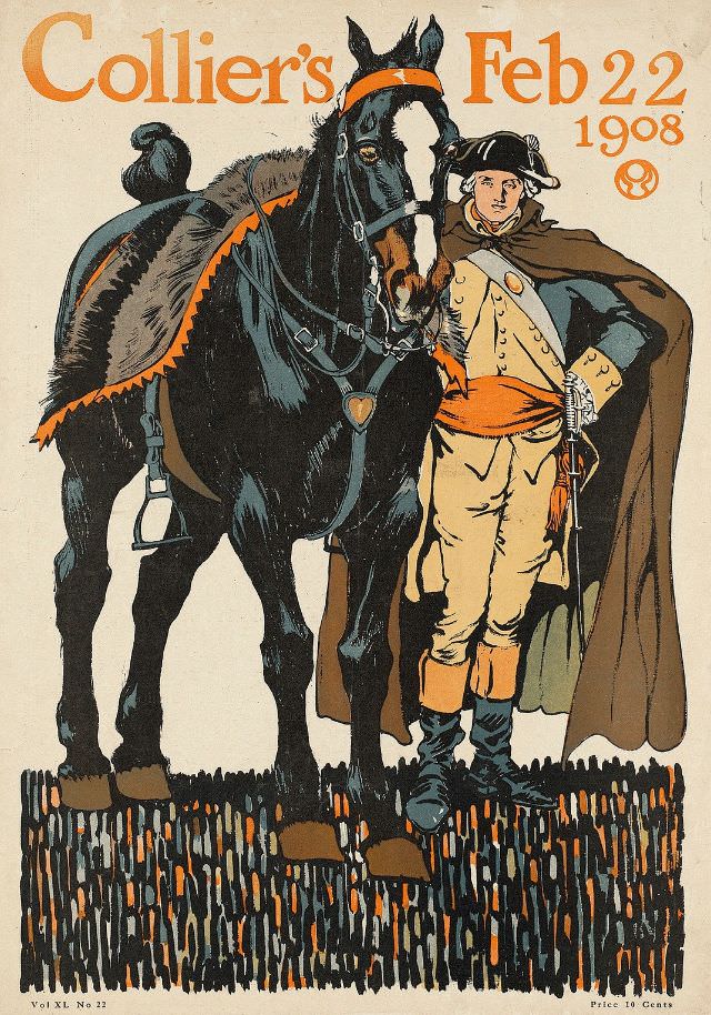
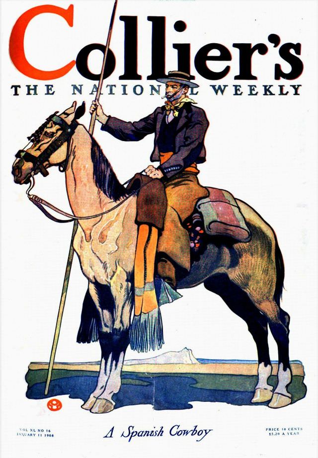
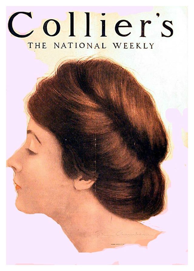
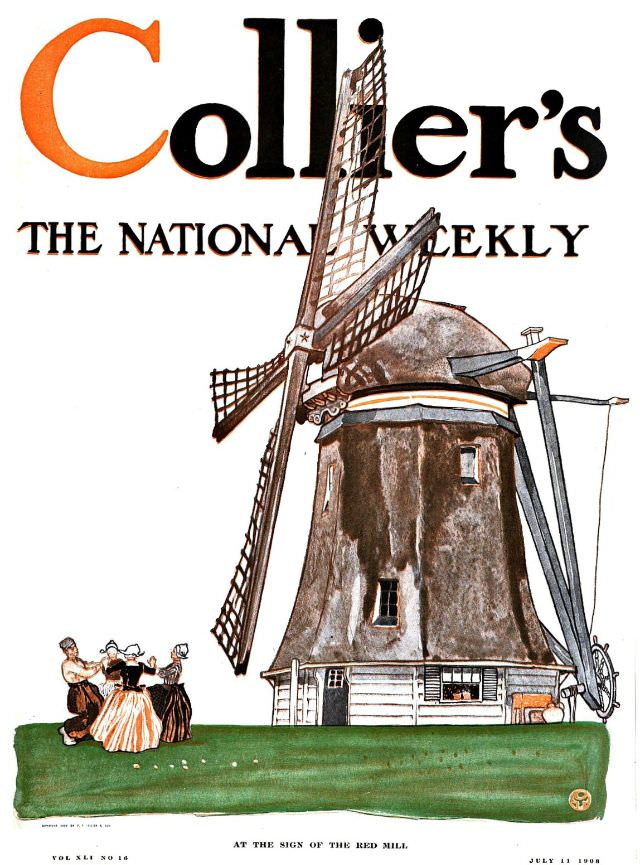
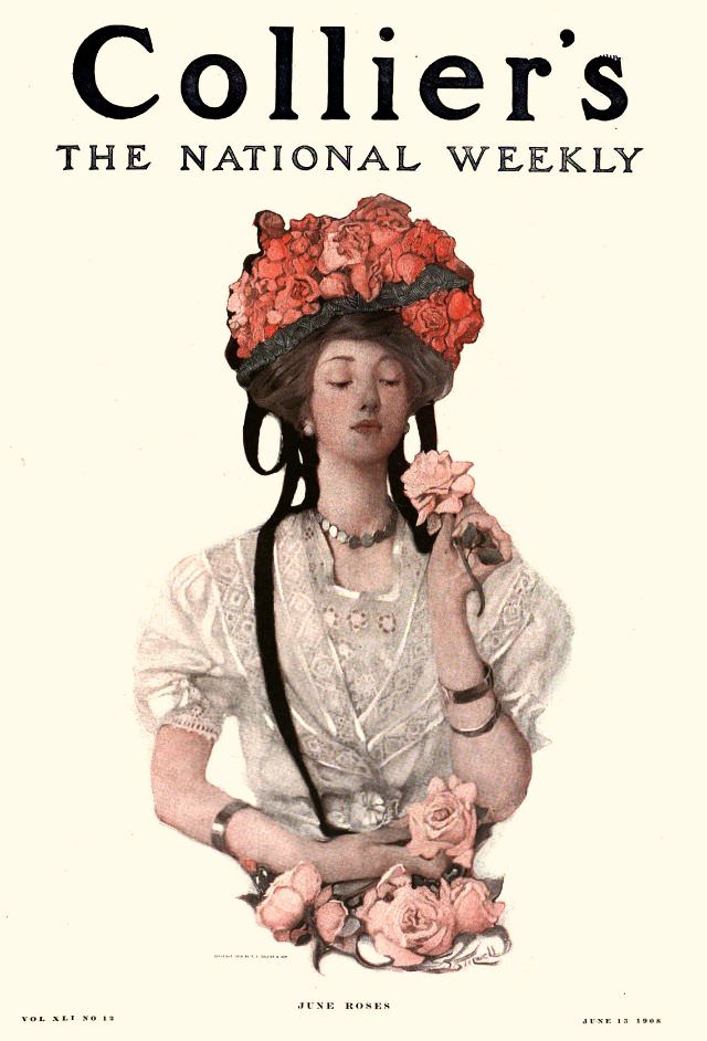
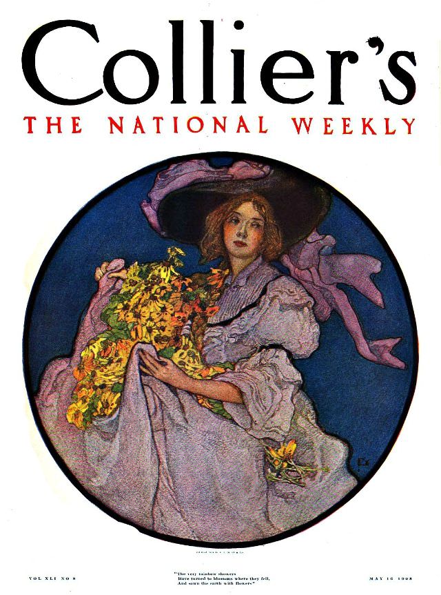
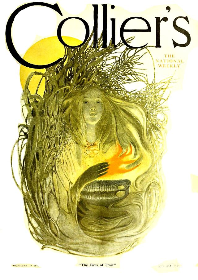
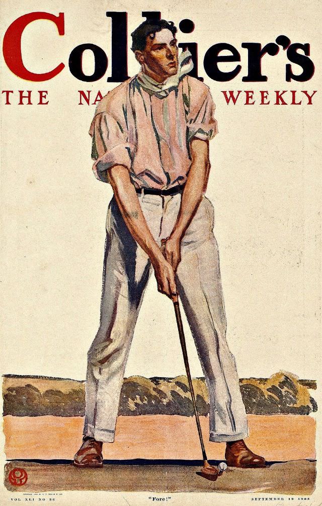
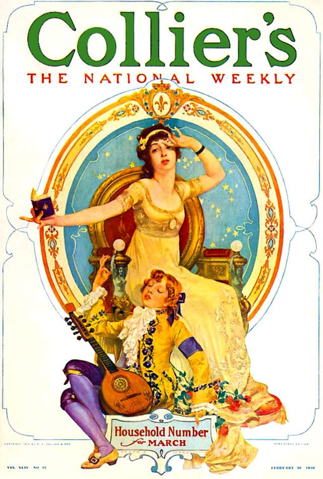
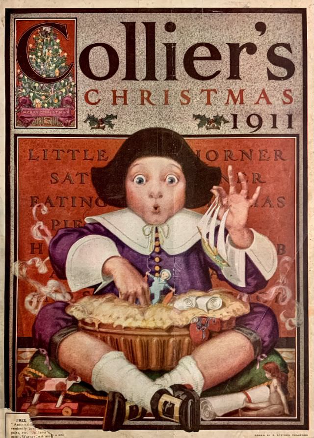
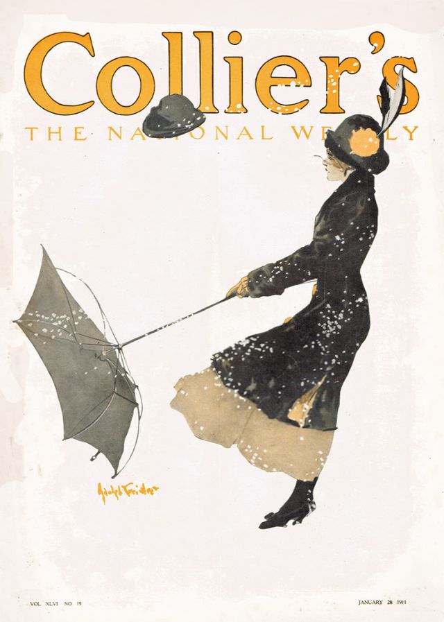
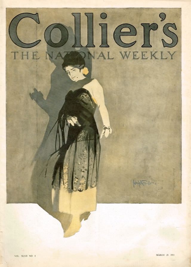
Moving into 1910 and 1911, the covers took on a slightly more refined quality. Lines were cleaner, color palettes more deliberate. The illustrations from these years feel more precisely crafted, reflecting both advances in printing technology and a maturing visual culture in American publishing.
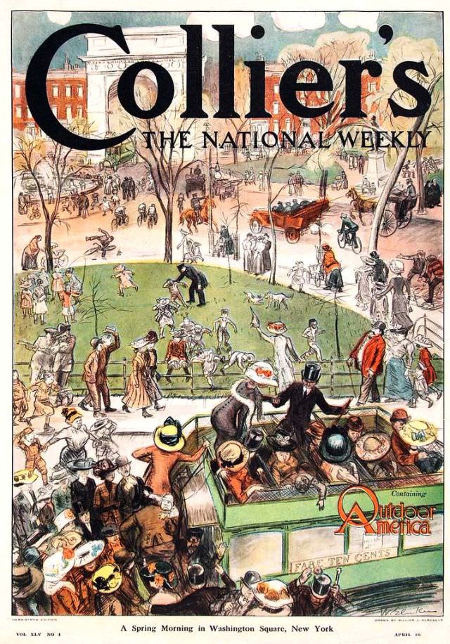
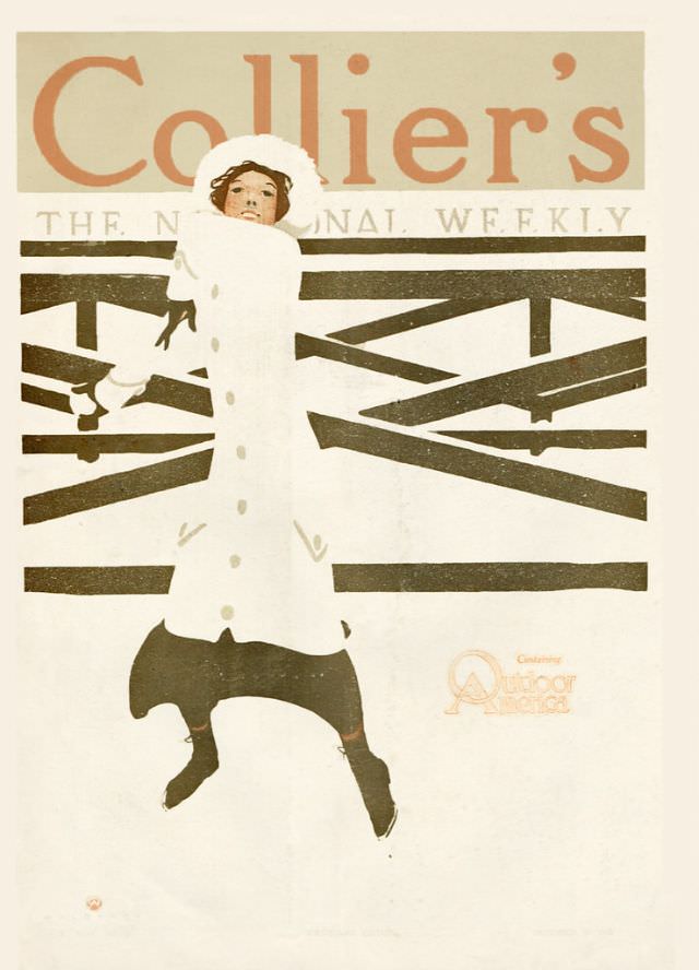
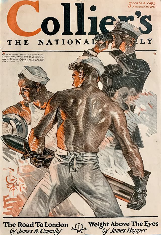
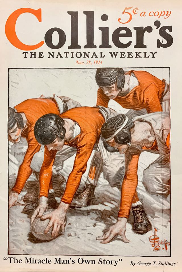
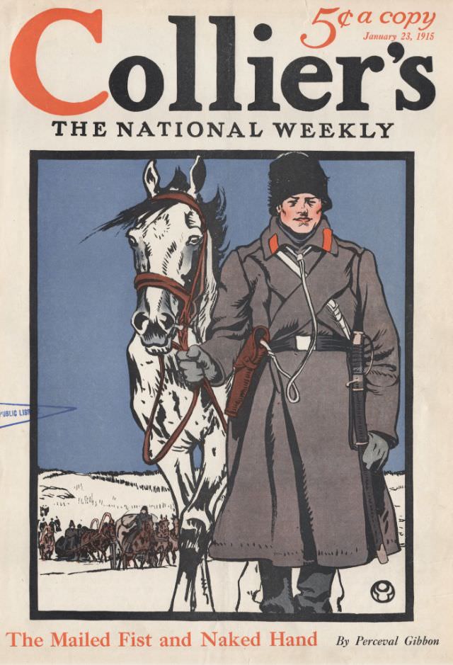
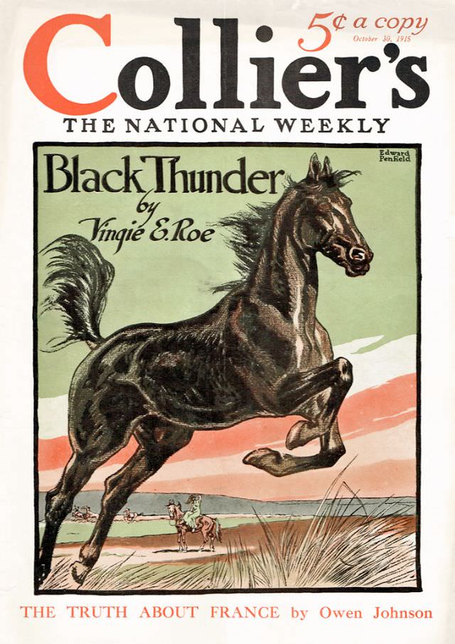
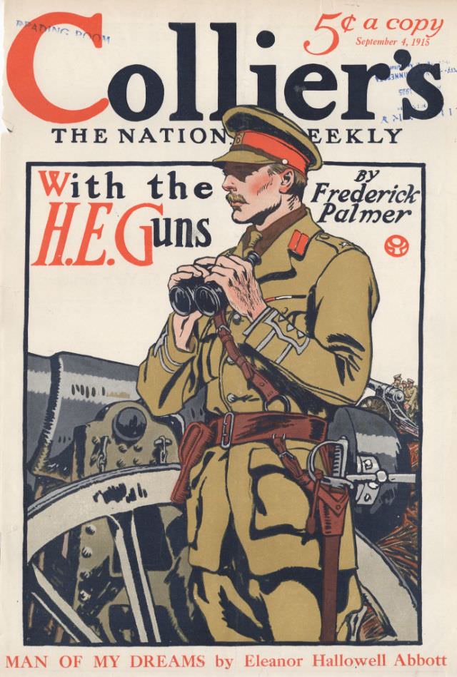
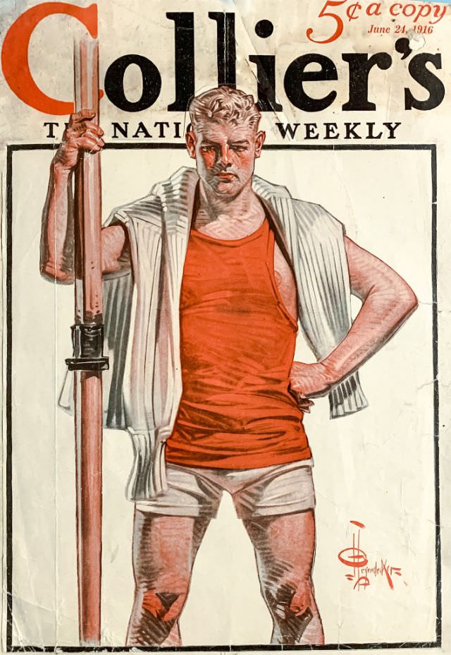
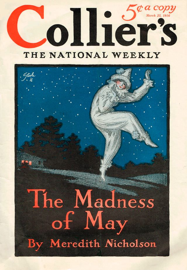
The mid-1910s brought a new edge to Collier’s covers. With World War One reshaping the global landscape by 1914, the magazine’s tone shifted at times to reflect the seriousness of the era. The covers from 1914 through 1917 sit at a fascinating intersection of peacetime illustration traditions and a world in upheaval.
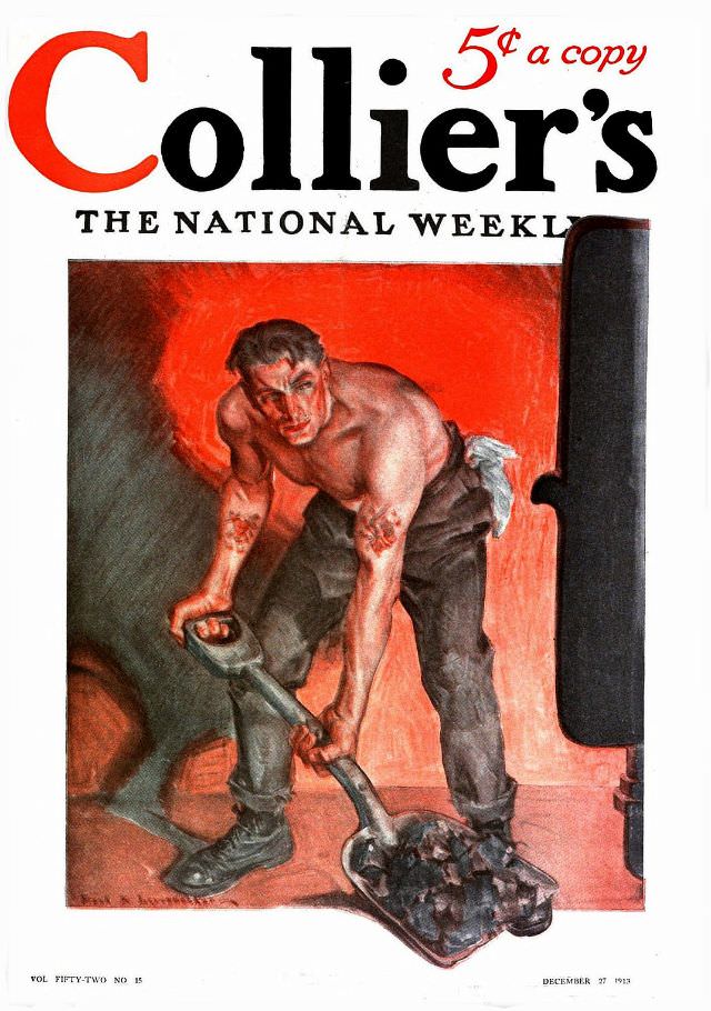
The November 1917 cover closes out this collection at a pivotal moment. The United States had entered World War One earlier that year in April, and American life was fully oriented around the war effort. Collier’s, as a national weekly, was right in the middle of it all. The magazine would continue publishing for four more decades, printing its final issue on January 4, 1957. A brief attempt to revive the Collier’s name in 2012 ultimately fell short.