
Hey There! Before You Go. 😧
Get the best vintage content straight into your inbox!

Don't worry, we don't spam

Art for the Silver Screen: A Look at Vintage Cannes Film Festival Posters

Each year, the Cannes Film Festival releases an official poster to announce that edition of the world’s most famous film event. Held on the French Riviera, Cannes has been commissioning unique artwork for these posters since its very first scheduled festival in 1939. Looking at them side by side tells a story about changing tastes in graphic design — and about cinema itself.

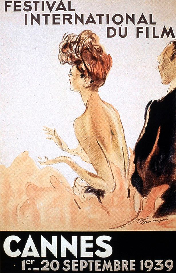
1939: The first ever 'Festival International du Film' was scheduled to start on 1 September, but was forced to close after the first night because of the outbreak of WWII. This poster, featuring an illustration by Jean Gabriel Daumergue, is the first and still one of the best.
1939: The first ever ‘Festival International du Film’ was scheduled to start on 1 September, but was forced to close after the first night because of the outbreak of WWII. This poster, featuring an illustration by Jean Gabriel Daumergue, is the first and still one of the best.

The 1939 festival never truly launched — the outbreak of World War II shut it down after just one night. After the war ended, the festival restarted in 1946, this time with not one but two official posters. These early designs leaned heavily on illustration and painting, reflecting both the glamour of Hollywood and a post-war hunger for celebration and international unity.

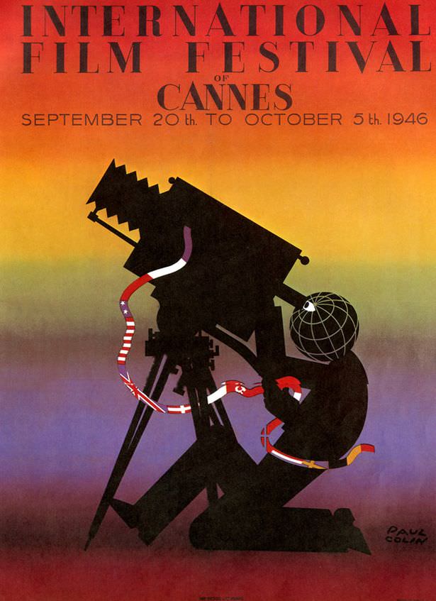
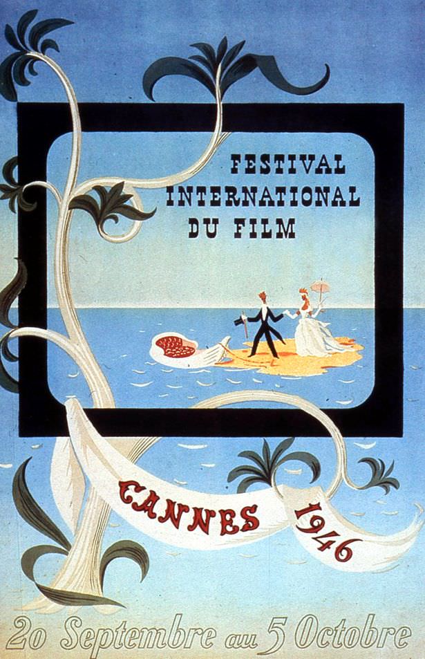
1946 had two posters. Greedy
The Festival was abandoned during the war, but kicked off again in September 1946. There were TWO official posters that year, the last of which is an original illustration by Leblanc.

Through the late 1940s, the festival’s poster art leaned on familiar imagery: film reels, spotlights, palm trees, and the blue Mediterranean. The 1947 festival still awarded prizes nominated by individual countries, meaning nearly every nation left with some form of recognition. Funding trouble forced a gap in 1948, and the festival returned in 1949 with a notably athletic-looking design.

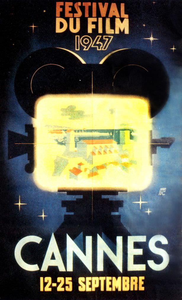
1947: Films were still nominated for awards by their respective countries which basically meant everyone won something. Organisers didn't want to upset anybody so everyone left happy.
1947: Films were still nominated for awards by their respective countries which basically meant everyone won something. Organisers didn’t want to upset anybody so everyone left happy.
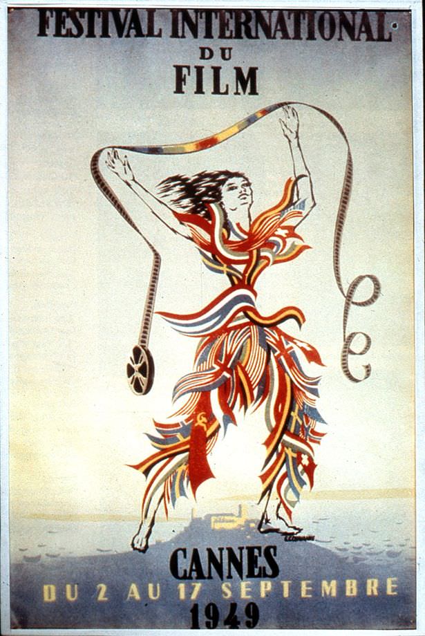
1949: A distinct lack of funds led to there being no festival in 1948, but never fear, it was back the year afterwards with a slightly dubious Olympic-style poster.

The festival skipped 1950 as well before returning in 1951 with a new dedicated home: the Palais Croisette, later known as the Palais des Festivals. In 1952, the dates shifted from September to April to better align with the start of tourist season on the Riviera. The posters of this period continued to evolve, though some still carried that athletic, Olympic-style aesthetic.

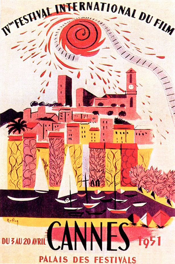
1951: The festival took another year's hiatus in 1950, (we're getting the impression that Cannes is a bit like Glastonbury - temperamental, stroppy and in need of a year off now and then), but returned in 1951. Cannes had a new dedicated venue for the event: the Palais Croisette, which became known as the Palais Des Festivals.
1951: The festival took another year’s hiatus in 1950, (we’re getting the impression that Cannes is a bit like Glastonbury – temperamental, stroppy and in need of a year off now and then), but returned in 1951. Cannes had a new dedicated venue for the event: the Palais Croisette, which became known as the Palais Des Festivals.
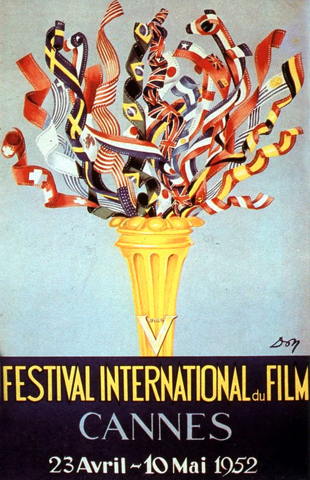
1952: The Festival moved from September to April to make the most of the beginning of the tourist season. The poster though, er, still looks like an advert for the Olympics. In fact it arguably looks better than the adverts for this year's Olympics.
1952: The Festival moved from September to April to make the most of the beginning of the tourist season. The poster though, er, still looks like an advert for the Olympics. In fact it arguably looks better than the adverts for this year’s Olympics.

Two landmark decisions came in the mid-1950s. In 1954, a palm leaf motif was added to the festival’s trophies and emblem — and in 1955, the top prize was renamed the Palme d’Or in its honor. Neither development made it onto those years’ posters, which stuck to nautical and coastal themes.

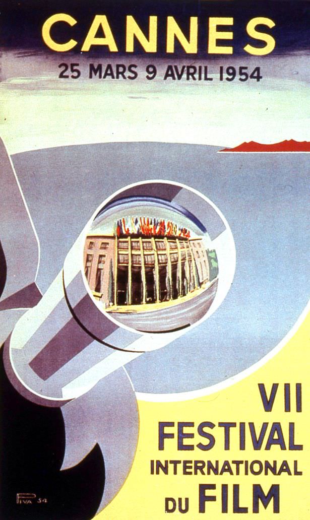
1954: The year someone had the bright idea of incorporating a palm leaf motif on all the trophies and the Cannes emblem was born. No one thought to put it on the seafaring-going-to-war-style poster though.
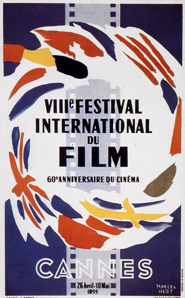
1955: Everyone loved the palm leaf thing so much they renamed the top prize - the Grand Prix - the Palme d'Or. Again no one thought to put it on the poster.
1955: Everyone loved the palm leaf thing so much they renamed the top prize – the Grand Prix – the Palme d’Or. Again no one thought to put it on the poster.

The late 1950s brought a wider range of visual approaches. Some posters nodded to abstract art movements, others favored sun-drenched Mediterranean scenery that looked more like travel advertising than a film event. The range itself reflects a festival still searching for a consistent visual identity.

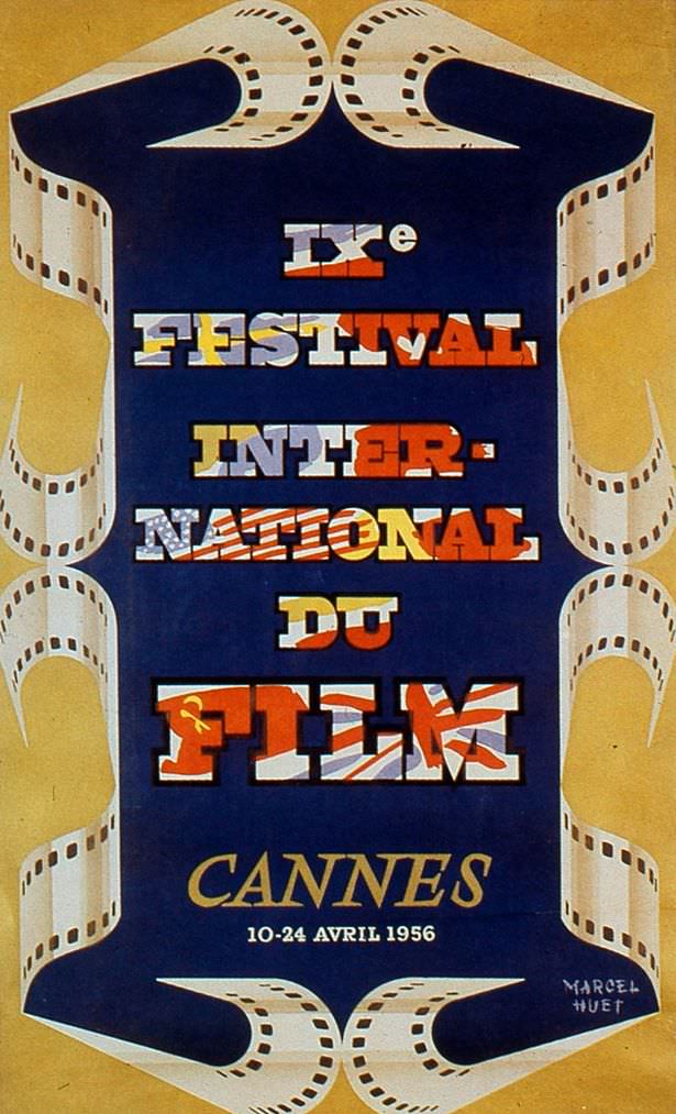
1956.
1956.
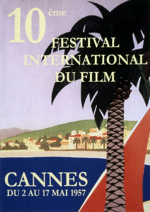
1957: This looks like somewhere we might actually want to go. For an all-inclusive holiday. In no way does this poster say anything about the festival. It actually looks like a stamp.
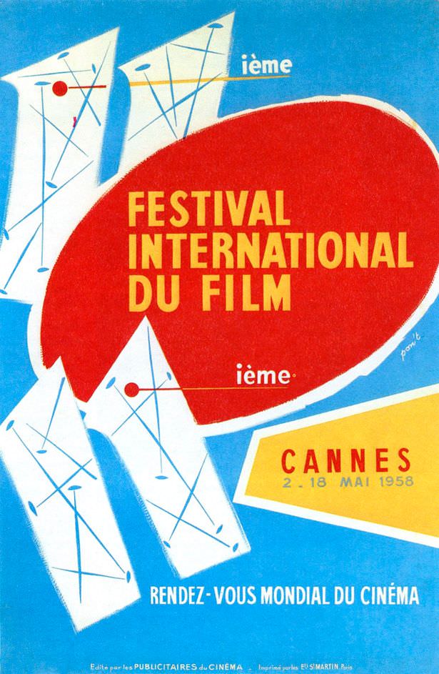
1958: As far as we were aware, the film festival is not a modern art festival.
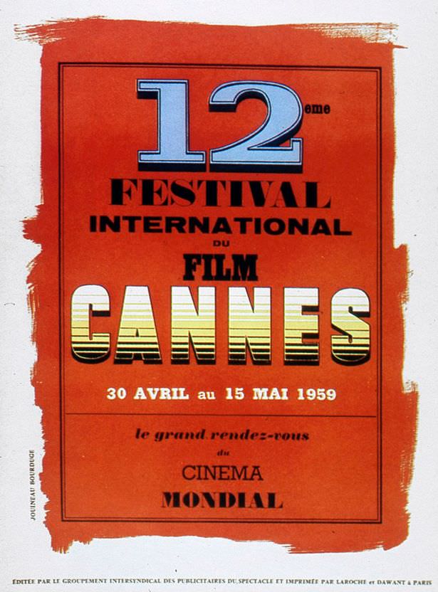
1959
1959

Into the 1960s, the posters shifted toward modernism. Flat color, bold graphic shapes, and experimental typography replaced the detailed illustrations of earlier years. Artists like Jean Cocteau, who had deep ties to the festival, contributed designs. Jean-Michel Folon also brought a distinctive, imaginative visual language to the event’s promotional art during this decade.

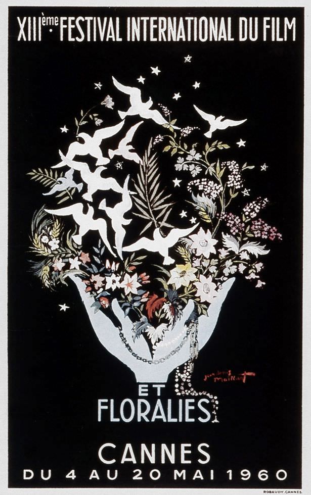
1960: This looks like the book cover for a new Twilight sequel.
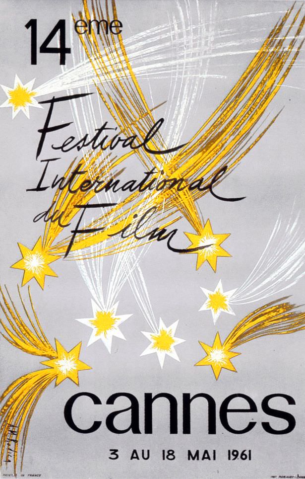
1961: This one by A.M. Rodicq. It's simple and pretty.
1961: This one by A.M. Rodicq. It’s simple and pretty.
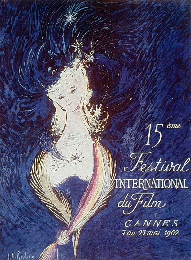
1962: Van Gogh-style pretty
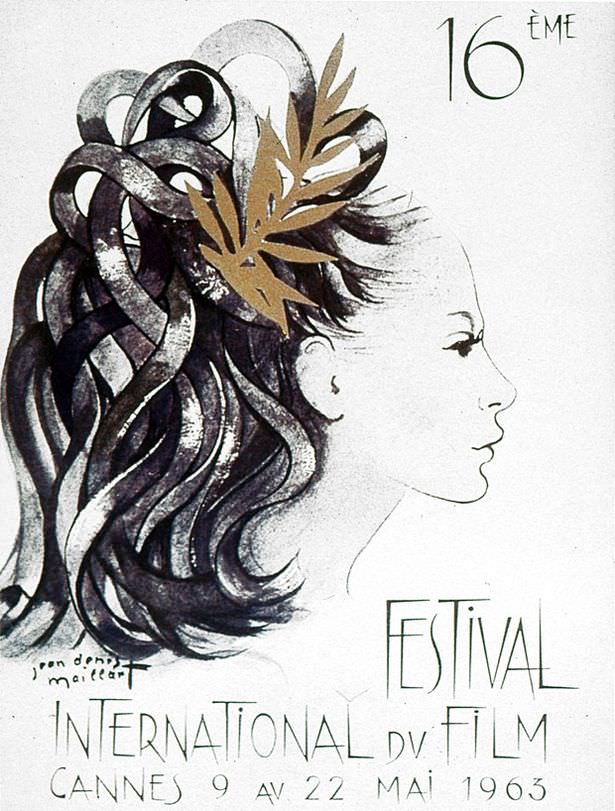
1963
1963

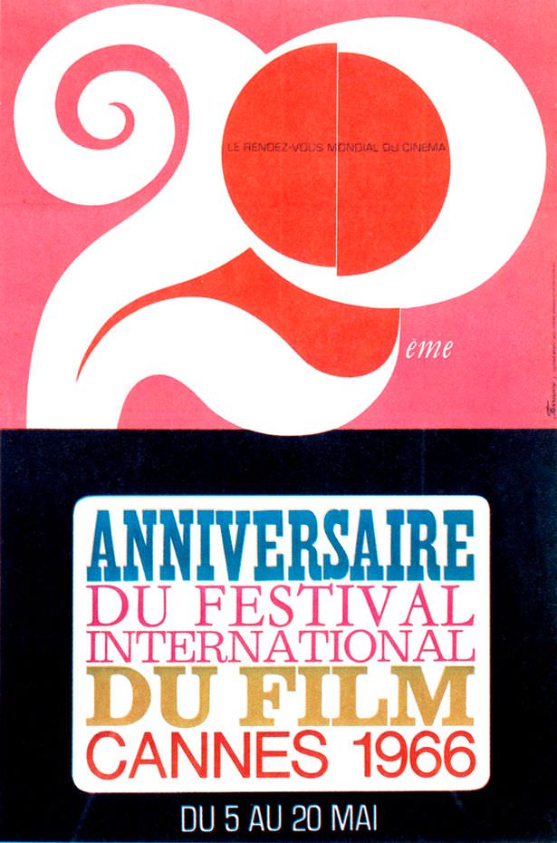
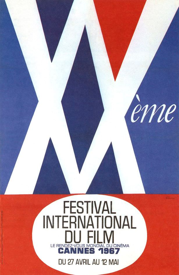
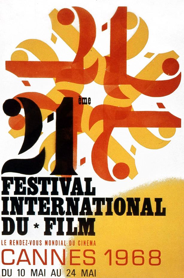
The festival’s 20th anniversary in 1966 was marked by another milestone: Sophia Loren became the second woman ever appointed president of the festival jury, following Olivia de Havilland in 1965. The 1967 poster used light-burst patterns evoking the beams of spotlights, and the 1968 design leaned heavily into celebrating the festival’s 21st year.

1966: The 20th anniversary of the awards and the year Sophia Loren was appointed the festival's second ever female president. (Olivia de Havilland was the first in 1965).
1966: The 20th anniversary of the awards and the year Sophia Loren was appointed the festival’s second ever female president. (Olivia de Havilland was the first in 1965).
1967: The patterns are meant to emulate the shapes created by spotlights in the sky. Either that or it's going to be an X-rated festival.
1967: The patterns are meant to emulate the shapes created by spotlights in the sky. Either that or it’s going to be an X-rated festival.
1968: This poster is more excited about the fact it's the 21st anniversary than that it's about films.
1968: This poster is more excited about the fact it’s the 21st anniversary than that it’s about films.

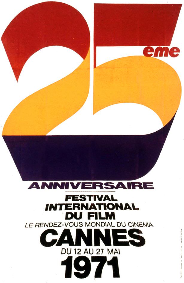
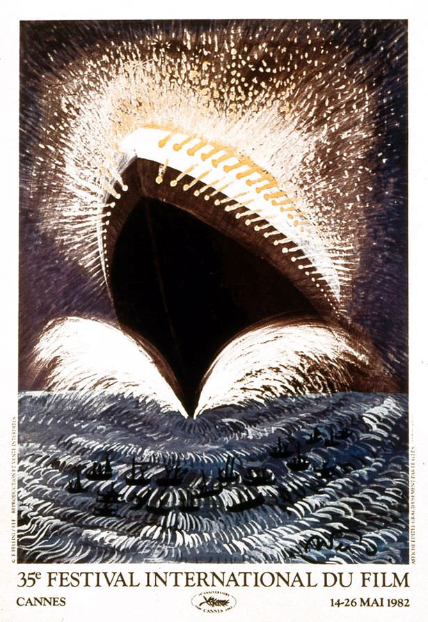
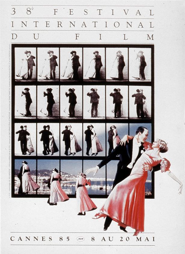
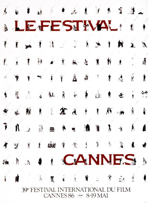
By the 1970s and into the 1980s, photography began appearing more regularly on the official posters, sometimes blended with graphic illustration. Artists like Georges Lacroix created memorable work during this period. The range of styles grew broader — from playful, colorful compositions to more atmospheric and conceptual designs.

1971: The 25th anniversary of the awards.
1982
1982
1985
1985
1986
1986
Enjoyed this post? Get new ones in your inbox.

Leave a Comment

Your email address will not be published. Required fields are marked *

Share this Post 🥺

Please take a moment to share this content. Your support is greatly appreciated! 🙌🙏

Share this Post 🥺

Please take a moment to share this content. Your support is greatly appreciated! 🙌🙏
Scroll to Top
 
Hey Friend, Before You Go.. Please like & follow for more interesting content