
Bird’s Custard has been a fixture in British homes since Alfred Bird invented his egg-free formula in 1837. The product spread quickly through word of mouth, winning fans in households and restaurants alike. But as competitors entered the market, clever advertising became just as important as the recipe itself. By the late 1800s, printed ads were appearing in newspapers and magazines, most featuring a gleaming bowl of yellow custard paired with fruit or pie. Simple, direct, and unmistakably appetising.
The 1930s marked a turning point in the brand’s visual identity. Ads from this era leaned on bold colours and warm domestic scenes — a smiling mother ladling custard for eager children was a recurring image. The message was clear: Bird’s Custard belonged on the family table. Slogans like “Don’t forget the Bird’s!” kept the brand top of mind. In 1929, the company had already introduced its iconic “three bird” logo, which quickly became one of the most recognised symbols in British food marketing.
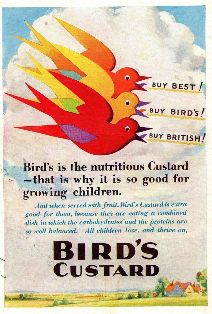
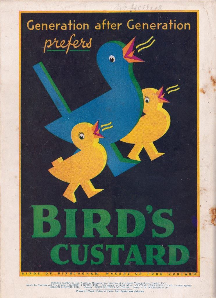
By the early 1930s, ads were making specific nutritional claims, positioning Bird’s Custard not just as a treat but as a wholesome addition to any meal.
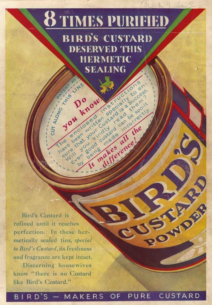
A year later, the brand was promoting its manufacturing standards with the kind of detail that reassured quality-conscious shoppers.
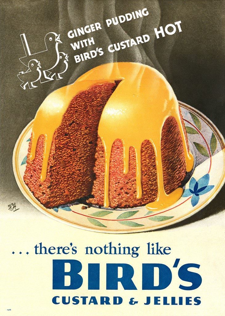
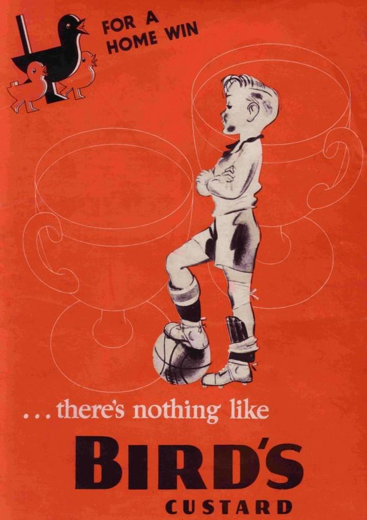
As the decade closed, Bird’s leaned into comfort and occasion. Two 1939 ads captured this perfectly — one pairing custard with a steaming ginger pudding, the other wrapping the brand in a spirit of domestic triumph.
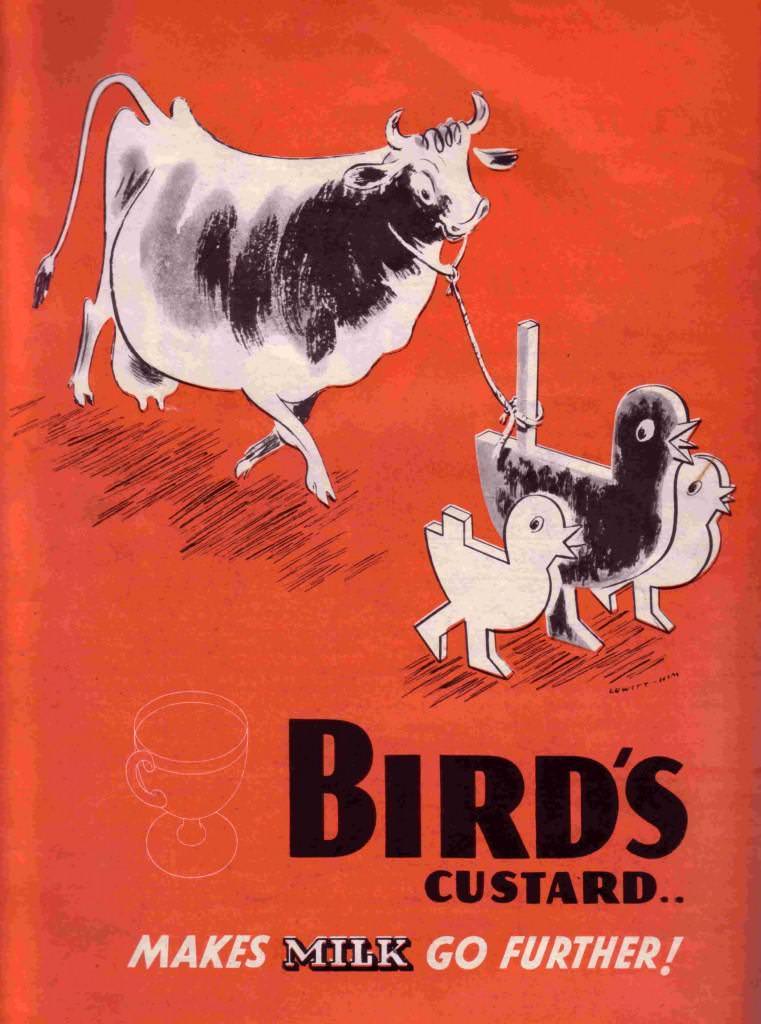
World War II brought food rationing and sugar shortages that cut into production. Bird’s responded by adjusting its messaging. The 1940 ad below urged households to make the most of their milk rations — a practical, wartime-savvy pitch.
Even at the height of the war, Bird’s kept advertising. The 1943 and 1944 campaigns found creative ways to keep the brand present in people’s minds, pairing custard with jellies and making the most of whatever ingredients were available.
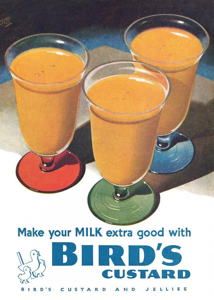
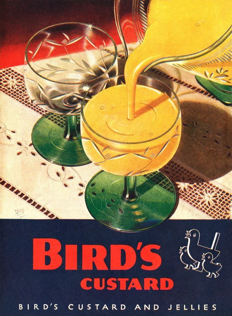
After the war, the ads shifted tone. The 1947 campaign revisited the custard-and-jelly pairing with renewed optimism, reflecting a country ready to enjoy its food again.
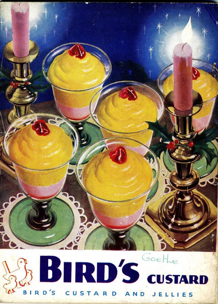
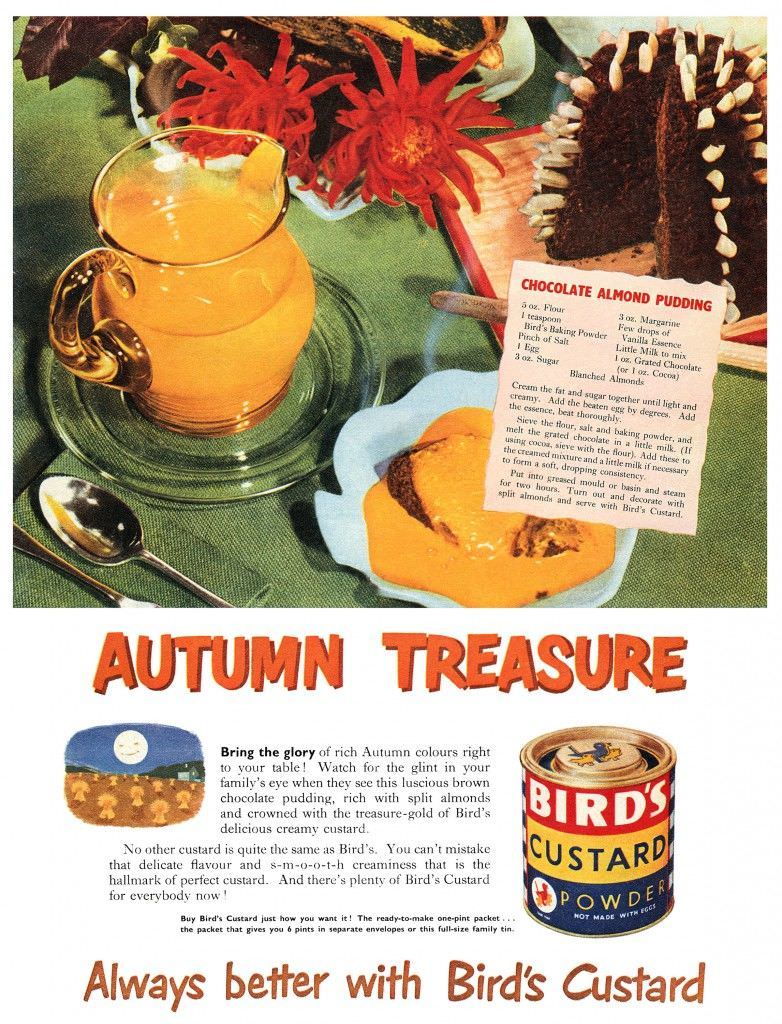
Into the 1950s, full-page spreads grew more lush and colourful. The 1950 “Autumn Treasure” ad placed Bird’s Custard alongside seasonal produce, making the dessert feel both natural and indulgent. Recipes were frequently included, showing readers exactly how to pair the custard with crumbles, cakes, and puddings.
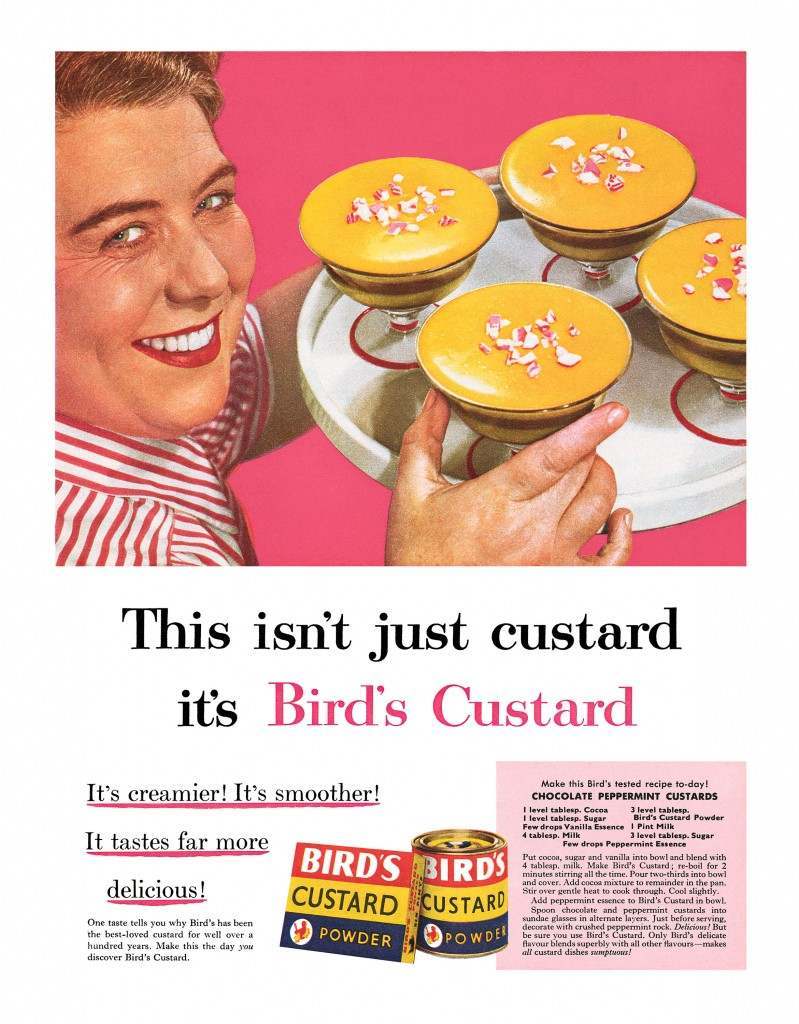
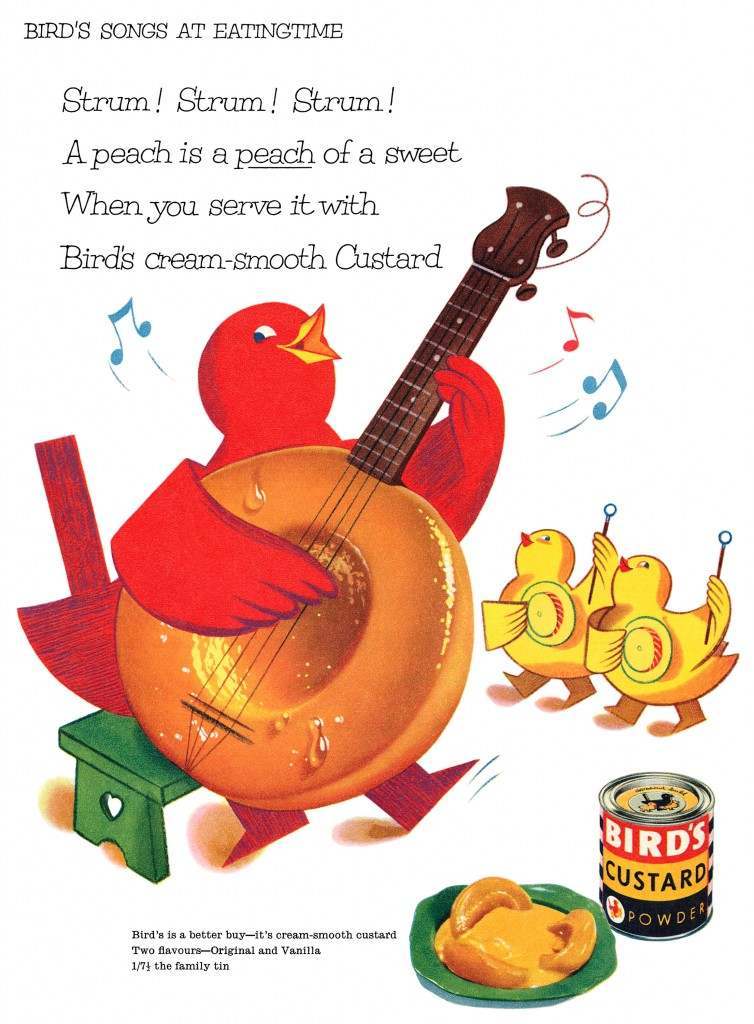
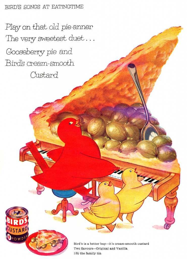
By the mid-1950s, the brand’s confidence was on full display. The 1955 ad made the distinction plain — this wasn’t a generic product. It was Bird’s. A year later, a musical theme emerged with the “Songs at Eating Time” campaign, which ran into 1959 and brought a playful, joyful tone to the brand’s print presence.