
For just 10 cents in 1953, a teenager could pick up Youthful Romances, a comic book published by Ribage Publishing Corporation, and lose themselves in stories of heartbreak, crushes, and the messy business of young love. The drama was front and center from the very first page — and often before it.
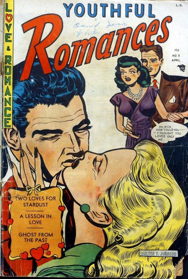
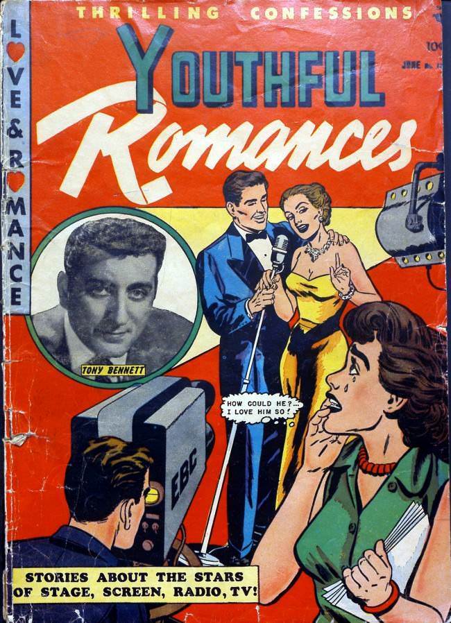
The covers did a lot of heavy lifting. They drew readers in with bold visuals and emotional punch. Real celebrities also made appearances, lending the comic a sense of glamour that connected it to the wider pop culture of the era.
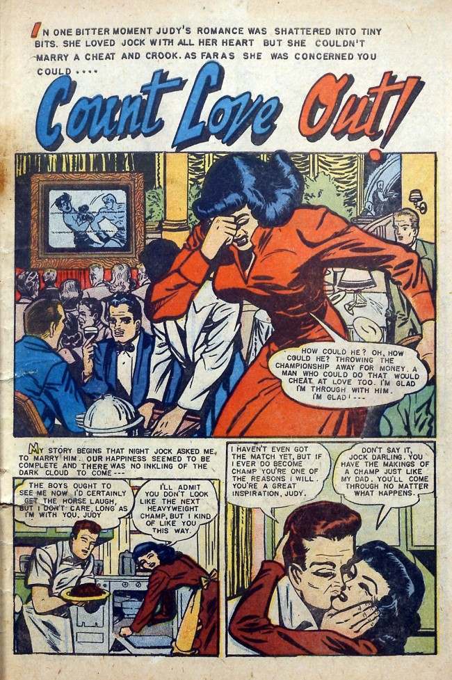
Inside, the stories didn’t hold back. Every page carried some form of emotional crisis — jealousy, rejection, longing, or misunderstanding. The storytelling leaned hard into teenage anxieties, which made the comic feel urgent and relatable to its young audience.
But the stories weren’t the only thing competing for readers’ attention. The advertisements crammed between panels were just as dramatic — and far less grounded in reality. Advertisers in 1953 had no shortage of confidence. Products promised to solve nearly every problem a self-conscious teenager could name, starting with the basics like breath.
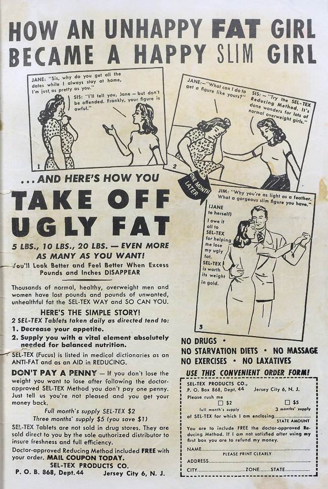
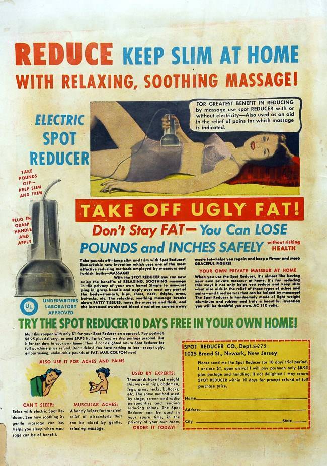
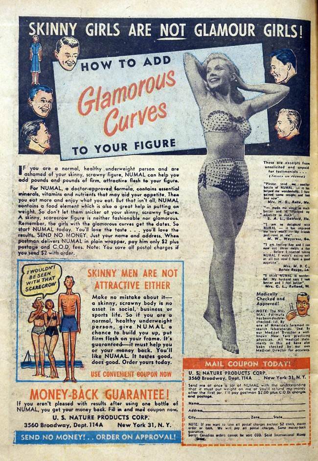
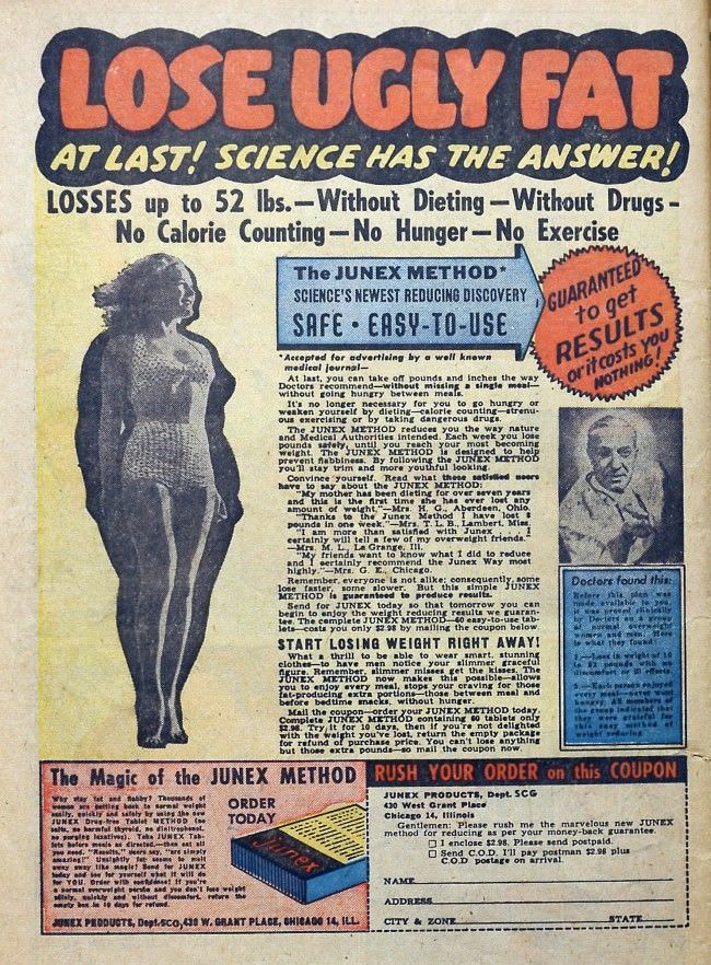
Weight was another major target. Ads framed fatness as a personal failure and thinness as the guaranteed path to happiness and romance. The solution was always simple: just take the tablet.
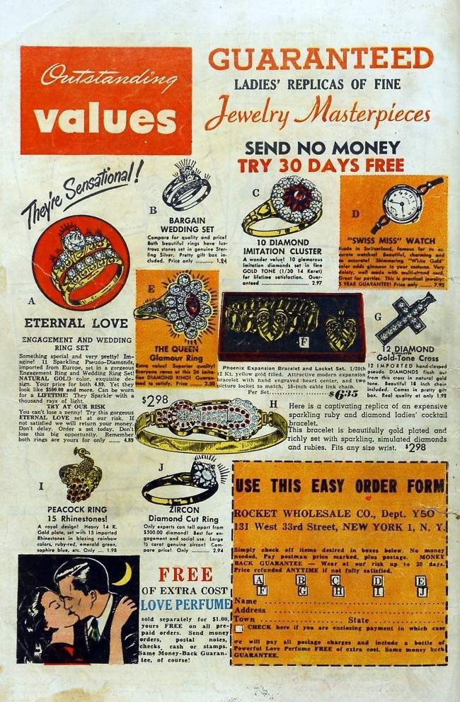
Not all the ads targeted bodies directly. Some went after wallets. One pitch offered replica jewelry — a way to replace pawned rings without anyone being the wiser. The tone was breezy, the ethics less so.
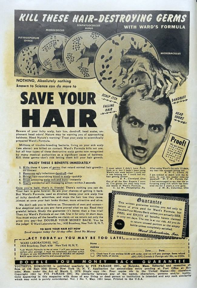
Hair was a recurring obsession throughout the comic’s ad pages. Products warned of follicle-destroying threats lurking on every scalp, with illustrations that veered from alarming to absurd.
To back up their claims, advertisers leaned on medical-sounding language. Vague references to professional endorsements gave products an air of authority they rarely deserved.
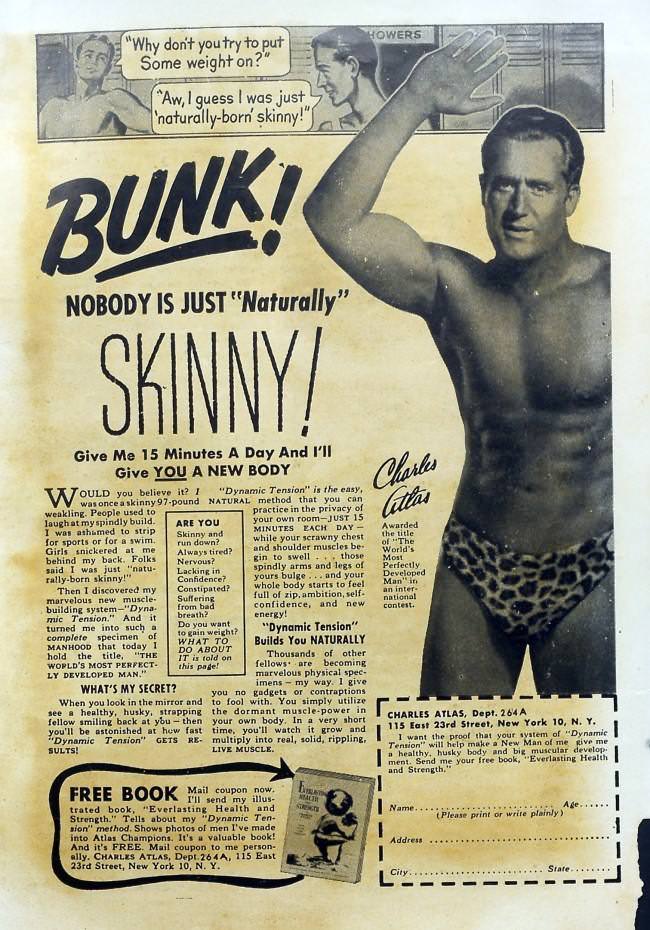
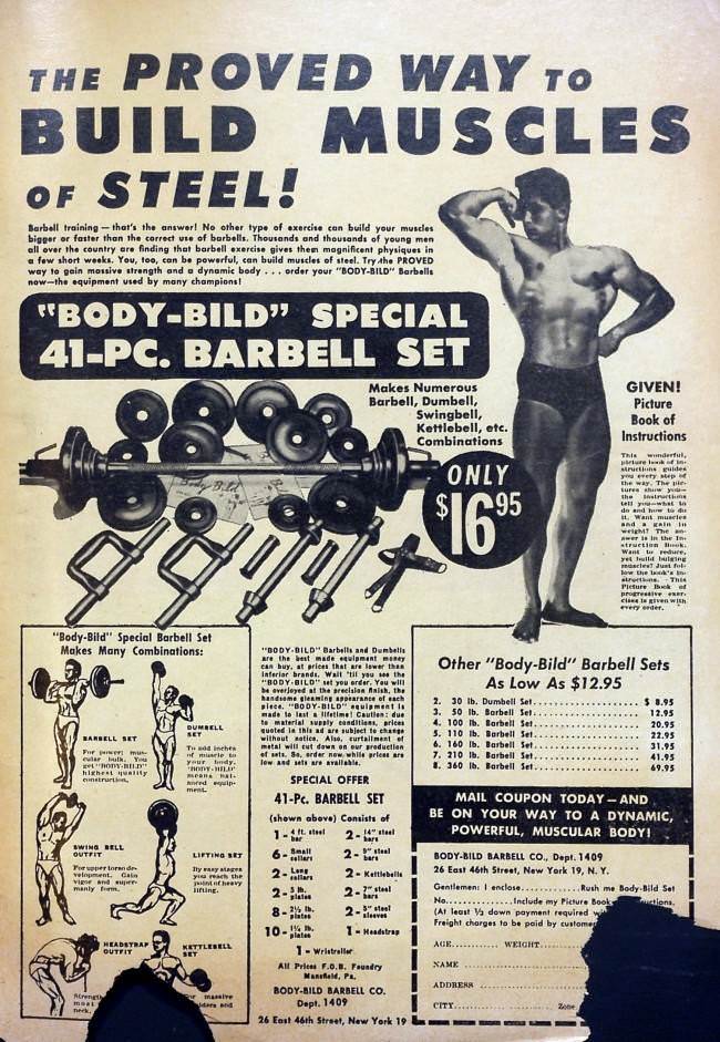
The ads weren’t just aimed at girls. Men got their own set of insecurities to address — often framed around building a body worth showing off.
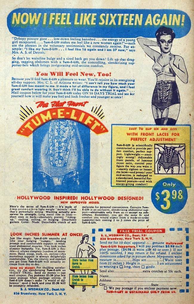
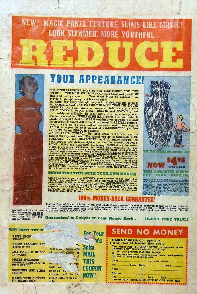
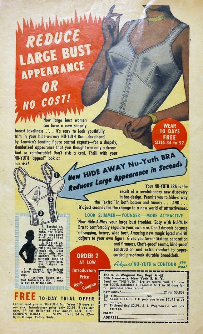
Undergarments capable of reshaping the body were a staple of 1950s advertising. The promises were bold, the garments were large, and the expectations were larger.
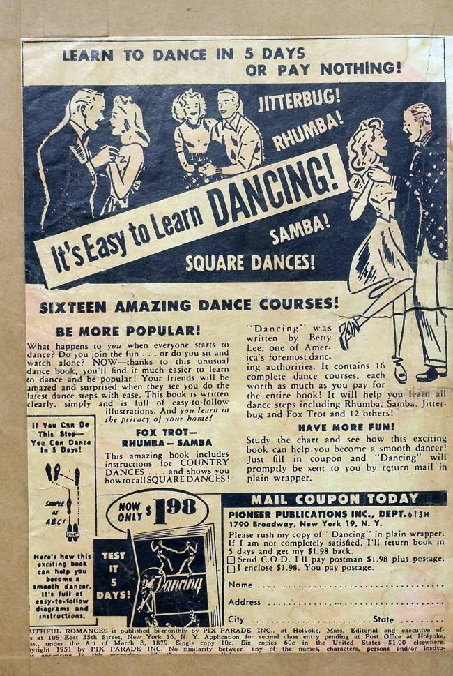
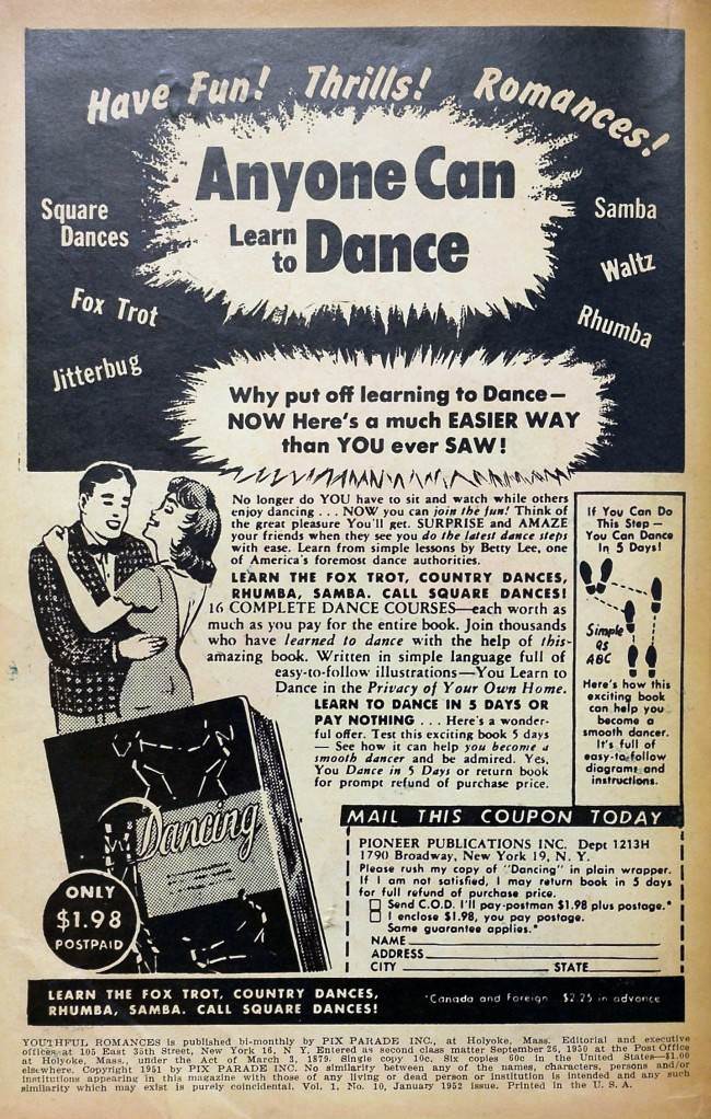
Dancing was sold as a social superpower. Learn the steps, the ads promised, and romance would follow. The fine print on the timeline, however, told a different story.
The weight-related ads worked both ends of the scale. After warning readers about the dangers of being too heavy, other ads turned around and sold products to help the newly thin bulk back up.
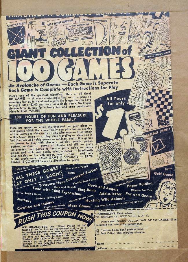
The comic’s reach extended beyond its target audience. Younger siblings who picked up the magazine found ads pitched squarely at them, proving no demographic was left without a product to buy.
Body-shaping products for men came with their own dramatic vocabulary. Words like “BULGE” were deployed with maximum urgency, as though an untreated midsection was a genuine emergency.
The dance school ads doubled down on their promises. Step-by-step mastery in days was the pitch — though the actual steps described suggested a more modest outcome.
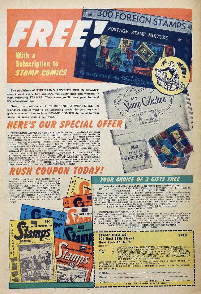
For readers who hadn’t found romance through any of the other advertised solutions, there was always the stamp-collecting route — proof that the advertisers were casting as wide a net as possible.
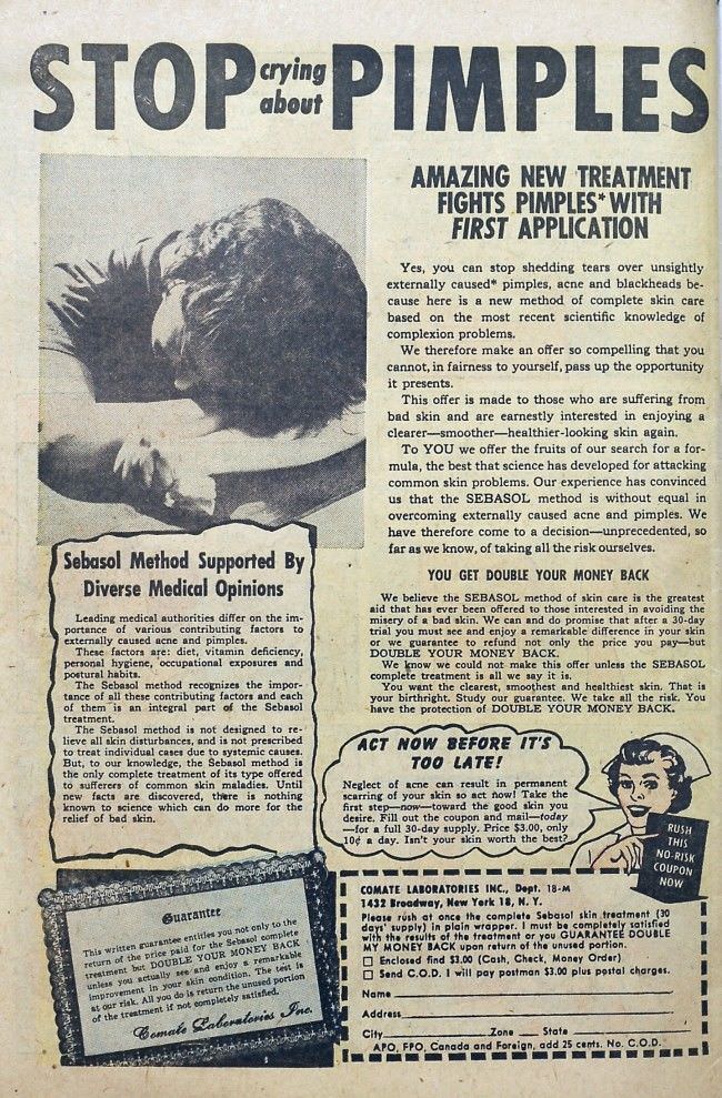
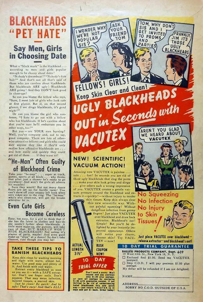
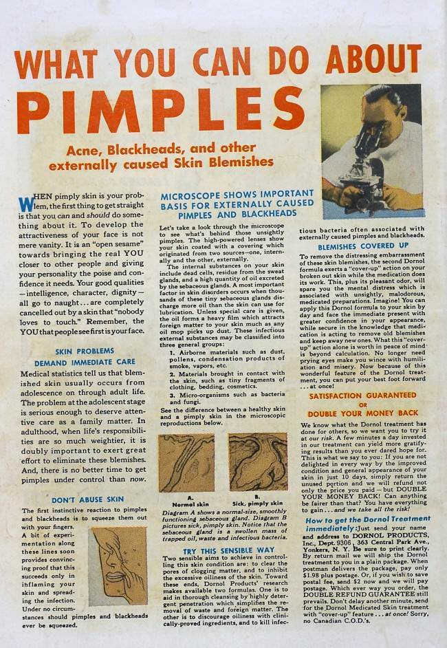
Skin was never far from the conversation. Blackheads, acne, and blemishes were presented as social catastrophes, with cartoon mascots making the pitch feel almost cheerful despite the underlying message.
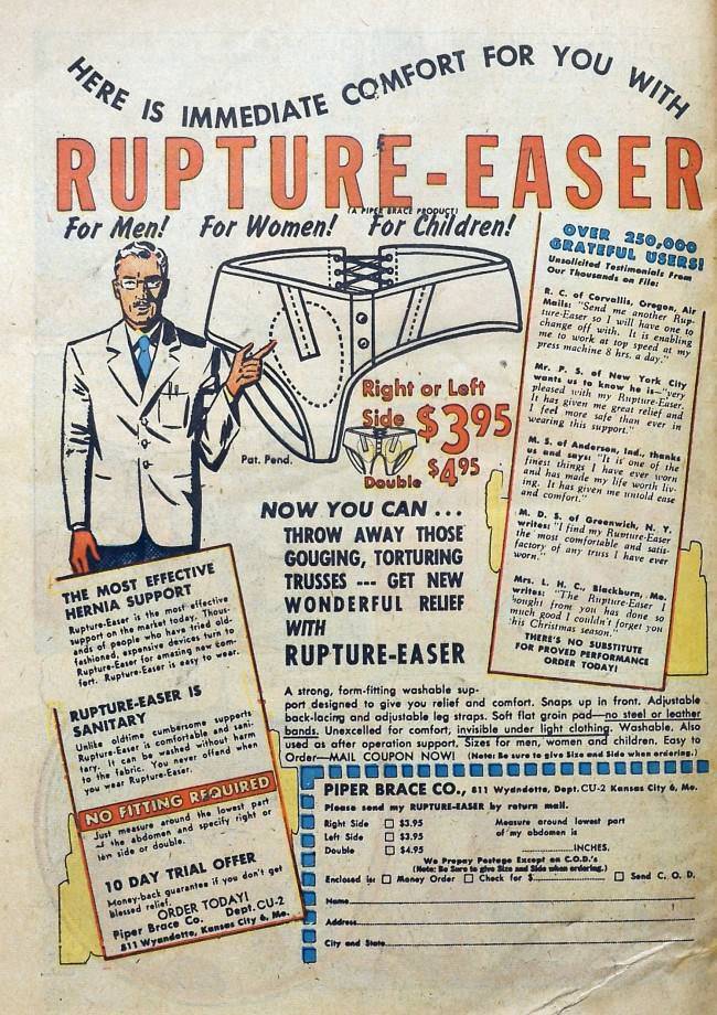
The compression garments advertised throughout the comic turned out to be remarkably versatile. The same product sold for body shaping also promised to handle hernias — a detail tucked in without much fanfare.
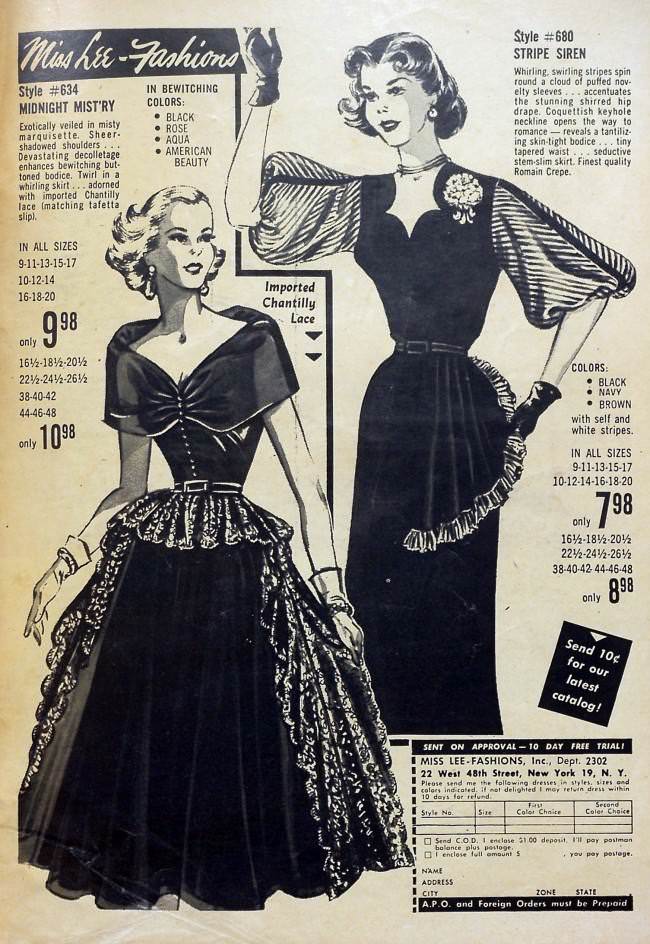
Color choices in clothing ads were presented as bold lifestyle decisions. The shade you picked signaled who you were — or at least, that’s what the copy wanted you to believe.
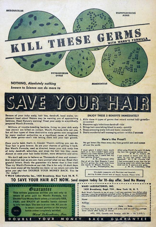
Hair loss got the full scare treatment, complete with microscopic villains described as microbes consuming follicles from the inside. The imagery was designed to make inaction feel dangerous.
Weight messaging in the comic was anything but consistent. Fatness was attacked as ugly in one ad, then celebrated — depending on where it sat — in the very next column.
Breath products appeared repeatedly across the pages, each one pitching a world where fresh air was the enemy and sealed lips were the mark of a sophisticated, attractive person.
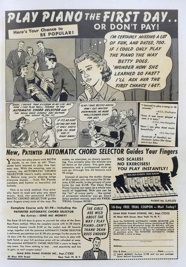
Music lessons found their way into the ad pages too, with instrument-based pitches promising a shortcut to popularity. The logic was simple: learn to play, and the admirers will come.
Guarantees were thrown around freely. Double refunds, money-back promises, and bold assurances filled the ad copy — backing products that rarely had the science to match the swagger.
Free trials came with their own complications. The generosity of a 10-day offer looked different once the fine print on what counted as a “day” came into the picture.

The final pages of Youthful Romances drove home the same point the whole issue had been making: every flaw had a product attached to it. From bad skin to thin hair to two left feet, 1953’s advertisers were ready with a solution — and they weren’t shy about saying so.



Are you letting AI write these captions? Some make no sense and terrible spelling. Doesn’t anyone proofread? If you do this for a living and get paid for it then do better.
Horrible commentary how many bad jokes and typos can one person make. It’s like a 5 yr old wrote this crap.
No one laughs are brain anymore?? Really? What is mahoosive? Phwoar? So many typos . I could understand one or maybe two but damn you do this for a living and screwed these up so bad. So many of them just don’t make any sense at all, not the ads but your captions.