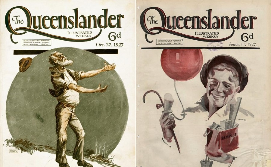
Canada’s cities transformed rapidly during the 1960s. New buildings rose across the country, reflecting fresh ideas in design and technology. At the center of it all was Canadian Architect magazine — a publication that documented this construction boom issue by issue. It served architects and designers, but its clear writing and strong visuals made it accessible to a much wider audience.
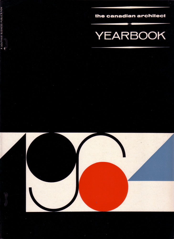
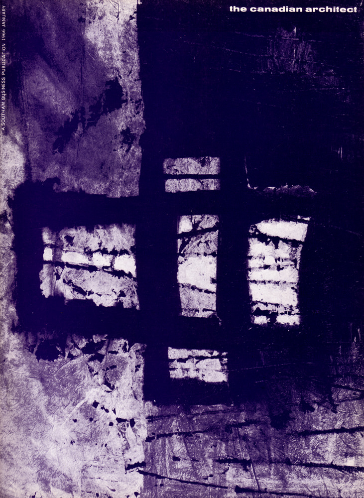
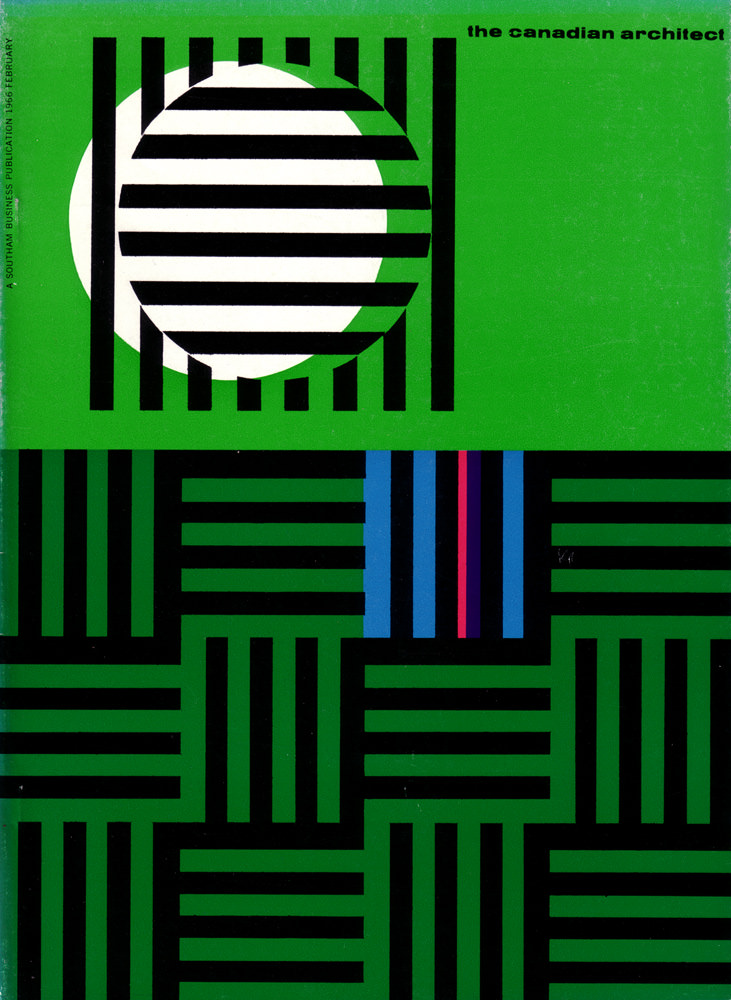
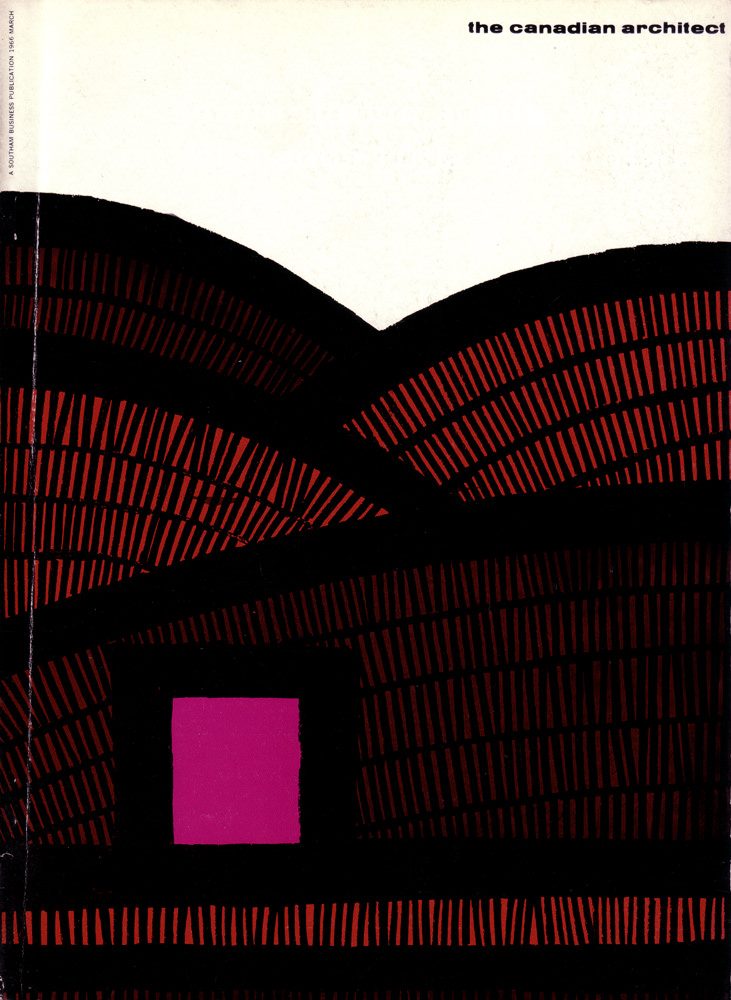
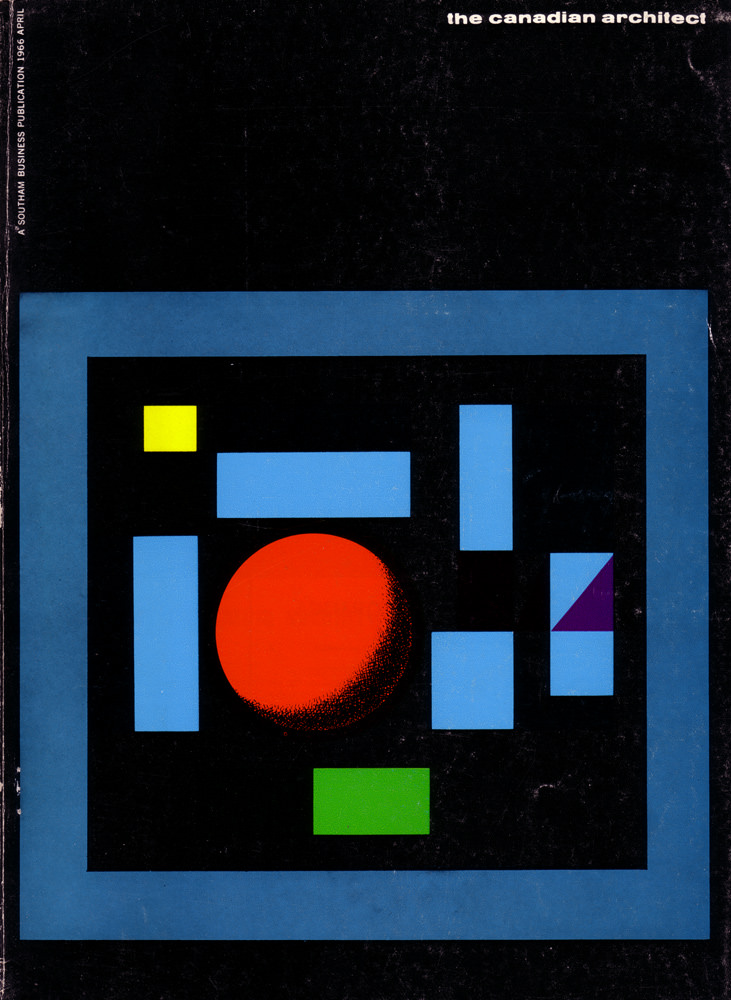
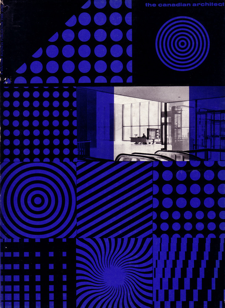
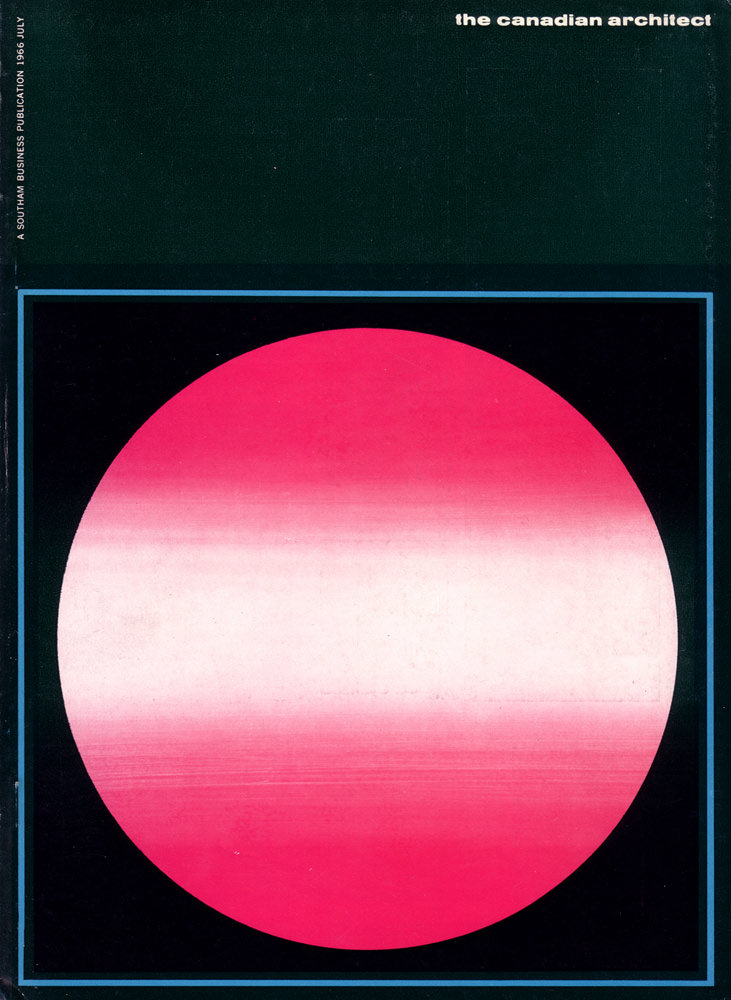
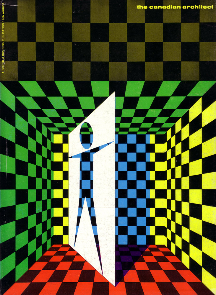
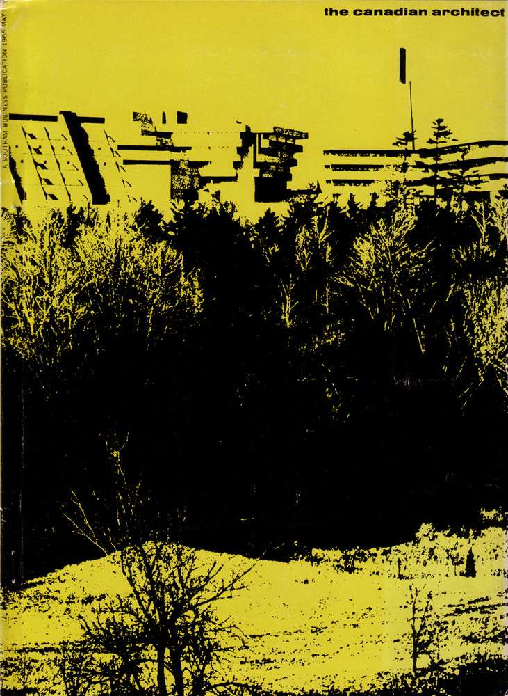
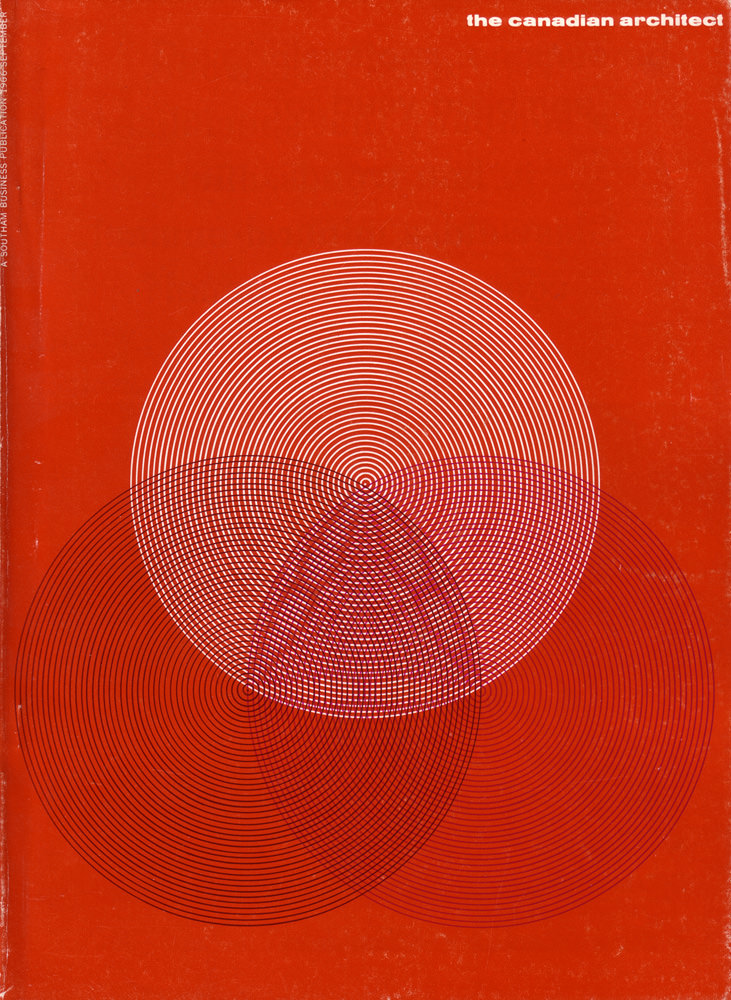
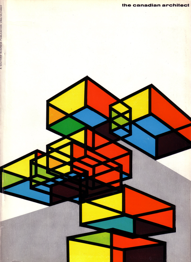
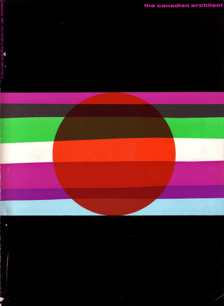
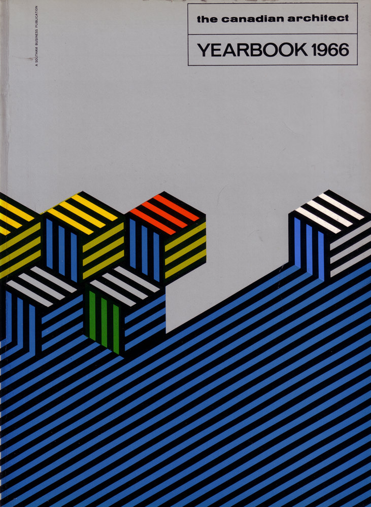
From 1964 to 1967, artist Laszlo Buday designed the magazine’s covers. His work stood out immediately. Buday used bold colors and sharp geometric shapes to create covers that functioned like miniature posters for modern design. Each one was designed to stop a reader in their tracks and pull them inside.
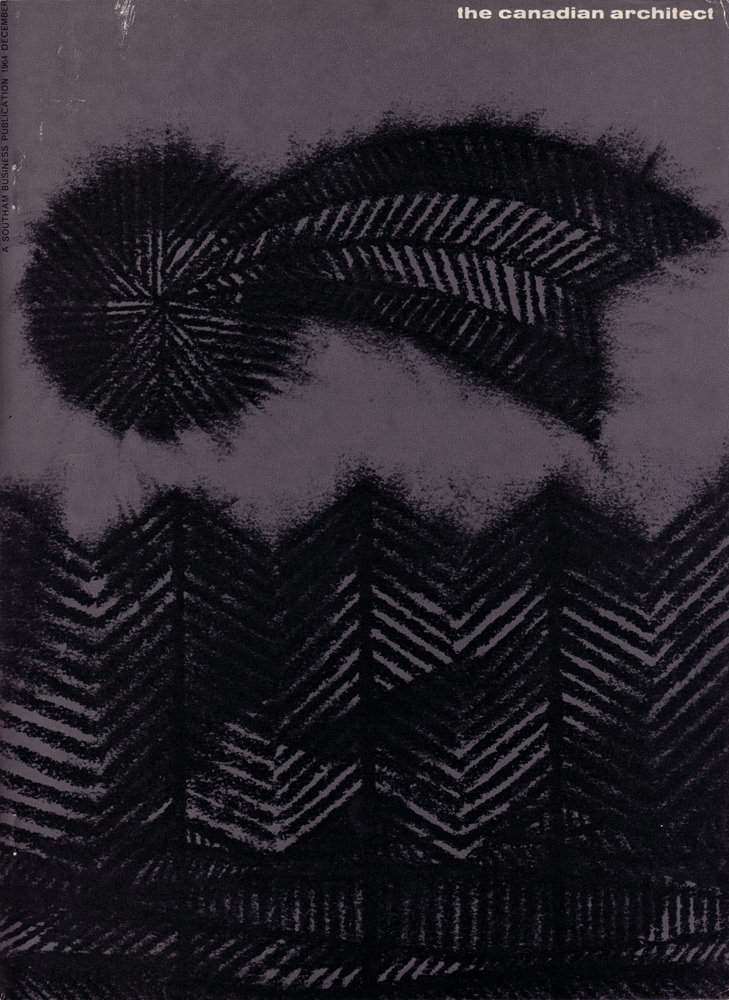
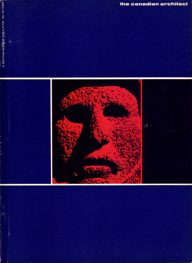
The buildings featured inside the magazine were far from ordinary. They showcased innovative structures that pushed the boundaries of what Canadian architecture could be. Writers explained these designs in plain, direct language, breaking down complex ideas so readers without a technical background could follow along.
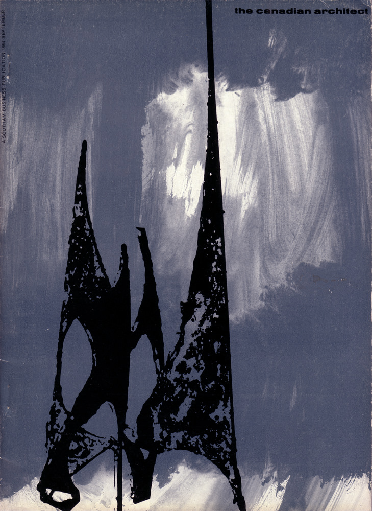
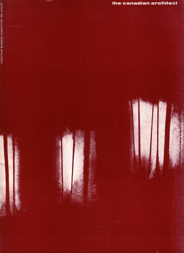
Photography was central to every issue. Images showed buildings from multiple angles, revealing construction details and how each structure sat within its surrounding environment. A photograph could communicate what a paragraph of text struggled to convey about scale, material, and form.
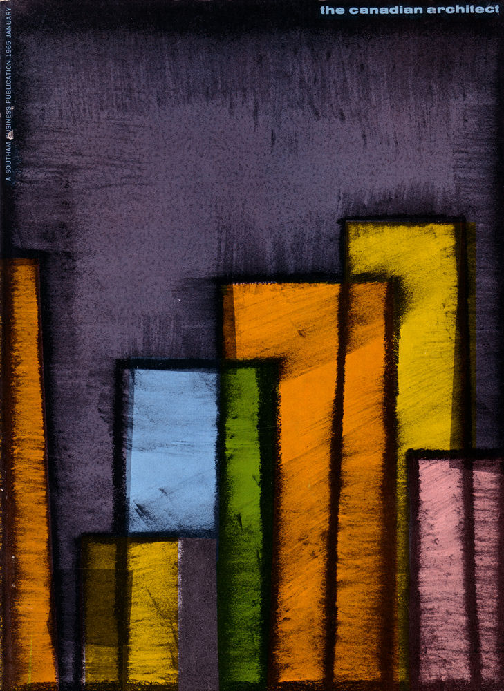
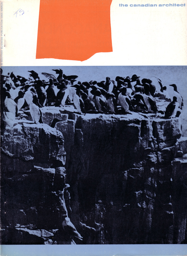
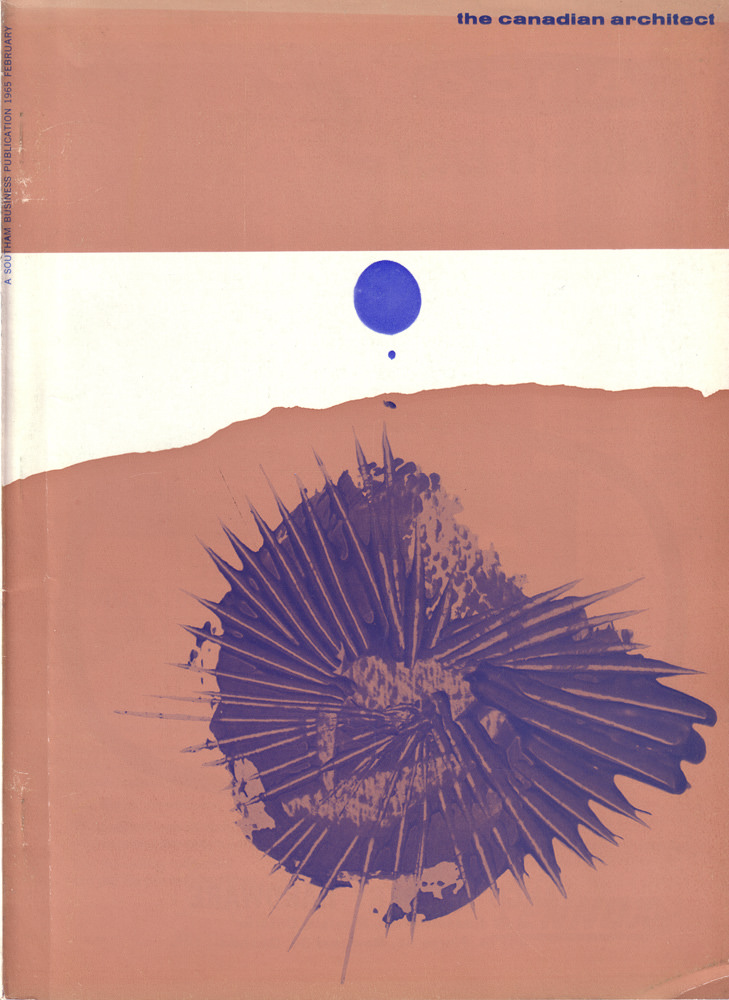
Buday’s cover designs evolved across each issue while keeping a consistent visual language. The 1965 run of covers showed his range — shifting palettes and compositions that kept the magazine feeling fresh month after month.
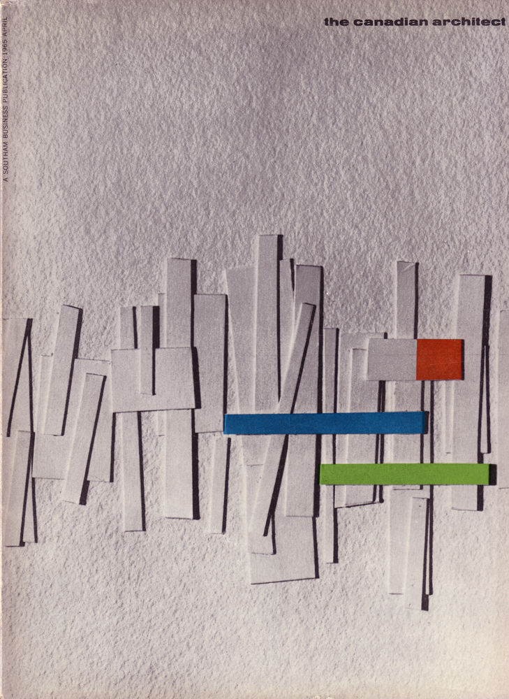
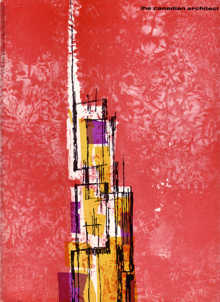
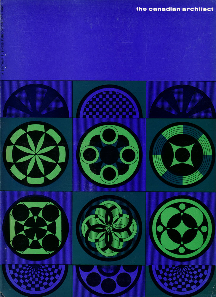
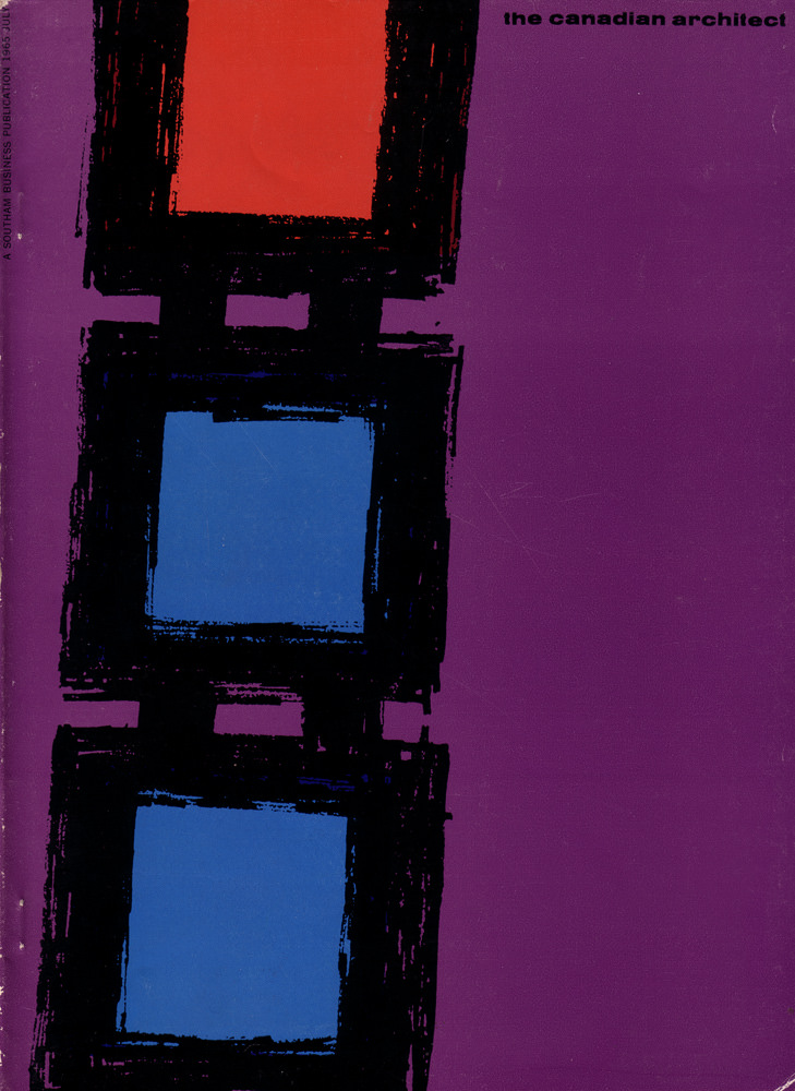
By mid-decade, Canadian Architect had established itself as a reliable record of the country’s architectural ambitions. Each issue was both a professional resource and a snapshot of a nation actively reshaping its built environment.
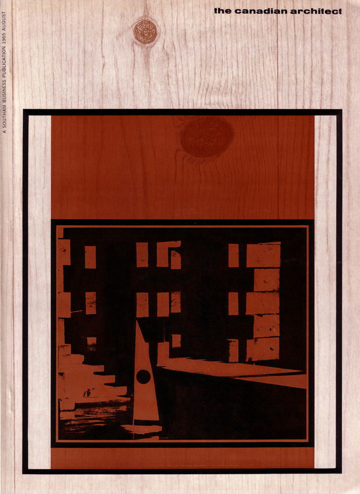
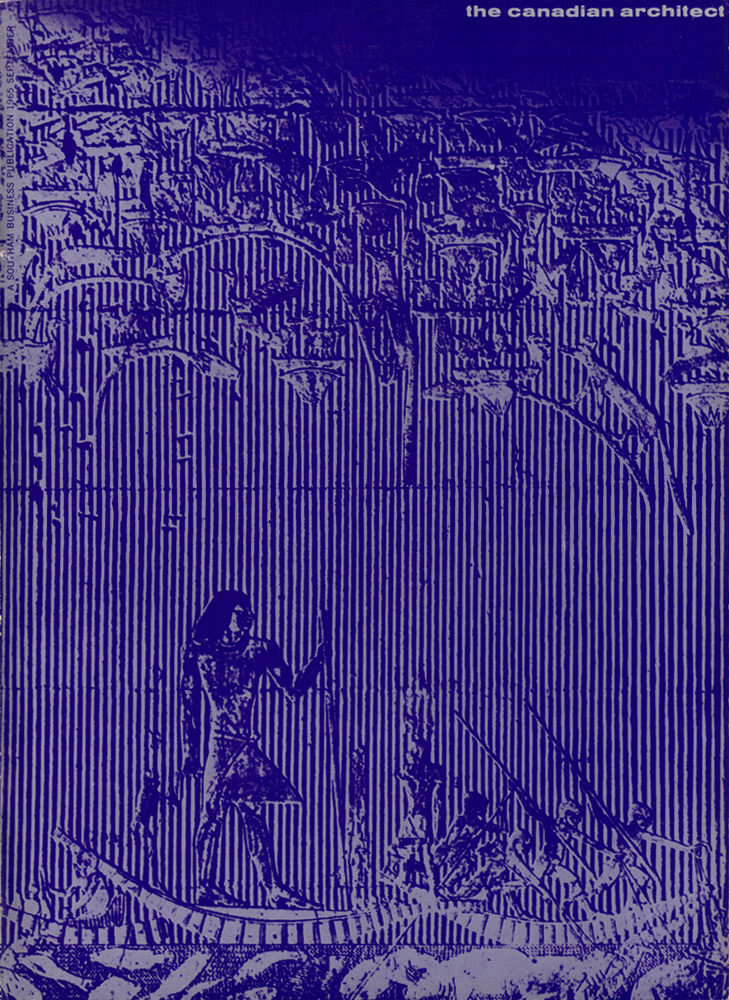
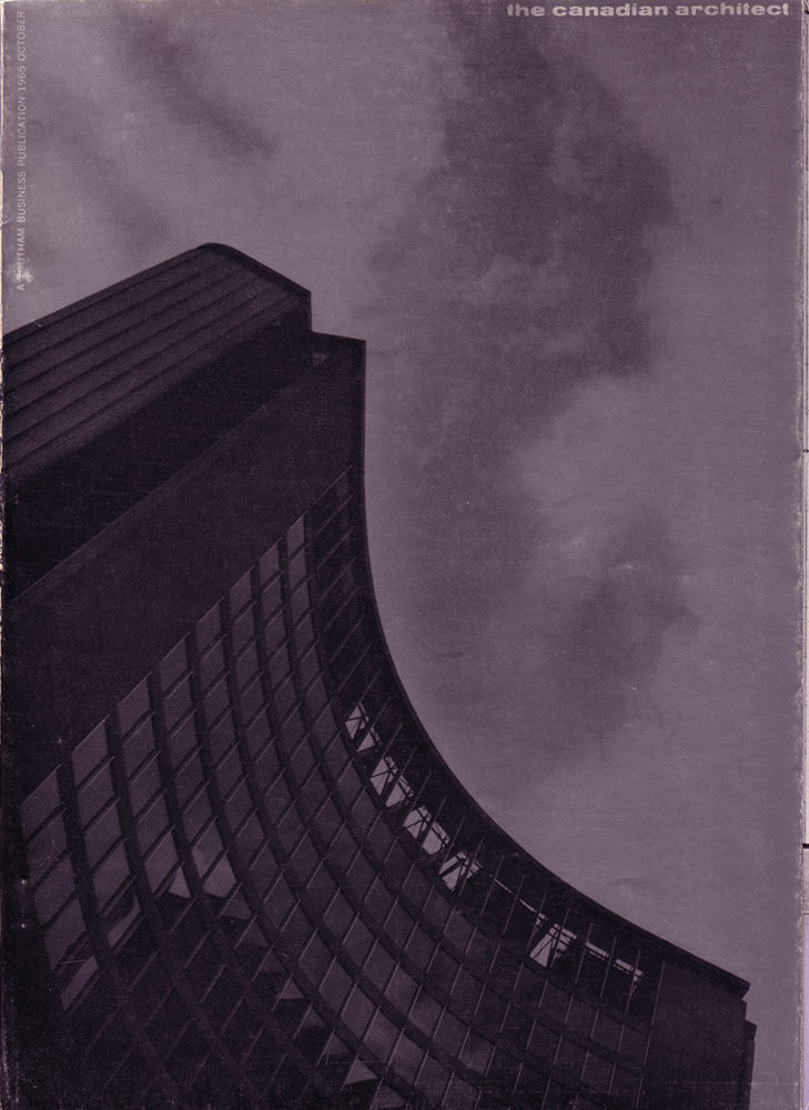
The 1966 issues continued the same formula with equal energy. Buday’s covers remained bold and graphic, reflecting the optimism of a decade that believed in design as a tool for building a better country.