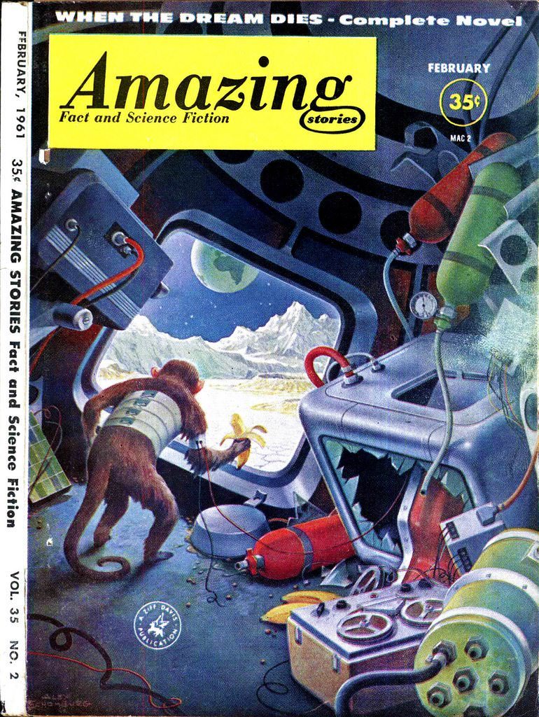
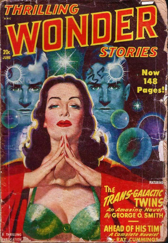
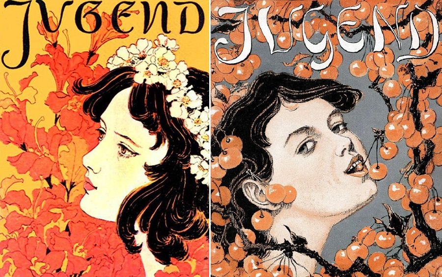
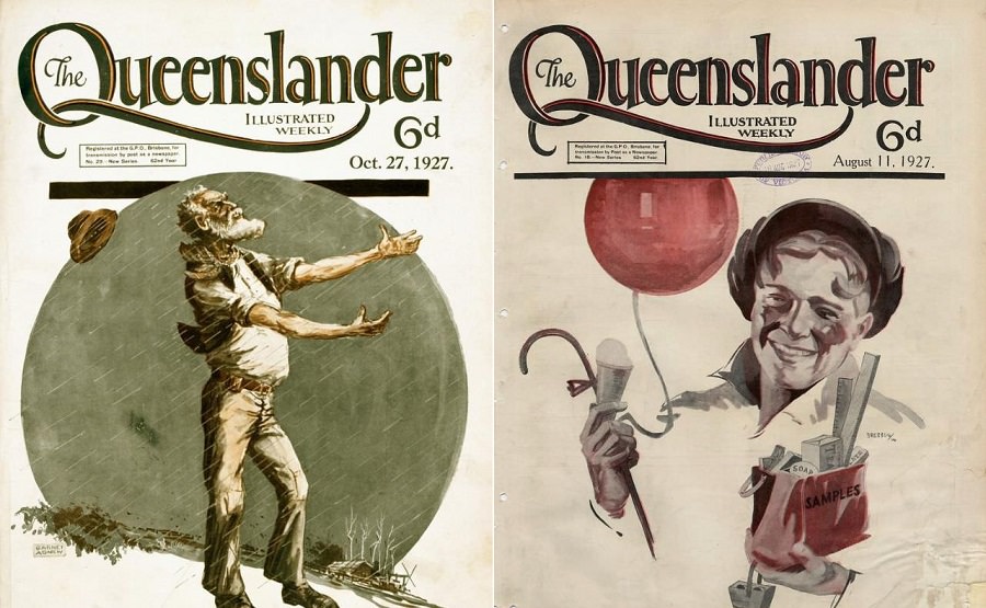
From the 1940s through the 1960s, science fiction magazines called “pulps” flooded newsstands across America. The nickname came from the cheap wood-pulp paper they were printed on. But inside, readers found stories set in distant galaxies, alien worlds, and a dazzling future. What made someone pick one up in the first place? The cover.
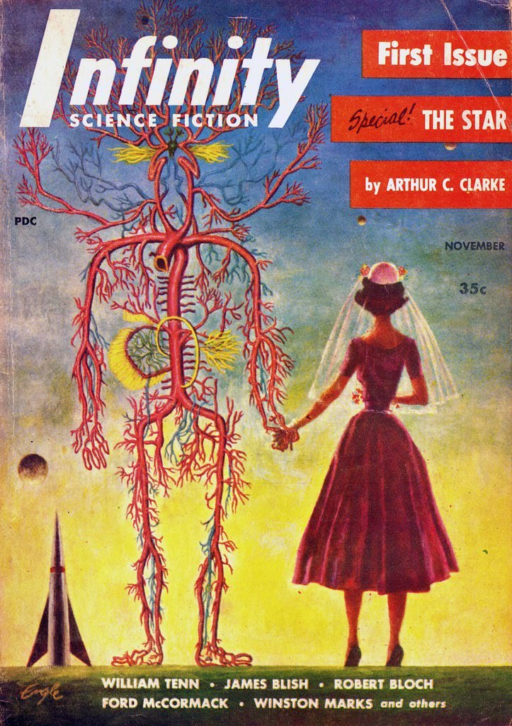
These covers had one job: stop a passerby cold. Artists used bold, vibrant colors to do exactly that. Deep blacks of outer space collided with blazing oranges, electric blues, and vivid greens. The contrast made these magazines impossible to overlook on a rack packed with competing titles.
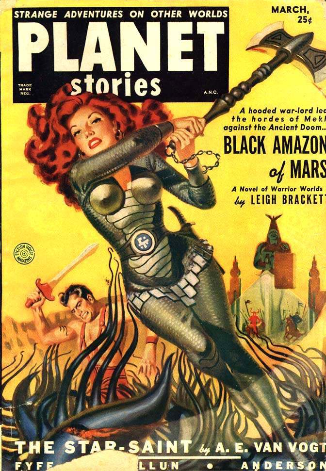
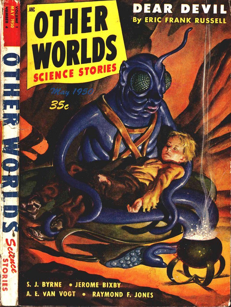
The scenes were almost always action-packed. Sleek spaceships tore through asteroid fields. Heroes faced off against menacing alien creatures. Ray guns fired across alien landscapes bathed in strange light. Every image promised danger, discovery, and high adventure.
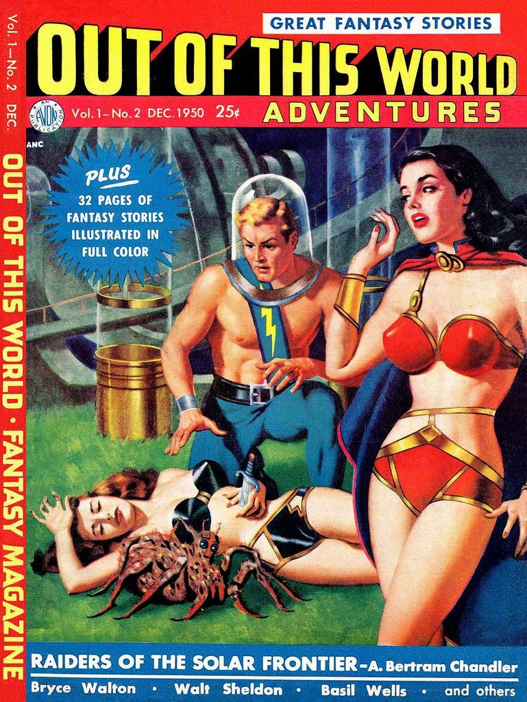
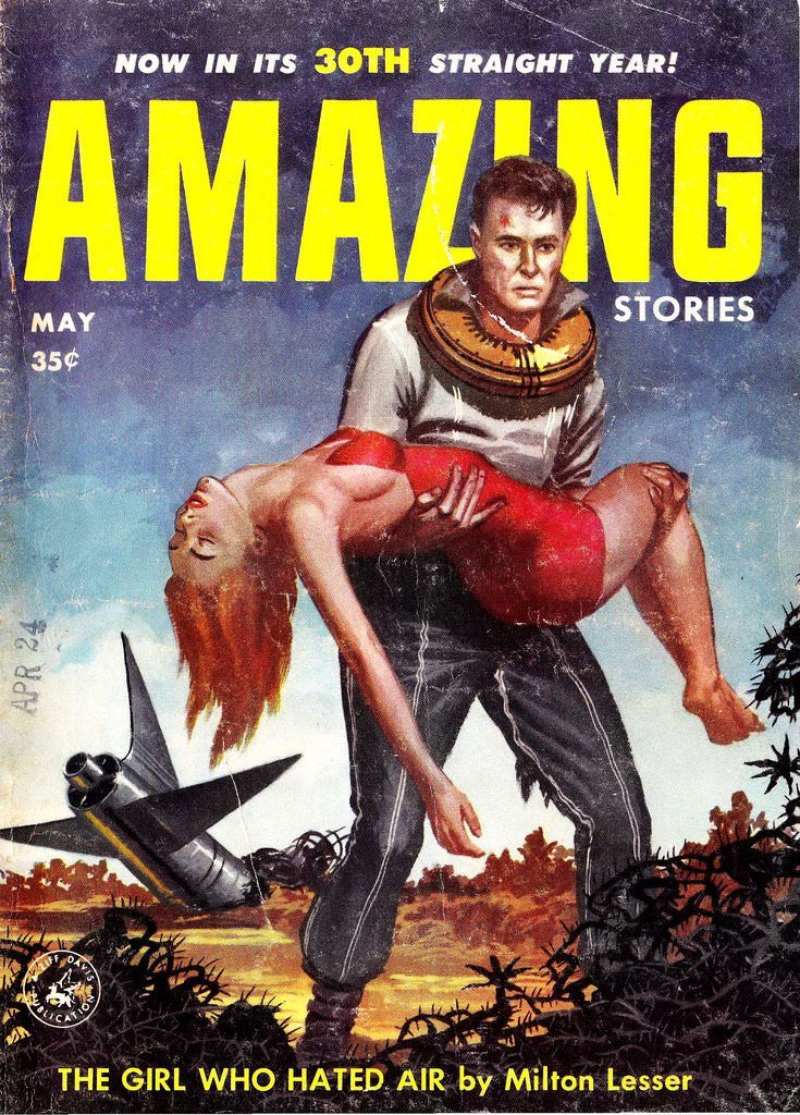
Characters on these covers looked the part. Heroes stood strong and determined, weapons raised, ready for whatever the universe threw at them. Female characters appeared too, shown as active participants in the drama rather than bystanders.
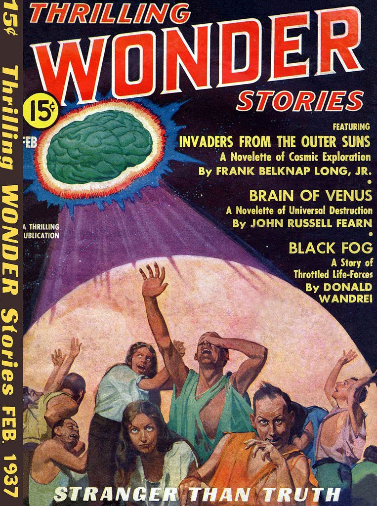
Alien creatures came in every shape imaginable. Some looked vaguely humanoid; others were grotesque and threatening. Artists gave each monster its own visual identity, reinforcing the idea that the universe was vast, strange, and full of unknown dangers.
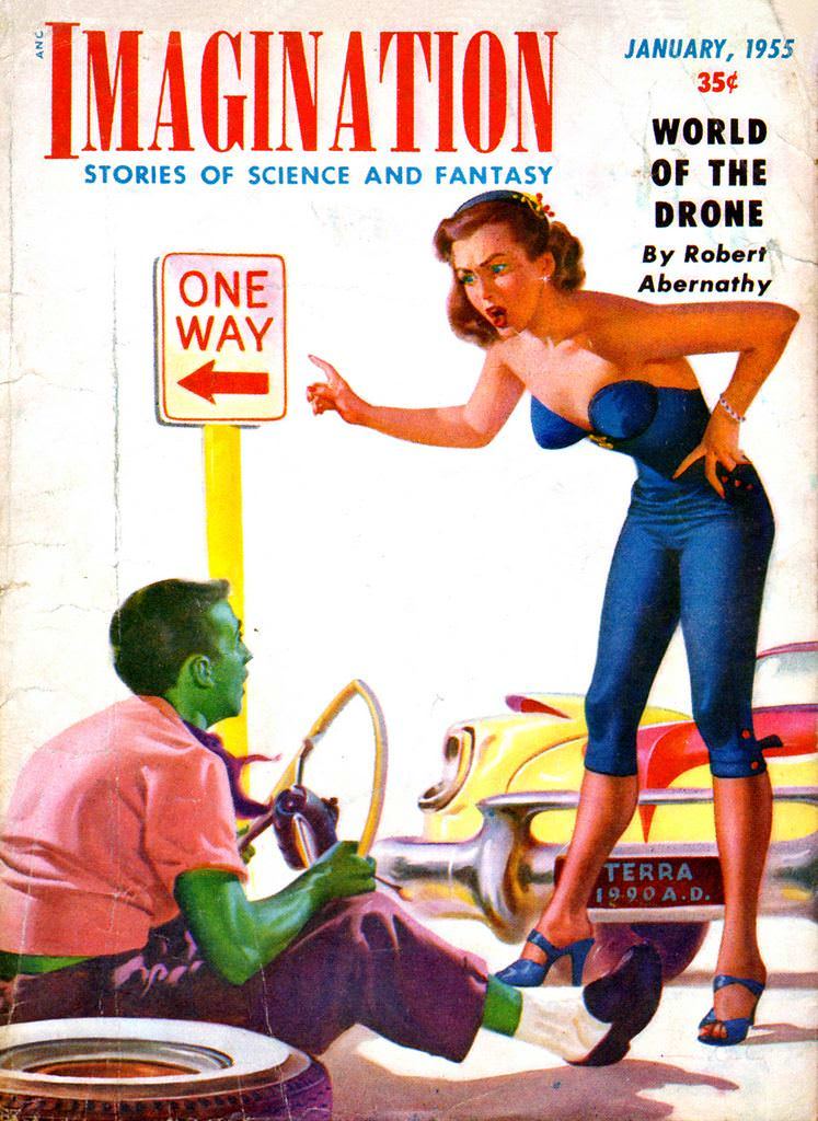
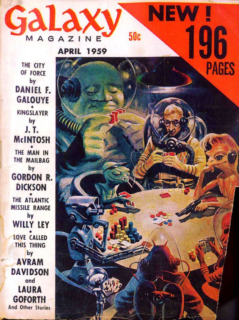
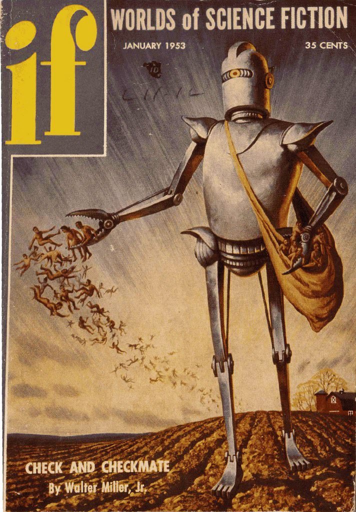
Futuristic technology filled these compositions. Laser beams, advanced machinery, and experimental spacecraft weren’t just background details — they were central to the visual story being told. The artwork made the science feel real and the fiction feel possible.
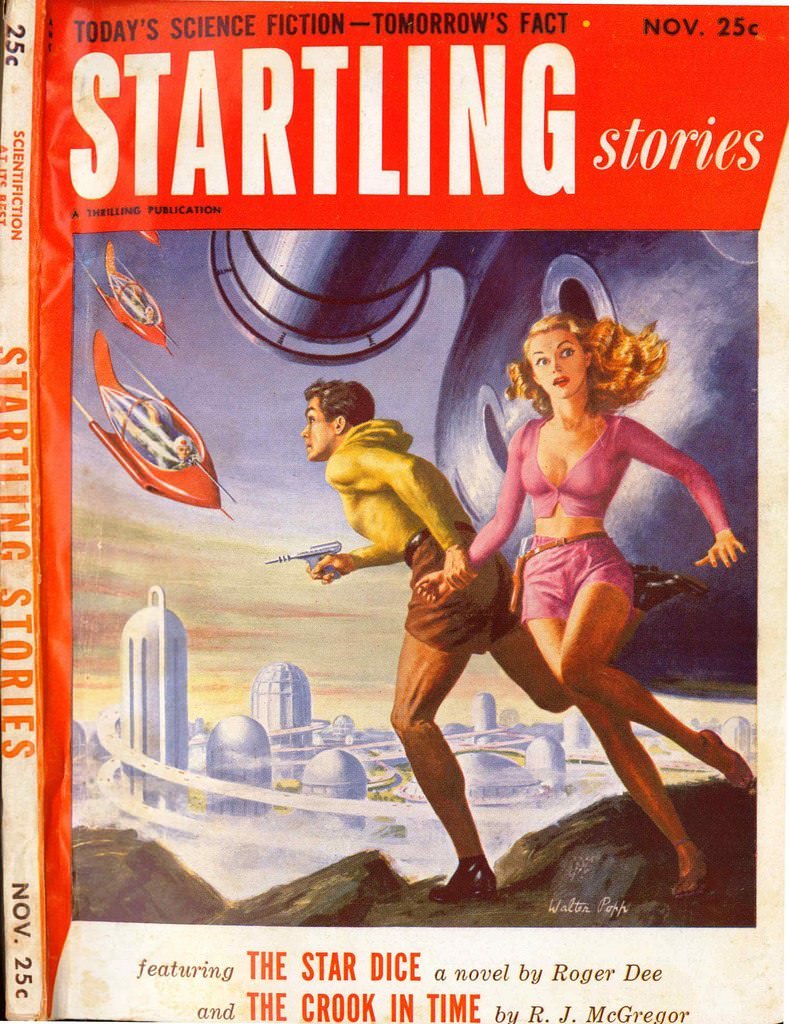
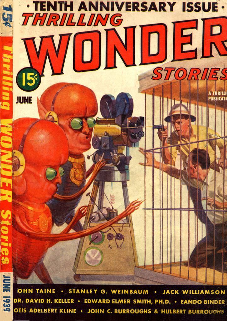
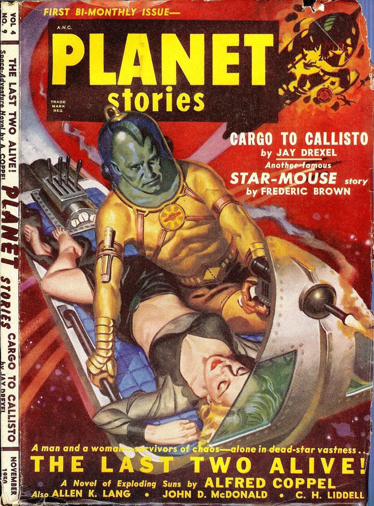
Each cover also functioned as a preview. The image hinted at a specific story inside — a landing on a hostile planet, a battle in the void of space, a first contact gone wrong. Readers knew exactly the kind of thrill they were buying before they ever opened the cover.
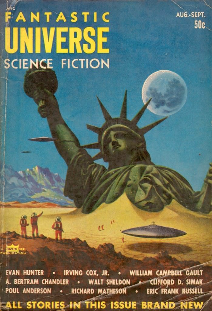
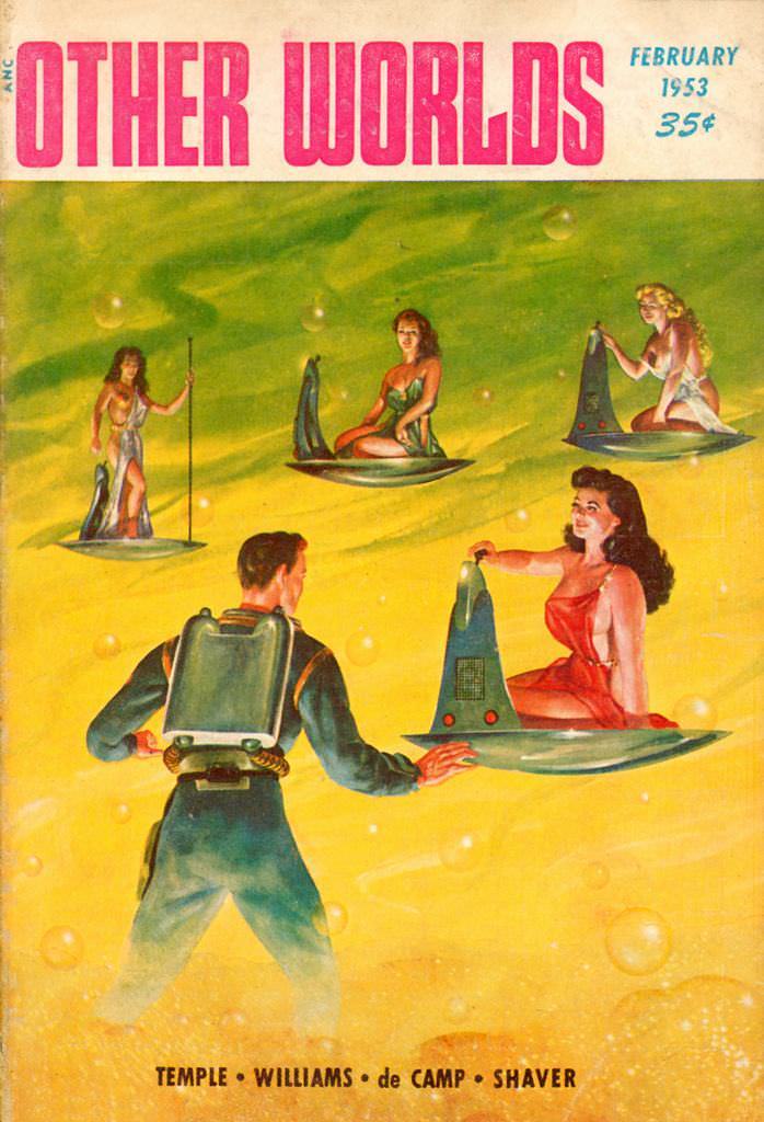
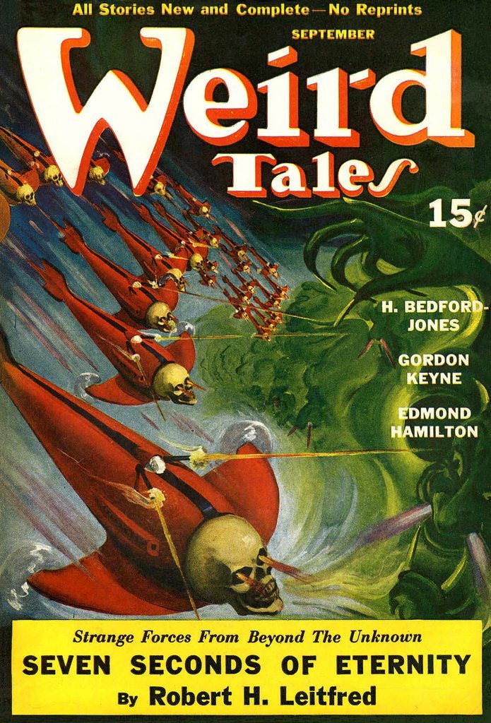
The titles themselves reinforced the drama: *Thrilling Wonder Stories*, *Startling Stories*, *Amazing Stories*. Every design choice — the typography, the color, the composition — worked together to sell a feeling of breathless excitement.
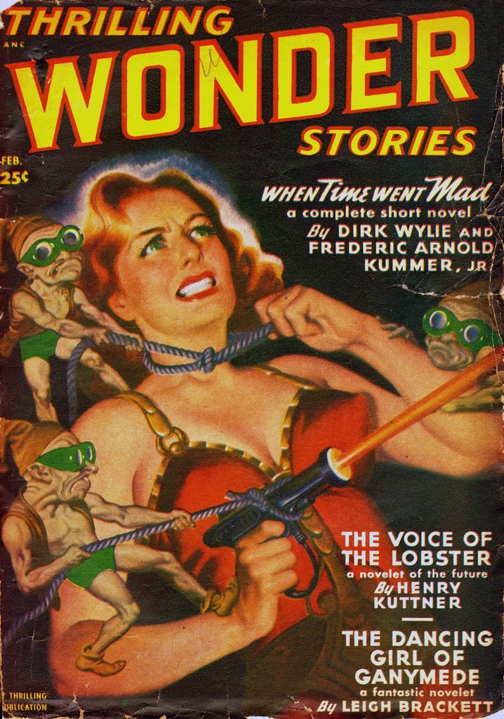
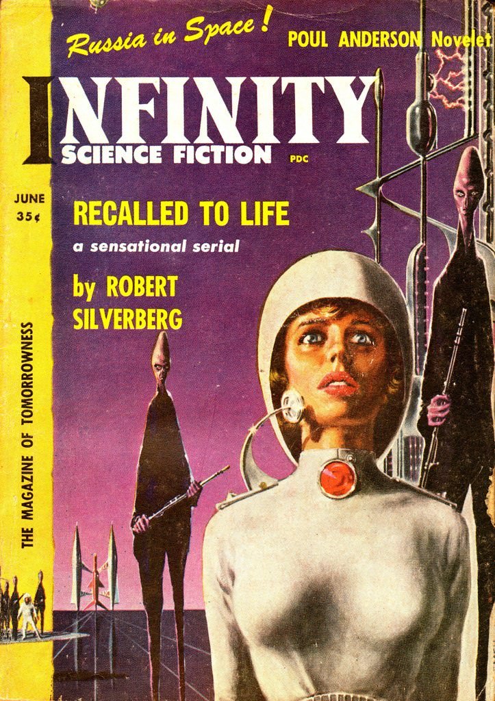
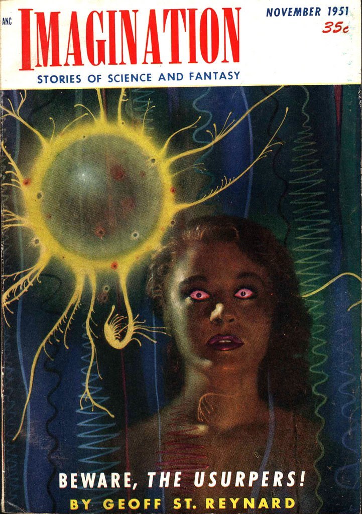
Taken together, these covers form a vivid record of how mid-20th-century culture imagined the future — bold, dangerous, and endlessly exciting.