
Hey There! Before You Go. 😧
Get the best vintage content straight into your inbox!

Don't worry, we don't spam

Cringeworthy Album Covers: A Look at the Worst of 1970s and 1980s Netherlands Music

The 1970s and 1980s produced some of the most beloved music in history. The Netherlands was no exception, putting out plenty of hits that fans still remember fondly. But behind some of that music sat album covers so baffling they deserve a category of their own.

Cringeworthy Album Covers: A Look at the Worst of 1970s and 1980s Netherlands Music

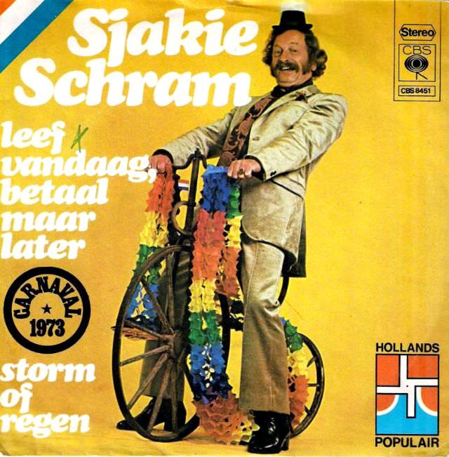
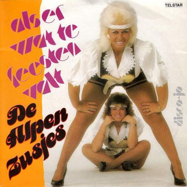
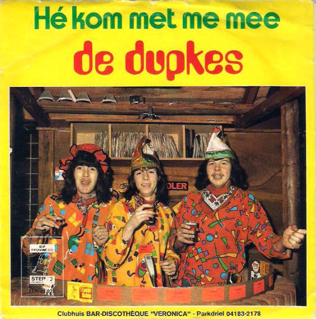
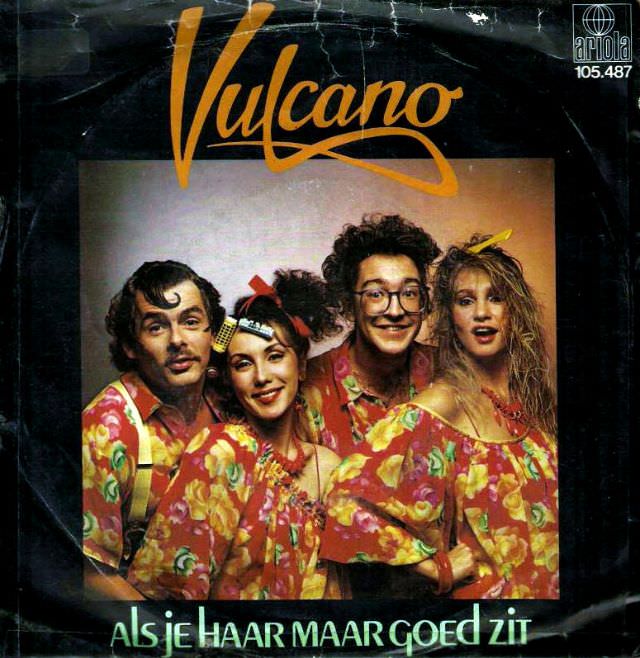
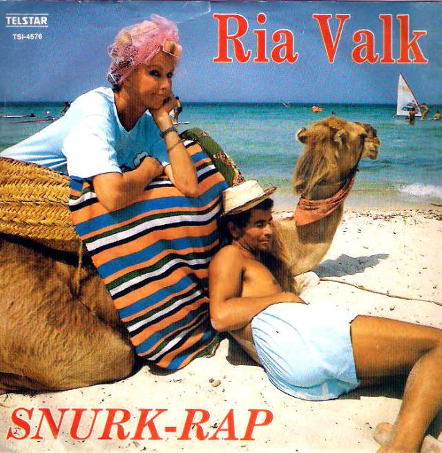
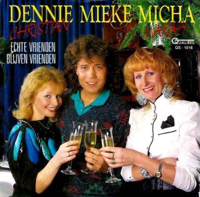
Dutch artists of this era leaned hard into the visual trends of their time — sometimes too hard. Voluminous perms, sequined jackets, and color combinations that should never have left the design studio all made it onto store shelves.

Cringeworthy Album Covers: A Look at the Worst of 1970s and 1980s Netherlands Music

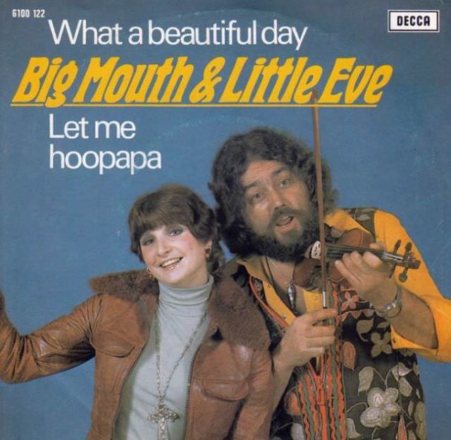
The poses alone tell a story. Stiff, awkward stances and forced smiles were standard. Some artists went the other direction, aiming for brooding intensity and landing somewhere closer to unintentional comedy.

Cringeworthy Album Covers: A Look at the Worst of 1970s and 1980s Netherlands Music

Design quality varied wildly. Low-budget releases showed it plainly — blurry photos, clip-art-style illustrations, and printing that looked rushed. Even higher-profile albums sometimes featured Photoshop-style compositing that was crude by any standard.

Cringeworthy Album Covers: A Look at the Worst of 1970s and 1980s Netherlands Music

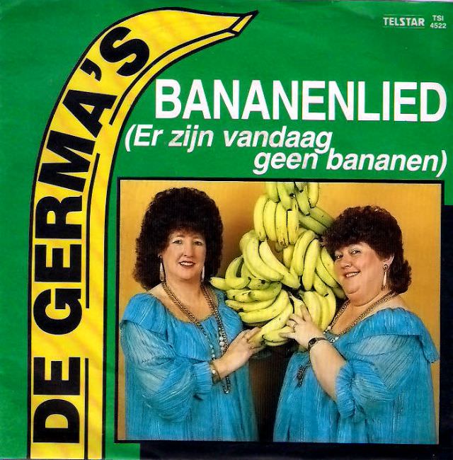
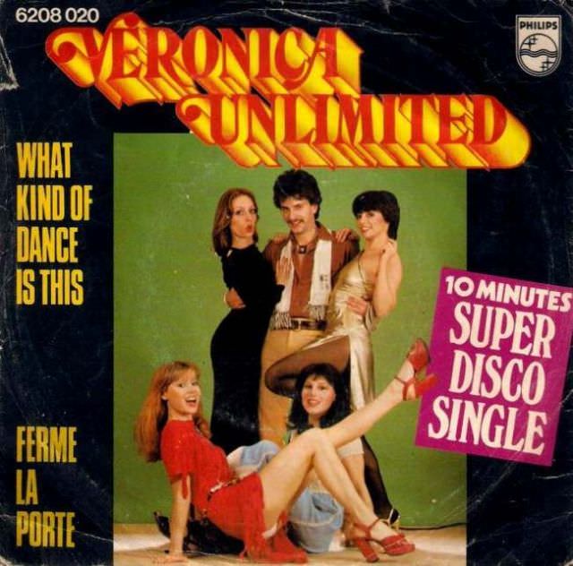
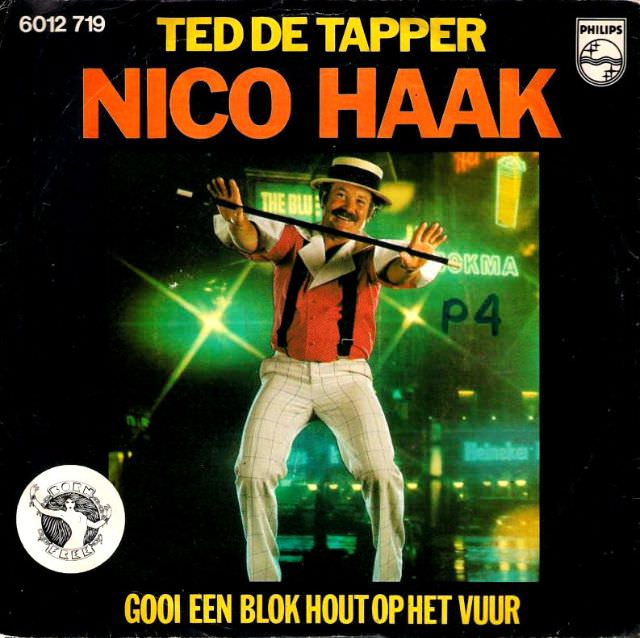
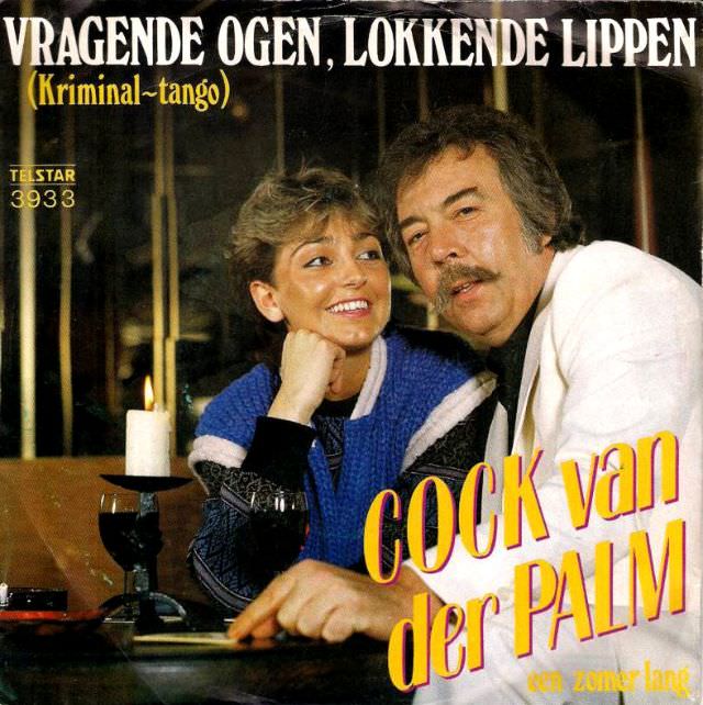
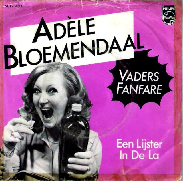
Typography was another weak point. Fonts were often stretched, shadowed, or outlined in ways that clashed with the photos behind them. Color choices — think neon yellow text over an orange background — made some covers nearly impossible to read.

Cringeworthy Album Covers: A Look at the Worst of 1970s and 1980s Netherlands Music

What makes these covers fascinating is that many of the albums sold well. Dutch buyers were clearly there for the music, not the art direction. Commercial success had little to do with whether the sleeve looked good.

Cringeworthy Album Covers: A Look at the Worst of 1970s and 1980s Netherlands Music

Some covers went for elaborate concept art and ended up with something that looked more like a fever dream than a musical statement. Fantasy imagery, odd props, and costumes that straddle the line between theatrical and absurd pop up again and again.

Cringeworthy Album Covers: A Look at the Worst of 1970s and 1980s Netherlands Music

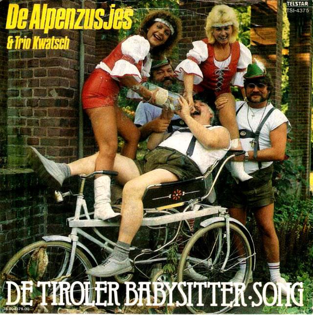
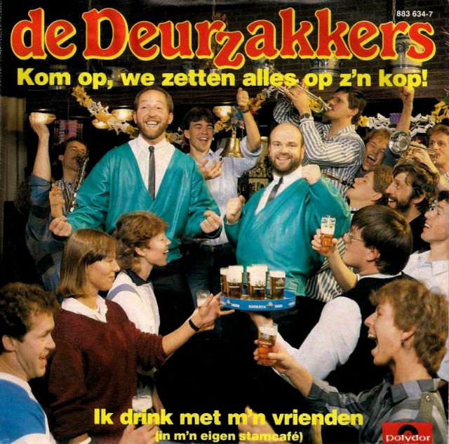
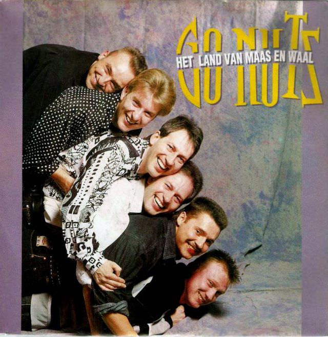
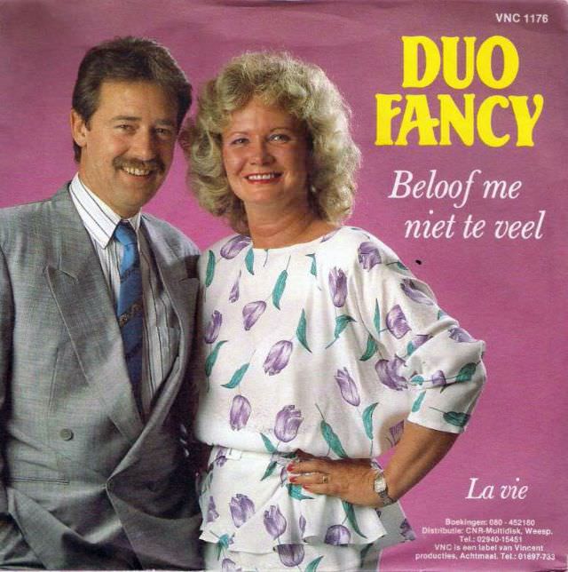
Group shots brought their own challenges. Getting four or five people to look natural in front of a camera was apparently a tall order. Mismatched outfits, uneven lighting, and someone always blinking at the wrong moment are recurring themes.

Cringeworthy Album Covers: A Look at the Worst of 1970s and 1980s Netherlands Music

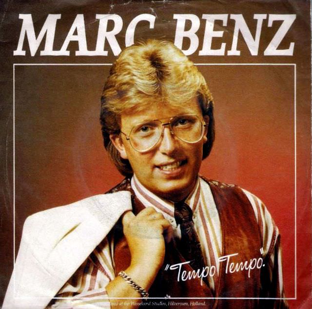
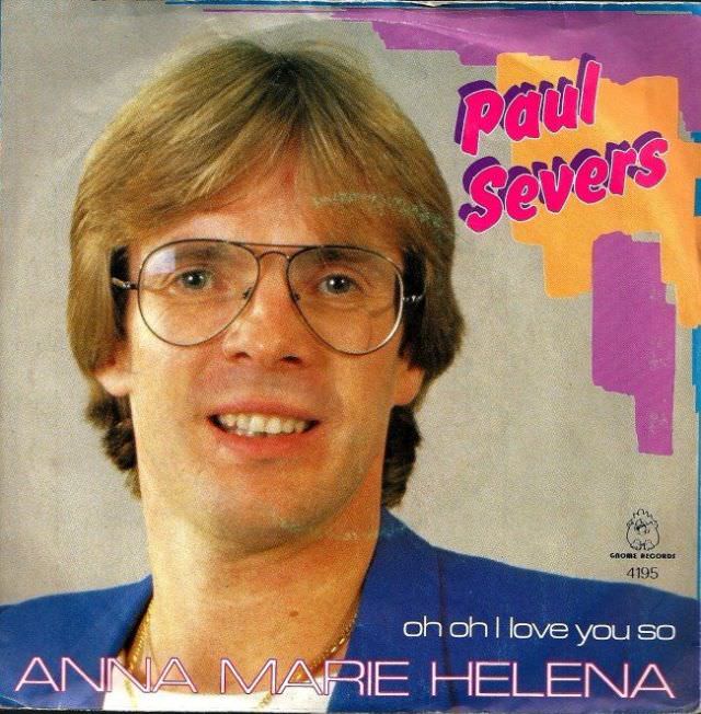
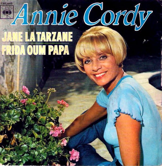
Solo artists weren’t immune either. Glamour shots that were meant to project star power often projected something else entirely. The gap between intention and result is sometimes enormous.

Cringeworthy Album Covers: A Look at the Worst of 1970s and 1980s Netherlands Music

Looking at these covers today, it’s clear that very few people involved were asking hard questions before going to print. Budget constraints, tight deadlines, and supreme confidence in bad ideas all played a role in what ended up on record store shelves across the Netherlands.

Cringeworthy Album Covers: A Look at the Worst of 1970s and 1980s Netherlands Music
Enjoyed this post? Get new ones in your inbox.

Leave a Comment

Your email address will not be published. Required fields are marked *

Share this Post 🥺

Please take a moment to share this content. Your support is greatly appreciated! 🙌🙏

Share this Post 🥺

Please take a moment to share this content. Your support is greatly appreciated! 🙌🙏
Scroll to Top
 
Hey Friend, Before You Go.. Please like & follow for more interesting content