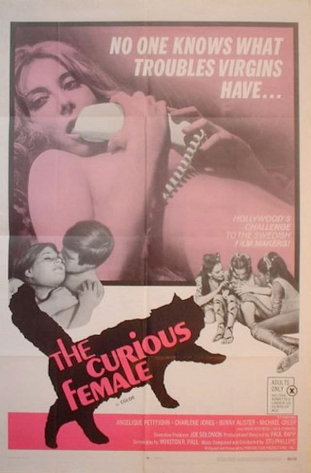
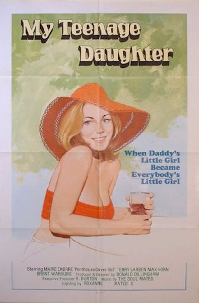
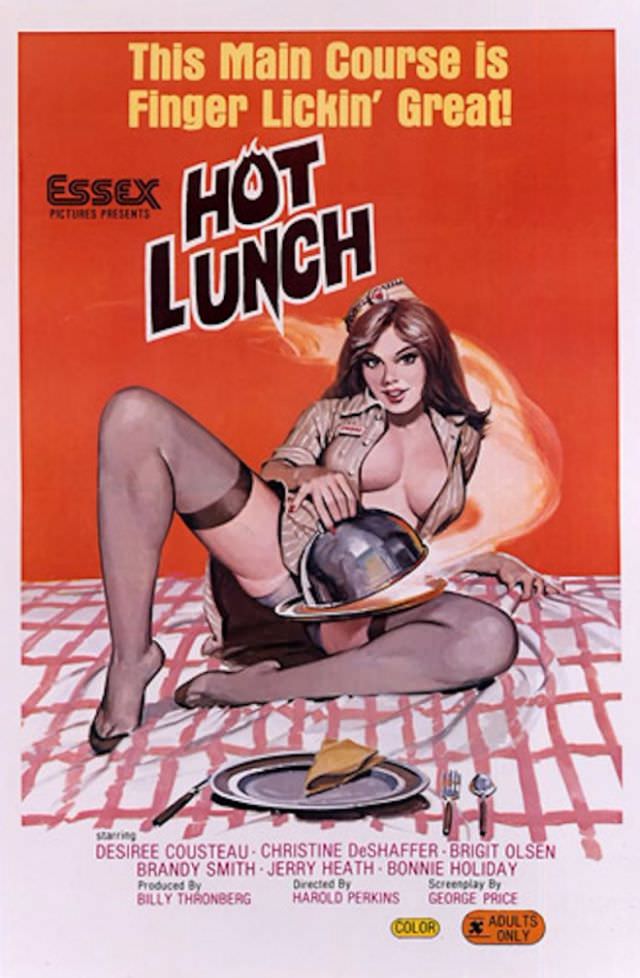
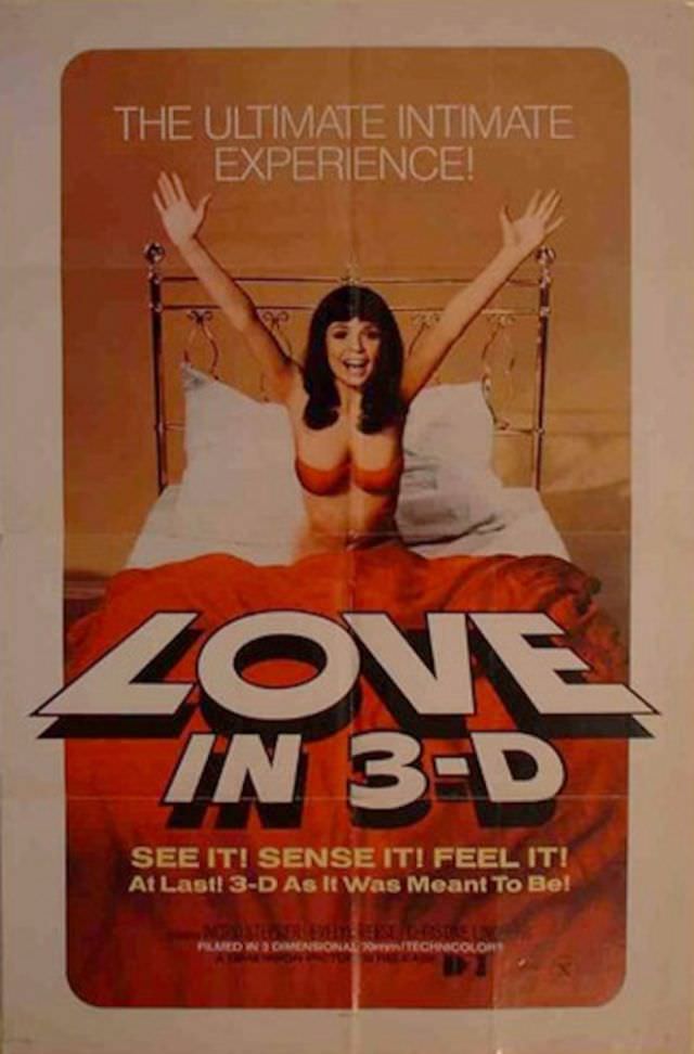
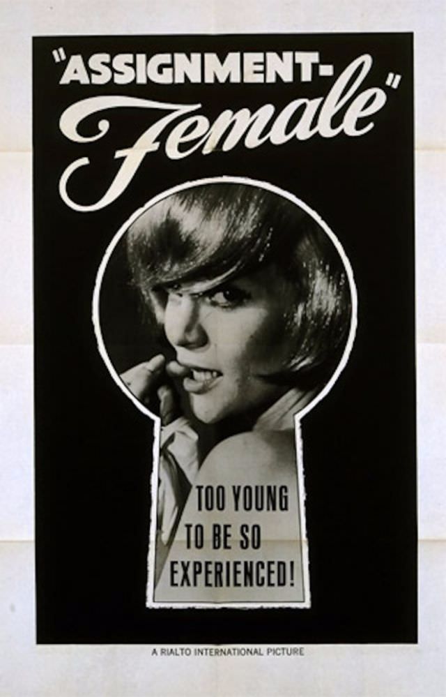
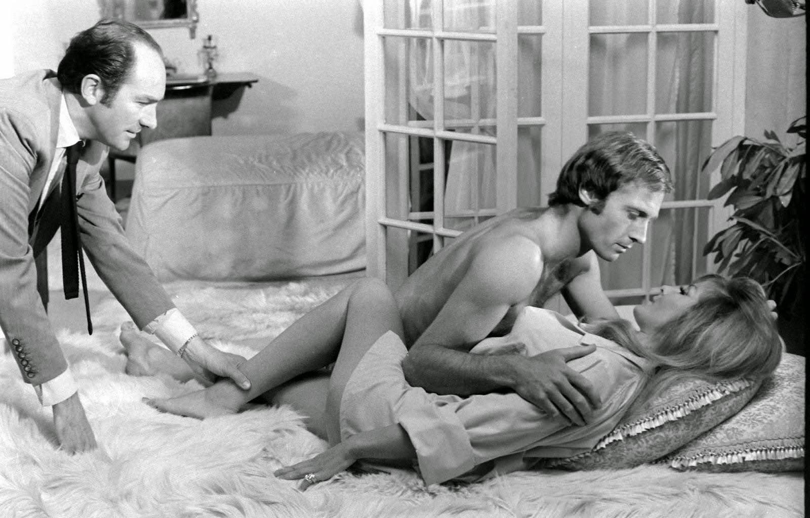
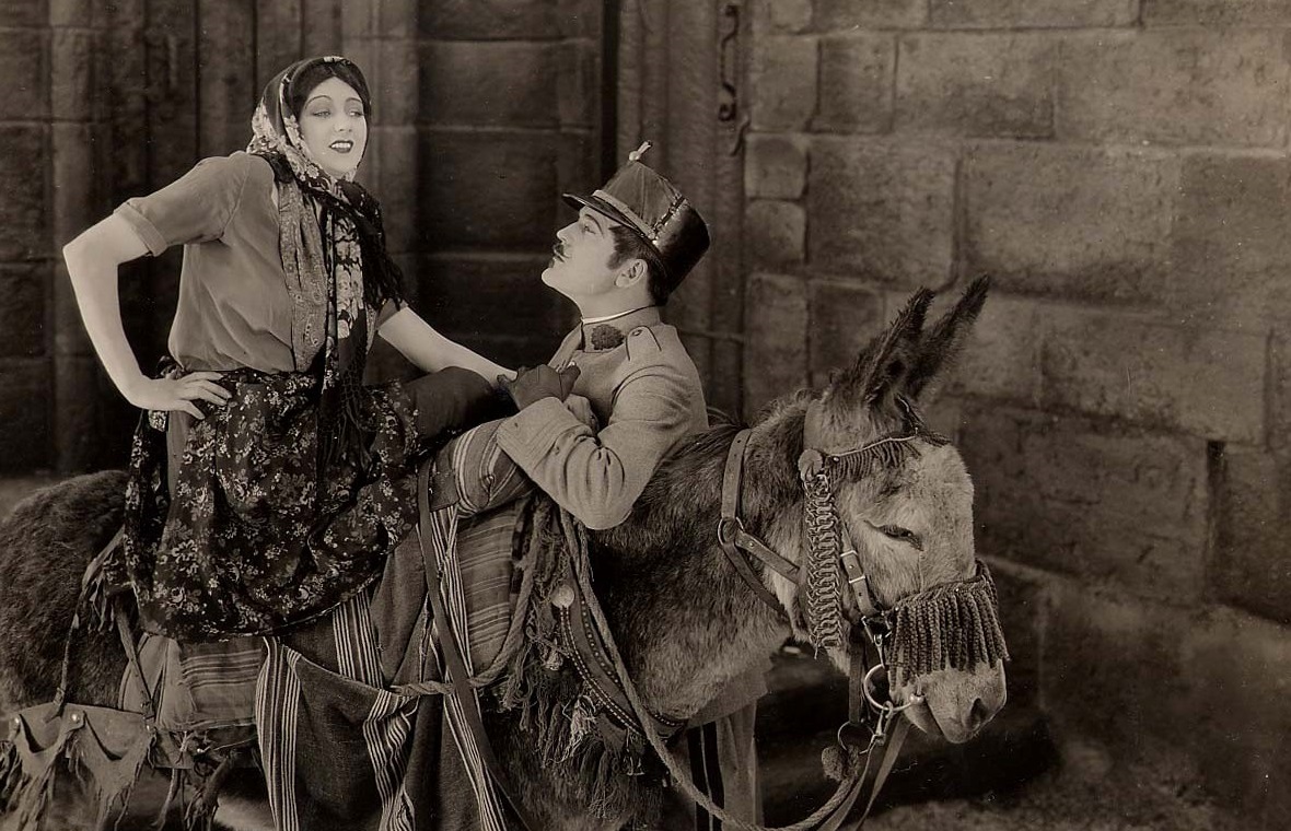
Before streaming and digital marketing took over, adult films of the 1960s, 70s, and 80s relied on one thing to pull in audiences: the poster. These were low-budget productions with no big studios behind them. The poster was often the only advertisement a film had. So filmmakers and artists made them count.
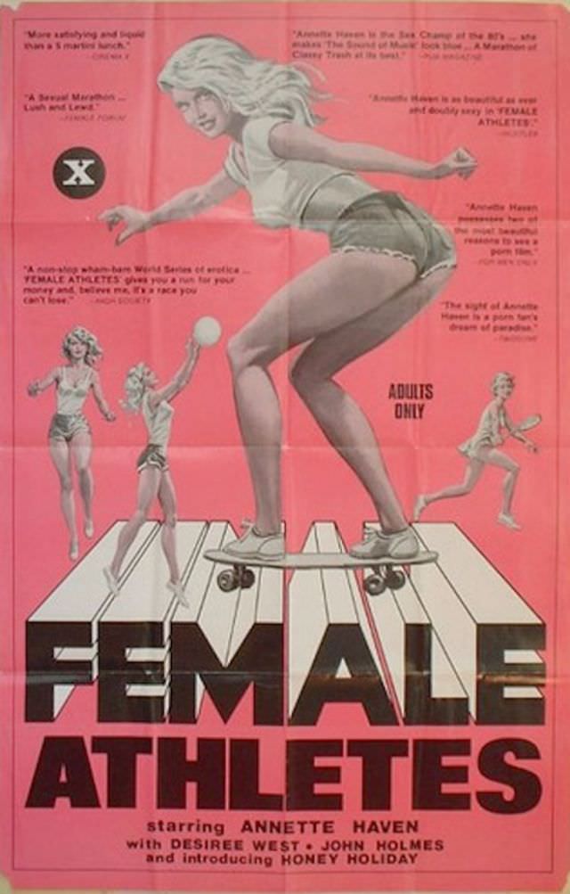
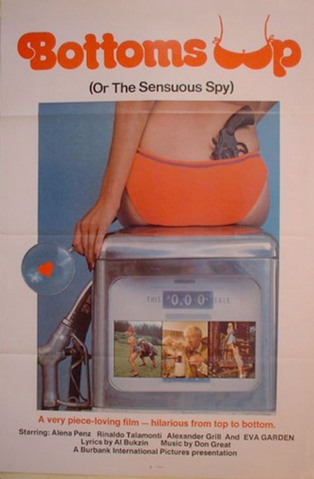
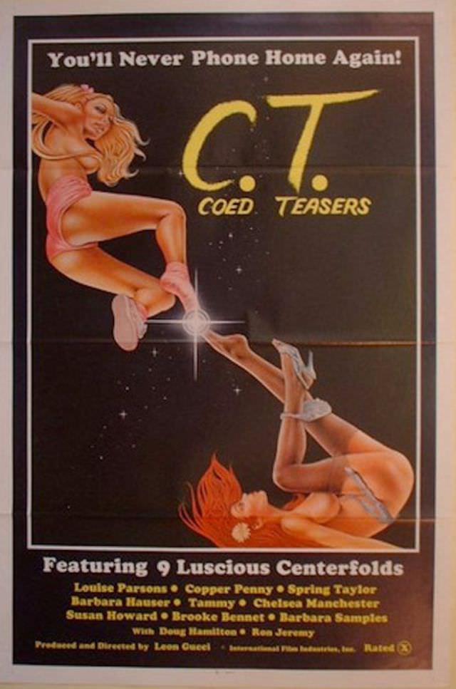
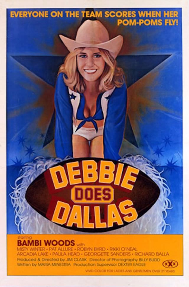
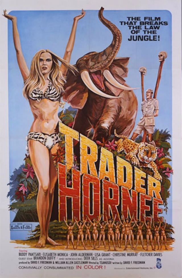
One of the first things you notice about these old posters is the art style. Most were hand-drawn, not photographed. Illustrators used bright, bold colors to grab attention from across a busy street. The figures were exaggerated, the fonts were loud, and everything was designed to be impossible to ignore.
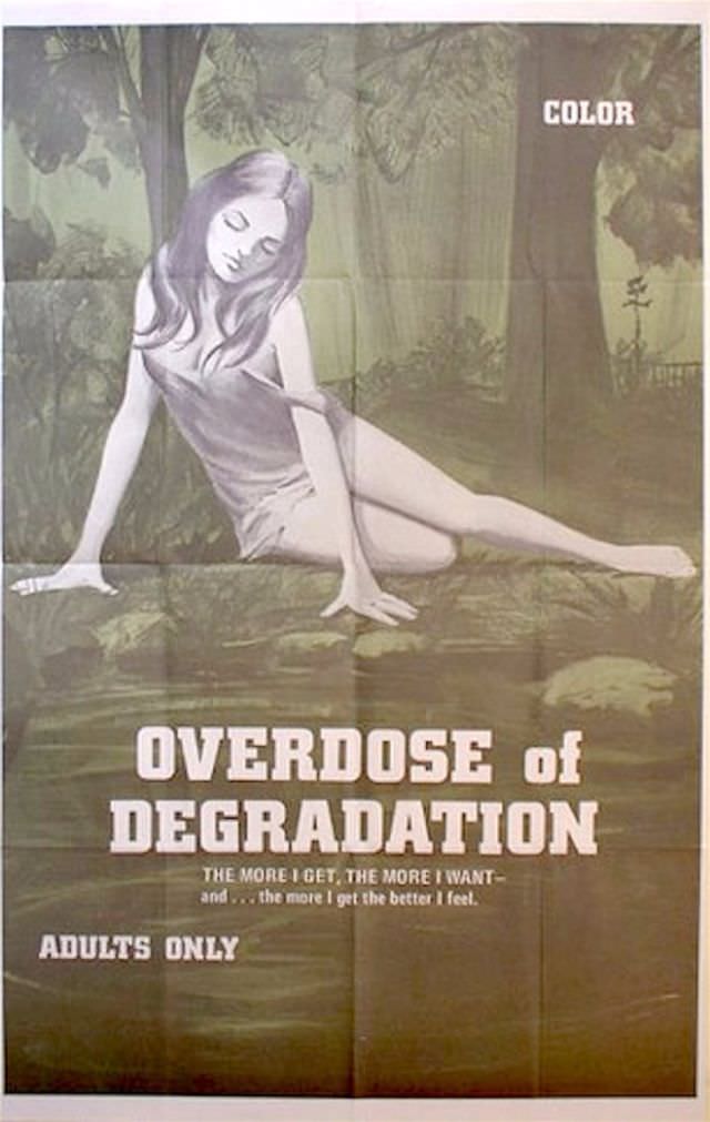
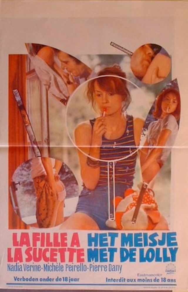
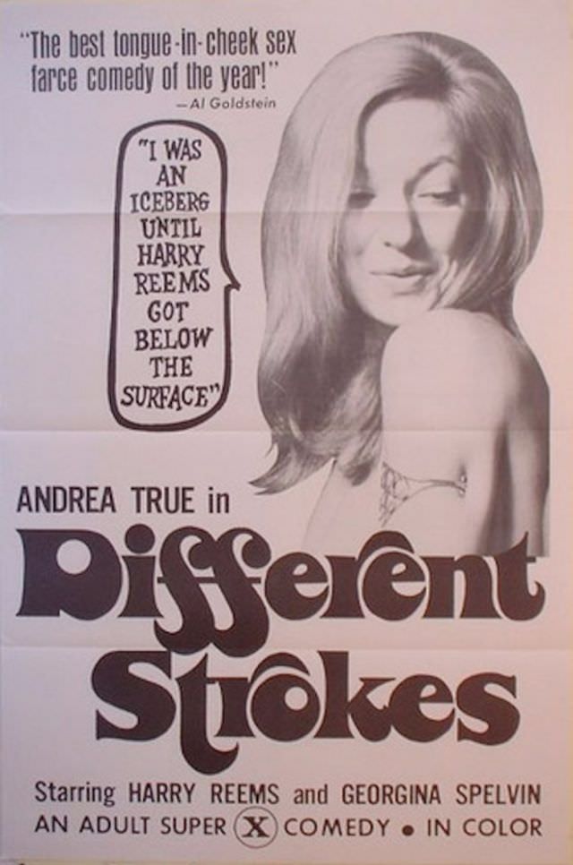
Humor was a huge part of the formula. Filmmakers leaned into puns, wordplay, and outright silly titles. The goal was to make someone walking past a theater stop, smirk, and buy a ticket. Many of the titles alone are enough to make you laugh out loud today.
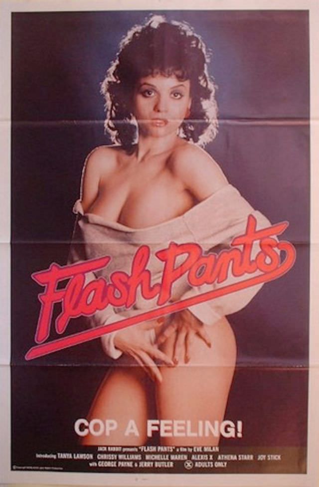
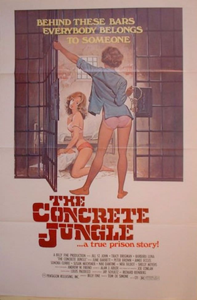
The taglines were carefully crafted to carry double meanings. A phrase that seemed innocent on the surface always had a second, obvious layer underneath. This kind of wordplay made the posters more memorable and gave audiences a sense of being in on the joke.
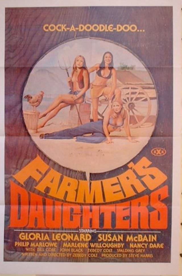
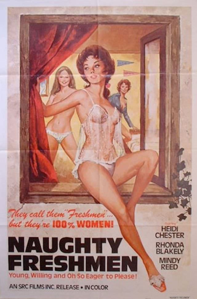
Limited budgets actually pushed artists to be more creative. Without money for fancy photography or printing, illustrators had to rely purely on skill and imagination. The result was a raw, energetic style that polished modern marketing rarely matches.
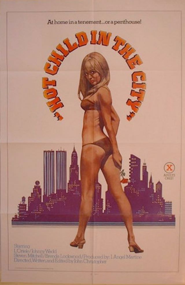
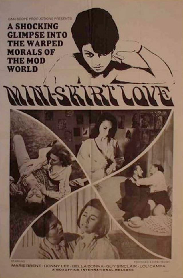
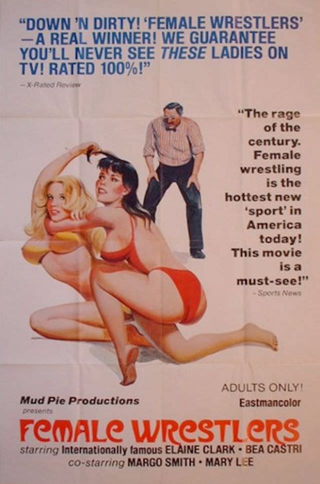
These posters also reflect the cultural attitude of the era. Adult films were shown in dedicated theaters, often in urban areas. The posters had to work hard on the street level, competing with dozens of other films and distractions for a passerby’s attention.
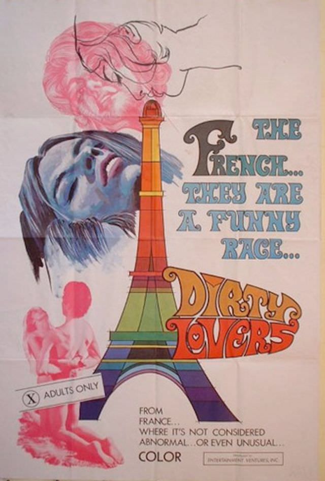
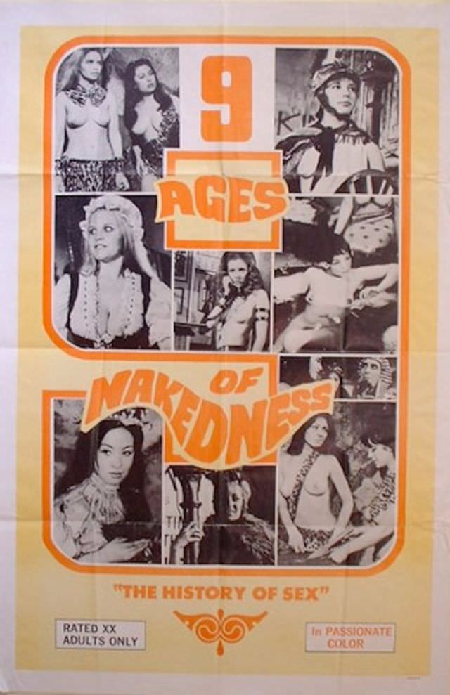
The sheer variety of themes is remarkable. Some posters spoofed popular mainstream films. Others leaned into fantasy, comedy, or absurd scenarios. The filmmakers were not shy about being outrageous — it was practically a requirement of the genre.
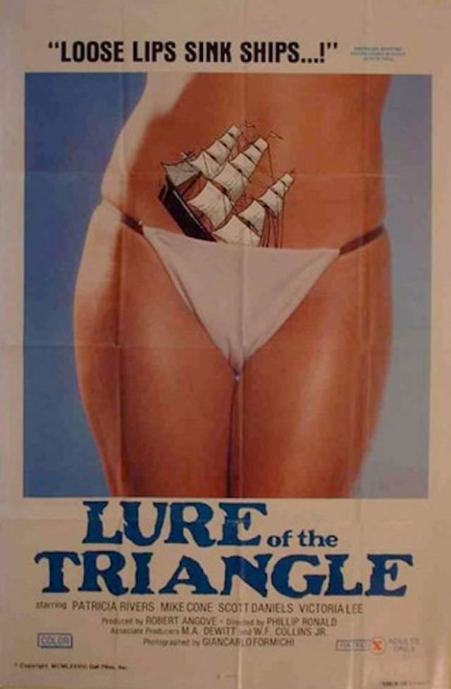
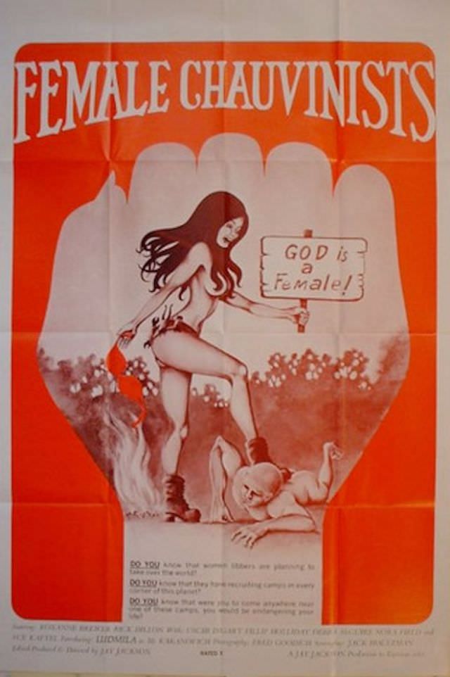
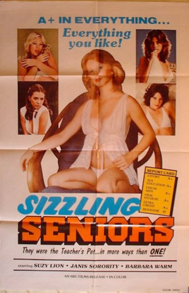
Collectors and film historians now seek out these posters as genuine artifacts of American pop culture. They document a specific moment when adult entertainment operated in a more open, street-level commercial space, advertised boldly and without apology.
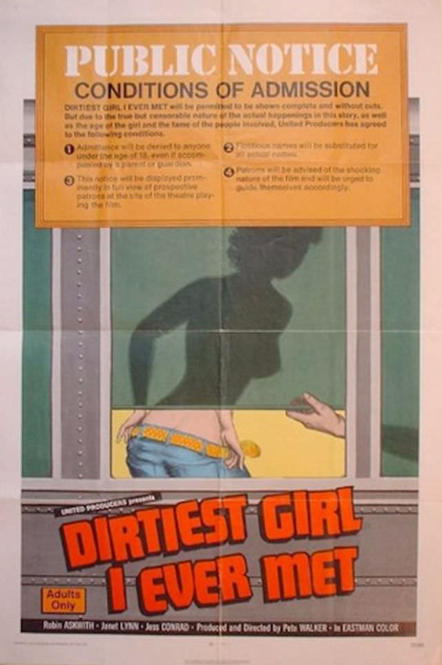
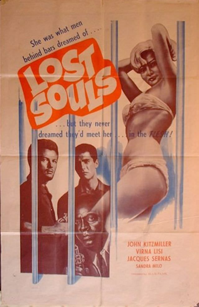
The illustrators behind these works were largely uncredited. Their names rarely appeared on the posters they made. Yet their work was skilled — balancing composition, color theory, and typography all at once, often under tight deadlines and with little pay.
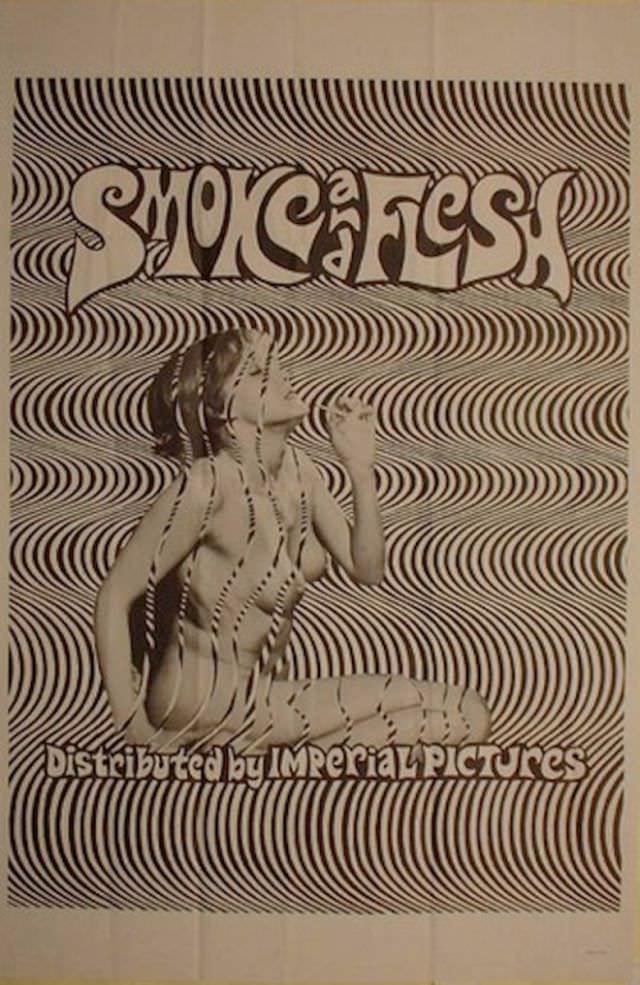
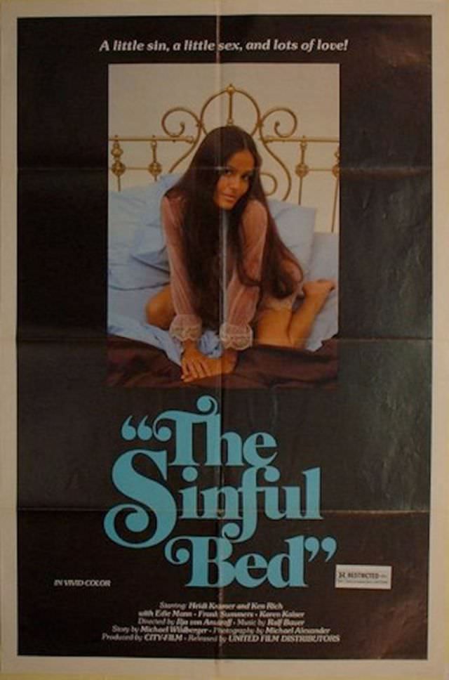
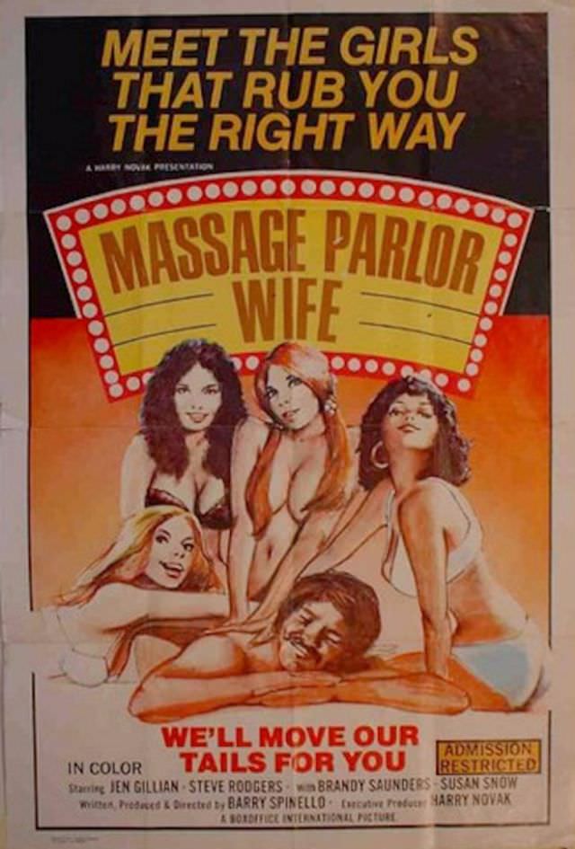
Looking at these posters today, the humor still lands. The puns are groan-worthy in the best way. The art has an energy that feels alive. They are a reminder that even in the most unexpected corners of film history, creativity found a way to thrive.