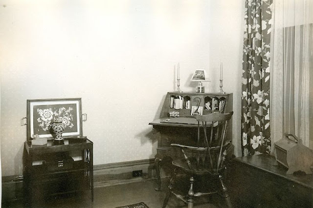
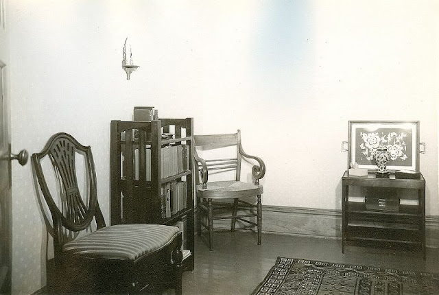
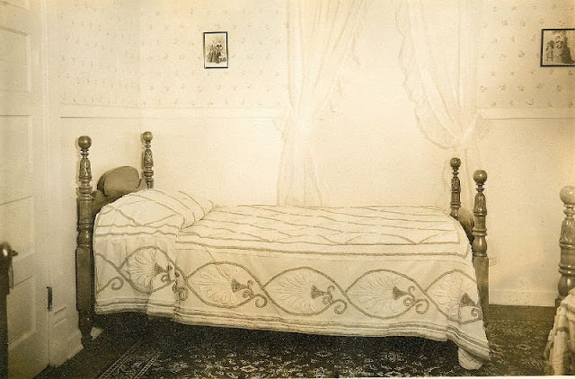
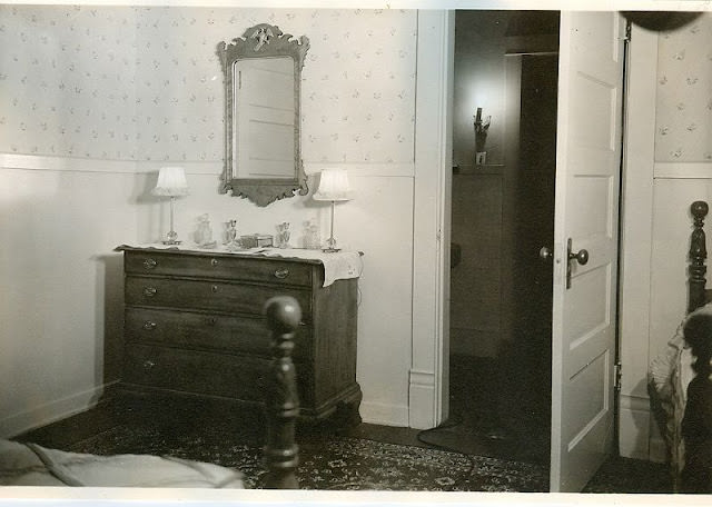
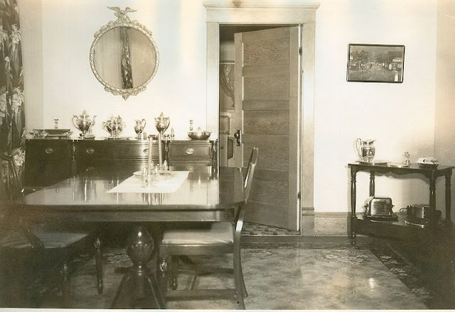
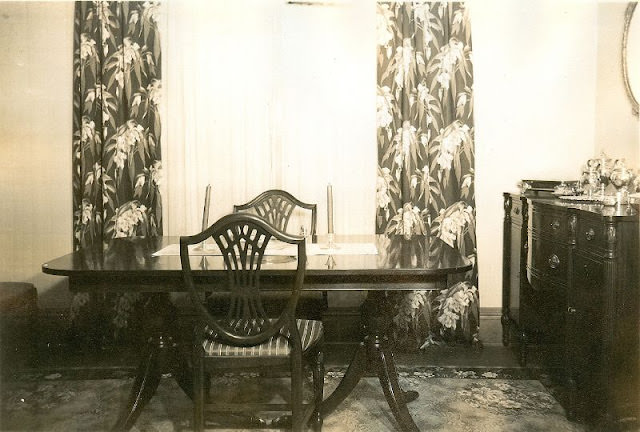
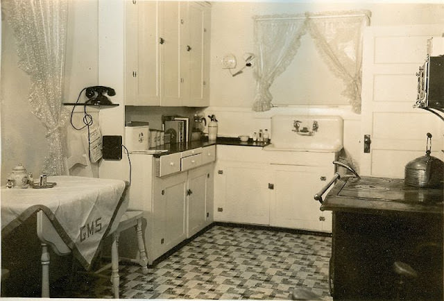
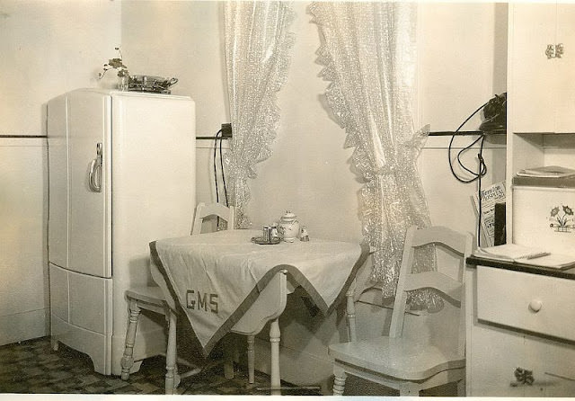
The 1930s were a decade pulled in two directions at once. The Great Depression drained household budgets across the country, yet home interiors from this period are anything but dull. Families worked with limited resources and still managed to create spaces that were warm, functional, and often surprisingly stylish. These vintage photos offer a window into exactly how they did it.
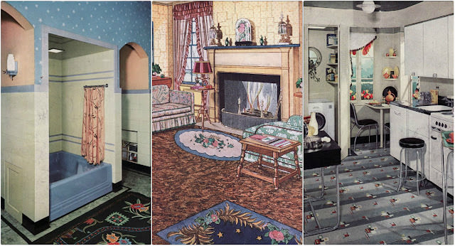
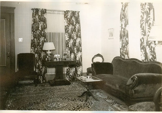
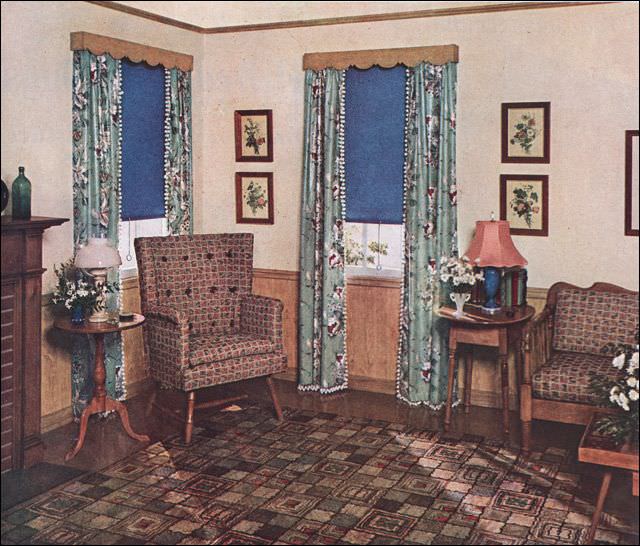
With money tight, homeowners leaned into simplicity. Repurposed furniture and home-sewn textiles replaced store-bought goods. Curtains and upholstery fabrics were often bright and floral — a deliberate contrast to the hardship outside. Handmade items weren’t a sign of poverty; they were a point of pride. This resourcefulness gave 1930s interiors a personal, lived-in character that mass-produced décor rarely achieves.
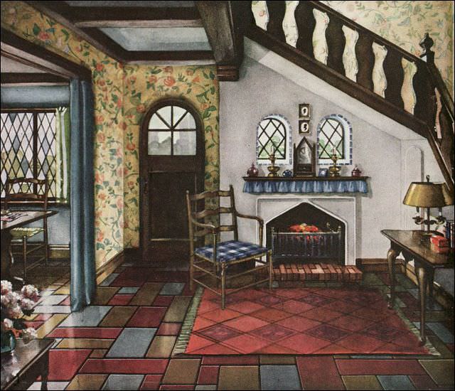
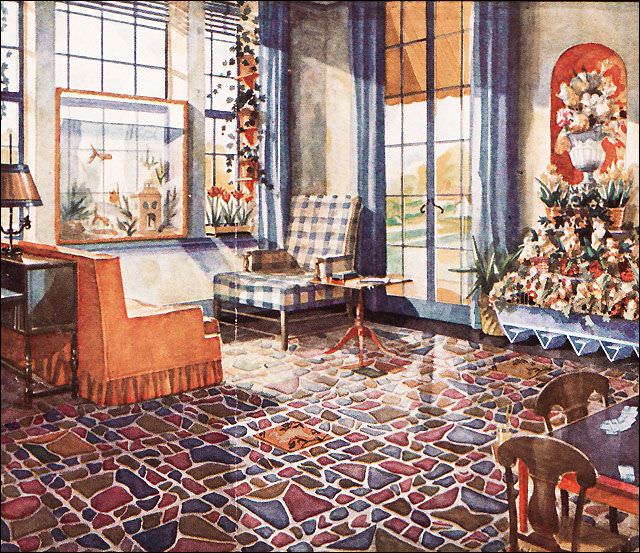
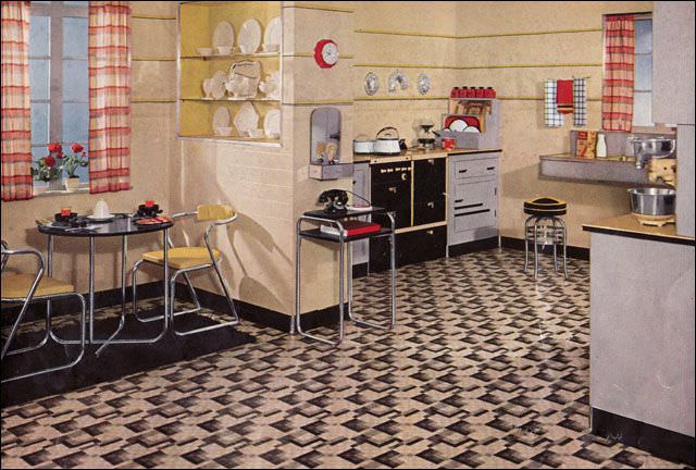
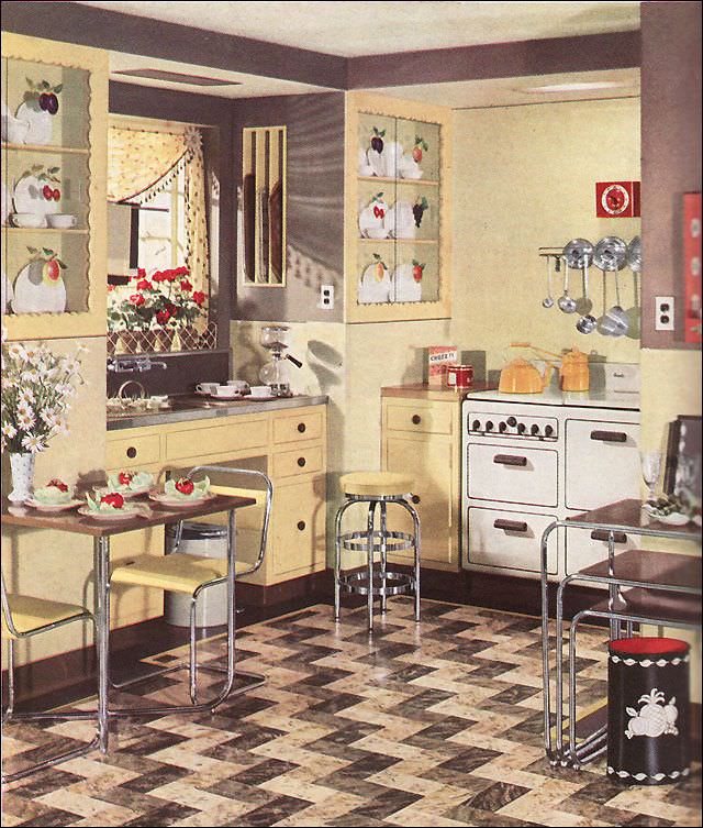
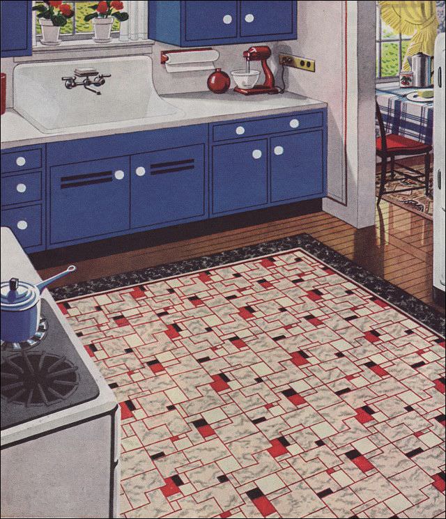
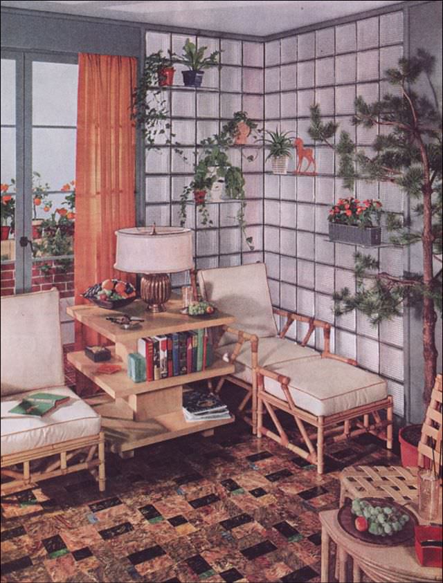
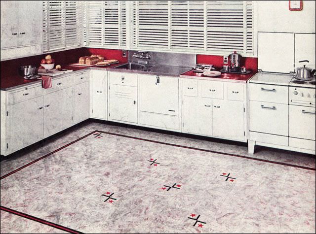
Flooring was one area where families could make a dramatic visual statement without spending a fortune. Linoleum was widely used throughout the decade — affordable, durable, and available in a range of bold patterns. Companies like Armstrong and Sealex marketed it heavily, producing designs that ranged from traditional English revival styles to vivid geometric prints.
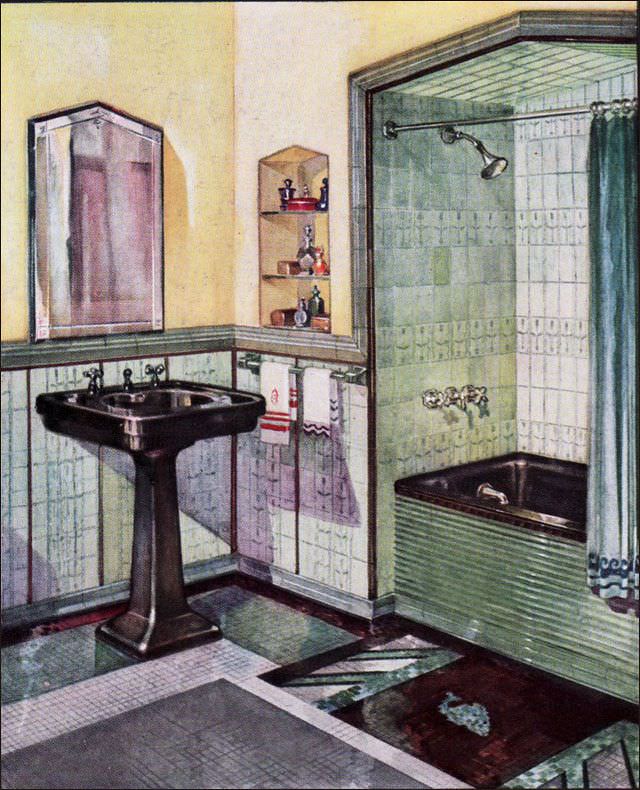
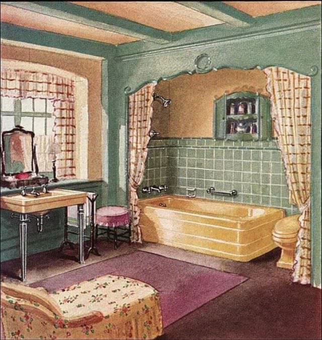
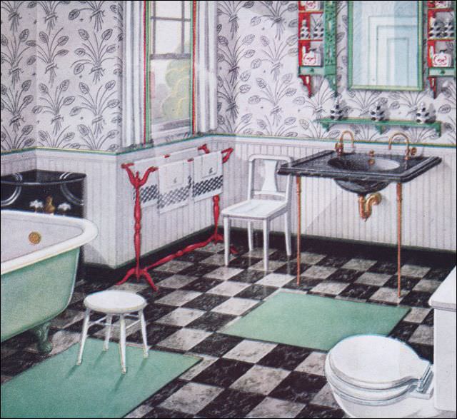
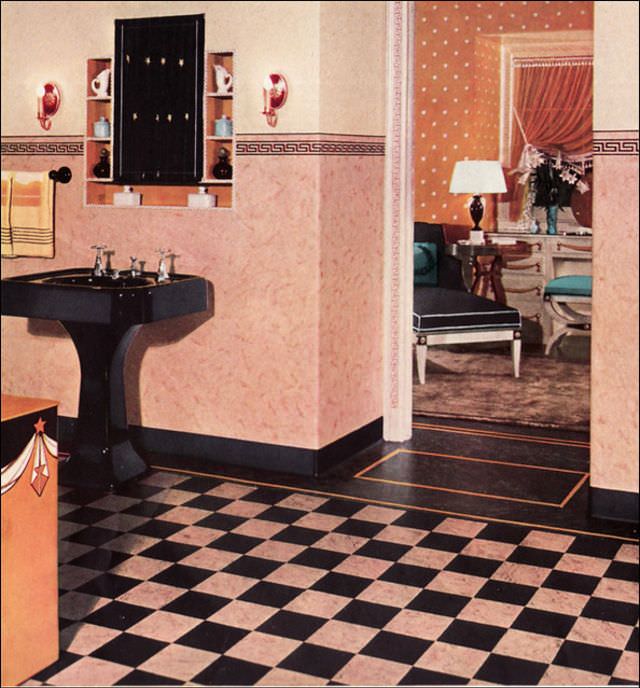
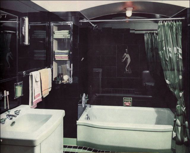
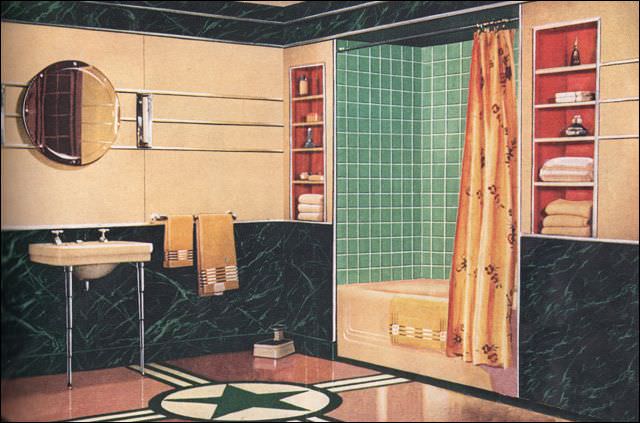
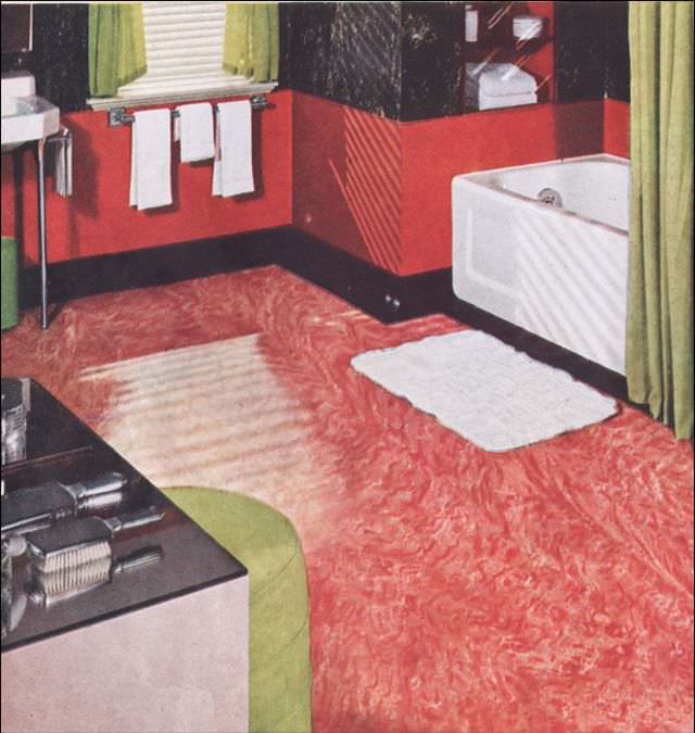
Bathrooms in the early 1930s were undergoing a quiet transformation. Clean lines and coordinated color schemes replaced the cluttered, purely utilitarian look of earlier decades. Fixture manufacturers like Crane promoted fully designed bathroom suites — matching tubs, sinks, and toilets in cohesive palettes. Pastel tones, particularly pink, green, and ivory, were especially popular.
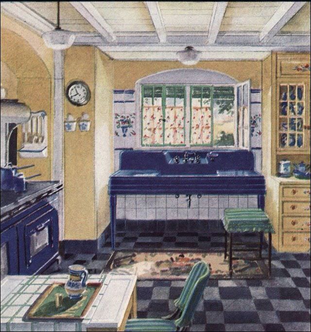
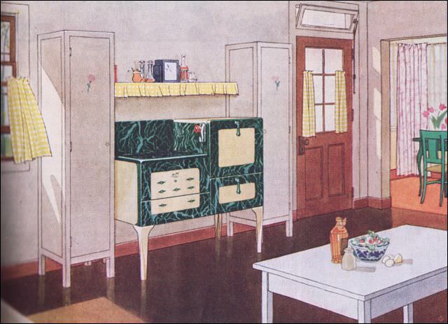
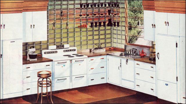
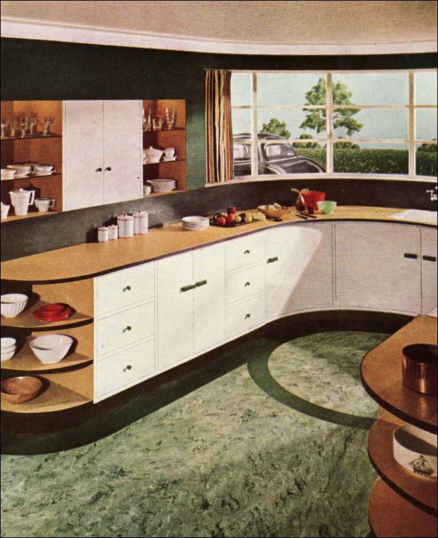
The kitchen became a focal point of 1930s home design. Advances in household technology turned it into a showpiece for modernity. The so-called “electric kitchen” — equipped with the latest appliances and featuring chrome fixtures and smooth, easy-to-clean surfaces — was a strong selling point for new homes. It promised relief from domestic labor and reflected a genuine optimism about what technology could deliver.
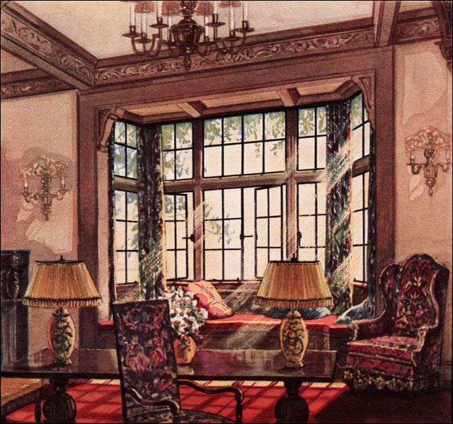
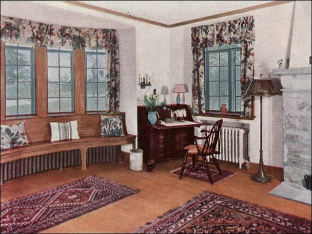
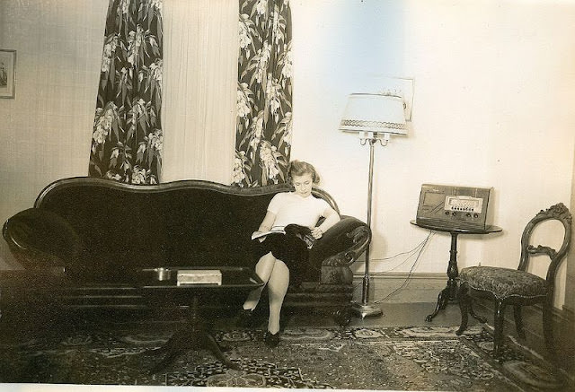
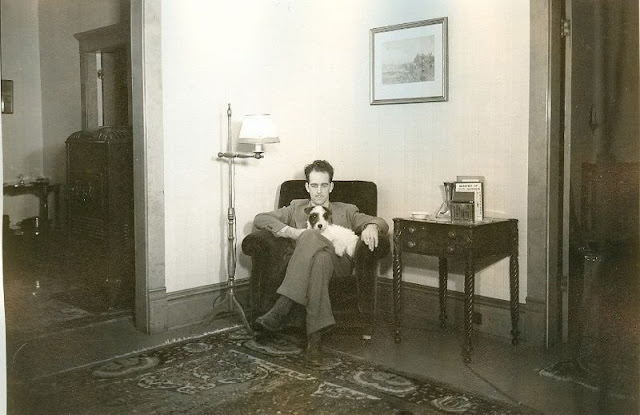
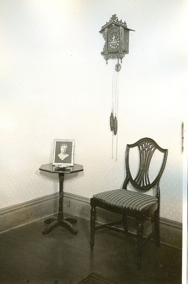
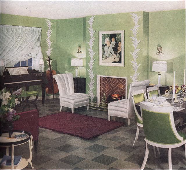
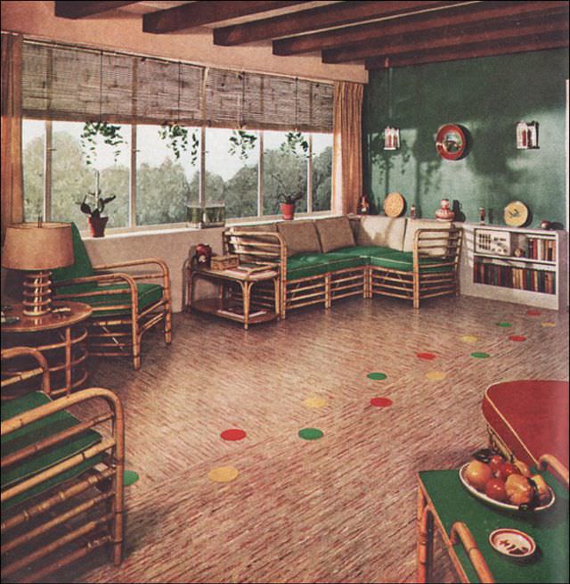
Living rooms of the period moved away from the stiff, formal parlor layout. Comfort and family use drove the new arrangements. The Chesterfield sofa appeared in many homes, paired with armchairs and footstools. Furniture was often a mix of older inherited pieces and newer streamlined designs — wood remained dominant, but Bakelite, chrome, and glass were making their way into everyday households.
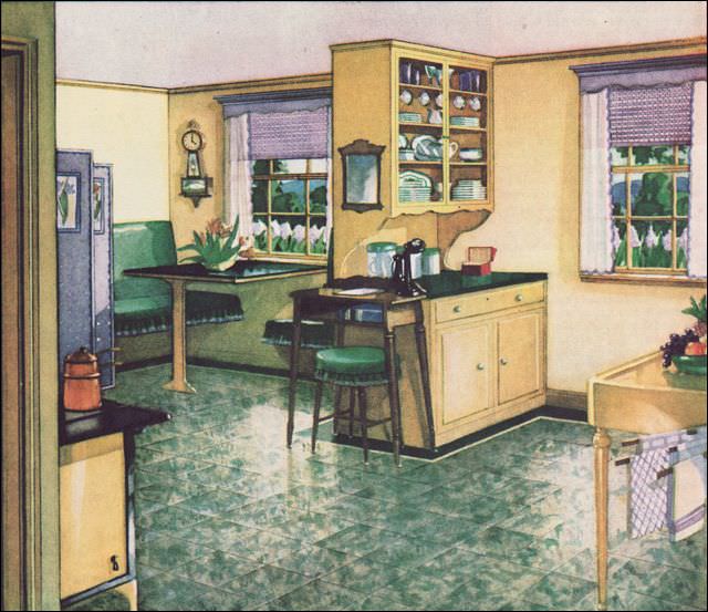
Yellow kitchens were a recurring trend throughout the decade. Bright, cheerful, and energizing, yellow worked well with the white enamel appliances and chrome hardware of the era. Armstrong’s flooring catalogs frequently featured sunny kitchen settings, pairing their linoleum products with carefully staged interiors that gave homemakers a blueprint to follow.
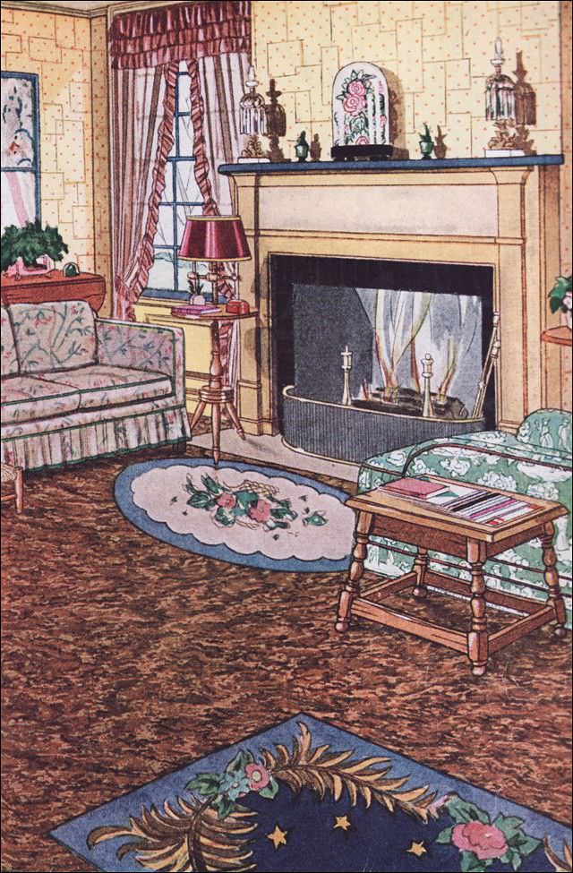
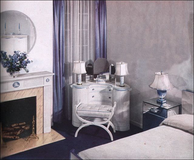
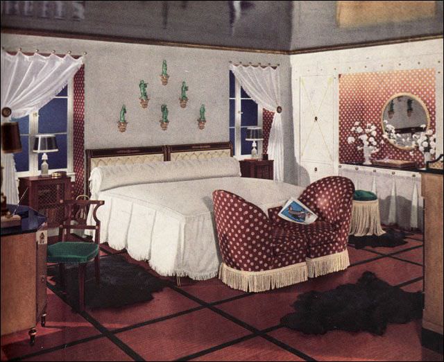
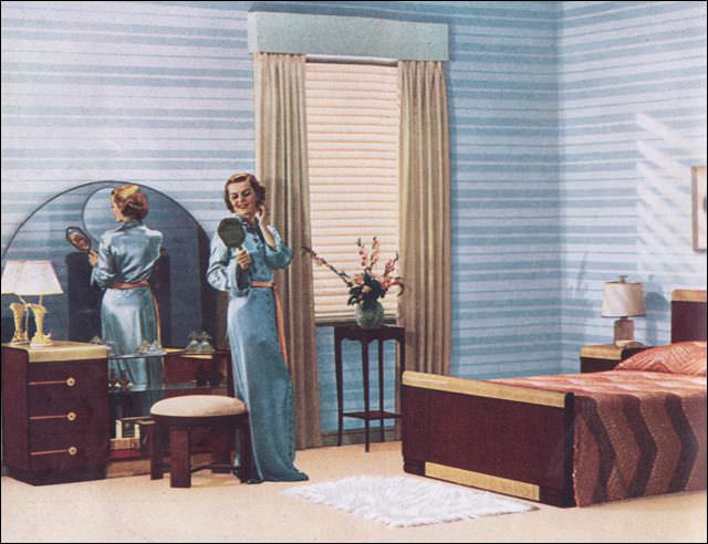
Art Deco, the defining design movement of the era, filtered down from grand public buildings into ordinary homes. Its hallmarks — geometric shapes, bold outlines, and a taste for glamour — appeared on wallpaper, furniture, and decorative objects. The waterfall front, a curved Art Deco design element, showed up on dressers, cabinets, and even radios. Deep, rich colors like royal blue, forest green, and red brought drama to rooms that might otherwise have felt plain.
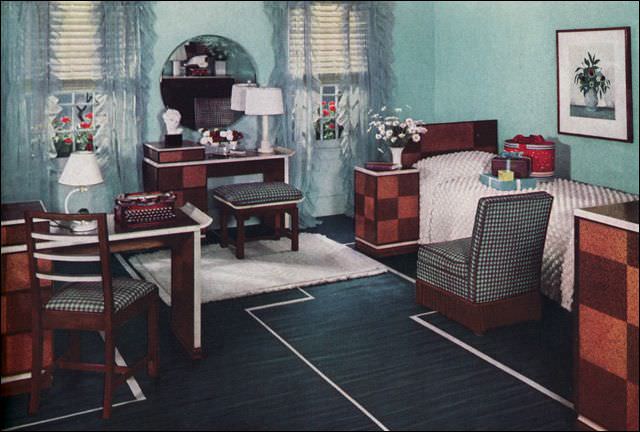
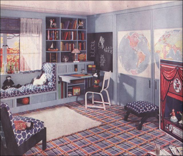
Bedrooms for children and teenagers began to reflect a more playful approach to design in the mid-1930s. Lighter furniture, patterned wallpaper, and purpose-built storage solutions made these spaces feel designed for the occupant rather than simply furnished. Girls’ rooms in particular favored soft color schemes with decorative accents.
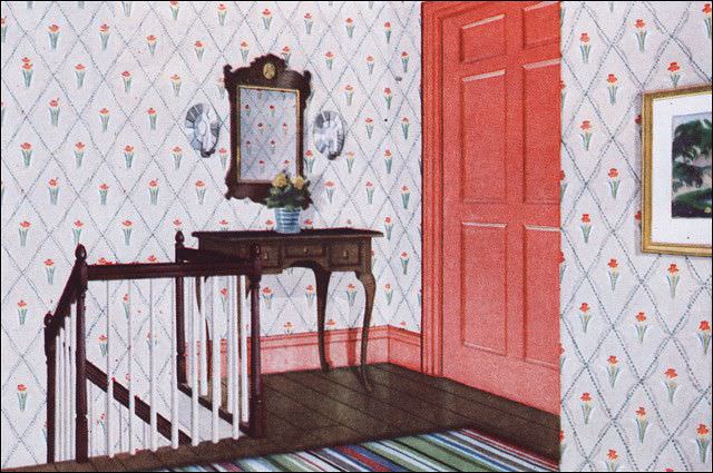
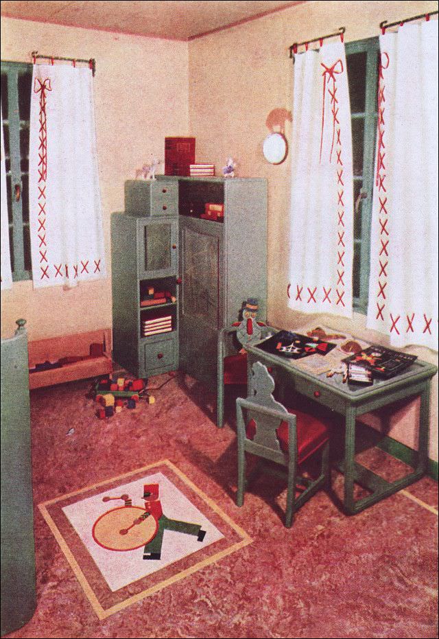
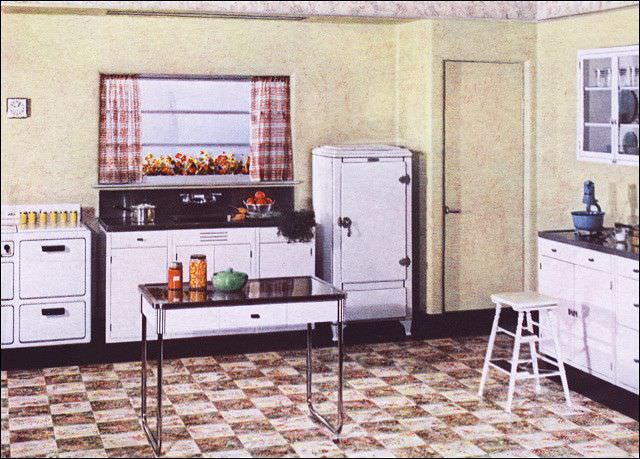
By the mid-1930s, branded home furnishing companies were producing full room concepts — not just individual products. Sealex, Armstrong, and others released catalogs showing complete room designs built around their flooring lines. These images gave consumers an aspirational vision of the modern home, and they sold the idea of a coordinated, designed interior to a mainstream audience.
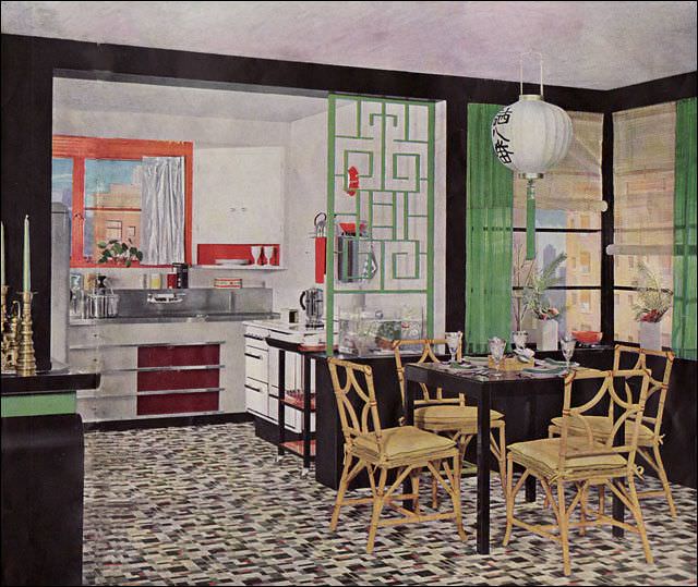
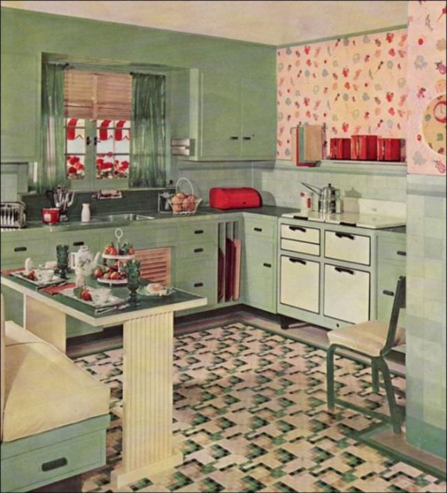
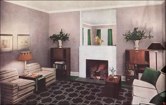
Neutral color schemes — cream, beige, and ivory — served as common backdrops in living rooms, allowing bolder accents to stand out. These muted tones felt sophisticated without demanding expensive furnishings to match. Lighting played an important role in this balance. The 1930s moved away from heavy, ornate fixtures toward simpler geometric designs in glass and chrome. Floor lamps and table lamps were styled to complement the room, not just illuminate it.
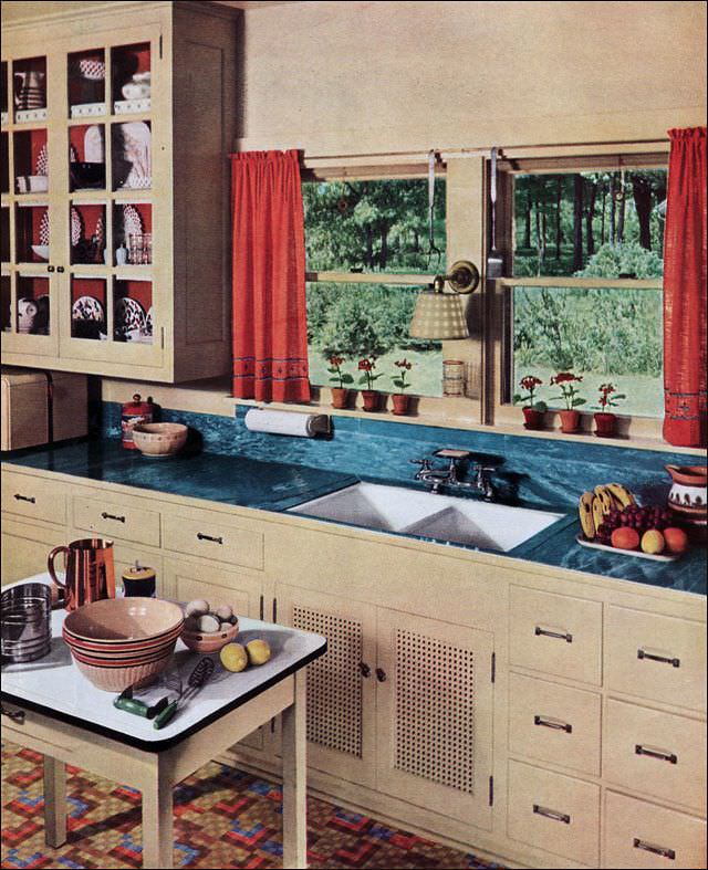
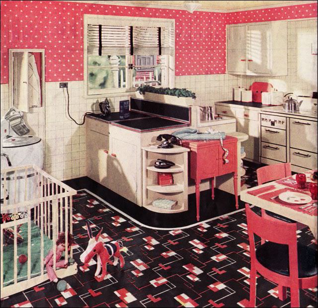
By 1936, kitchen design had grown more adventurous. Polka dots, bold stripes, and novelty patterns appeared on everything from wallpaper to flooring. Manufacturers like Westinghouse pushed for fully integrated kitchen systems, where appliances, cabinetry, and surfaces were designed to work together visually. Linoleum even moved onto countertops, offering a seamless and washable surface at an accessible price point.
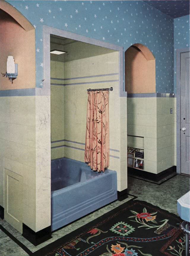
The late 1930s saw bathrooms reach a new level of design ambition. Carrara structural glass — a smooth, opaque glass tile used for walls — became a hallmark of high-end bathroom design. It was sleek, hygienic, and carried a distinctly modern look. Combined with chrome fixtures and geometric tile floors, these bathrooms looked as polished as anything seen in hotels or public spaces.
Specialty features began appearing in 1930s kitchens that went beyond basic cooking and cleaning. A dedicated dog-washing sink — a low, built-in basin designed specifically for bathing pets — shows how domestic design was becoming more thoughtful about the full range of household needs. It was a practical idea dressed up in period style.
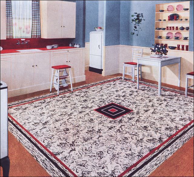
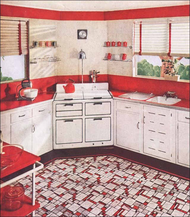
Red and white kitchens were among the boldest design statements of the late 1930s. Against white cabinetry and appliances, red accents — in flooring, curtains, or decorative trim — created a sharp, graphic look that felt thoroughly modern. It was a color combination that translated well in print advertising, making it a favorite for flooring and kitchen product catalogs of the period.

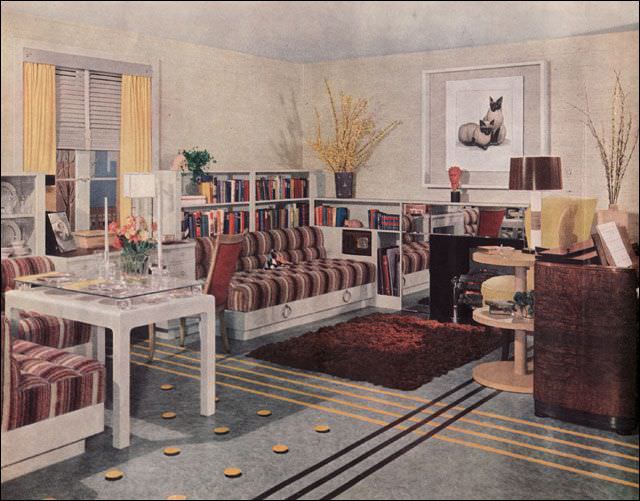
As the decade drew to a close, multipurpose rooms began appearing in home design guides. These flexible spaces — part laundry room, part hobby room, part utility space — reflected a practical approach to the smaller homes many families occupied. Armstrong’s 1938 multipurpose room design showed how a single well-organized space could serve several functions without feeling cramped.
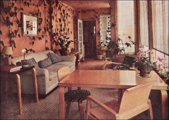
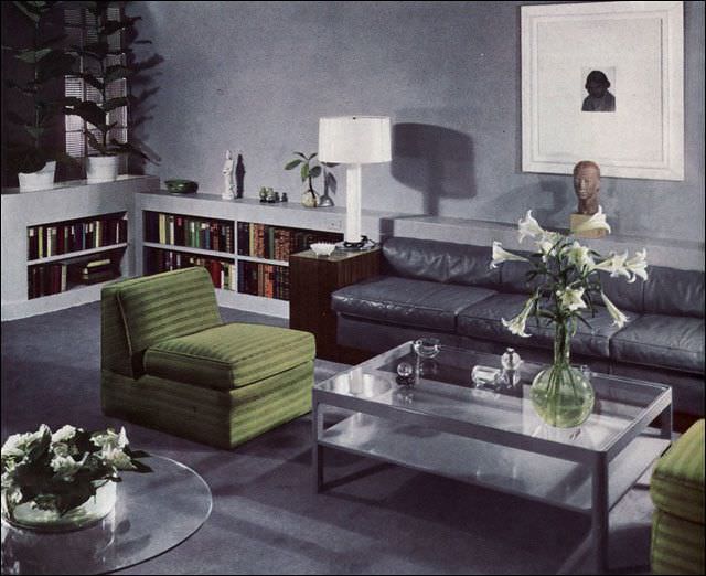
By 1939, the interiors showing up in design catalogs were pointing clearly toward what would become mid-century modern style. Cleaner lines, lower furniture profiles, and less ornamentation signaled the direction the next decade would take. The den had emerged as a distinct room type — casual, comfortable, and separate from the more formal living room.