Many new kitchen ideas were introduced in the 1940s, especially after the Second World War. As the manufacturing and supply of different materials and accessories were restored, new ideas took hold, and kitchens were transformed. The 1940s kitchen designs focused on color, texture, themes, and accessories, with dark and vivid colors driving much of the inspiration. Here are some fantastic American kitchen styles from the 1940s.
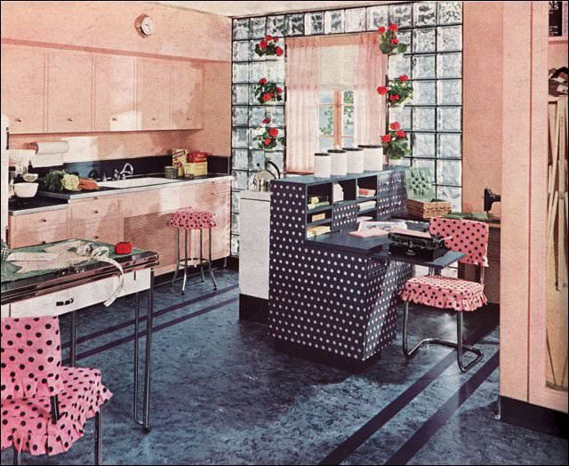
Glass block appeared during the 1930s and, combined with the clean streamlined design of the late Deco period, this kitchen achieves a bit of modernity. The polka dots, ruffles, and ubiquitous geraniums keep it casual and appealing without becoming too design-heavy.
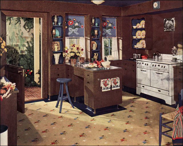
Most kitchen designs were lighter and brighter than this dark chocolate brown kitchen. Blue accents and white appliances provide some relief in this “gardener’s kitchen,” as it was referred to in the ad that ran in American Home.
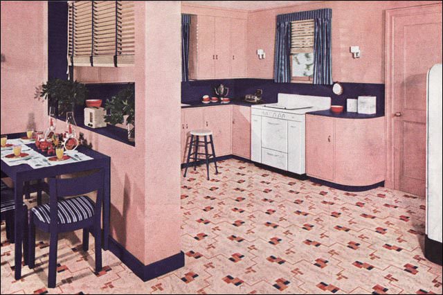
This Nairn ad ran in American Home magazine and it is really pink. The combination of pink and navy blue is not uncommon, but the amount of pink is. Even the ceiling is a lighter shade. It really makes those white appliances and red accessories stand out.
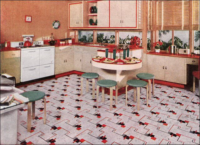
Shown in American Home magazine, this classic red, light tan, and green scheme has lots of clean modern elements. As an ad for Nairn, one of the oldest flooring companies in the US, the linoleum was the featured element, but the tan walls and red linoleum counters make a nice counterpoint to the green-topped Aalto stools. Also seen regularly were the window walls under the cabinets.
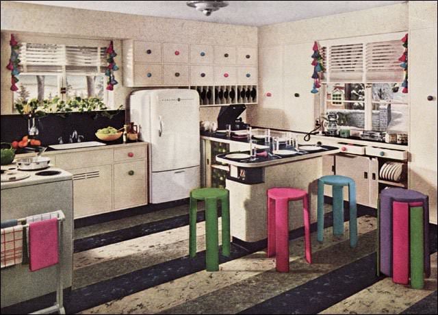
Armstrong ran full-color ads throughout the Depression and WWII advertising their various flooring, wall, and insulation products. Unlike many companies, they had a dedicated staff responsible for constantly coming up with new room ideas. Though “high designers” like Raymond Loewy and Russell Wright influenced the direction of interior design, it was companies like Armstrong that appealed most directly to the primary decision maker — the American housewife.
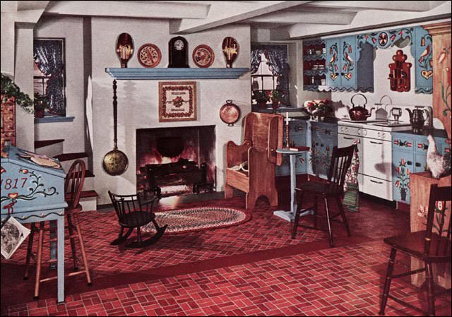
The folkloric style is one that surfaces consistently throughout the 20th century. Painted Pennsylvania Dutch flowers and birds, an Early American theme, and antiques (or imitations) create a traditional, comfortable look that appealed to many homeowners.
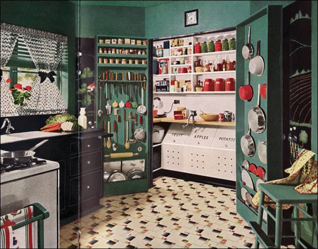
This kitchen is dark, with black and green prominently featured in the scheme. The white of the pantry and light floor serve to reduce the light-absorbing qualities, but it is the functionality of the pantry that stands out. It is fully functional for baking and other food preparation tasks. When not in use, the doors close and the kitchen becomes neat and tidy.
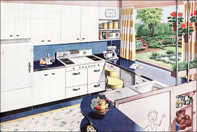
This kitchen ad appeared in Ladies Home Journal in mid-1945. It may have been the first of the New Freedom Gas Kitchen ads published. This one is notable for its blue, white, and yellow color scheme and having no name — the rest of the kitchen designs had names.
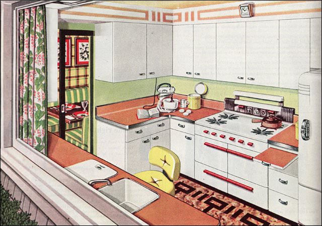
Immediately after the war, the American Gas Association launched its New Freedom Gas Kitchen campaign. This image appeared in Ladies Home Journal as the “Picture Window Kitchen.” Most kitchens were named to reflect their primary characteristic. This apple green and melon-colored kitchen was bright and cheery.
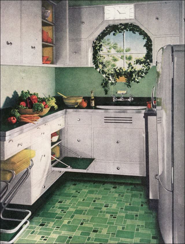
This kitchen is a tiny 6’x6′. The open door is designed to function as a step to access upper cupboards. After WWII, many people were still living in cramped quarters, so small, attractive kitchen designs would have appealed to many people, including apartment dwellers.
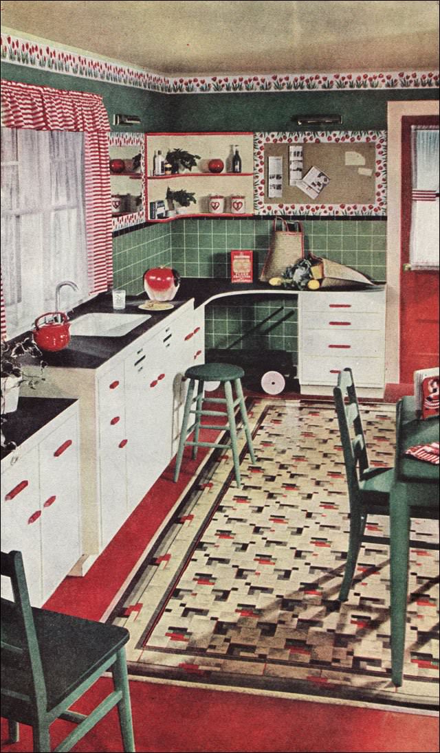
This 1945 Congoleum ad was published in Ladies Home Journal and reflects the continuation of 1930s style. Unlike its main competitor, Armstrong, the Congoleum company was more inconsistent in its advertising style. This kitchen would be fairly easy to replicate today with contemporary linoleum on the floors and counters, right down to the gooseneck faucet on the sink. Red, green, and white is a timeless color scheme.
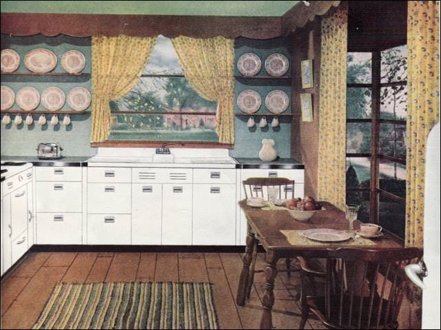
This ad was published in American Home magazine. The color scheme of white, yellow, and green is very calm, and the lack of clutter is very attractive. Unlike many Early American interiors, there is no busyness — the simplicity here is unusual.
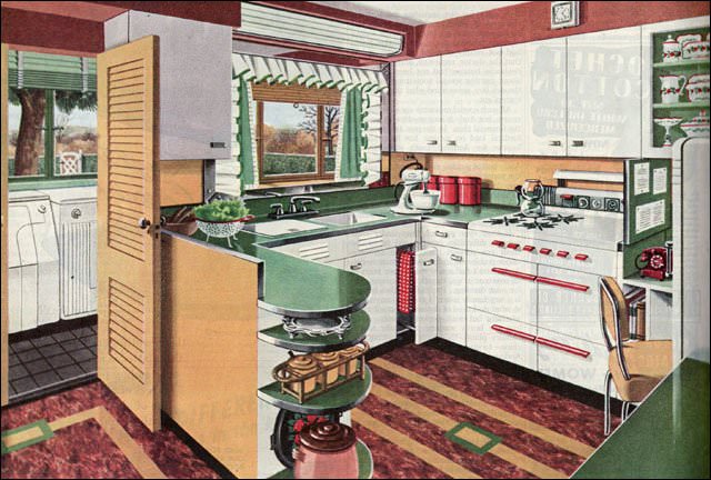
This ad was published in Ladies Home Journal and featured one of the American Gas Association’s New Freedom kitchens. The color scheme of red, green, and yellow (or gold) has always been a popular combination. The counters and floor were likely both linoleum, though in a few short years, plastics like Formica would begin to dominate the market.
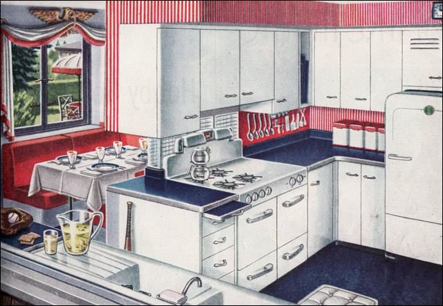
The Americana kitchen was published in American Home magazine, among others, and reflected the optimistic patriotism of the winners of the Second World War. The glass block between the stove and breakfast booth is a nice mid-century touch.
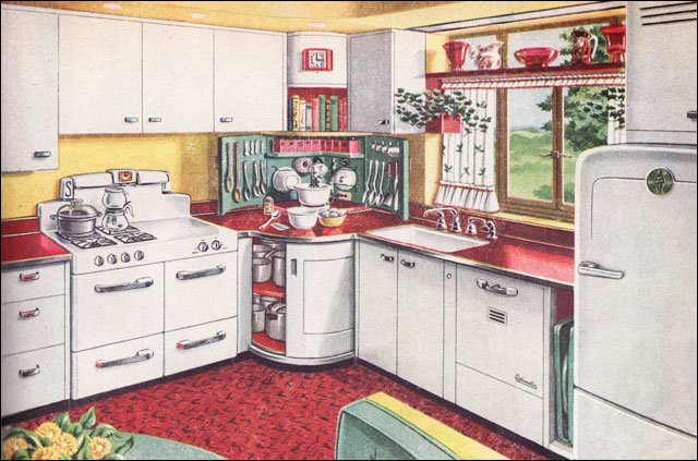
This ad for a “Mixing Corner Kitchen” was published in American Home magazine. Red, green, yellow, and crisp white steel cabinetry was a classic color combination. Steel cabinetry was popular during the post-war years as companies retooled to meet the demand for kitchen cabinets instead of machine gun turrets.
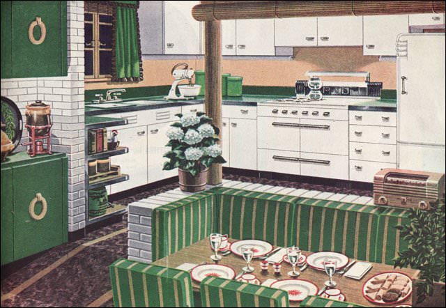
Intended to appeal to owners of older homes who wanted a kitchen update for their mid-1920s house, this ad by the American Gas Association was published in American Home. During the post-war years, they published a series of attractive color illustrations reflecting the current trends in kitchen design.
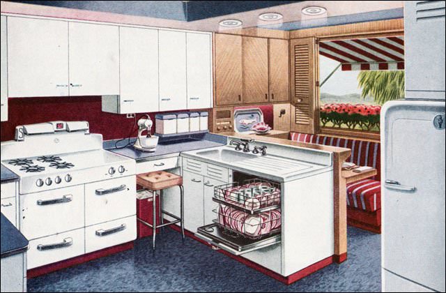
A variant on the popular red, white, and blue theme replaced the red with maroon. This kitchen design shows all the features desired by the American homemaker after WWII, including the stand mixer, built-in dishwasher, and a brand new gas range. The small breakfast booth is also a notable feature.
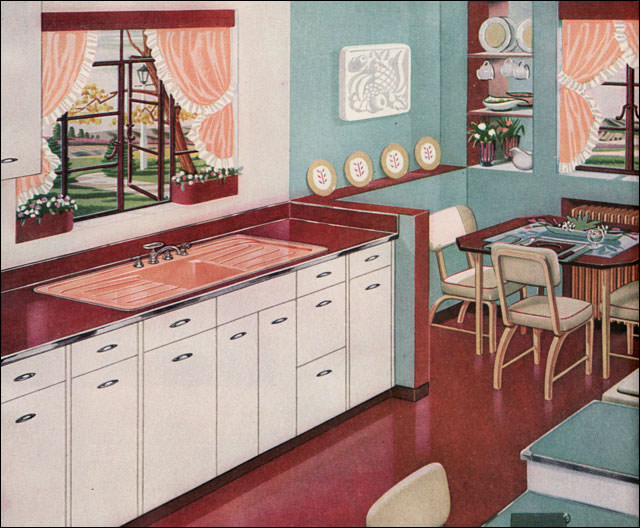
This small brochure, published by American Standard, shows colors that were muted and toned down. The combinations ranged from unusual (to the modern eye) to very sophisticated. This color scheme comes from the palette of colors in the brochure: Ivoire de Medici, Corallin, Clair de Lune Blue, and T’ang Red.
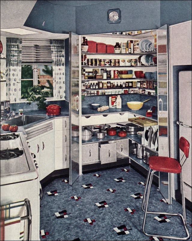
Keeping a small kitchen tidy but functional is as much a challenge today as it was in 1948, when this ad appeared in American Home magazine. In keeping with the post-war period, it is yet another example of the popular red, white, and blue color scheme that captivated many American homeowners.

This ad for a very busy, multifunction kitchen appeared in American Home in 1948. Regardless of how you feel about the color scheme or layout, this kitchen packs a lot of function into a small footprint.
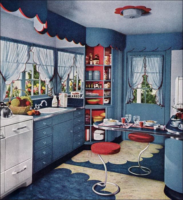
This is a standout design for those who like scallops — again in red, white, and blue, with many over-the-top scallops in the floor and trim. A lazy-susan corner cabinet shows how easy it is to design functional storage in a small footprint, especially if the husband has a workshop in the basement.
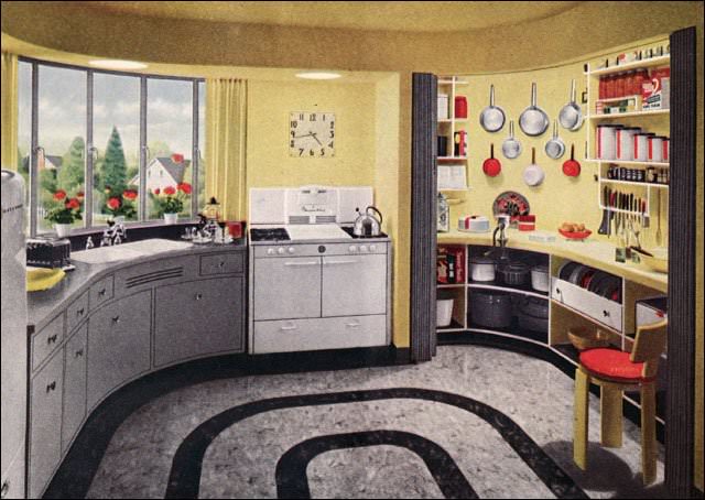
Right after WWII, the lead designer at Armstrong was clearly taken with the idea of a working pantry that could be closed off when not in use. This one features an accordion-style door on a track, which was a significant space saver. Everything is tidy and organized — a feature that would not have been lost on many homemakers.
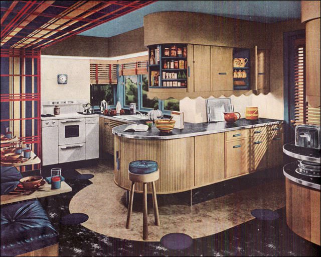
This modern-style kitchen shows Armstrong linoleum to good advantage. The cabinets have tambour doors, a post-war design feature that appears in many publications of the period. Eat-in kitchens were also desirable, and many had both a booth or nook and a counter breakfast bar.
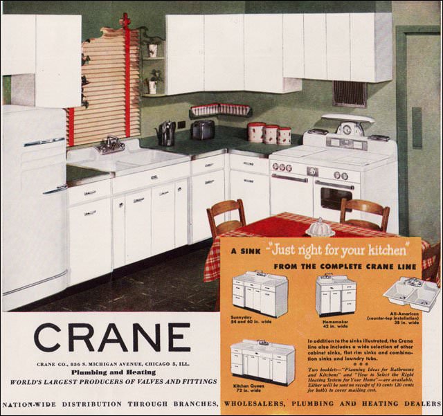
During the 1920s, Crane advertised broadly and in color. During the Depression and through WWII, their ads were primarily in black and white. All that changed after the war, when they began advertising using both color illustrations and photos.
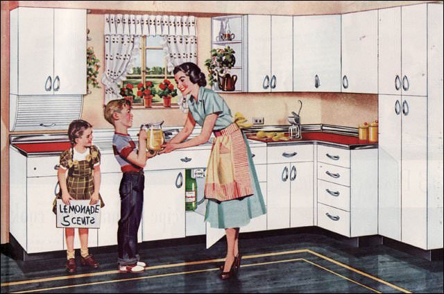
Advertising during the 1940s and ’50s was often cheerful and followed a theme. This image is from a Youngstown ad that promoted their steel cabinets. Each ad has some kind of happy family image that has since come to represent the spirit of the period. The kitchens depicted were modern, clean, and affordable — all good reasons to buy them. Finding steel cabinets today has become somewhat challenging, but they work very well in retro kitchen renovations. Some people sand them down and have them refinished by auto painters.
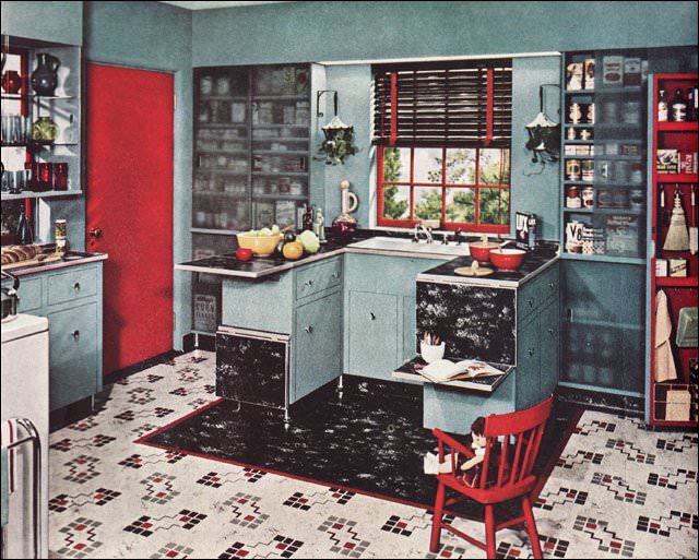
Shown in Ladies Home Journal, this Armstrong ad features creative storage ideas as well as their latest linoleum pattern to attract homeowners considering a kitchen update. Some of the ideas, like the shallow wall storage and drop-leaf work space, would maximize the functionality of many of today’s kitchens.
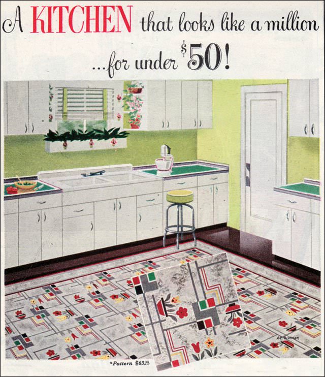
This ad for Bird linoleum is interesting both for its design, which is more typical of the pre-WWII period than the late 1940s, and for its relative rarity. Though Bird had been in business for decades, it was never as large as the main flooring companies, and advertisements like this one are unusual.
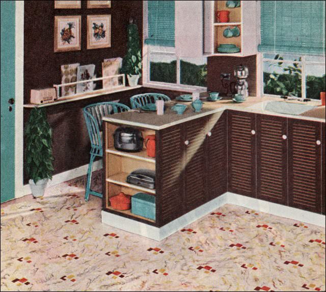
This ad for Pabco linoleum appeared in Ladies Home Journal and is included here because its color scheme foreshadows some of the color schemes that would become enormously popular during the 1950s — in this case, turquoise, orange, and brown.
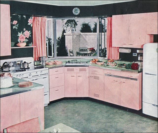
This image came from an article that ran in Ladies Home Journal. Another image showed the corner table and banquette seating. The pink is a modern departure from the more common color schemes, with dark green, mint green, and white lightening it up. The giant cabbage rose wallpaper over the range is used on the entire wall over the banquette.
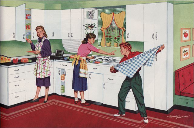
Another Youngstown kitchen uses the red, green, and gold color scheme to contrast with the crisp white cabinetry and black counters.