“Cigarettes are like women. The best ones are thin and rich.” That slogan stopped people in their tracks when Silva Thins cigarettes first used it in the 1960s. It was sharp, provocative, and completely intentional. In an era when advertisers were competing harder than ever for consumer attention, a line like that got the job done.
The 1960s brought sweeping changes to American culture, and the advertising industry charged right alongside them. Brands moved away from straightforward product descriptions and toward selling a lifestyle, an attitude, or an identity. Billboards, magazine spreads, and print campaigns became stages for bold storytelling. Companies understood that standing out meant taking risks.
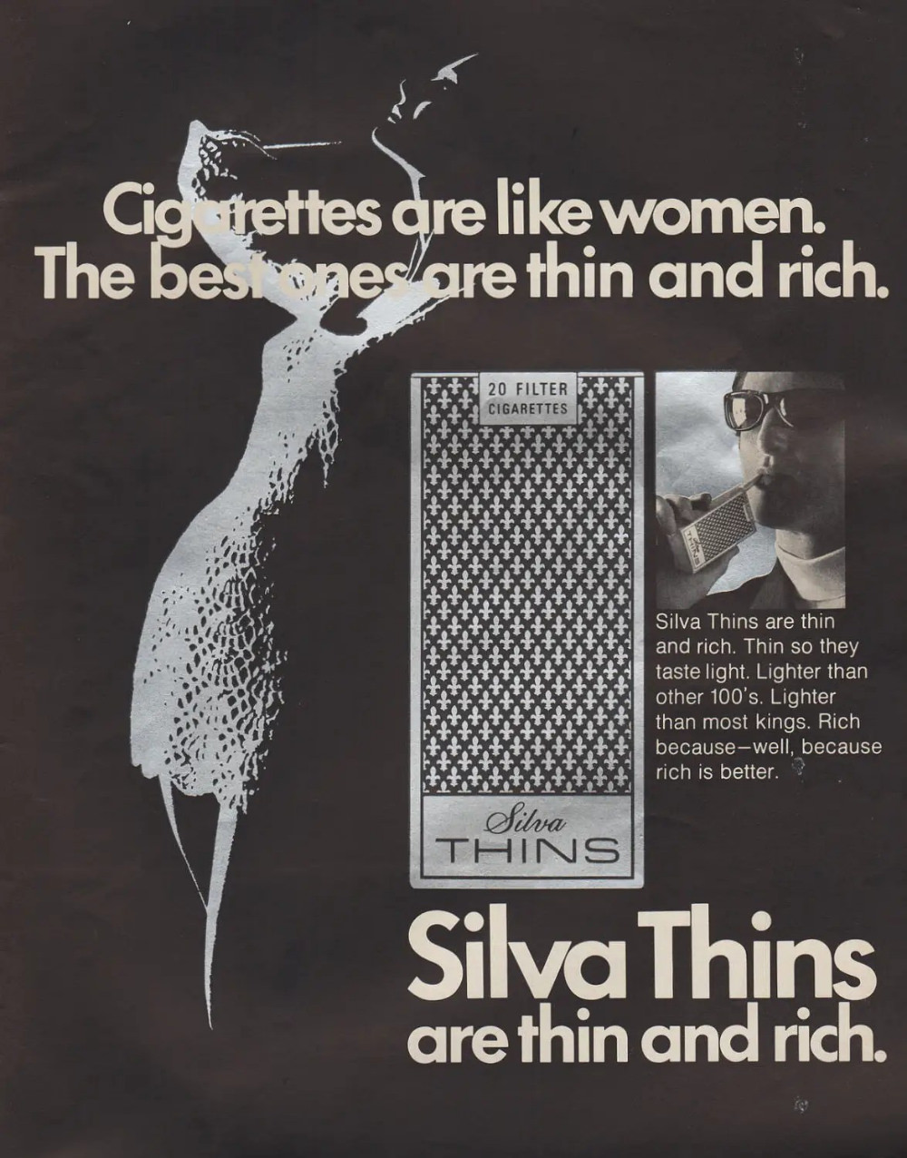
Silva Thins leaned into this shift fully. The brand’s print ads were visually clean — minimal clutter, sleek design, and a single punchy tagline. The elongated shape of the cigarette was front and center, reinforcing the “thin” identity. Everything about the visual layout was deliberate, designed to project class and sophistication to a mid-century audience.
The humor in the slogan was part of the strategy. Advertisers of the time regularly used wit and wordplay to make their messages stick. A tongue-in-cheek comparison between cigarettes and women was considered clever rather than offensive by the standards of the day. It sparked conversations, which kept the brand’s name circulating long after someone turned the magazine page.
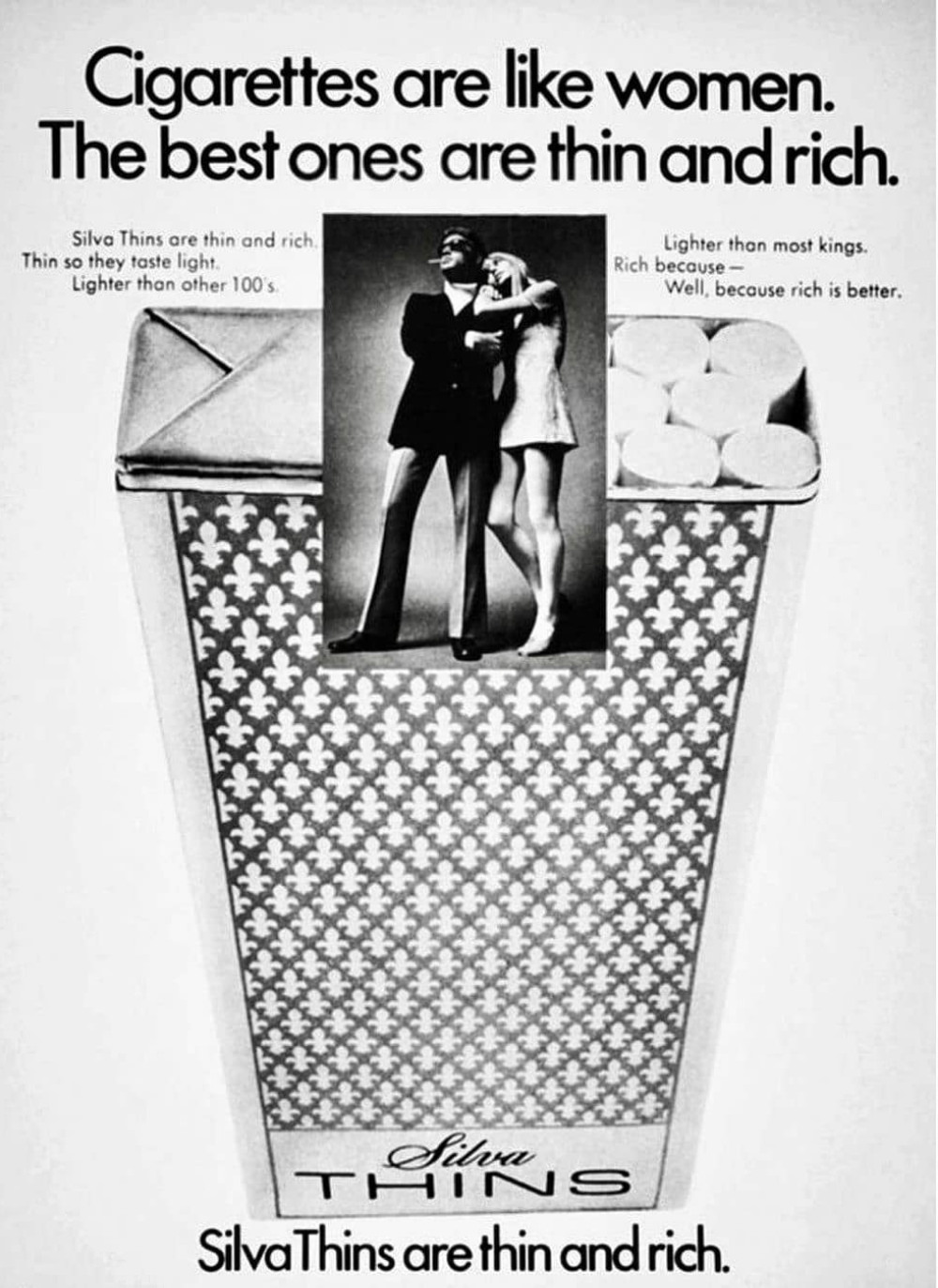
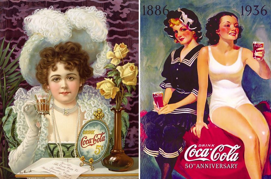
The ads also tapped directly into postwar consumer values. Wealth and slenderness were openly marketed as aspirational traits in 1960s America. Silva Thins packaged both into a single product — a cigarette that signaled refinement through its very shape and name. The brand wasn’t just selling tobacco; it was selling a self-image.
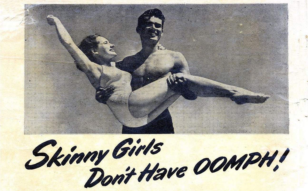
Gender stereotypes were not only present in these ads — they were the engine driving them. Women were used as a reference point to define product quality, reducing both to a narrow set of physical traits. This approach was standard practice across many product categories throughout the decade, not just in cigarette advertising.
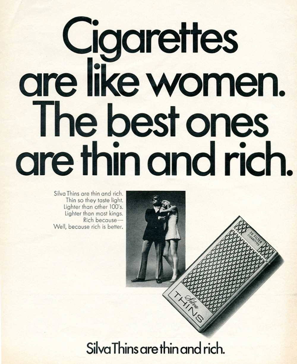
By 21st-century standards, the Silva Thins tagline reads as openly reductive. It frames thinness and wealth as a woman’s defining values, then assigns those same traits to a consumer product. Historians and media critics point to campaigns like this one as clear evidence of how normalized gender objectification was in mid-century advertising. The ads are not subtle about it — they make the comparison explicit and frame it as a selling point.
What makes the Silva Thins campaign particularly useful as a historical document is its directness. There is no subtext to decode. The ads show exactly what 1960s advertisers believed their audience valued, what made them laugh, and what made them buy. That transparency is precisely what makes them so revealing decades later.